
Bipedalism and The Skyscraper
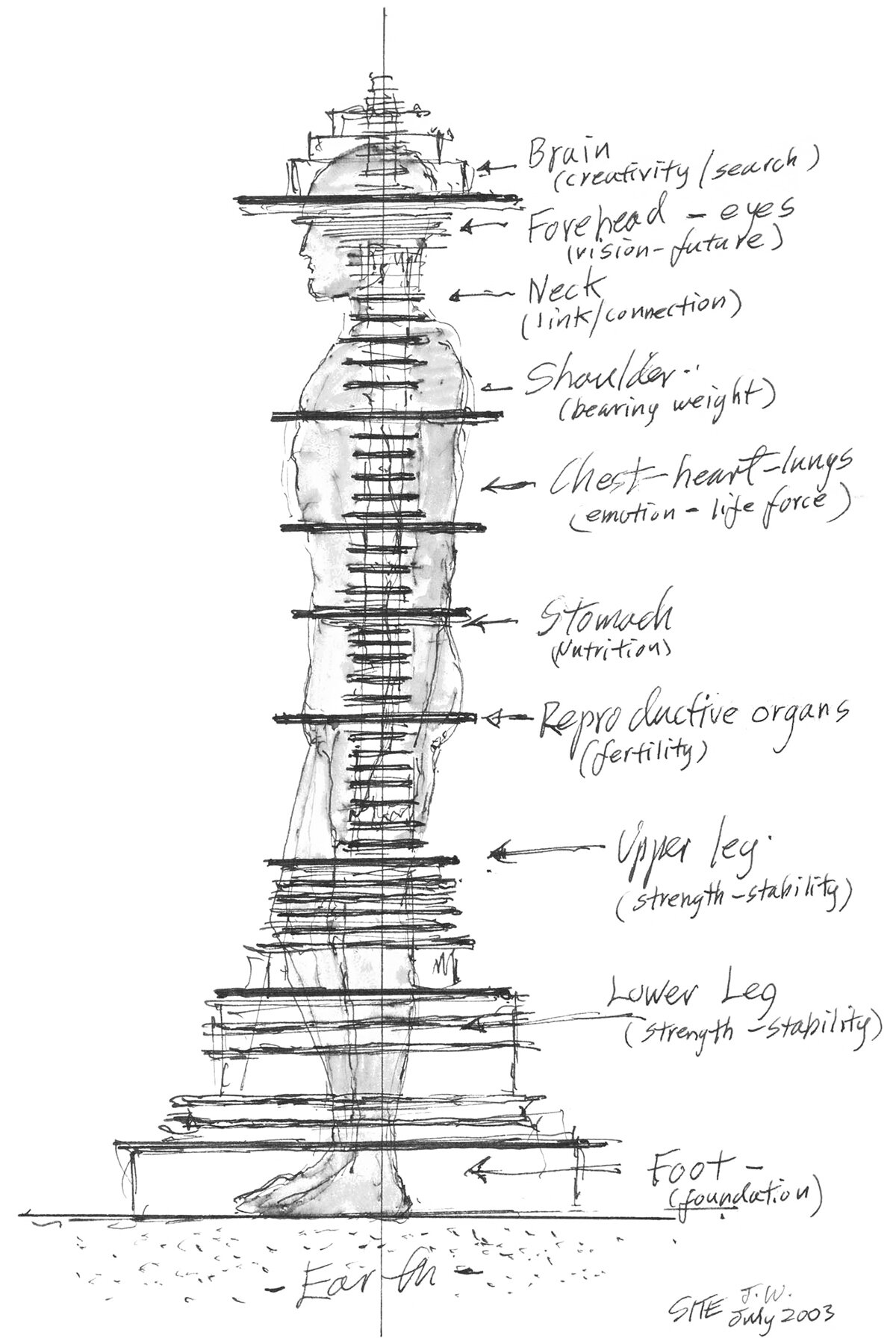
Concept sketch by James Wines of SITE, for his Antilia Tower project. The diagram tries to apply the verticality of the human body to the verticality of the skyscraper. Image ©️ James Wines, SITE. Image source.
I came across this diagram the other day, and it immediately struck me. It was drawn in 2003 by James Wines of SITE for his Antilia Tower project, and it superimposes a human body on top of a tower section. I’ve previously written about the conceptual link between the bipedal human body and the tower, but this diagram takes it a step further and matches the functions of each part of the body to each part of the tower. This mostly works, but a few of the links get a bit tenuous. It does add some food for thought to the historic comparisons between the human body and towers, however, which I think is worth exploring here.
When our ancestors left the trees and moved out onto the savannah, we began to walk upright, which set us apart from our ape cousins, and in many ways defined us as a species. Our earliest constructions were upright monoliths, called menhirs, which were placed on the landscape to signify the importance of a place and mimic our upright bodies. As such, they were our first attempts at externalizing our primal need for verticality. Pictured below on the left, these monoliths laid the groundwork for subsequent architectural languages to develop. Examples of upright monoliths can be found in every early civilization, and over time these vertical elements began to support other elements above them. These were columns, and they would become one of the main elements in architecture that we still use extensively today. The connection back to the human body was made clear by the Ancient Greeks with the caryatid, which is a column shaped like a person, pictured below at the center. These forms existed alongside the much more common classical columns, pictured below on the right. This progression from the human body to the column was continued into the tower and ultimately into the skyscraper, as technology developed to make the later building types possible.

Comparison between an ancient menhir, a Greek Caryatid (a column shaped like a human), and a Greek Column. Illustrations taken from Banister Fletcher’s History of Architecture on the Comparative Method.
This brings us back to James Wines’ diagram shown above. He brings the metaphor full-circle, and superimposes the human body on his design. It brings to mind Louis Sullivan’s late-nineteenth-century idea for a tri-partite design methodology for the skyscraper. Sullivan was connecting classical column design to the modern high-rise, and in the process he strengthened the metaphor. The upright human body has three main parts: the legs, the body, and the head, which correlate with the base, shaft, and capital of a classical column, respectively. Sullivan advocated for a high-rise to have the same elements, with a base, shaft and cornice. Modern skyscrapers generally follow suit, with a base, shaft and crown. Wines’ sketch explores this theme further. He’s included a massive base at the legs, which tapers up to a straight shaft throughout the body, topped with a distinct form at the head.
His labeling further explores the nature of these three elements. At the base, or legs, he labels the floors as strength and stability. This makes sense, because any tower needs to have a strong and stable base, both physically and conceptually. This is the part of the tower that meets the ground, so there are massive forces at play. Next up is the shaft, or body. These labels, such as fertility, nutrition and emotion, are less clear. This is the weakest part of the metaphor, and it’s unclear how the architecture of the tower would exhibit these concepts. The top of the tower, at the head, is labeled as creativity. This is an interesting one, and it makes sense. The crown of a tower is where it meets the sky, and generally this is where the most flair is found in the design. This is also true of classical columns, where the capital is the most sculptural part.
I’ve often pondered the conceptual link between the upright human body and the modern skyscraper. This is why I love the sketch shown above, because it shows that James Wines was pondering the same thing during his design process for the Antilia Tower. He’s clearly aware of the historical baggage that comes with this building type, and is attempting to add some new ideas to the conversation. He goes a bit too far when he attempts a direct link between anatomy and architecture, but in the end these links just make the design more intriguing.
Check out other posts about James Wines here.