
The March of Progress and the Fallacy of Progressive Evolution
Evolution and natural selection are tricky concepts to represent in an illustration. This is partly true because the reality of these processes is so complex and nuanced that some type of simplification is required when introducing them. This is a fine line however, because each concept can easily be over-simplified to the point of confusion. This is exactly what happened with the illustration above. At first glance, it appears to be a simple meme that shows how the human species went from moving on all fours to walking upright, but behind this is a fascinating and painfully unfortunate backstory about the nature of evolution. It began with a simple but quite difficult task, and after a series of unintended events, it ended with a meme that fundamentally misrepresents the initial concept being discussed.
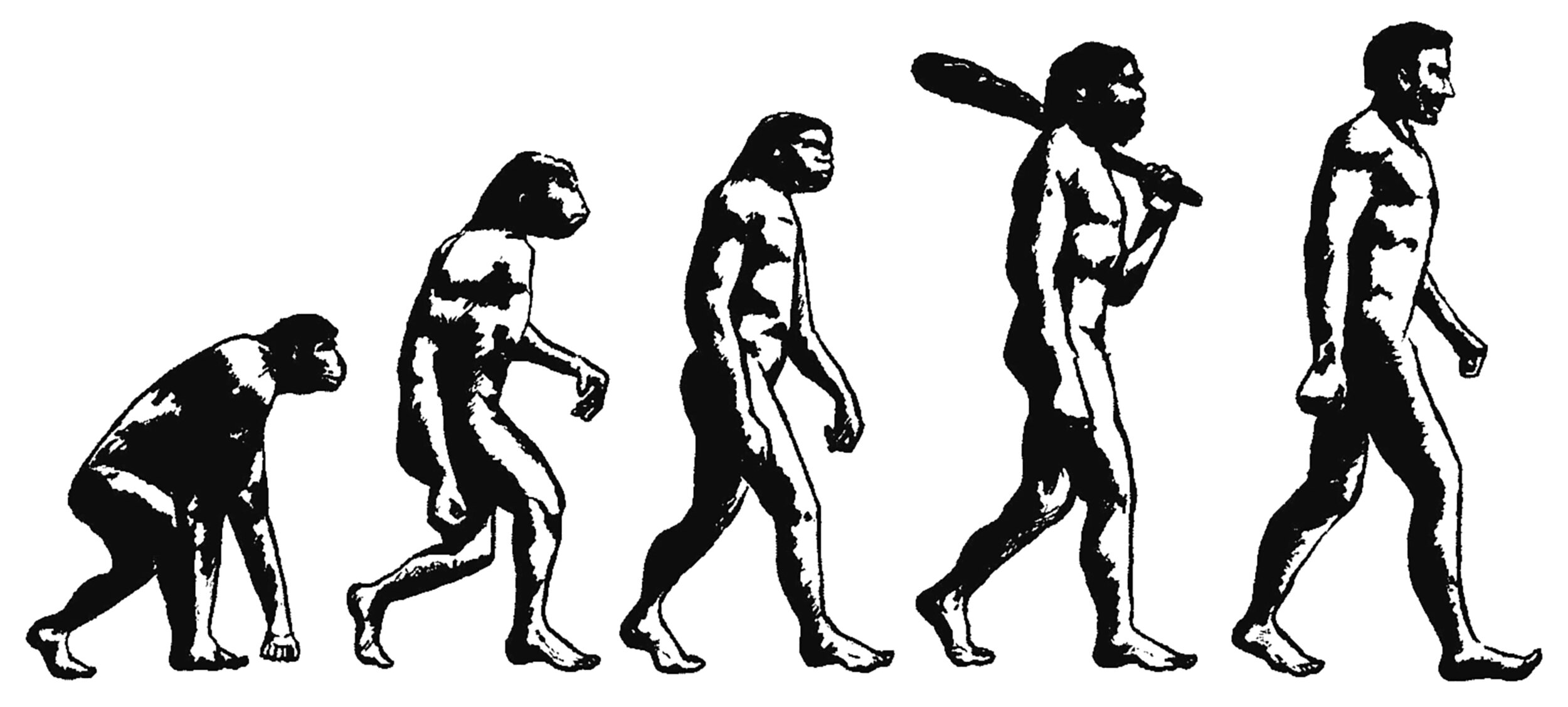
Most people have seen the image pictured above, or some variant of it. It’s a meme that shows a modern human being and some of our ancestors walking in a line behind him. Each subsequent species is a closer ancestor of ours, and the figures progress from walking on all fours to standing upright. This is such a powerful and infectious visual concept that the meme has become synonymous with the concept of evolution itself. To illustrate this, try a simple internet image search for the word evolution. More than half the results will be this meme or a variant of it. Unfortunately, this is not how evolution works, and it’s not what the original artist intended.
The meme pictured above can trace its roots back to the graphic pictured below. It was created by Rudolph Zallinger for the 1965 book Early Man from the Life Nature Library. The original title for the graphic was The Road to Homo Sapiens, but it has since become known as The March of Progress. Zallinger was tasked with representing the history of our species, all the way back to our tree-dwelling ancestors who didn’t walk upright. He chose to do this by drawing each ancestor we knew about at the time, and arranging them in the aforementioned marching lineup.

This marching lineup is very seductive. It’s instantly understandable and it makes sense to anyone who doesn’t understand evolution. It has two major problems, however. The first is the progression from left-to-right, which is reinforced by the walking motion of the figures. This implies a progressive process and a shared goal, which are both incorrect. Evolution isn’t intelligent or progressive, and it doesn’t have goals. It’s an indifferent process that relies on genes passing from one generation to another. Individuals who survive and reproduce get to pass their genes on to subsequent generations. Therefore, the genes and traits that help an individual survive and reproduce will be passed on more often than those that don’t. Over time, this process results in slow changes based on inter- and intra-species competition. This is why our ancestors looked and acted quite differently than we do. The difficulty with showing this visually is the sheer complexity of it. There are millions of genes and traits in play and the process of selection is based on the wonderfully complex relationships between them all.
The second problem is that it implies each subsequent species came before the next one. In reality, there was quite a lot of overlap between them, and in many cases there were multiple species living side-by-side on the earth. This is because any significant change to a species takes hundreds or thousands of generations to become commonplace, and in the meantime there’s lots of other related and unrelated genes being passed on. Zallinger tried to illustrate this with the timeline above the figures, but the seductiveness of the marching lineup made it an afterthought.
The idea of progression is also implied by the original title, The Road to Homo Sapiens, which adds to the confusion. In reality, evolution isn’t a line or a road. According to Stephen Jay Gould, the web of life on earth is like a copiously branching bush, continually pruned by the grim reaper of extinction, not a ladder of predictable progress.[1] Hannah Devlin gave a more detailed description of this bush in an article from The Guardian in 2018: different branches evolve at different rates; new traits can emerge several times independently; splits can be dragged out over millennia and across continents, with populations diverging and then interbreeding again. Rather than the tree of life it’s more like a dense, thorny bush.[2] The illustration below attempts to show this dense, thorny bush. It was drawn in 1879 by Ernst Haeckel and titled the Paleontological Tree of the Vertebrates. It still contains progressive elements, but it tells more of the story. It shows the myriad branches and dead-ends that occur within the system, and it doesn’t present the web of life as a road or an isolated path like the March of Progress does.

Still, the sheer complexity of evolution on earth isn’t quite captured in this image either. In reality, every branch and path contains millions of individuals who lived and died along the way. Some of them passed their genes on, but most of them didn’t. This is another shortcoming of the marching lineup. Each of the individuals that Zallinger drew exists in the middle of the aforementioned dense, thorny bush, similar to Haeckel’s diagram. The process of getting from one figure to the next required untold amounts of life and death to occur.

Apart from the baggage that comes with the marching lineup, there was also a formatting issue with the graphic in the book itself. The full graphic was laid out onto a five-page foldout, which appeared as a shortened version of itself when the pages were folded up. Pictured above is this shortened layout without the fold-out pages. This version further simplifies an already overly-simplified idea, and unfortunately these six individuals would become the basis for the meme at the top of this page.
The tough thing about the March of Progress is that it contains some truths, they were just overshadowed by the visual power of the marching lineup. It’s true that our ancestors transitioned from walking on all-fours to walking upright. It’s true that we can trace our lineage back through most of the individuals that Zallinger drew. It’s true that our ancestors gradually grew taller as they evolved. It’s also true that Zallinger over-simplified the story to a point that it confused things more than it clarified them. Zallinger set out to show a single thread within a massively complex system, and did it effectively. So effectively, in fact, that his graphic became emblematic of the system rather than the single thread.


Pictured here are larger versions of the figures Zallinger drew for his March of Progress. I include them because, for all its flaws, I still believe Zallinger created a beautiful work of art with positive intentions. Even if it misrepresented aspects of evolution, it still illuminates a single thread within the massively complex web of life on earth, and there is still much to be learned from it. Any knowledge gained must be accompanied by the inherent shortcomings, however, which I have outlined above. By understanding both, the story behind the March of Progress serves as a cautionary tale on the power of representation, and it shines a light on the fallacy that evolution is progressive.
Check out other posts that discuss bipedalism and verticality here.
[1]: Gould, Stephen Jay. Wonderful Life: The Burgess Shale and the Nature of History. New York: W.W. Norton & Company, 1989. 30-36.
[2]: Devlin, Hannah. "Tracing the tangled tracks of humankind’s evolutionary journey." The Guardian, February 12, 2018.