
Piero Portaluppi’s SKNE Company Skyscraper
Watercolor perspective showing Piero Portaluppi’s conceptual New York skyscraper from 1920.
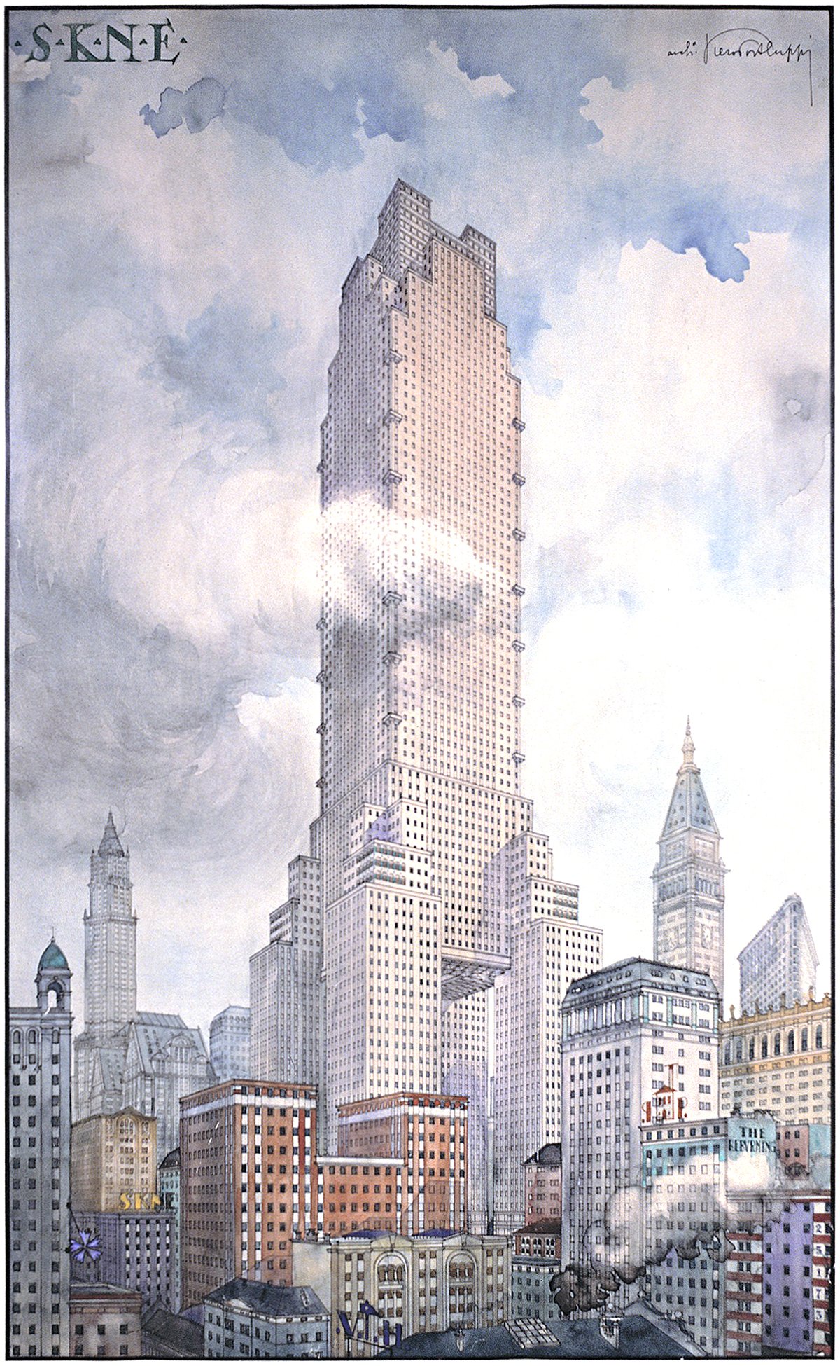
Pictured above is a conceptual design for a skyscraper by Piero Portaluppi from 1920. I stumbled across it while browsing this article of unbuilt architecture from New York City. It was designed as the headquarters of the S.K.N.E. or SKNE company for a site somewhere in New York. There’s two interesting angles here; the first is the tower design, and the second is the method of representation shown.
First, let’s look at the tower design. The main feature is the four tower legs that support the main tower volume above. These legs allow the main tower to lift up high above the city, leaving a massive void down below. This lifting action results in a much taller building with better views throughout the upper section, and it allows more daylight to reach the lower volumes through the void. It’s an interesting idea, but would be way too expensive to build because of the structural and circulation requirements. Aside from this, the tower is a rather standard setback and tower design. One small detail of note is the small terraces along the corners of the upper volume. These give the tower volume some visual interest, but in reality they’d be much too exposed and windy to get any real use.
Now for the representation. There’s a few interesting things going on here. At first glance, it’s clear the artist wanted to show the building towering above the actual city of New York, but upon closer inspection it’s not a real view of Manhattan. It’s a collage of buildings with a few well-known New York skyscrapers thrown in. The well-known buildings are shown in the background and include (from left to right) the Woolworth Building, the Met Life Tower and the Flatiron Building. I suspect the artist wanted to show the building in the actual city, but also wanted to show a height comparison between it and the tallest buildings in the city. Regardless, the composition works well. This building would’ve been so much taller than anything else in the city, so it makes sense that the artist would throw as much existing height at it to hit the comparison home. Buildings like the Woolworth and the Met Life towered over their surroundings at the time, and the SKNE tower makes them look small in comparison. This isn’t just a marketing piece for the building, but also a marketing piece for the company it was built for. The height of the building is being used here as a metaphor for the power of the company that owns it. We’re taller and higher than you, therefore we’re better than you. Another nice touch is the cloud that appears in front of the upper tower. The artist is telling us that this tower is so tall it’s not in the clouds, but above them.
I love wild designs such as this, because they give us a look into the values of those who wish to build them. This design was meant to announce the power and domination of the company who built it, and it was using verticality to do so. It was also wrestling with daylight access for its lower levels, which resulted in a unique form that no doubt would’ve changed how skyscrapers were designed if it got built.
Check out other posts about unbuilt architecture here.