Welcome to On Verticality. This blog explores the innate human need to escape the surface of the earth, and our struggles to do so throughout history. If you’re new here, a good place to start is the Theory of Verticality section or the Introduction to Verticality. If you want to receive updates on what’s new with the blog, you can use the Subscribe page to sign up. Thanks for visiting!
Click to filter posts by the three main subjects for the blog : Architecture, Flight and Mountains.
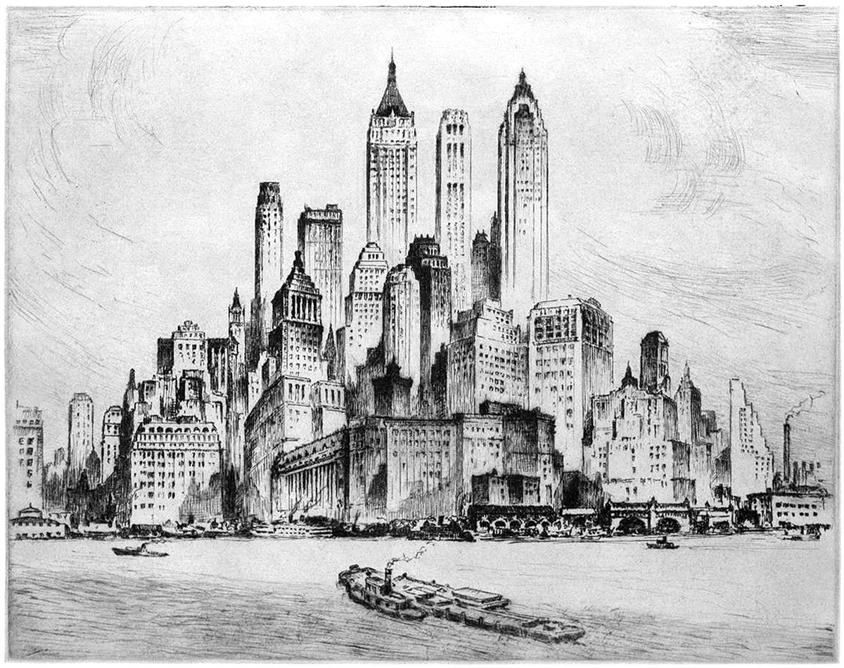
Nat Lowell and the Tip of Manhattan
Pictured here is an etching by artist Nat Lowell, showing the southern tip of Manhattan, circa 1940. The perspective is from the harbor, and Lowell focuses on three towers, which are the tallest of the bunch. From left to right, they include 40 Wall Street, 20 Exchange Place, and 70 Pine Street. The composition isn’t literal, and Lowell has taken some liberties to arrange the buildings into a mountain of sorts, with the three aforementioned towers at the summit.
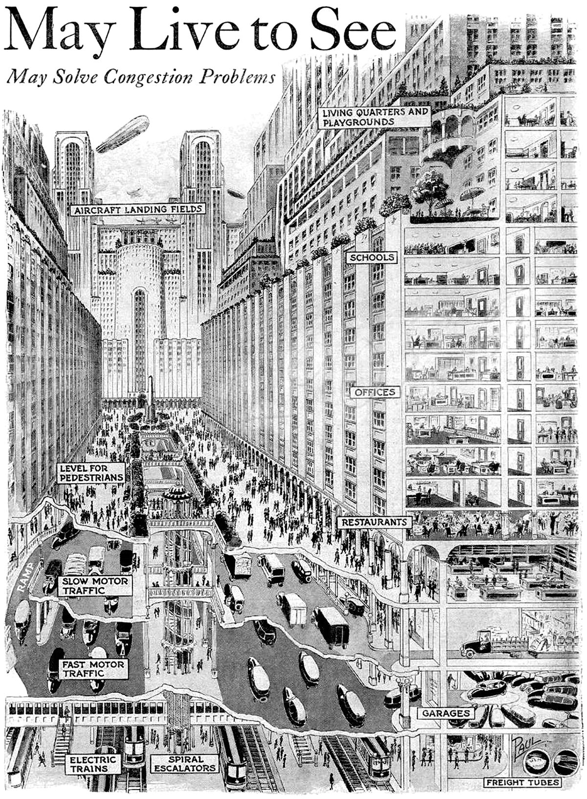
How You May Live and Travel in the City of 1950
Pictured above is a vision for a future city from 1925, which predicted what cities would look like in 1950. It’s quite an ambitious proposal, since it required sweeping urban changes to occur in only 25 years. The changes feature a vertical separation of city functions that start below the ground and end on top of skyscrapers.
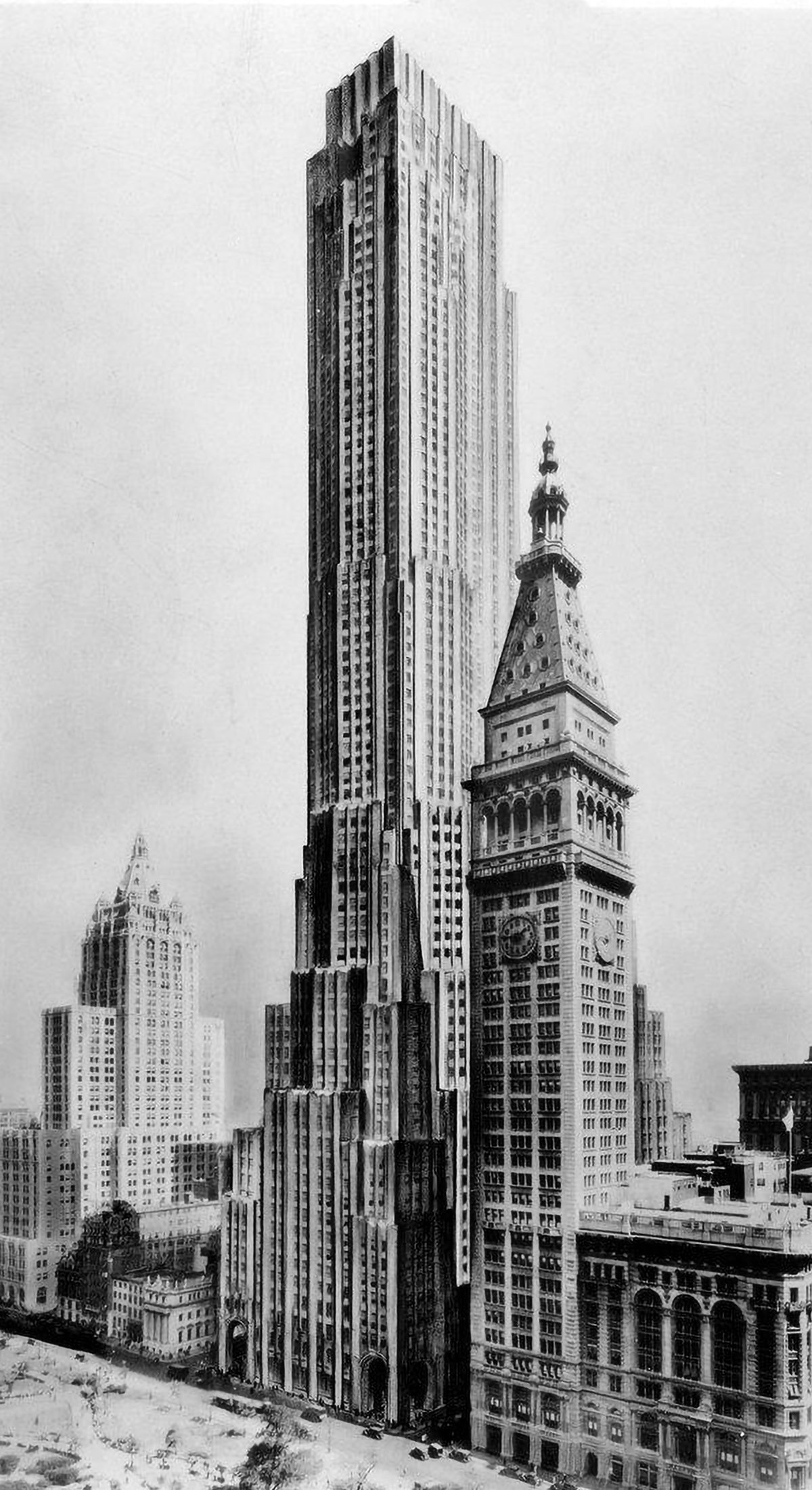
Best-Laid Plans : The Metropolitan Life North Building
The best-laid plans of mice and men oft go astray. This quote pretty much sums up the story of the Metropolitan Life North Building. What began as a design for the world’s tallest building ended with a bulky mid-rise building that feels too grand for its modest height. Pictured above is an illustration of the original design, located on the east side of Madison Square Park in New York City. Topping out at 100 stories tall, it would’ve been the tallest building in New York by a long shot. Then the Great Depression happened.
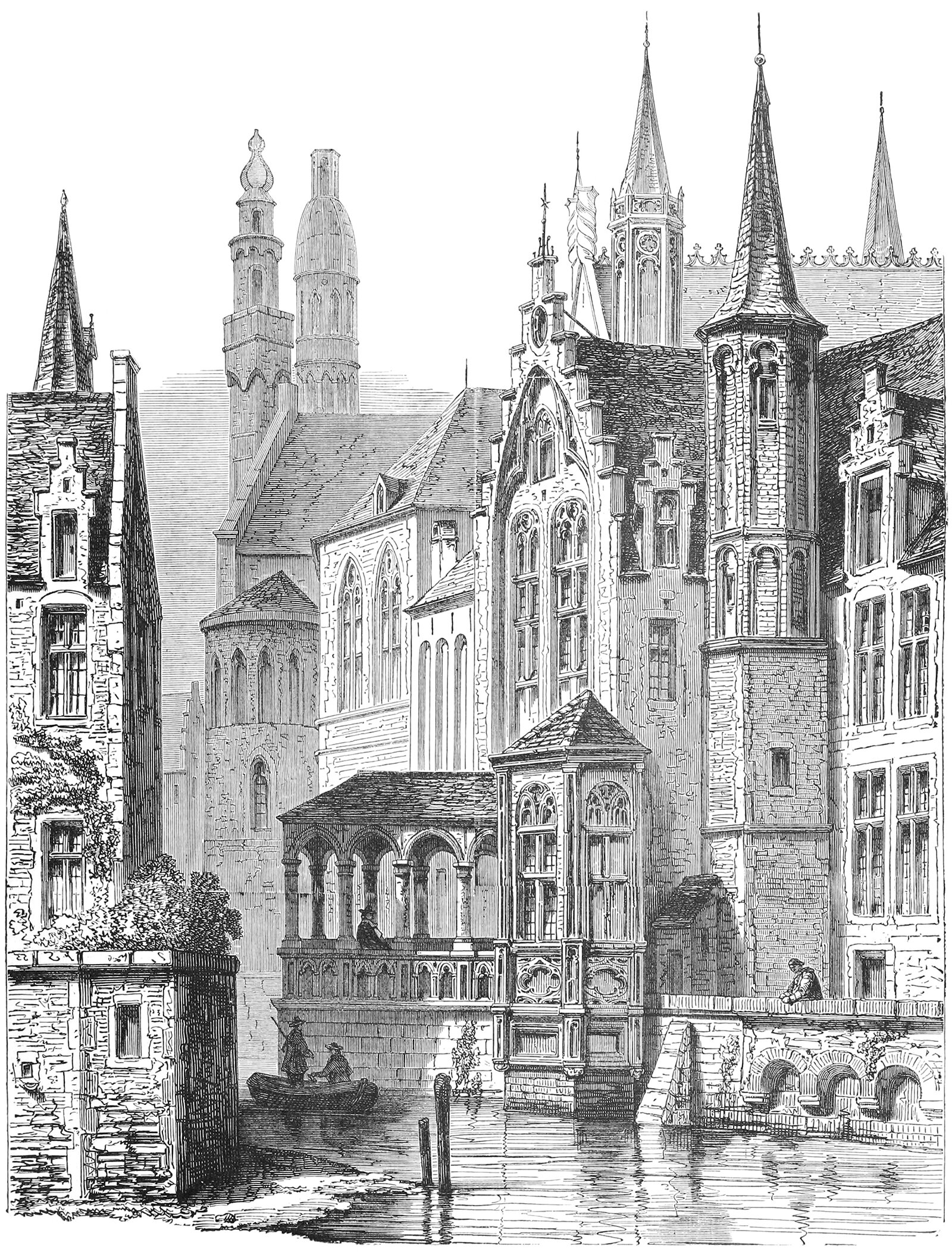
The Vertical Townscape
I came across this illustration recently, and I was immediately struck by it. It was drawn in 1880 and shows a medieval canal in Bruges, Belgium. What struck me was how the entire townscape seems to reach upward toward the sky. The scene is an amalgamation of turrets, towers and pinnacles, and the effect is a forest of brick and wood with each part jockeying for position on the skyline.
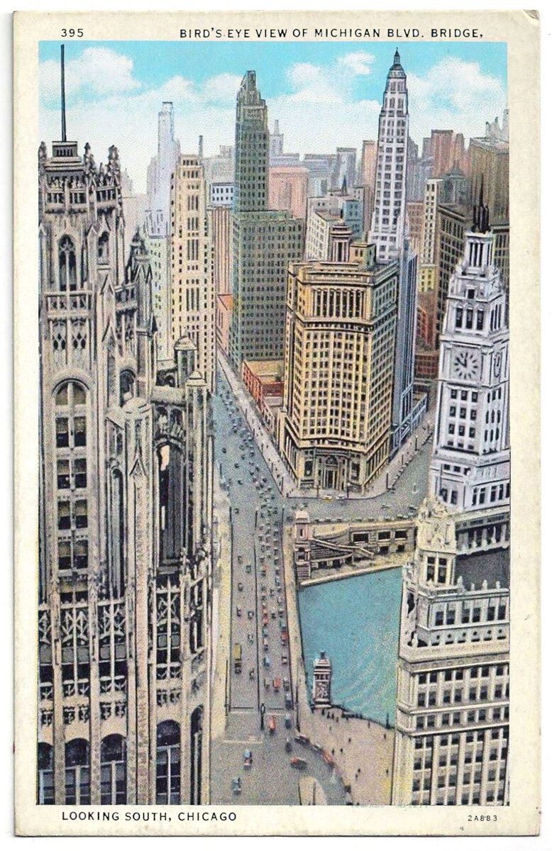
The Urban Canyon
It’s difficult to reconcile the inhuman scale of the skyscraper with the human experience at street level. In most Western cities of today, the experience of walking down the street is largely soul-less, with a relentless street wall rising up on both sides and massive towers rising above that, usually set back from the street wall a bit.
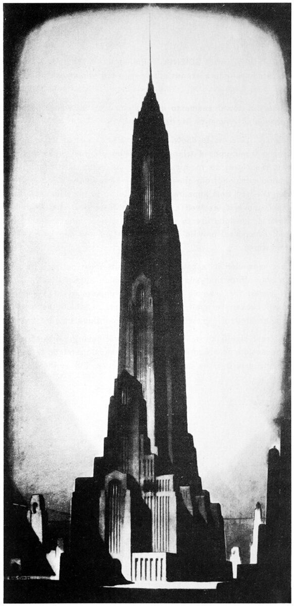
Hugh Ferriss and Religion on the Skyline
Hugh Ferriss was an architect and illustrator, best known for his charcoal renderings of skyscrapers in the first half of the 20th century. Pictured here is an illustration from his 1929 work The Metropolis of Tomorrow, titled Religion. This image and the underlying thought behind it’s creation ties into a larger trend around this time that saw religious structures attempt to re-take the skyline from commerce.
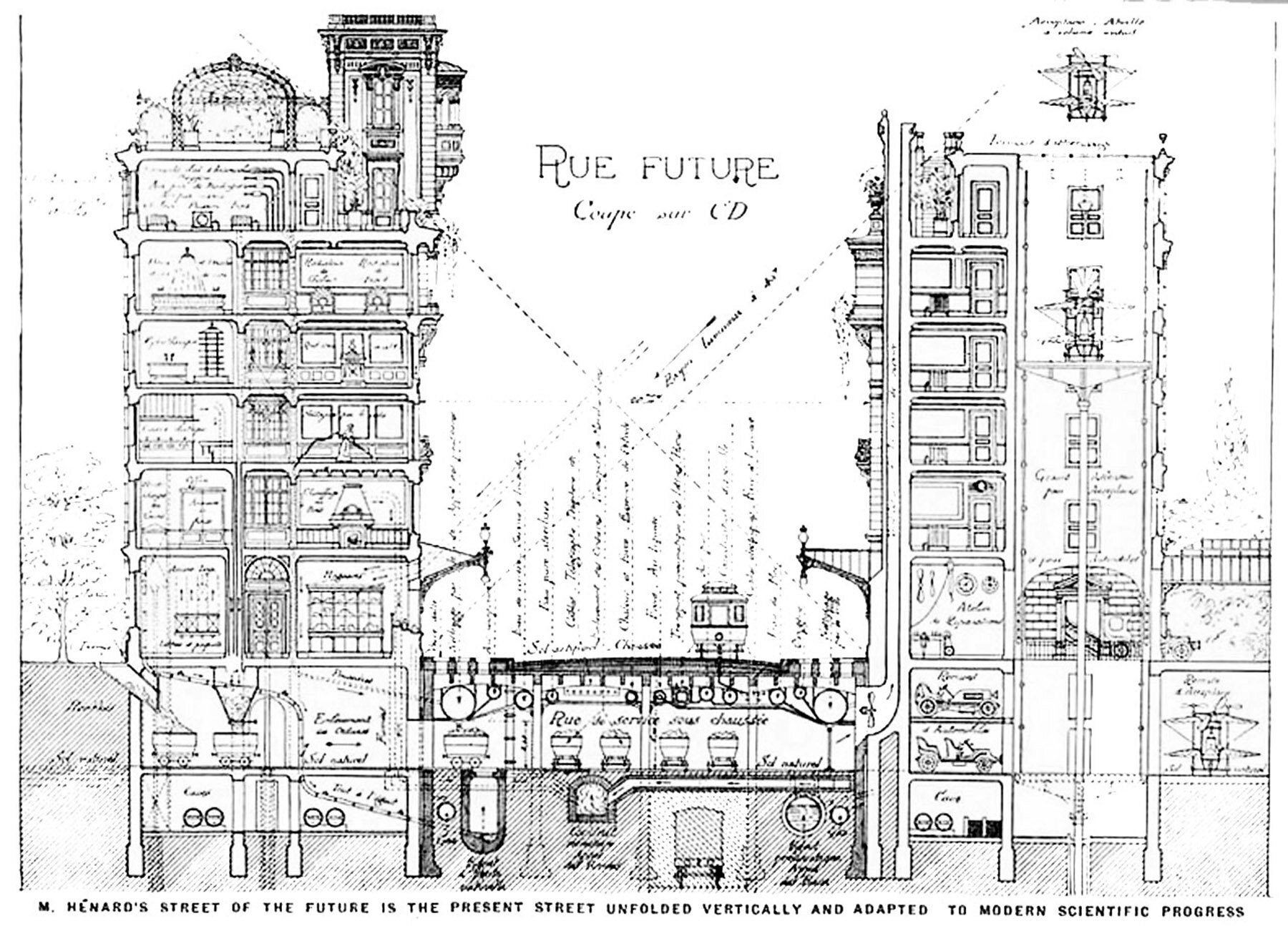
Cities of the Future from the Past
It's always interesting to see how previous generations viewed the future of their cities. In particular, the early 20th century was a hotbed for this type of thinking due to the emergence of the skyscraper as a building type.
