Welcome to On Verticality. This blog explores the innate human need to escape the surface of the earth, and our struggles to do so throughout history. If you’re new here, a good place to start is the Theory of Verticality section or the Introduction to Verticality. If you want to receive updates on what’s new with the blog, you can use the Subscribe page to sign up. Thanks for visiting!
Click to filter posts by the three main subjects for the blog : Architecture, Flight and Mountains.
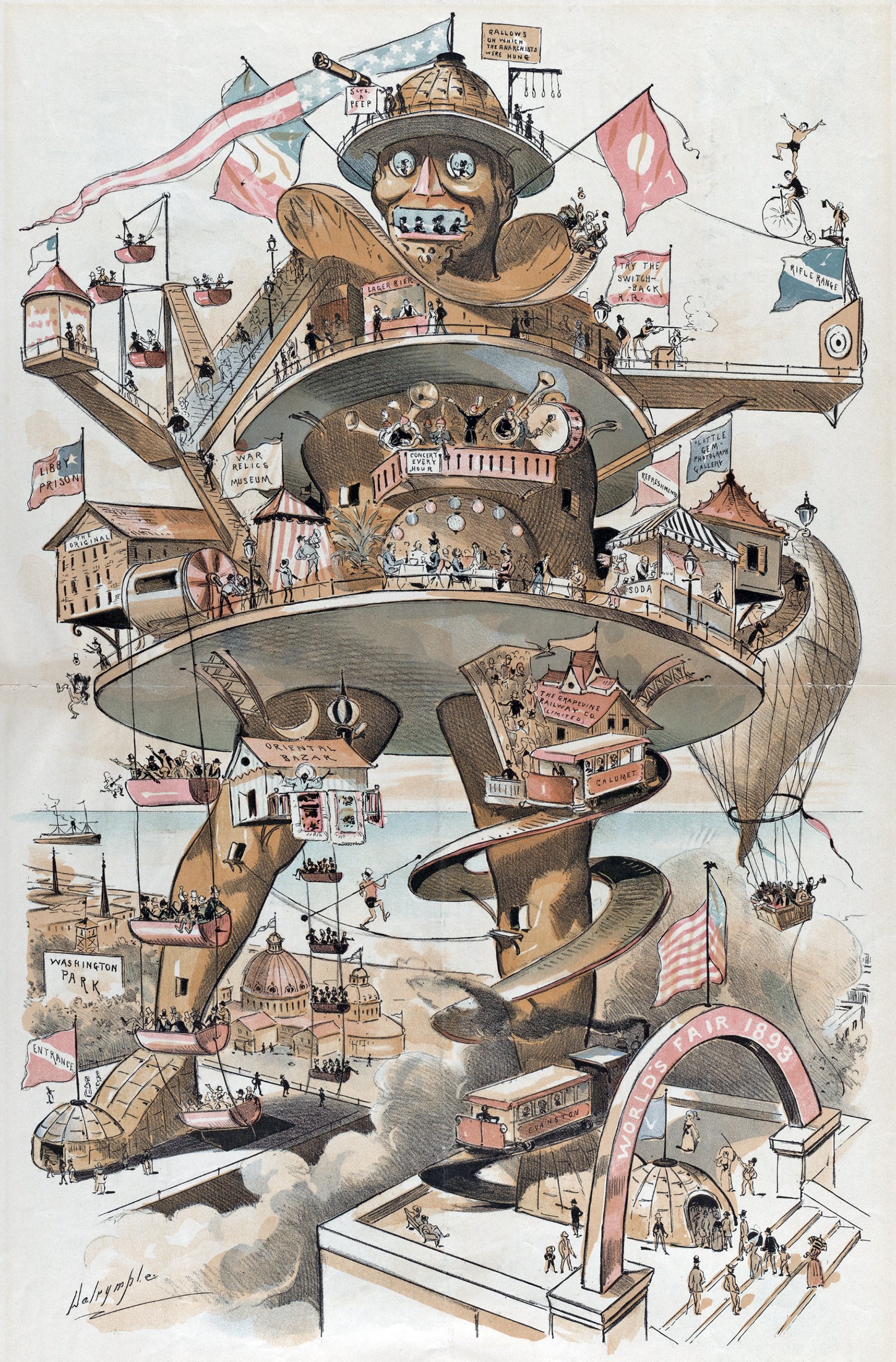
The Colossus of Chicago
The caption for the illustration shown above reads: Puck’s suggestion for the World’s Fair - the “Colossus of Chicago” would knock out the Eiffel Tower. It was drawn by Louis Dalrymple for the 8 October 1890 issue of Puck magazine, a popular humor and satire publication. With Colossus, Dalrymple was mocking a series of proposals leading up to the 1893 World’s Fair that sought to out-do the Eiffel Tower from the previous World’s Fair in Paris. Eiffel had become so popular that the organizers of the 1893 World’s Fair wanted to re-create its success in Chicago.
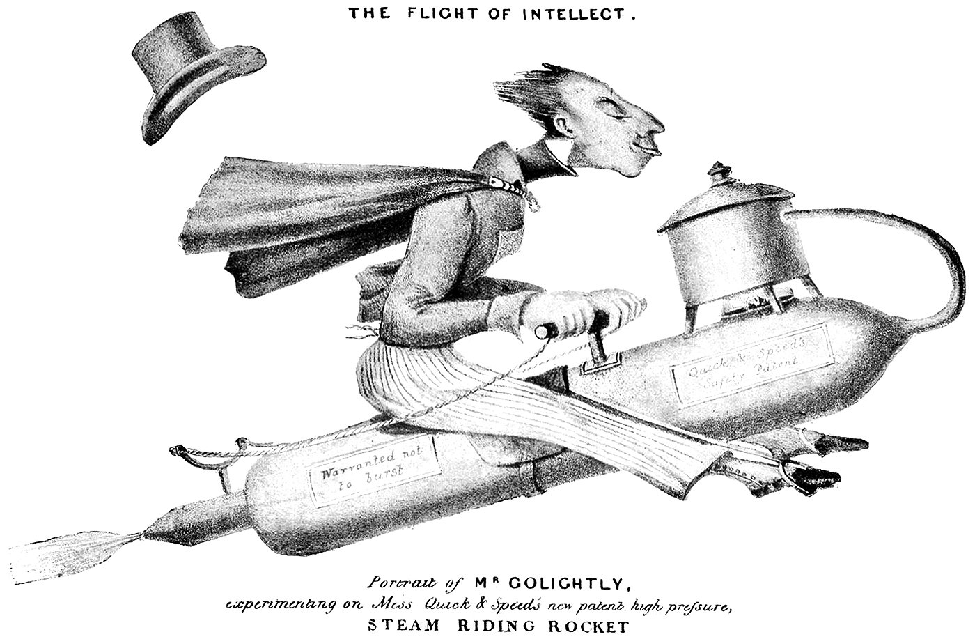
Mr. Golightly and the Flight of Intellect
Pictured here are a pair of cartoons drawn in the 1800s by Charles Tilt. They feature the character Mr. Golightly flying on a steam-powered rocket. The first, pictured above, is from 1826 and it features a well-dressed Mr. Golightly sitting on his rocket, flying fast through the air. The caption reads Portrait of Mr. Golightly, experimenting on Mess Quick & Speed’s new patent high pressure, steam riding rocket.
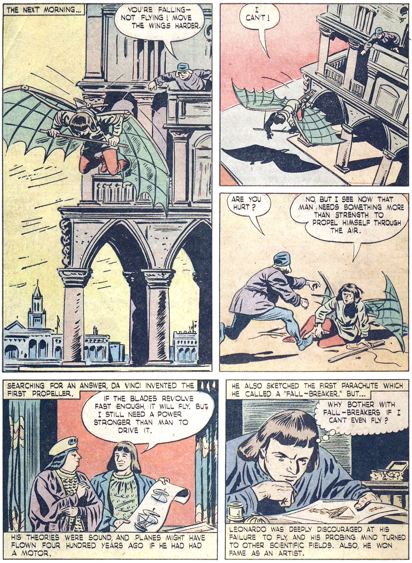
Leonardo da Vinci : 500 Years Too Soon
I see now that man needs something more than strength to propel himself through the air.
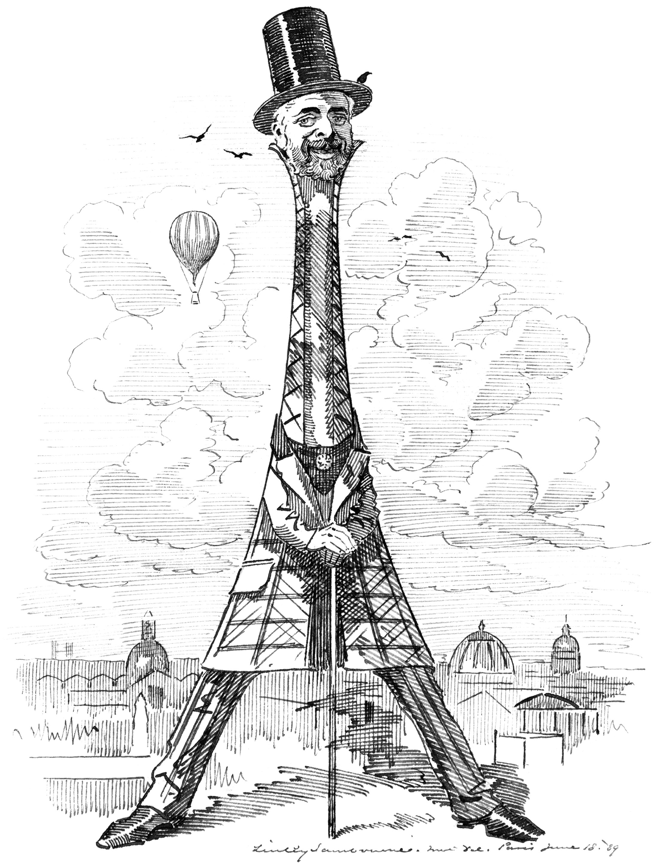
Eiffel as his Tower
Our buildings reflect our values and needs. This is especially true of our tall buildings, because they cost so much to build. When the Eiffel Tower was built in Paris, it reflected a worldwide drive for height in our buildings that was emerging at the time. It was a such a powerful statement of verticality that the man who designed it became something of a celebrity. He became linked with the tower in the eyes of the public, so much so that it was named after him like one of his children. This rarely happens with a building, but it demonstrates just how big an impact the Eiffel Tower had on the world.
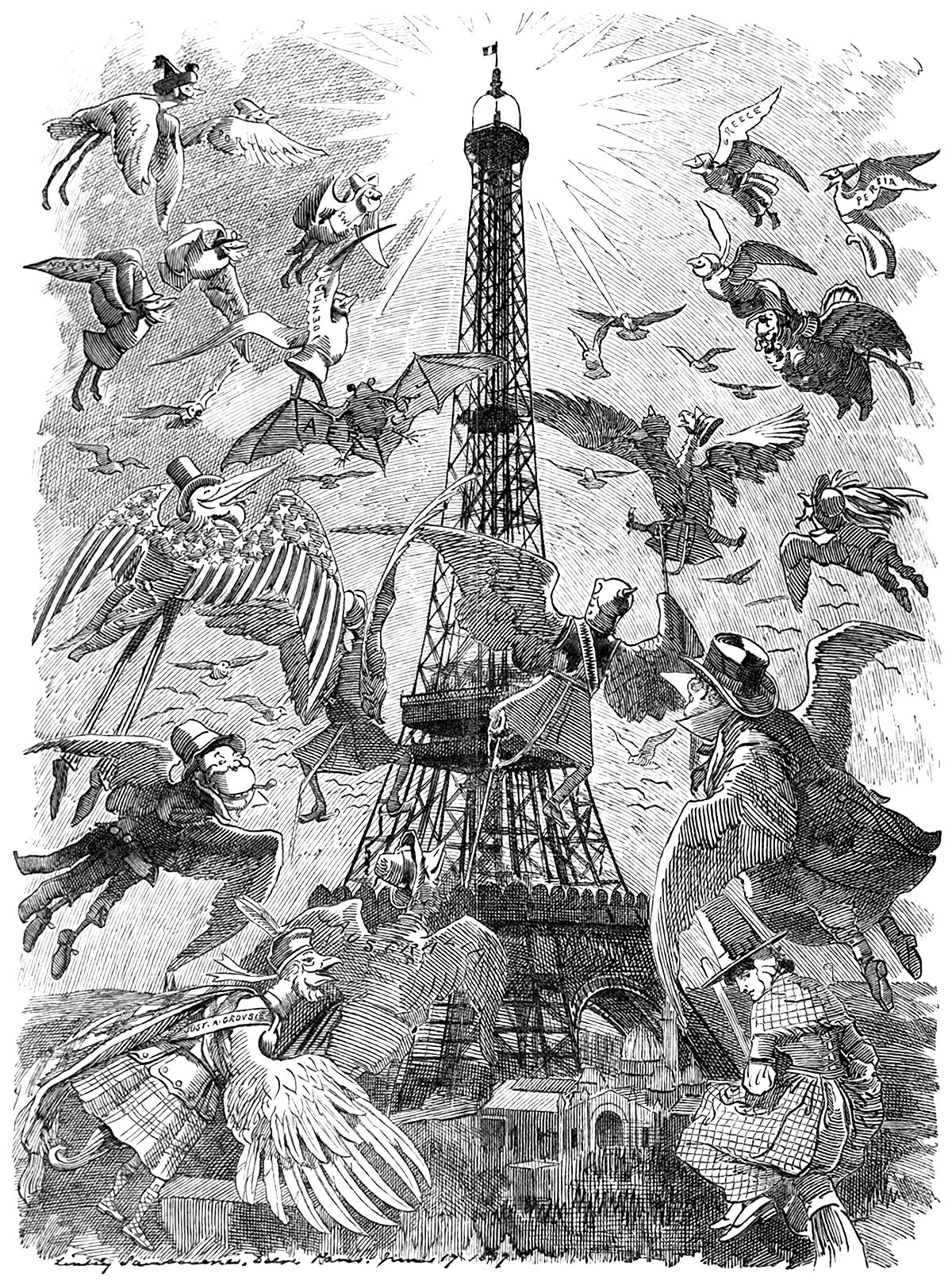
The Eiffel Tower Effect
When the Eiffel Tower was completed in 1889 for the World’s Fair in Paris, it changed the world. It re-defined what humans were capable of, and it gave the city of Paris an architectural icon that hasn’t faded with age. It was the tallest structure in the world, and it allowed its visitors to achieve verticality. As such, upon its completion the world took notice. Countless media sources reported on the structure, and it instantly took its place on the world stage. Pictured above is one such example of this. It’s an illustration from an 1889 issue of Punch magazine, and it shows a flock of birds flying toward the Eiffel Tower. These birds represent the countries of the world, and the piece was meant to symbolize the world’s envy for the iconic tower.
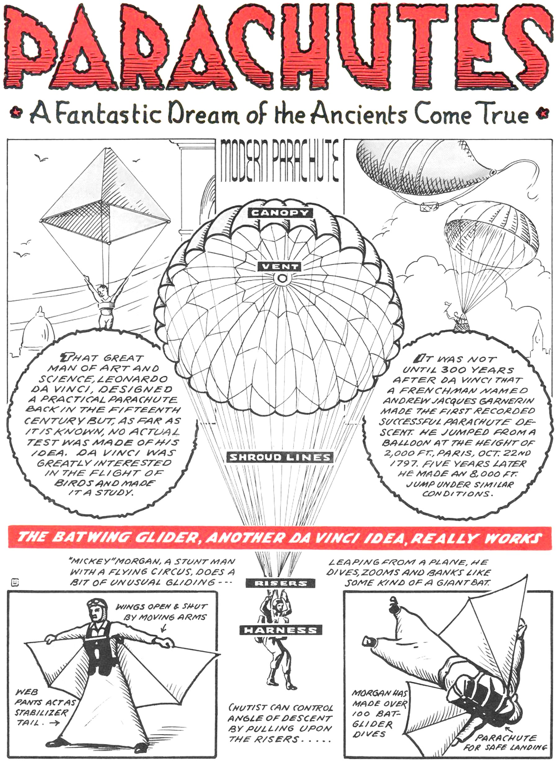
Parachutes : A Fantastic Dream of the Ancients Come True
Pictured above is a page from a War Heroes comic book from 1943. It features a few examples of parachutes and a flying suit called the Batwing Glider. At the center of the page is a modern parachute, complete with its canopy, vent, shroud lines, risers and harness. Flanking this drawing are two historical examples of parachutes. The first is a sketch from Leonardo da Vinci’s notebooks circa 1495, and the second is the world’s first successful parachute descent by André-Jacques Garnerin in 1797. This triad presents a concise, albeit incomplete history of parachute design, but it does do a good job of visually connecting a modern parachute to its ancestors.
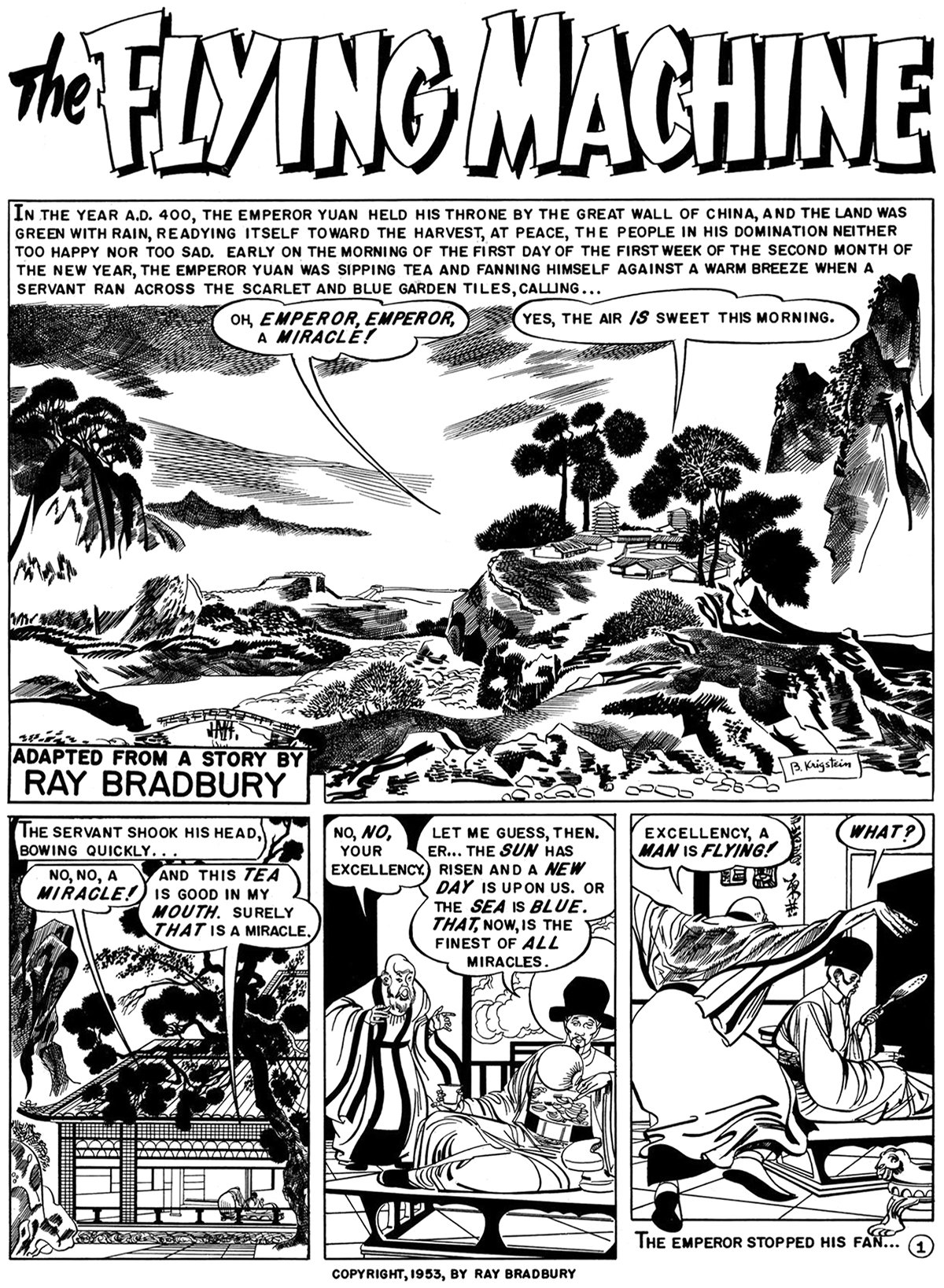
The Flying Machine by Ray Bradbury
With great power comes great responsibility. This is the major theme of Ray Bradbury’s short story from 1953, titled The Flying Machine. It was adapted into a comic in 1954 by Al Feldstein, and the full piece is pictured here. It tells the story of a meeting between an emperor and an inventor who has built a flying machine. The inventor is an optimist who experiences the full delights of flying, while the emperor is a pessimist who fears the technology will fall into the wrong hands. It’s a theme that runs much deeper than human flight, but Bradbury’s choice to feature the flying machine demonstrates the power of flight for humanity.
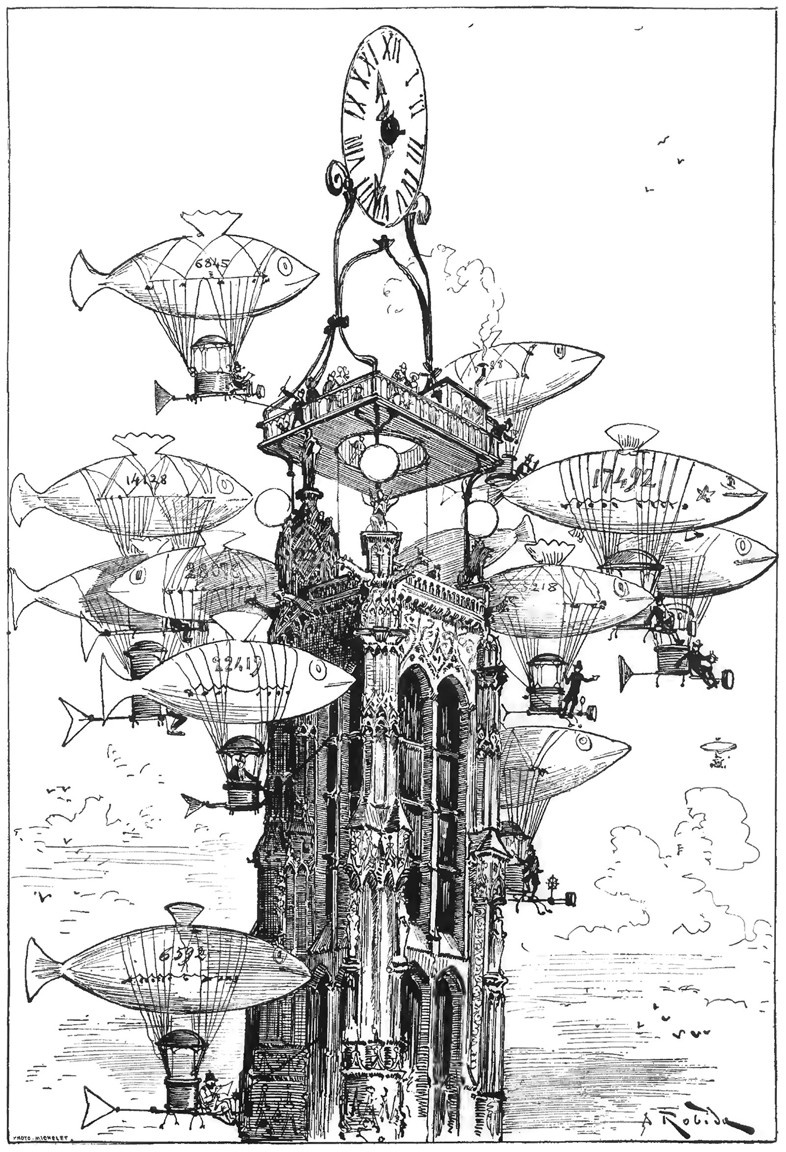
An Aerocab Station atop the Tour Saint-Jacques
The above illustration was drawn by Albert Robida for his 1883 novel Le Vingtième Siècle, or The Twentieth Century. This illustration was titled La Station d'Aerocabs de la Tour Saint-Jacques, or The Aerocab Station of the Tour Saint-Jacques, and it shows a raised platform and clock atop the iconic Parisian structure. Flocking around the tower is a group of dirigibles made to look like fish. What’s charming about the image is how the cluster of dirigibles resemble a school of fish, almost crowding out the tower itself from the image.
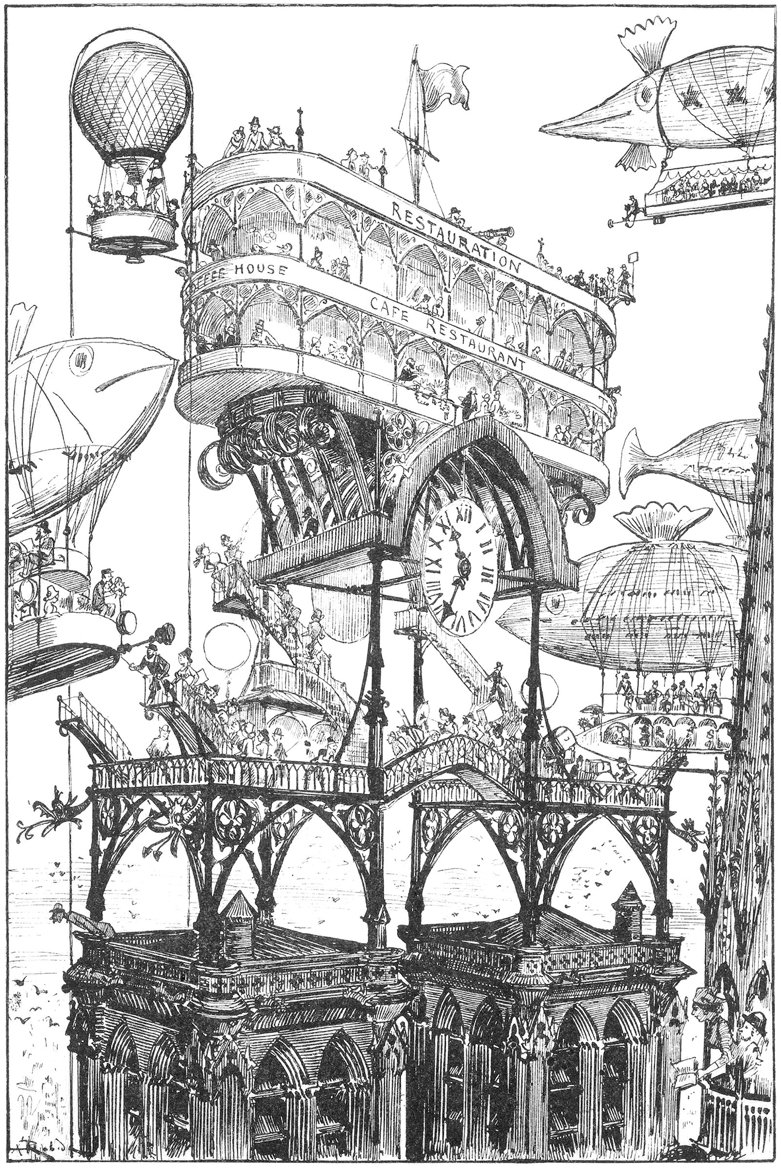
An Airport on top of Notre Dame
The above illustration was drawn by Albert Robida for his 1883 novel Le Vingtième Siècle, or The Twentieth Century. The novel describes a future vision for Paris in the 1950’s, focusing on technological advancements and how they would affect the daily lives of Parisians. Here he shows an elaborate transit station built on top of the bell towers of the Notre Dame Cathedral. It’s a wonderfully ambitious idea, and it represents modernity overtaking history.
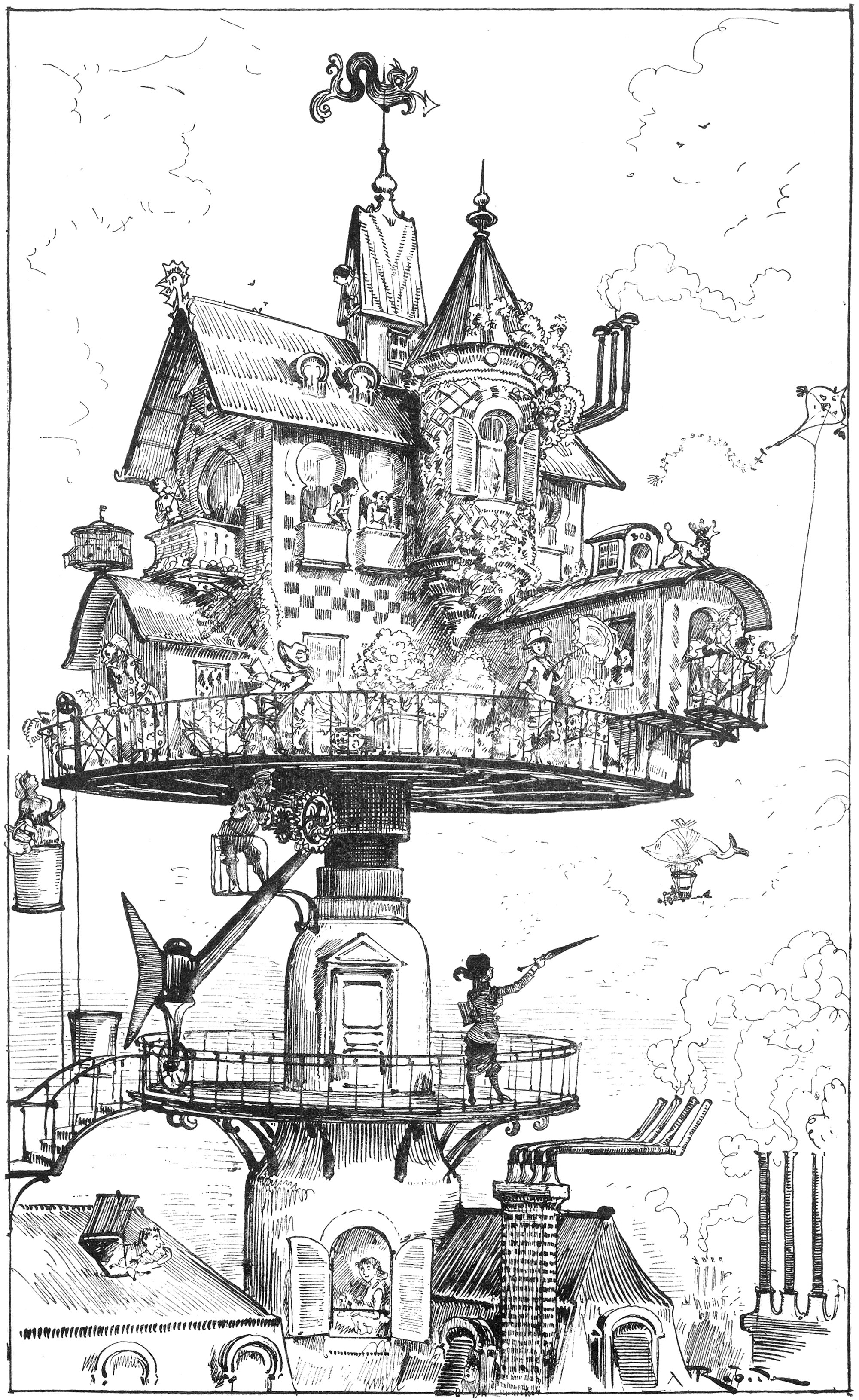
Albert Robida’s Aerial Rotating House
The above illustration was drawn by Albert Robida for his 1883 novel Le Vingtième Siècle, or The Twentieth Century. The novel describes a future vision for Paris in the 1950’s, focusing on technological advancements and how they would affect the daily lives of Parisians. Here he shows a house that’s been raised up on a rotating table. It’s a quirky image, but it also makes a statement on overcrowding and access to light and air for urban residents.
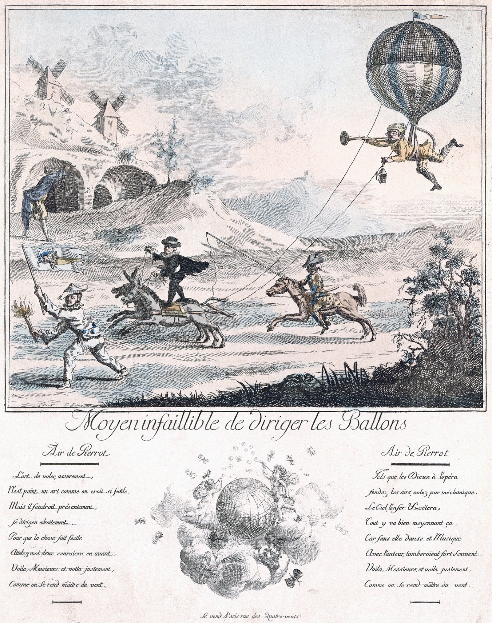
A Foolproof Way to Direct the Balloons
The above illustration shows a comical scene involving a man suspended from a balloon being pulled by a pair of horses. It was drawn in 1787 and it’s titled Moyen Infaillible de Diriger les Ballons, or A Foolproof Way to Direct the Balloons. It’s meant to be a satirical take on ballooning at the time, when flight was front-and-center on the public stage. The characters in the scene are from commedia dell'arte, which is a type of theatre with recurring archetypal characters.
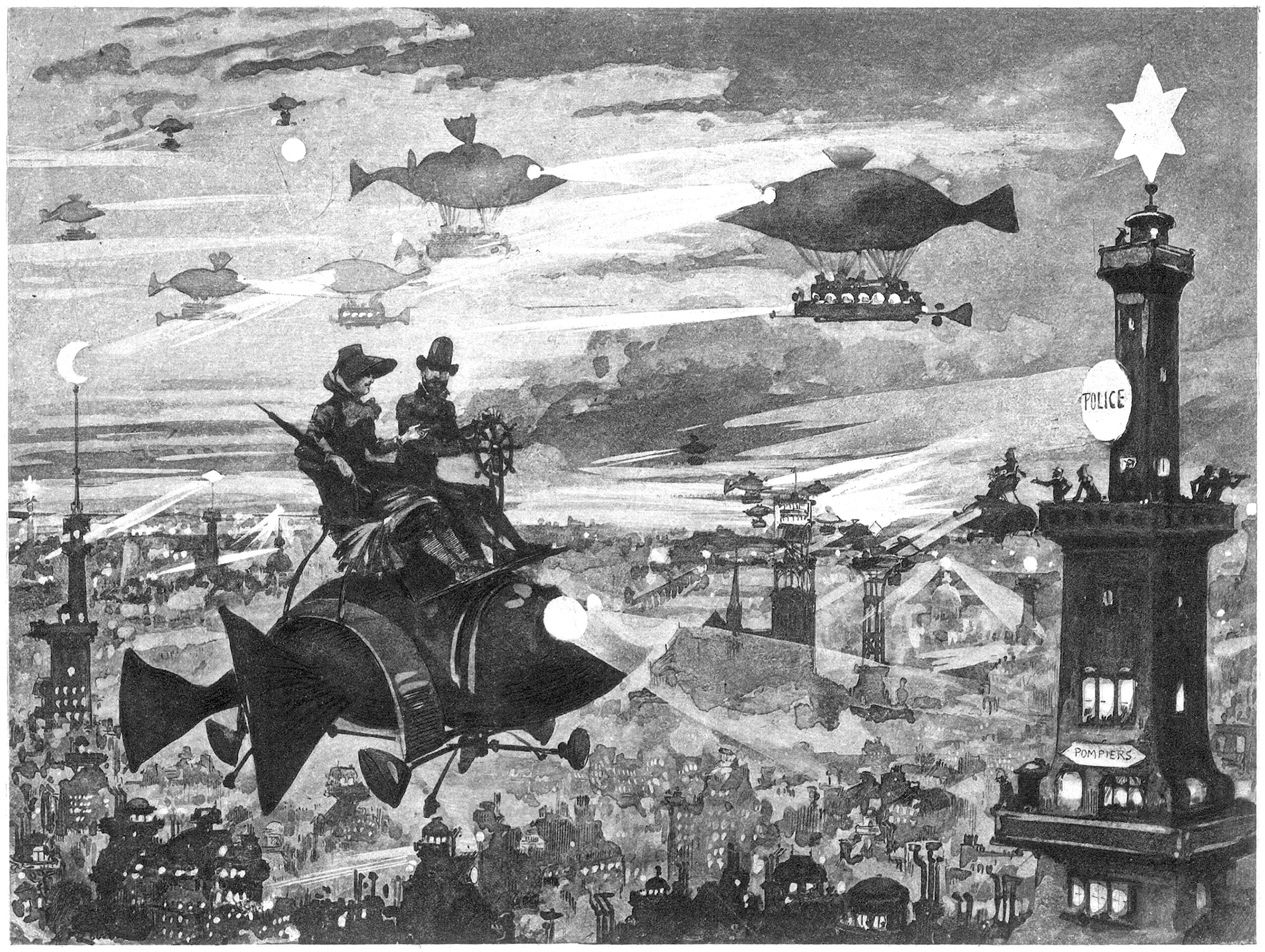
Albert Robida’s Vision for Paris
The above illustration was drawn by Albert Robida for his 1883 novel Le Vingtième Siècle, or The Twentieth Century. The novel describes a future vision for Paris in the 1950’s, focusing on technological advancements and how they would affect the daily lives of Parisians. Here he shows a vision for the night sky above Paris, which is dotted with various types of flying machines.
Utopian Flying Machines of the Previous Centuries
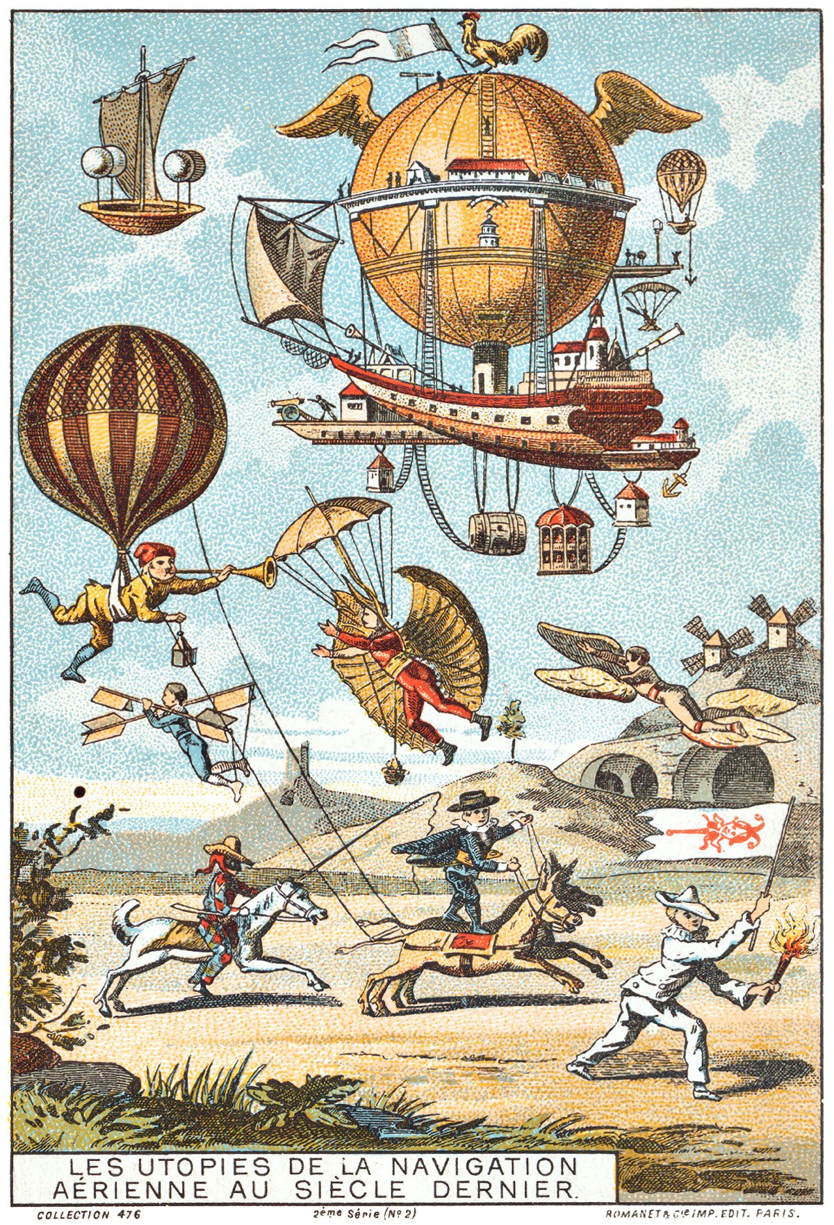
Pictured above is a French illustration from 1890, showing a collage of French flying machine ideas from the previous few centuries. The caption reads Les Utopies de la Navigation Aérienne au Siècle Dernier, which means The Utopia of Air Navigation in the Last Century. There are six flying machine ideas shown together in the sky.
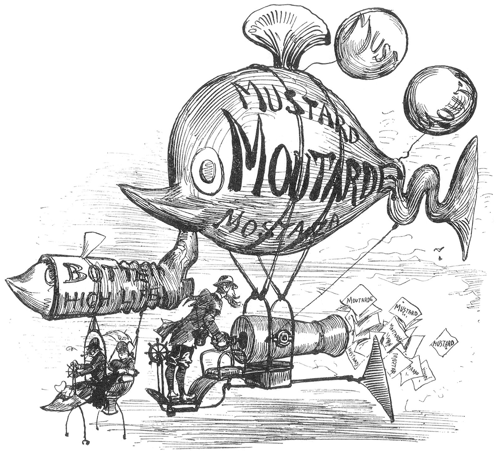
Albert Robida’s Flying Advertising Machines
The above illustration was drawn by Albert Robida for his 1883 novel Le Vingtième Siècle, or The Twentieth Century. The novel describes a future vision for Paris in the 1950’s, focusing on technological advancements and how they affected the daily lives of Parisians. Here, he shows a pair of flying machines meant for advertising.
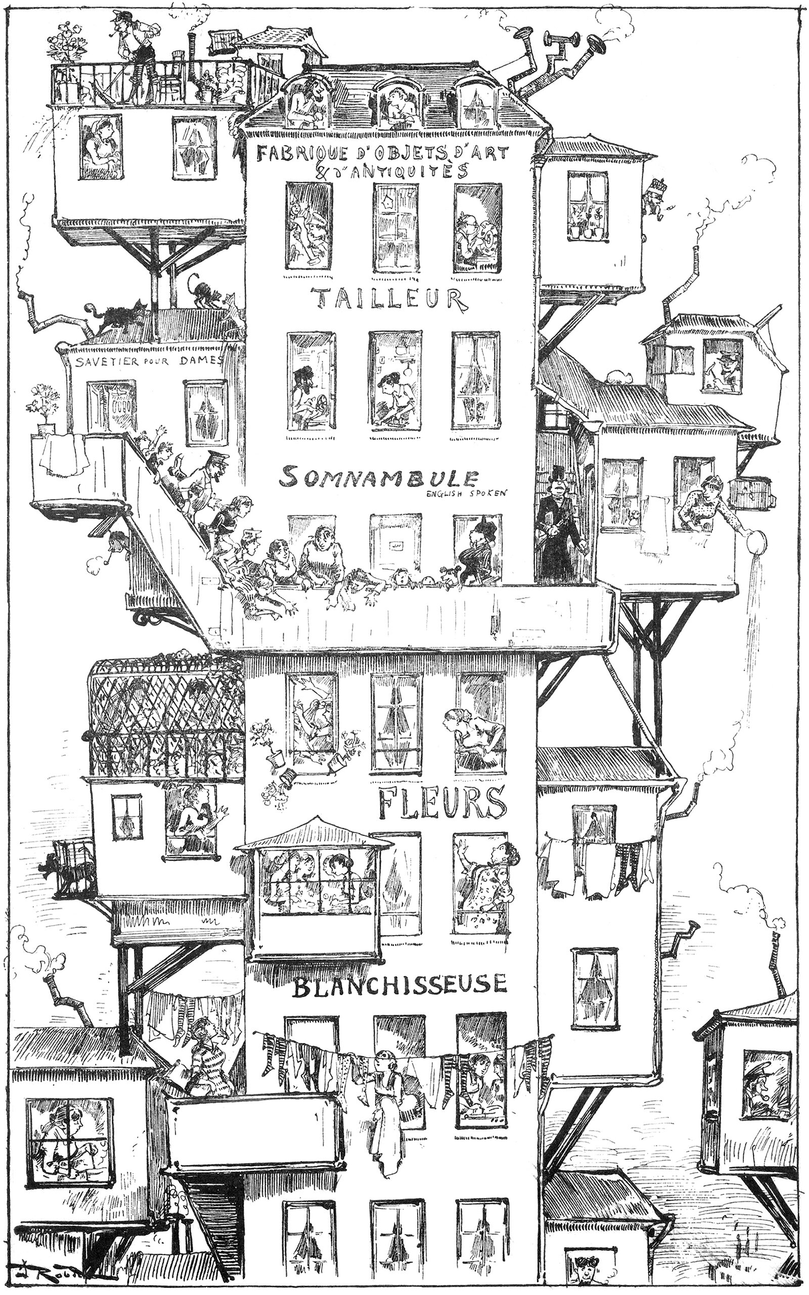
Albert Robida’s Eighteen-Story House
The above illustration was drawn by Albert Robida for his 1883 novel Le Vingtième Siècle, or The Twentieth Century. The novel describes a future vision for Paris in the 1950’s, focusing on technological advancements and how they affected the daily lives of Parisians. Here he shows what an apartment building might look like.
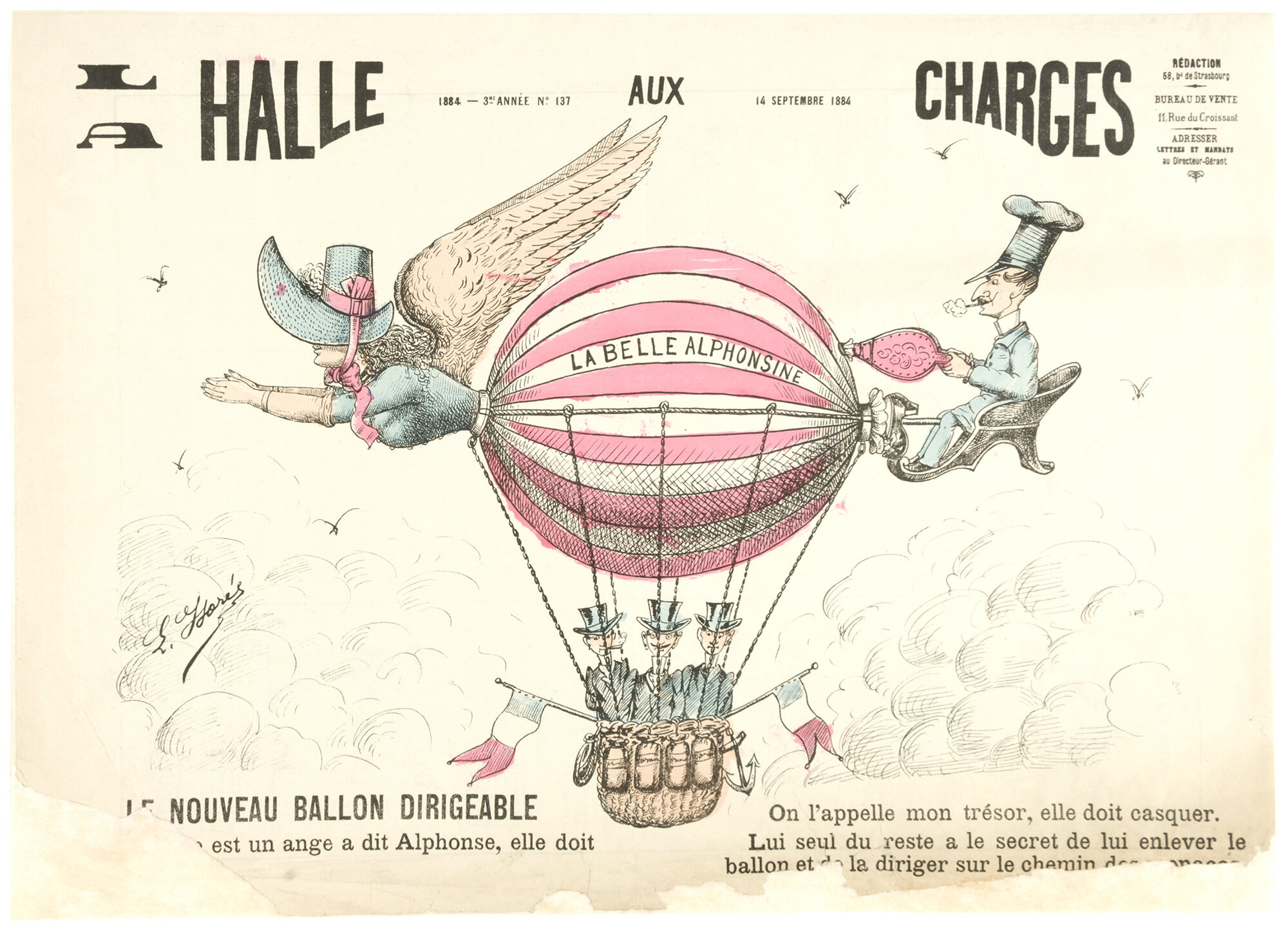
La Belle Alphonsine by E. Florés
In the eighteenth and nineteenth centuries, the human quest for flight was continuously on the public’s mind, and the above illustration is a testament to this. It’s from the front page of a French newspaper called La Halle aux Charges from 14 September 1884. This newspaper was well-known for it’s political caricatures and social commentary, and their choice to put a fictional balloon on their front cover is the perfect representation of what a successful flight means for all those involved.
Nadar and the Aerial Perspective
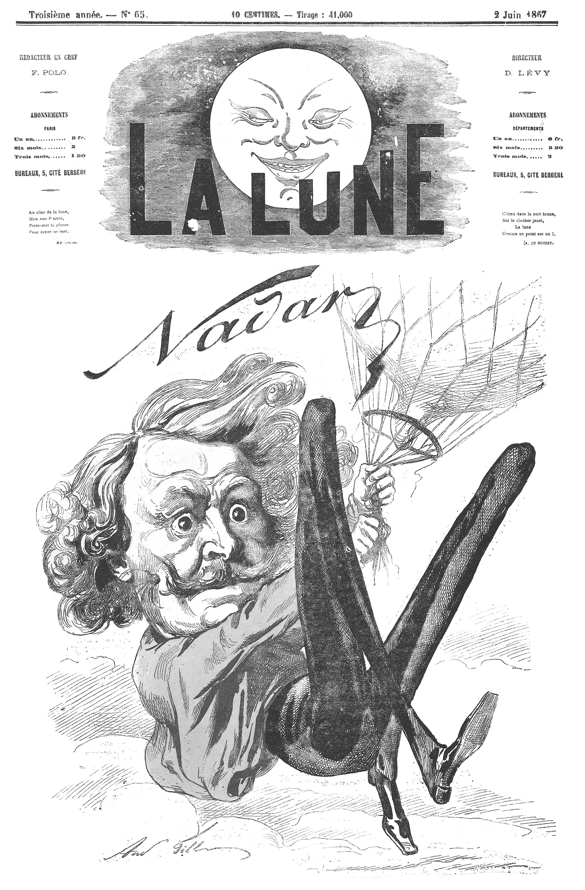
Pictured above is Gaspard-Félix Tournachon, better known by the pseudonym Nadar, who was a French photographer in the nineteenth century, just when aeronautics and air travel were entering popular culture. He was fascinated by human flight, and in 1858 he became the first person to successfully take aerial photographs while he was in a balloon. He subsequently commissioned balloons to be designed and built, and he would allow passengers to take flights with him. He was no doubt obsessed with verticality, and his aerial photographs mark a major turning point in the history of human flight.
By the size of the work, we measure the size of man
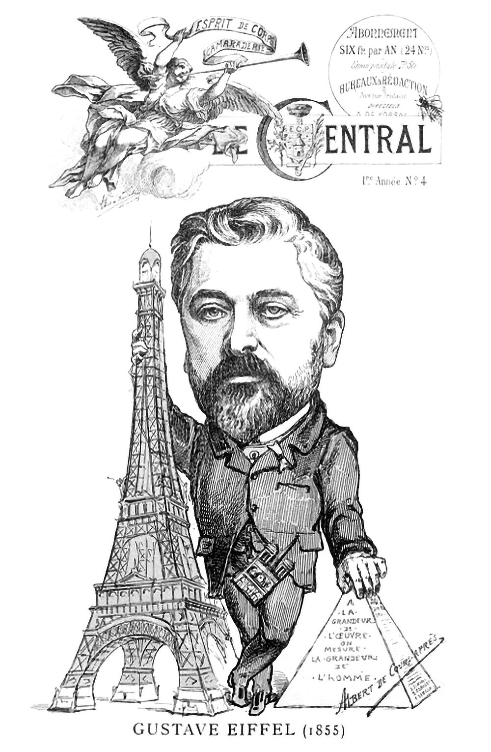
The above illustration is from the cover of an 1889 issue of Le Central. It shows a caricature of Gustave Eiffel standing in between his Eiffel Tower and the Great Pyramid. Inscribed on the pyramid is the phrase A la grandeur de l'oeuvre on mesure la grandeur de l'homme, or By the size of the work we measure the size of man. It’s a statement on verticality, and it illustrates how the height of these structures is their defining characteristic in the eyes of the public.
What We Are Coming To
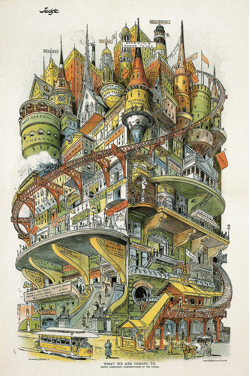
If you wanted to cram every possible building type into a single structure, what might that structure look like? It’s a hell of a design problem, and the image above shows one artist’s idea of what it might look like. It’s an illustration by Grant E. Hamilton, called What We Are Coming To. It appeared in an 1895 issue of Judge magazine, with the headline ‘Judge’s combination apartment house of the future.’
Skylines As Value Indicators
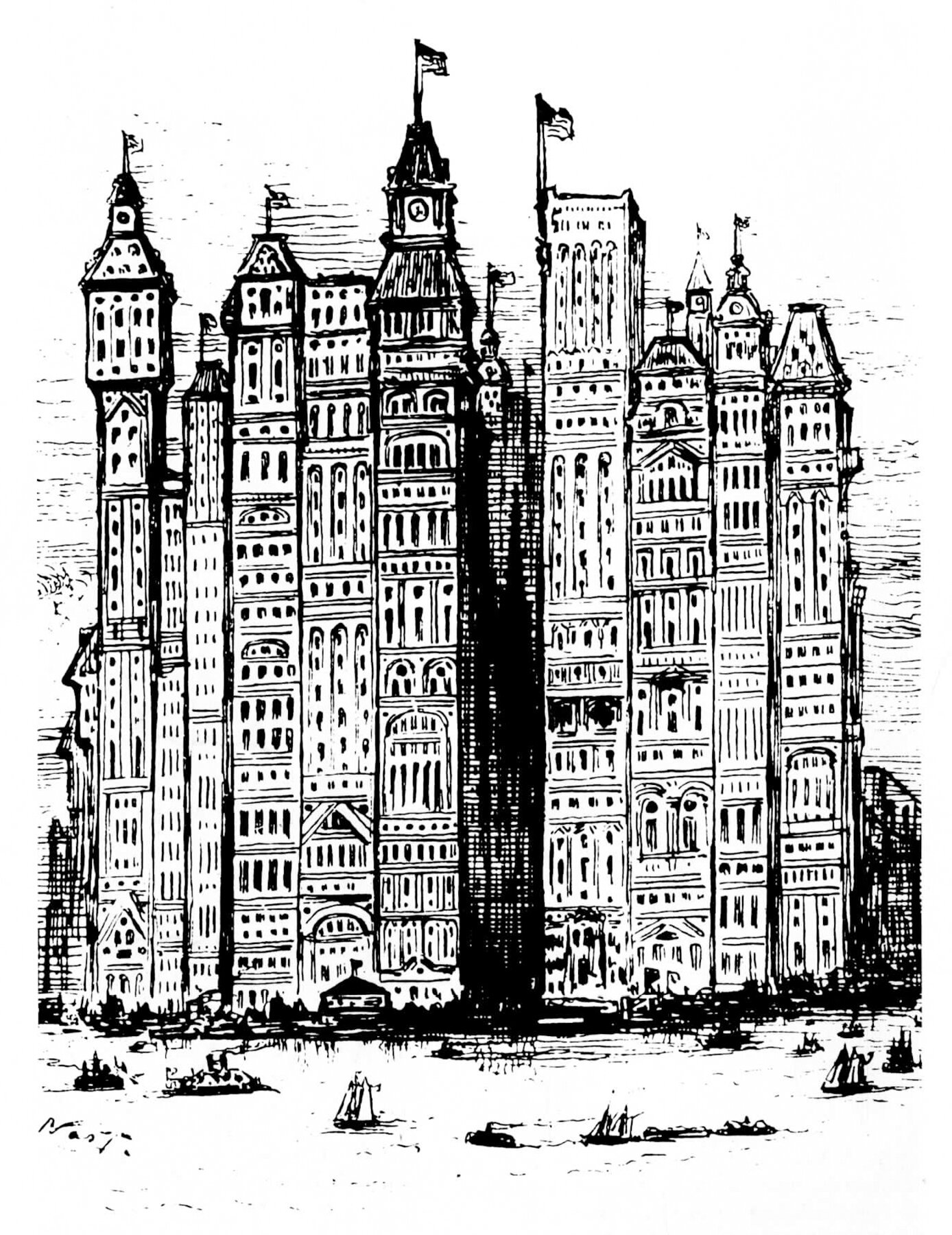
Take a look at this 1881 Cartoon by Thomas Nast for Harper’s Weekly titled New York A Few Years from Now. Nast shows the southern tip of Manhattan Island, jam-packed with a phalanx of skyscrapers. The buildings are pushed so close together it’s hard to imagine where the streets are. Back in the shadows, you can just make out the spire of Trinity Church, which at the time was the tallest building in the country. Nast is being hyperbolic, of course, but the reality of most modern cities isn't far off.
