Welcome to On Verticality. This blog explores the innate human need to escape the surface of the earth, and our struggles to do so throughout history. If you’re new here, a good place to start is the Theory of Verticality section or the Introduction to Verticality. If you want to receive updates on what’s new with the blog, you can use the Subscribe page to sign up. Thanks for visiting!
Click to filter posts by the three main subjects for the blog : Architecture, Flight and Mountains.

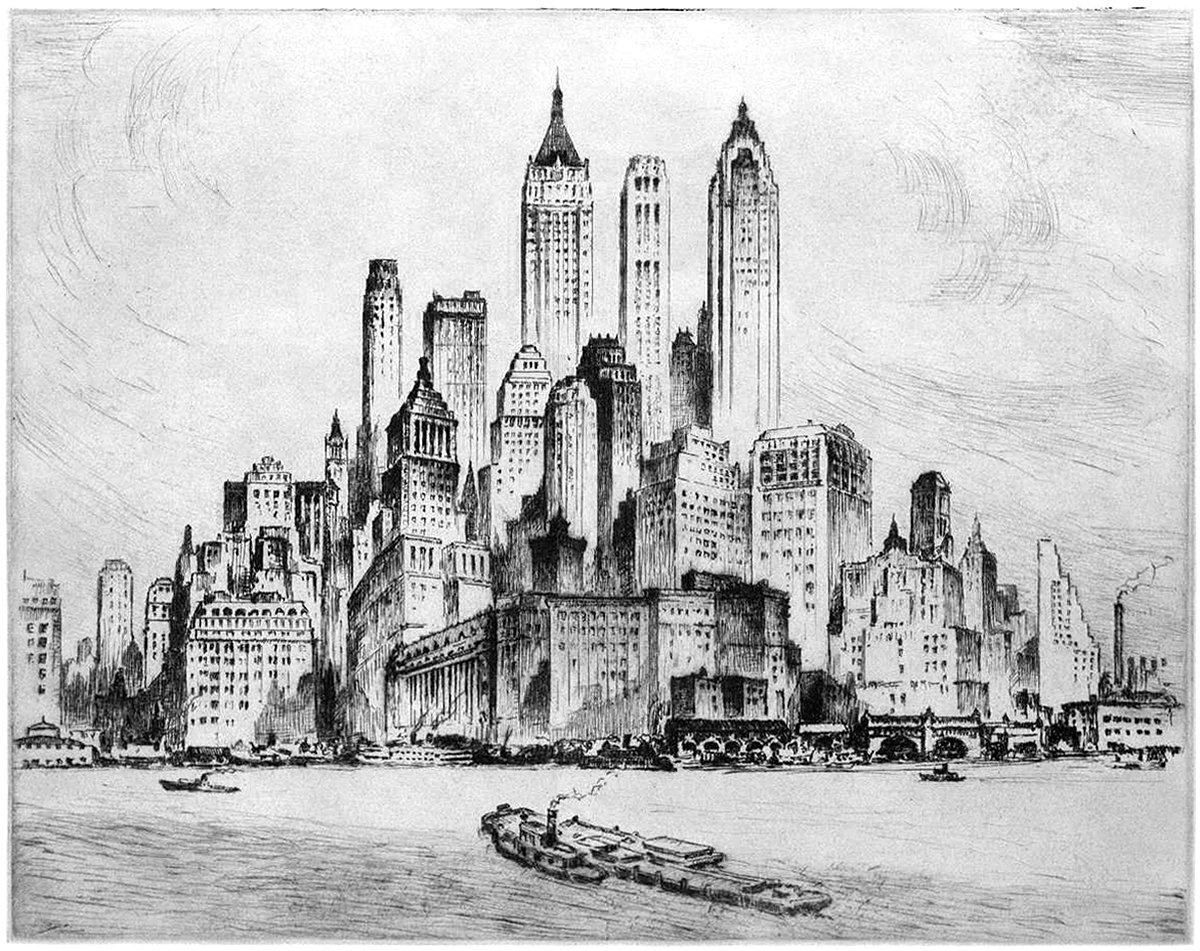
Nat Lowell and the Tip of Manhattan
Pictured here is an etching by artist Nat Lowell, showing the southern tip of Manhattan, circa 1940. The perspective is from the harbor, and Lowell focuses on three towers, which are the tallest of the bunch. From left to right, they include 40 Wall Street, 20 Exchange Place, and 70 Pine Street. The composition isn’t literal, and Lowell has taken some liberties to arrange the buildings into a mountain of sorts, with the three aforementioned towers at the summit.

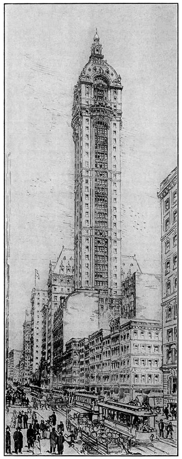
The Singer Building and the Power of Nostalgia
The Story of the Singer Building is a dark patch in the history of New York Architecture. It was the world’s tallest building when it was built, and just 50 years later it was the world’s tallest building to be demolished by it’s owner. This demolition coincided with a period of change in American cities, and it serves as a cautionary tale when compared to other, very similar buildings nearby.

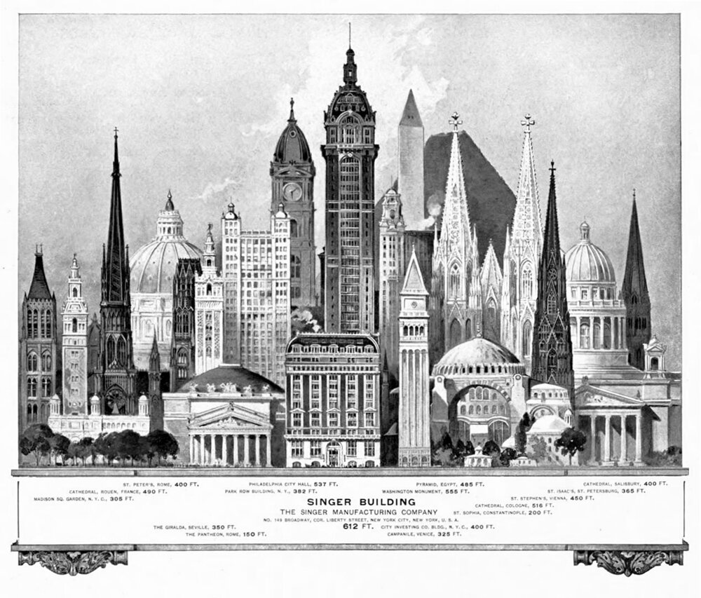
Height Lineups and the Abstraction of Verticality
Height lineups like this serve to illustrate how important Verticality is to the perception of our tall buildings, and studying this example got me intrigued about the nature of drawings like this. After some digging, I found many more examples of height lineups throughout the past two centuries, and there are curious commonalities throughout all of them. For starters, they are just beautiful drawings to study. On a deeper level, they provide us with a window into the perceived importance of buildings during a given time in history.
