Height Lineups and the Abstraction of Verticality
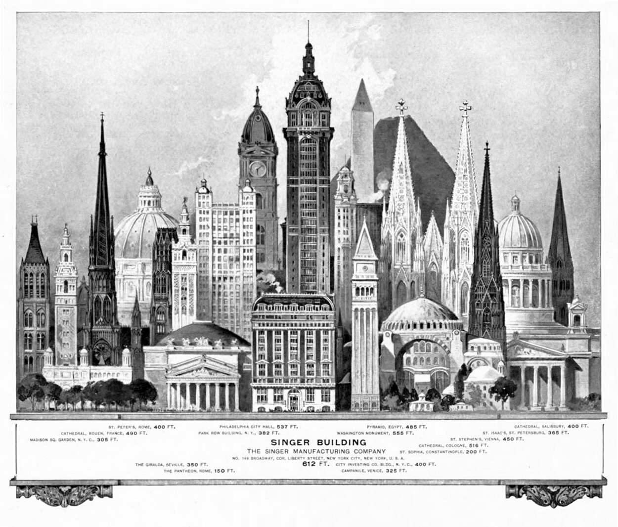
A 1908 drawing of notable tall buildings when the Singer Building was built in New York. The drawing abstracts the experience of verticality and creates an artificial ‘mountain’ out of the structures, with the Singer Building its peak. Verticality is being used to signify importance and accomplishment, as if the shorter structures aren’t as worthy or as good as the Singer, simply because it’s the tallest.
The drawing above is a piece of marketing material for the Singer Building, which is shown in the center of the image, taller than the rest of the buildings shown. Completed in 1908 in Lower Manhattan, Singer was the tallest building in the world upon completion. This status brought with it a weight that extended beyond Lower Manhattan and New York City. It lifted the visibility and importance of New York in the world’s eye, and instilled a sense of pride in New Yorkers for their city.
Height lineups like this illustrate how important verticality is to the perception of our tall buildings, and studying this example got me intrigued about the nature of drawings like this. After some digging, I found many more examples from the past two centuries, and there are curious commonalities throughout all of them. For starters, they are just beautiful drawings to study. On a deeper level, they provide us with a window into the perceived importance of certain buildings during a given time in history.
An 1826 drawing titled Tableau Comparatif de la Hauteur des Principaux Monuments, by Édouard Hocquart. The title translates to A Comparative Table of the Height of the World’s Main Monuments. As with many drawings of this nature, the pyramids are hulking in the background, with a forest of delicate steeples dominating the rest of the image.
Height lineups reduce buildings to a single metric: height. By composing a group of buildings together into a lineup, the illustrator is removing the building from its context and placing it in an abstract composition. Verticality is the sole indicator for relevance here. The building’s design and its relationship to the surrounding town or city are not important. To reinforce this point, many of these compositions create an artificial ‘mountain’ out of the collective, with the tallest structure in the middle, forming a peak that trails off with shorter structures flanking it.
This abstraction taps into a deeper human need for verticality. Throughout history, height has been an indicator of importance and dominance for humanity, and being the ‘tallest’ represents a conquering of competitors who would also make claim to the title. This can be seen all over the globe, and these drawings reveal the importance given to tall buildings by society. Had these compositions been arranged in chronological order or by some other metric, the message would be different.
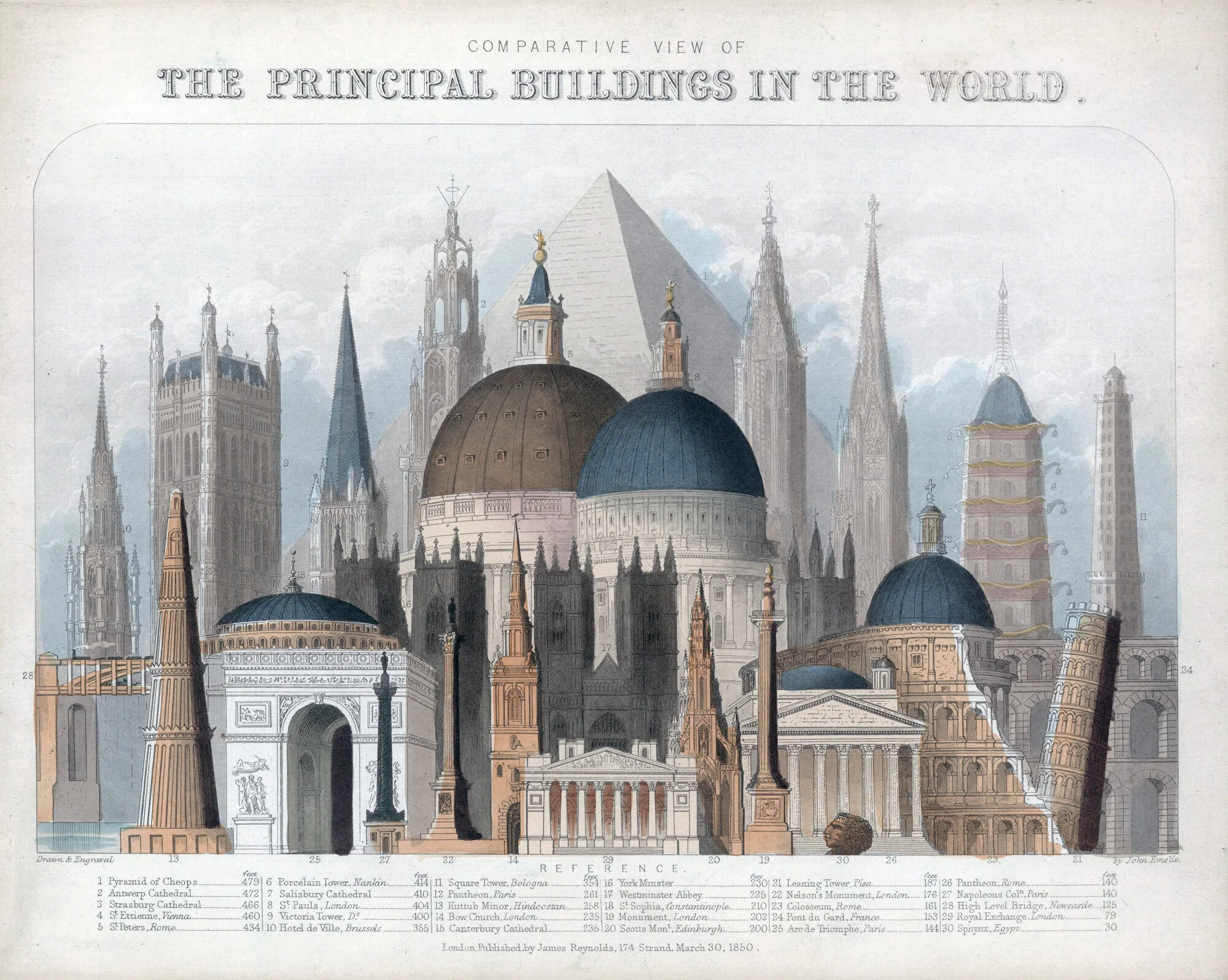
An 1850 drawing of The Principal Buildings in the World by James Reynolds & John Emslie. Here, the buildings are still arranged into an artificial mountain, with its peak at the top of the Great Pyramid. Verticality is used here to signify that height is the ‘principal’ factor in determining a building’s importance or relevance.
Illustration showing the Seven Great Towers of Italy. By focusing on a single country, the artist was pointing out the superiority of Italian construction, and using verticality to do so. What’s interesting to note is that all these towers are associated with a cathedral except the first example, at Bologna. Drawing from an 1872 edition of The Leisure Hour.
Diagram of the Principal High Buildings of the Old World, from an 1884 issue of Cram's Unrivaled Family Atlas of the World. There’s a striking number of steeples and domes throughout the diagram, illustrating the dominance of these building forms on verticality throughout history.
One thing I noticed about these drawings is which buildings are most commonly featured. As one could guess, the Egyptian Pyramids are included in nearly every lineup. This highlights the collective importance these structures have had on humanity throughout history. Their presence is in stark contrast to nearly every other building rendered, and they are usually hulking in the background, as if they’re presiding over the rest of the buildings depicted. As time goes on, however, they become dwarfed by taller structures.
An 1896 drawing of Notable High Buildings of the World by Rand, McNally & Co’s Universal Atlas of The World. Here, height is included in the title and the focus is on the Eiffel Tower, which is too tall to fit on the drawing. It towers over the rest of the buildings as if ruling over them.
Once skyscrapers took over our efforts to escape the surface, the two most common suspects are the Eiffel Tower and the Empire State Building. These landmarks represent benchmarks in the skyscraper game, and they appear in nearly every composition after their completion. They also require height lineups to take on a different scale. The Age of the Skyscraper brought with it an explosion in height, and with it the tall buildings of the old world would occupy a much lower part of these drawings.
A graphic from Le Petit Larousse Illustré, called Man Vs. Nature from 1925. Here, the height of man-made structures are compared to mountains. Needless to say, our attempts at verticality pale in comparison to Mother Nature’s.
A 1930 drawing from Popular Mechanics showing the height of the Empire State Building compared to other tall buildings of its day. What’s curious here is the inclusion of the Great Pyramid, lurking in the background and quite a bit shorter than any other building shown.
This contrast between the Old World and the New World can be seen in the drawing above, with the Great Pyramid still hulking in the background. It’s been dwarfed by more modern structures, however, and its presence is nowhere near as majestic or powerful as it was in previous drawings. Below is a promotional advert for the Queen Mary ocean liner. Here, verticality is being used to compare the length of the ship to the tallest buildings in the world. The pyramid is still present, but much like the drawing above, it’s been dwarfed by more modern structures.
Advert from the 1930’s showcasing the scale of the Queen Mary ocean liner. The ship is placed vertically in between the highest buildings in North America on the left, and Europe on the right. This symbolizes the Queen Mary as a link between the two continents. The drawing also uses verticality as a measure of power and might, using the length of the boat as a metaphor for the same values embodied in tall buildings.
A 1939 drawing of the proposed Palace of the Soviets from Mechanix Illustrated. The Palace of the Soviets was to be the tallest building in the world, and it’s compared to the Eiffel Tower and the Empire State Building.
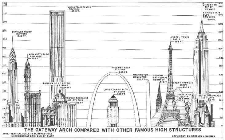
A postcard by Norbury L. Wayman, probably from the late 1970s, showing the height of the Gateway Arch in St. Louis compared to other ‘famous high structures’ throughout the world.
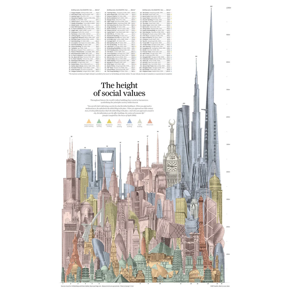
Fast forward to more recent times, and the drawing below shows the monumental shift that skyscraper construction has had on our struggles with verticality. The tall buildings of the old world appear as ground-feeders at the base of the drawing, with modern skyscrapers towering over them. Religion has no place here. It has been usurped by economic interests.
A 2016 drawing by Alberto Lucas López and the CTBUH of the tallest buildings of history, with color used to indicate function. Not surprisingly, the tallest buildings of modern times are economic in function, with office (pink) and mixed-use (blue) being the most popular, while religious buildings (green), public buildings (orange) and monuments (red) are much more common throughout history and dominate the lower regions.
Returning to the Singer Building, below is another height lineup comparing it to other tall buildings in the United States. Unlike the first image, however, it is paired with a skyline view of Lower Manhattan, which removes the abstraction from the upper drawing and gives us a proper context for the building. Singer pushes up past the rest of the city and commands the skyline, which enhances its status as the tallest building in the world. The building appears as a beacon or a lighthouse from a distance, staking claim to its place in the city and announcing the presence of Lower Manhattan to the surrounding landscape.
A pair of drawings examining the Singer Tower and it’s relationship to other tall buildings, as well as its context in Lower Manhattan. Drawing from a 1906 issue of Scientific American.
Height lineups abstract the experience of tall buildings, but they also illustrate our collective need for verticality and the power of the ‘tallest’ label for a building. When compared to the tallest buildings in the world at the time, Singer doesn’t appear to be that much taller than the competition. When viewed in its actual context, the building commands the skyline and becomes an icon of Lower Manhattan. What a difference a bit of context can make.


