Welcome to On Verticality. This blog explores the innate human need to escape the surface of the earth, and our struggles to do so throughout history. If you’re new here, a good place to start is the Theory of Verticality section or the Introduction to Verticality. If you want to receive updates on what’s new with the blog, you can use the Subscribe page to sign up. Thanks for visiting!
Click to filter posts by the three main subjects for the blog : Architecture, Flight and Mountains.
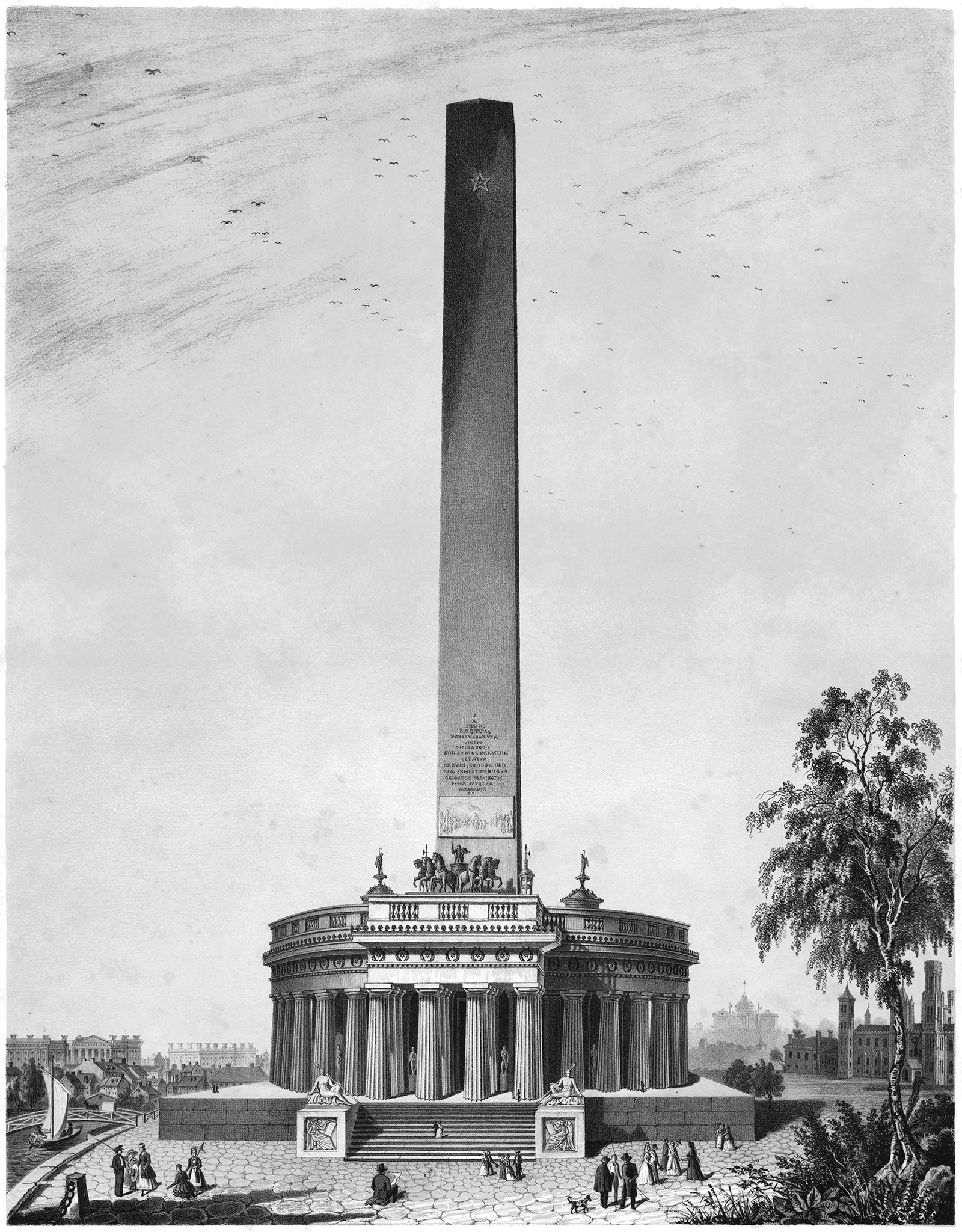
Alternate Realities : The Washington Monument
Pictured above is a proposal for the Washington Monument, designed by Robert Mills sometime around 1845. It was the winning entry of a design competition established in 1835 by the Washington National Monument Society. This design is the second of three structures that Robert Mills proposed or built for a monument to G.W., and each is based on verticality in some way.
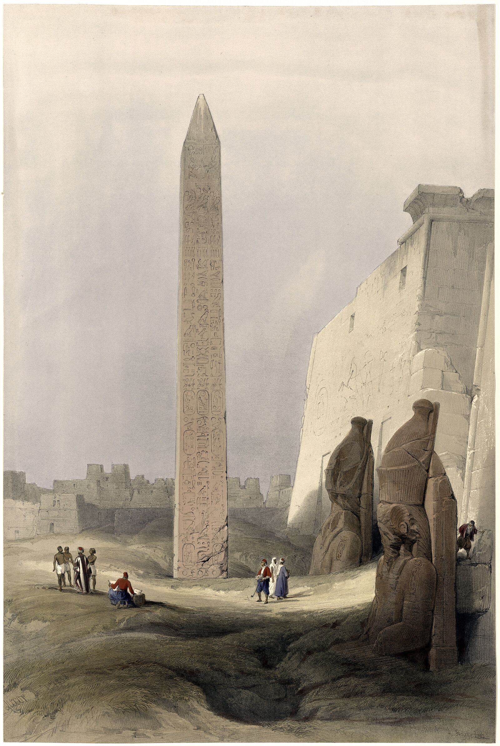
The Origin of the Obelisk
I was recently on a trip to Washington DC, and I went for a run on the National Mall. The centerpiece of the entire complex is the Washington Monument, which is a 169 m (555 ft) stone-faced obelisk. The monument is strikingly simple and quite effective at announcing its presence to the surrounding area. It got me thinking about the obelisk form, and how it’s meaning has changed over the centuries. What was once an integral part of a temple complex has become a singular expression of verticality.
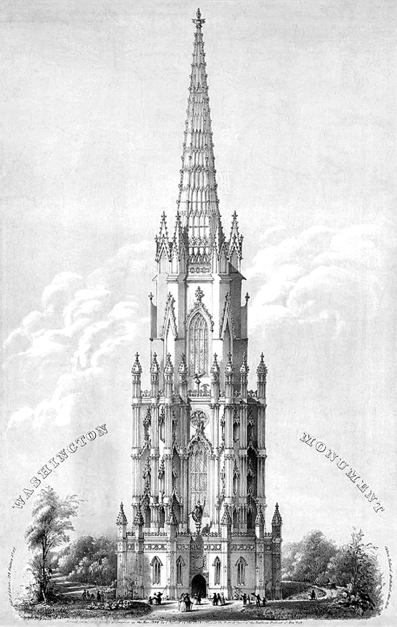
Calvin Pollard’s Proposal for the Washington Monument
Daniel Burnham once said, make no small plans. This is especially true in New York City, and the proposal pictured above fits right into both these molds. It’s a proposal for a monument to George Washington, and it would’ve dwarfed the height of the next tallest building in the city at the time (and also the tallest building in the world), Trinity Church.
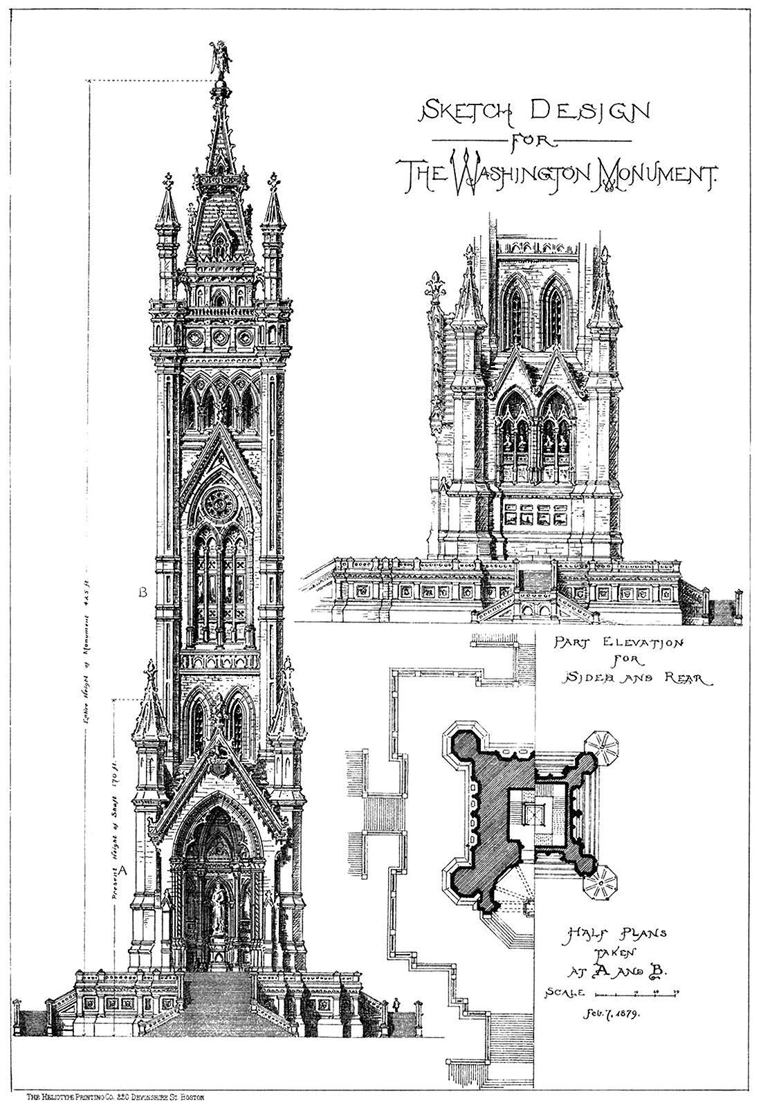
A Sketch Design for the Washington Monument
The above illustration originally appeared in American Architect and Building News, and was submitted to the publication by an architecture student. Curiously, the student is not named, and is just called ‘the author’. The student uses ‘the Gothic treatment’ for the design, which is wonderfully detailed, in stark contrast with the minimalist design that eventually got built.


