Alternate Realities : The Washington Monument
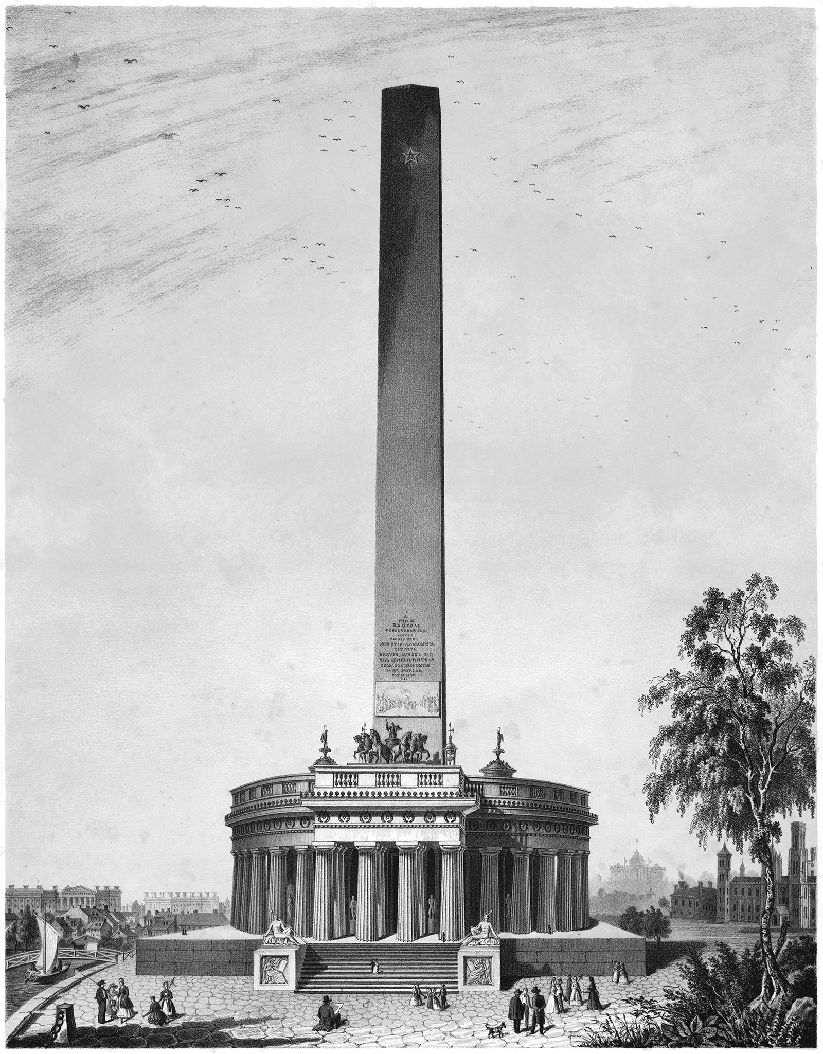
Illustration showing Robert Mills’ original design proposal for the Washington Monument. It’s more elaborate and commands more of a presence than the minimalist design that got built.
Pictured above is a proposal for the Washington Monument, designed by Robert Mills sometime around 1845. It was the winning entry of a design competition established in 1835 by the Washington National Monument Society. This design is the second of three structures that Robert Mills proposed or built for a monument to Washington, and each is based on verticality in some way.
The first design was proposed in 1814 for Baltimore, and it’s pictured below. For this version, Mills designed a triumphal column that springs from a massive base with classical detailing. Along the shaft are a series of balconies, and at the top is a statue of Washington. The entire design is rooted in verticality, and it serves to raise the man up above the surface in order to express his importance to the early history of the United States. Visitors could climb up the structure to visit the statue at the summit, which is akin to leaving the surface to experience the sky. Washington resides above the surface and in the sky, which is testament to his importance.
1814 proposal for a Washington Monument in Baltimore, proposed by Robert Mills.
A couple decades later, Mills proposed his second design for a Washington memorial, pictured at the top of this article. When the aforementioned design competition was announced, the organizers described the intention of the monument, and requested that it shall be like him in whose honor it is to be constructed, unparalleled in the world, and commensurate with the gratitude, liberality, and patriotism of the people by whom it is to be erected. In short, the monument should embody the man. This statement would lead to another design rooted in verticality. I’ve previously written about the link between the human body and singular expressions of verticality, and we can tie this link all the way back to prehistoric megaliths. A megalith is a large upright stone placed on the ground, in defiance of gravity. These stones are metaphors for the human body, which also stands upright on two legs. Throughout the history of architecture, megaliths have evolved in many different ways. In Ancient Egypt, the megalith evolved into the obelisk (for a detailed description of obelisks and the verticality inherent in their form, check out this post).
Robert Mills used the inherent verticality of the obelisk for his second design. This allowed the tower form to embody George Washington, just as the competition brief requested. This is similar to his first design, but here he uses the vertical element to represent Washington himself, rather than to raise the man up above the surface. In addition to this, Mills designed the obelisk to be the tallest structure in the world, which effectively meant Washington was the most important man in the history of the country (and, by extension, the world). This metaphor is reinforced in the third version of the monument, which is the version that got built.
Postcard showing the built version of the Washington Monument, completed in 1854.
In the built version of the Washington Monument, pictured above, the Greek temple structure at the base has been removed, leaving just the obelisk standing alone. Instead of springing from a classical building, the obelisk springs straight from the ground, which ties back directly with the megalith. This allows the full focus to be placed on the vertical element, and the result is a monument that stands upright in defiance of gravity. It perfectly showcases the enormity of Washington’s influence over his country’s early history, and it uses verticality to do it.
Check out other posts about unbuilt architecture here.


