Welcome to On Verticality. This blog explores the innate human need to escape the surface of the earth, and our struggles to do so throughout history. If you’re new here, a good place to start is the Theory of Verticality section or the Introduction to Verticality. If you want to receive updates on what’s new with the blog, you can use the Subscribe page to sign up. Thanks for visiting!
Click to filter posts by the three main subjects for the blog : Architecture, Flight and Mountains.

Skyscrapers of Philadelphia
The illustration above shows a lineup of tall buildings from 1898 in Philadelphia. All of them are of similar height, save for the City Hall Clock Tower. It stands alone, rising to a height of 548 feet, or 167 meters. It was the tallest building in the world when it was completed in 1894, and remained so until the completion of the Singer Building in New York in 1908. This status as the world’s tallest building is reinforced by the illustration, which shows it utterly dominating the other buildings in the city.

Sir Christopher Wren’s Church Steeples
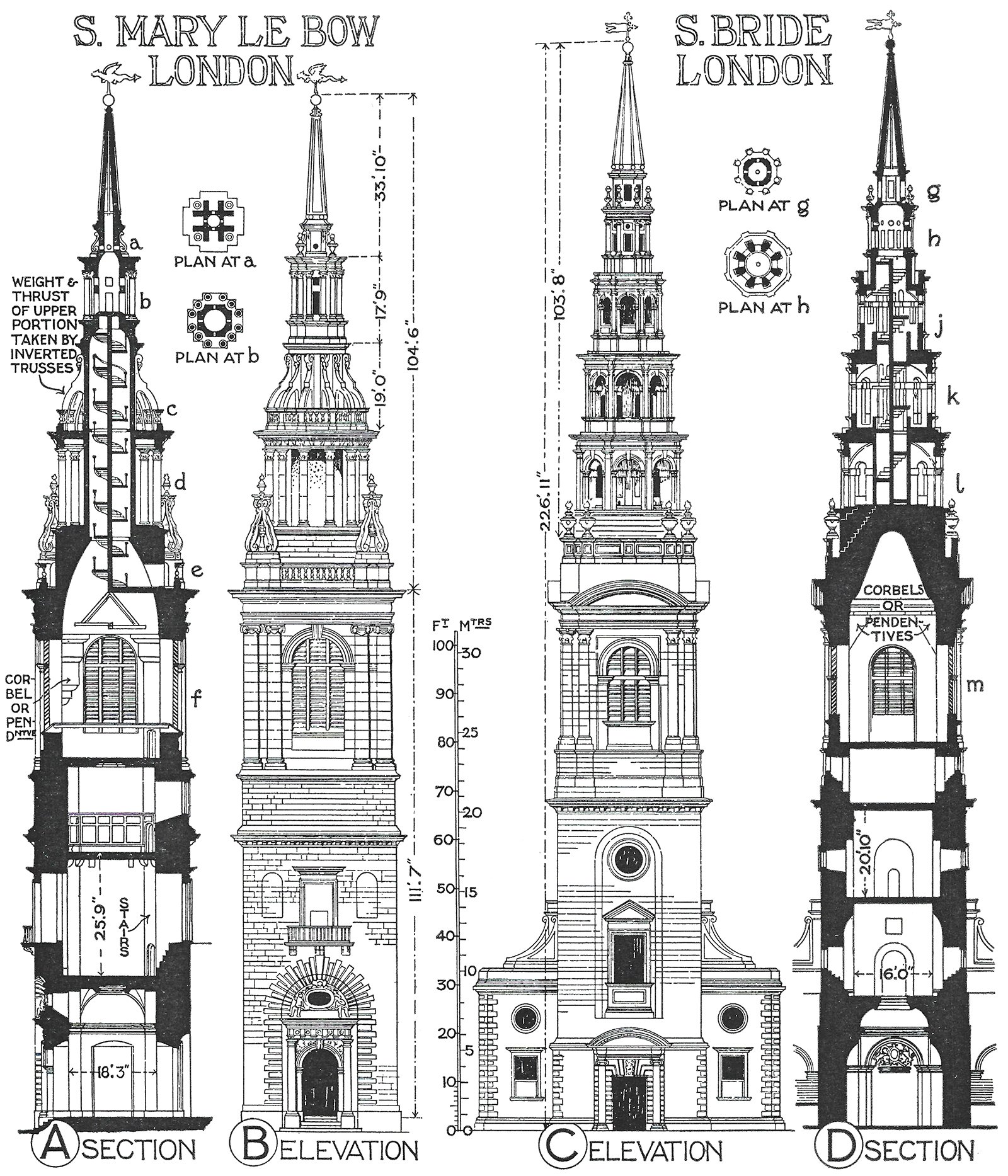
Sir Christopher Wren was an English architect best known for his Renaissance and Baroque church designs that commonly featured conspicuous steeple designs. Pictured above are drawings of two such examples. These steeples are massive in scale, and they dwarf their adjacent church buildings. This mismatch of scales suggests that Wren considered these towers to be much more important than the churches they accompany. Through their height, Wren was using verticality to announce the presence of his buildings.

A Mountain of Mountains
Check out this illustration from 1832 of the Principal Mountains in the World. It was drawn by John Dower, and it organizes the world’s mountains into a set of mountains, each from a different region in the world. There are five ‘peaks’, including the British Isles, Africa, Europe, America and Asia. These are ordered from lowest to highest, and they are superimposed on top of one another. This makes it quite simple to compare relative heights across continents, and to understand where the highest peaks are in relation to one another.

Height Lineups and the Abstraction of Verticality
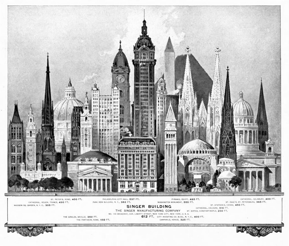
Height lineups like this serve to illustrate how important Verticality is to the perception of our tall buildings, and studying this example got me intrigued about the nature of drawings like this. After some digging, I found many more examples of height lineups throughout the past two centuries, and there are curious commonalities throughout all of them. For starters, they are just beautiful drawings to study. On a deeper level, they provide us with a window into the perceived importance of buildings during a given time in history.

Domes and Steeples of the Old World
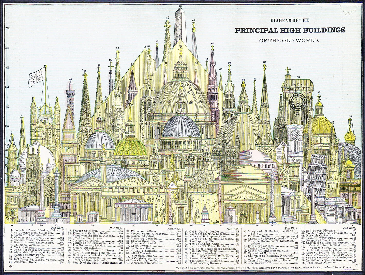
This drawing is from an 1884 issue of Cram's Unrivaled Family Atlas of the World, and it depicts the Principal High Buildings of the Old World. What’s striking about the composition is how many domes and steeples are featured. Aside from the hulking pyramids in the middle ground, there is a forest of slender steeples running along the background, along with a bunch of bulky domes that dominate the middle of the diagram. Steeples and domes were our most popular methods for achieving Verticality throughout history, with each form pushing up towards the sky and announcing its presence, and therefore importance, to the surrounding landscape.

Man Vs. Nature
A bit of context can change many things. Take a look at this drawing, titled Man Vs. Nature from a 1925 edition of Le Petit Larousse Illustré. The graphic compares the tallest works of architecture at the time to major mountain peaks from nature. It's a reality check to consider the size of the Eiffel Tower in Paris, shown as a tiny speck on the bottom left of the image.
