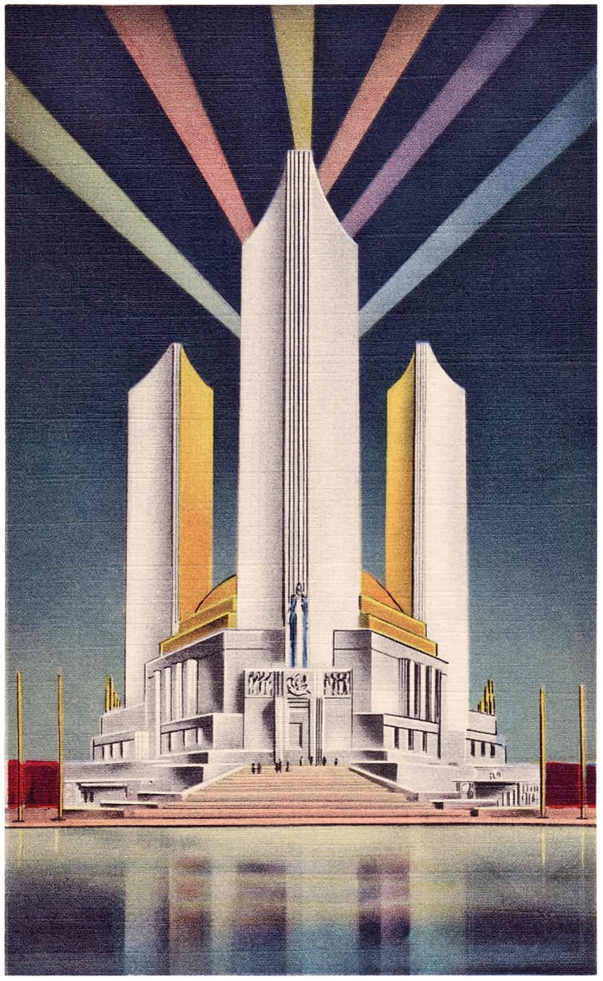
The Three Fluted Towers of the Chicago World’s Fair
Postcard from the 1933 Chicago World’s Fair, showing the Federal Building with its three fluted towers.
Pictured here are three postcards from the 1933 Chicago World’s Fair. Each shows the Federal Building, which featured three fluted towers. These towers represented the three branches of the US government, and together they created an icon for the fairgrounds.
The Federal Building housed exhibits focused on the history of ten US government agencies. The building was the lynchpin of a larger complex including the Hall of States. It was a triangular complex with a central courtyard, and the Federal Building at the midpoint of one side. The entire complex is low and sprawling, and the three towers are the only vertical element present.
Postcard from the 1933 Chicago World’s Fair, showing the Federal Building and the Hall of States from above.
On its own, the Federal Building is an oddly charming structure. The three towers seem tacked-on to the base building, and don’t gel with the rest of the architecture. It feels like the architects were late in the design process, and someone said we need to make this building a landmark; let’s add a vertical element. Then the architects forced three towers into the scheme while retaining the original design. This is conjecture, of course, but the addition of the towers worked quite well. Because of the towers, the Federal Building became emblematic of the Fair itself. Marketing materials and advertisements for the fair typically featured them, even though they were just one building out of many on the grounds. It’s a classic case of the taller, the better.
The symbolism behind the fluted towers is rooted in verticality. They’re much taller than the surrounding buildings, so they become much more visually important. What they represent, the three branches of the US government, becomes much more important as a result. Additionally, a tall building takes more time and effort to build than a shorter building, so focus and importance are inherent to their form. Through its architecture, the Federal Building is saying the US government is what’s important here, so come in and learn about its history.
Postcard from the 1933 Chicago World’s Fair, showing the Federal Building with its three fluted towers.
I’d love to know how the Federal Building’s design process went down. It’s such an odd structure visually, but it carries a certain charm despite it’s mixed messages. The base building carries classical vibes, while the blank white towers are forward-looking in their austerity. Taken as a whole, the building is saying the US government is rooted in tradition while being modern in function. Put simply, it’s the best of both worlds. Of course, this may or may not translate to reality, but the intent behind the building is still there.
Check out other posts about unbuilt architecture here.


