Welcome to On Verticality. This blog explores the innate human need to escape the surface of the earth, and our struggles to do so throughout history. If you’re new here, a good place to start is the Theory of Verticality section or the Introduction to Verticality. If you want to receive updates on what’s new with the blog, you can use the Subscribe page to sign up. Thanks for visiting!
Click to filter posts by the three main subjects for the blog : Architecture, Flight and Mountains.
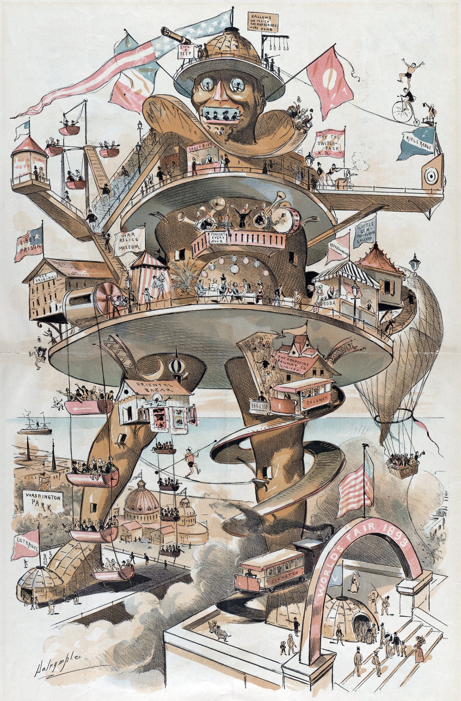
The Colossus of Chicago
The caption for the illustration shown above reads: Puck’s suggestion for the World’s Fair - the “Colossus of Chicago” would knock out the Eiffel Tower. It was drawn by Louis Dalrymple for the 8 October 1890 issue of Puck magazine, a popular humor and satire publication. With Colossus, Dalrymple was mocking a series of proposals leading up to the 1893 World’s Fair that sought to out-do the Eiffel Tower from the previous World’s Fair in Paris. Eiffel had become so popular that the organizers of the 1893 World’s Fair wanted to re-create its success in Chicago.
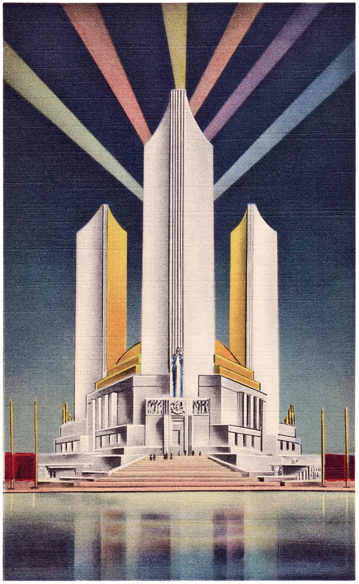
The Three Fluted Towers of the Chicago World’s Fair
Pictured here are three postcards from the 1933 Chicago World’s Fair. Each shows the Federal Building, which featured three fluted towers. These towers represented the three branches of the US government, and together they created an icon for the fairgrounds.
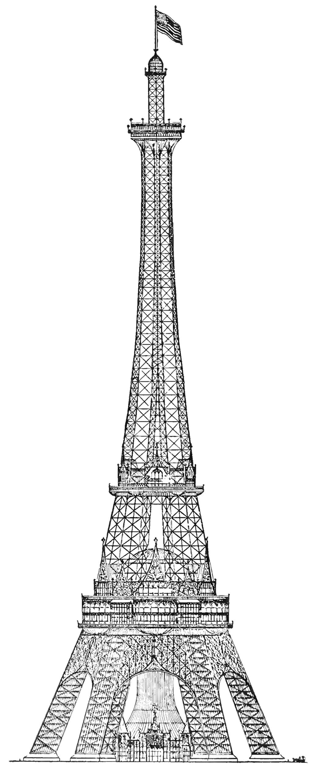
The Proctor Steel Tower
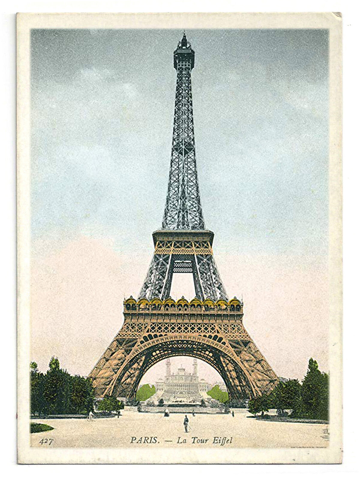
When the Eiffel Tower was completed for the 1889 World’s Fair in Paris, the world took notice. France had constructed the world’s tallest structure, and it immediately became the envy of the world. The next World’s Fair would take place in Chicago in 1893, and the organizers wanted to take the opportunity to out-do the Eiffel Tower with their own structure. The most successful proposal was the Proctor Tower, which is pictured above. It was 335 meters (1,100 feet) tall, which is roughly 12 meters (40 feet) taller than the Eiffel Tower.
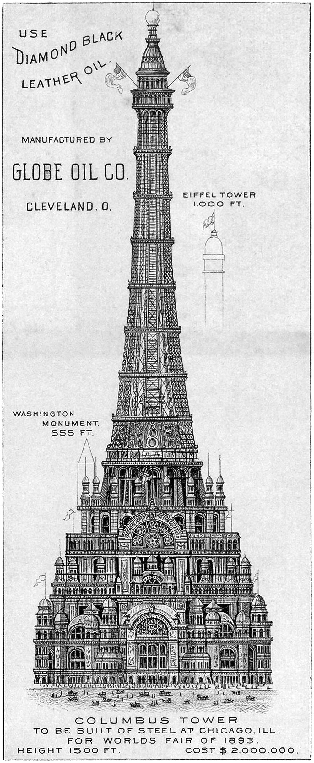
The Chicago Columbus Tower
Pictured above is the proposed Chicago Columbus Tower, which was designed to be the centerpiece of the 1893 World’s Columbian Exposition in Chicago. It was 455 meters (1,500 feet) tall and would’ve cost two million dollars at the time (roughly 62 million dollars today). It’s an elaborate and ambitious proposal that was meant to out-Eiffel the Eiffel Tower, which was built for the previous World’s Fair in 1889. As if to hit this point home, the above illustration includes height references to the Eiffel Tower and the Washington Monument, which would’ve been dwarfed by this new structure.
The Columbian Triumphal Arch
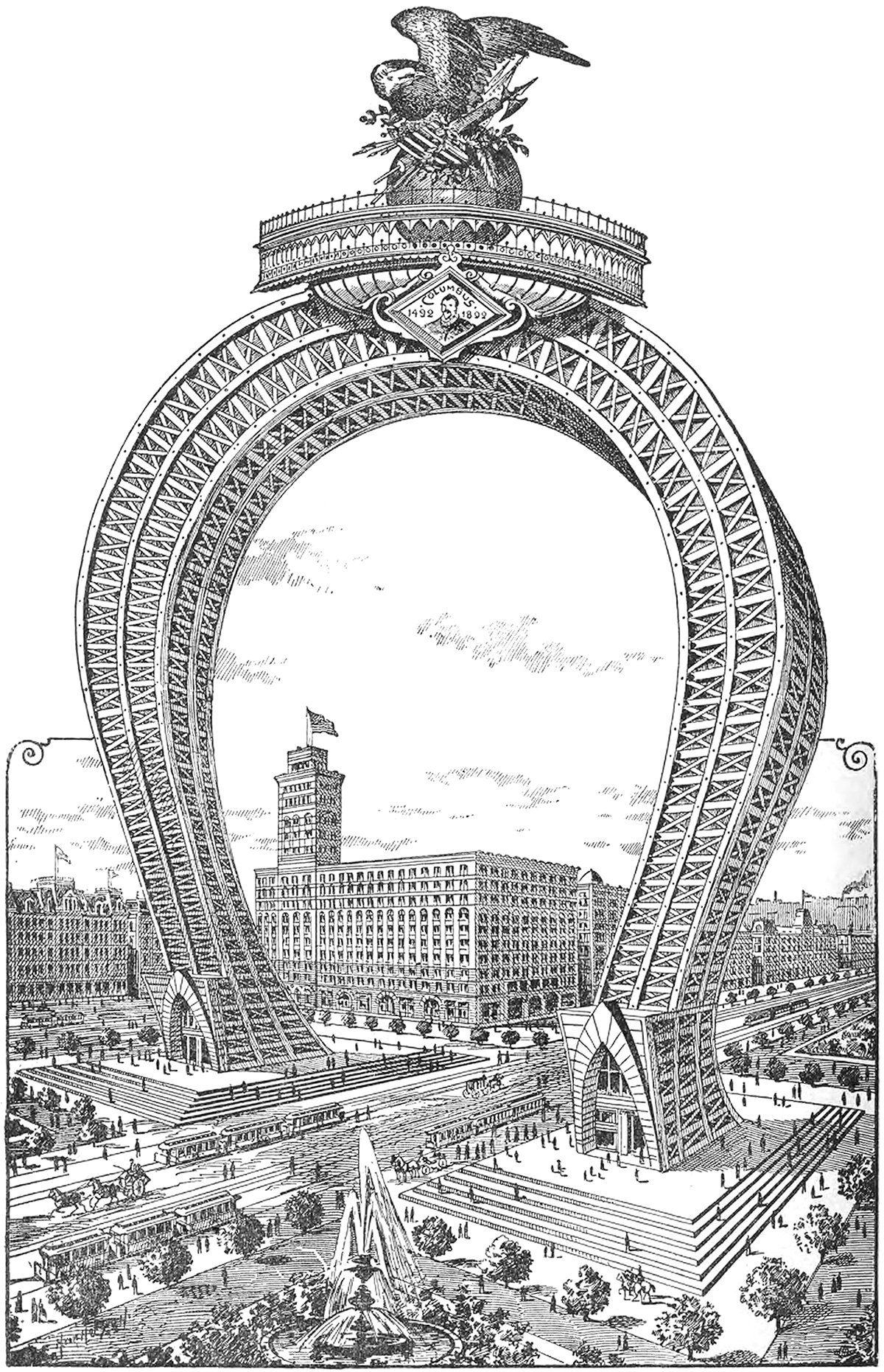
Here’s a doozy. It’s an 1891 proposal for a monumental arch that would’ve been the crown of the 1893 World’s Columbian Exposition in Chicago. It would’ve straddled South Michigan Avenue on the block adjacent to the Auditorium Building, which can be seen just behind the arch in the illustration. I can’t find any information on the designer, but whoever drew it up was no stranger to the Daniel Burnham quote make no small plans.
The Original Flat-topped Sears Tower
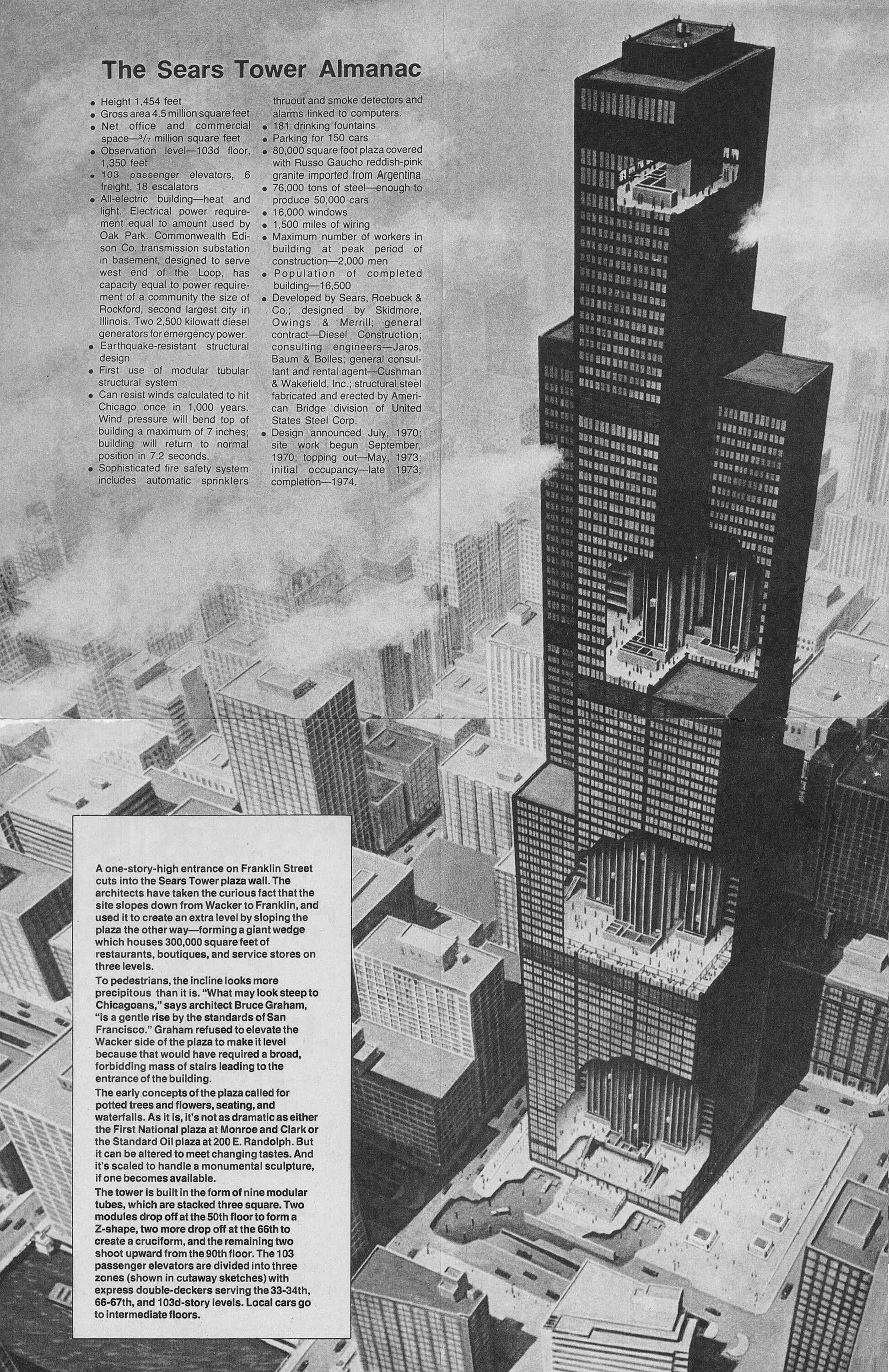
The above illustration shows the original design for the Sears Tower in Chicago, along with a bunch of factoids related to the scale of the building. Upon first glance, the first thing that stood out to me was the flat roof and lack of the building’s now-iconic antennae. As with most skyscrapers of this size, the building feels quite different without the white spires that are now so closely associated with the skyscraper. Similarly, imagine the Empire State Building without it’s spire, or the John Hancock Center without it’s antennae. It’s just not the same.
Alternate Realities : Chicago Tribune Tower
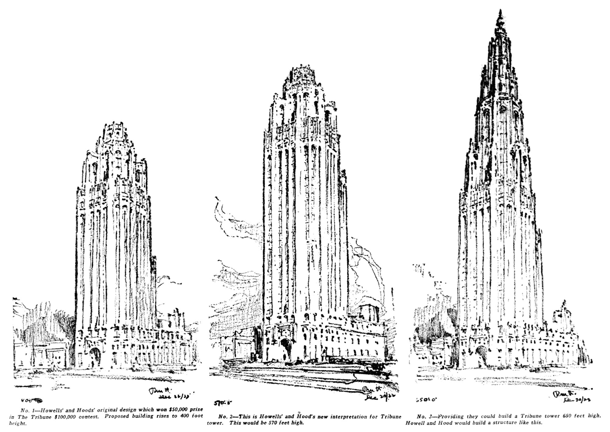
Pictured above are three design sketches for the Chicago Tribune Tower. They were drawn after the newspaper asked the architect to study taller options for the building, because they were considering whether or not to build the world’s tallest skyscraper. The increased height would require special approval from the city, so in the end they opted for beauty over height, and didn’t pursue the taller options.
The Urban Canyon
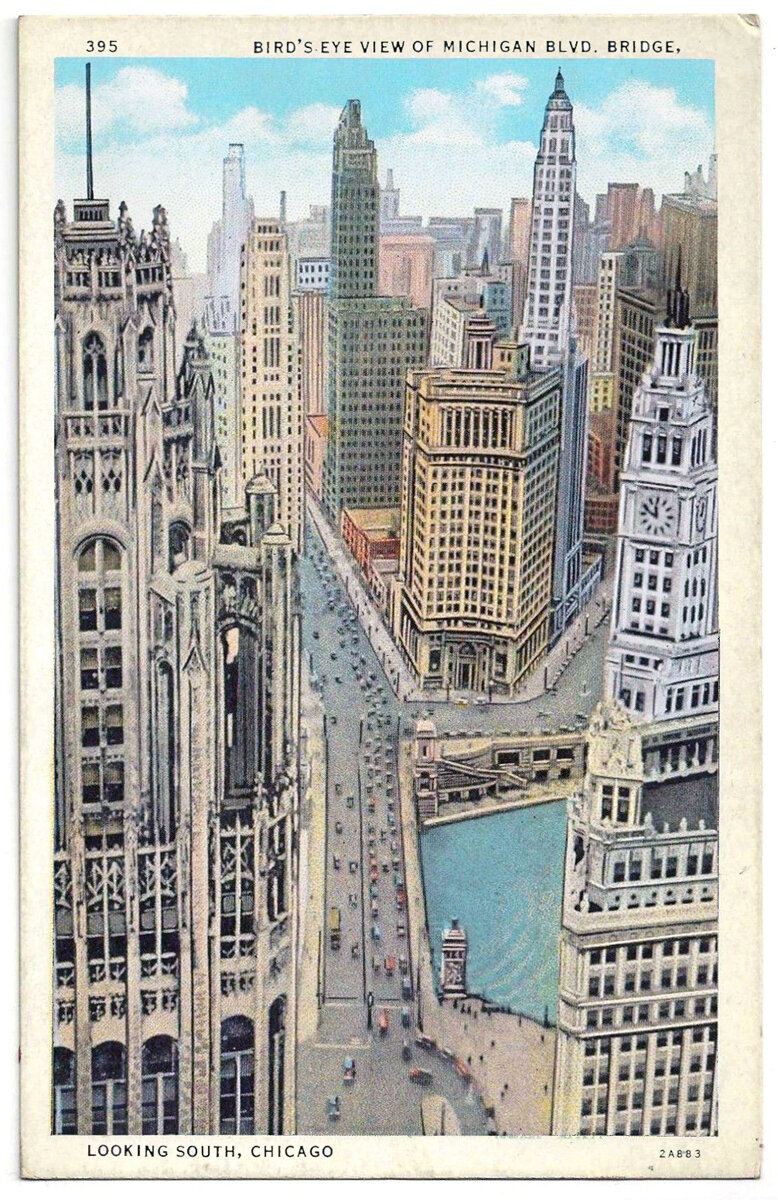
It’s difficult to reconcile the inhuman scale of the skyscraper with the human experience at street level. In most Western cities of today, the experience of walking down the street is largely soul-less, with a relentless street wall rising up on both sides and massive towers rising above that, usually set back from the street wall a bit.
Saverio Dioguardi's Tribune Tower Proposal
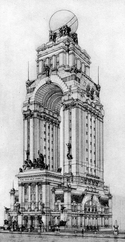
Every time I research the Chicago Tribune Tower competition, I run into this proposal by Italian architect Saverio Dioguardi. His design is wonderfully flamboyant, and it’s more of a monument than a building. There’s something eye-catching about the sheer audacity of it, however, which is why I’ve singled it out here.
Verticality, Part X: Conquering The Skies
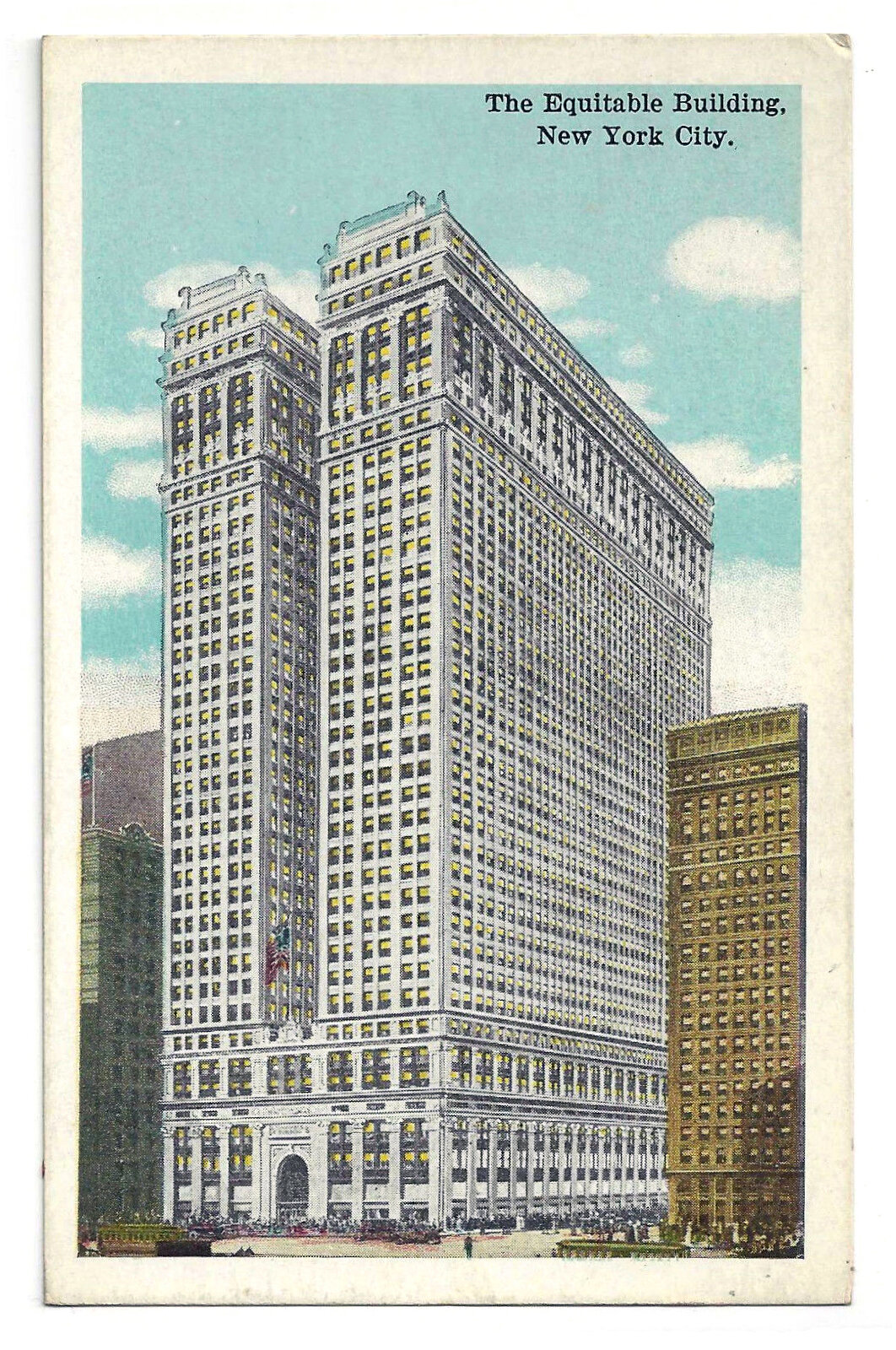
The construction of the Equitable Building in 1915 ushered in a new age of skyscraper design. Humans were now able to escape the surface of the Earth with our interior environments, and our need for Verticality had ceased to be driven by the unknown. It was now driven by our need to congregate through density and to distinguish ourselves from one-another. Ego had replaced God, and as a result our quest for Verticality would become synonymous with human achievement.
Verticality, Part IX: Man Upends God
The needs of man become more important than the needs of God
After the Renaissance, humanity would largely abandon our ambitions to recreate heaven on earth, and our focus would shift to raising up our bodies as far from the surface as possible. Rather than singular, largely empty spaces, our tallest and most ambitious constructions would become containers of stacked spaces, still with Verticality as the ultimate goal. We were beginning to escape the surface.
