Welcome to On Verticality. This blog explores the innate human need to escape the surface of the earth, and our struggles to do so throughout history. If you’re new here, a good place to start is the Theory of Verticality section or the Introduction to Verticality. If you want to receive updates on what’s new with the blog, you can use the Subscribe page to sign up. Thanks for visiting!
Click to filter posts by the three main subjects for the blog : Architecture, Flight and Mountains.
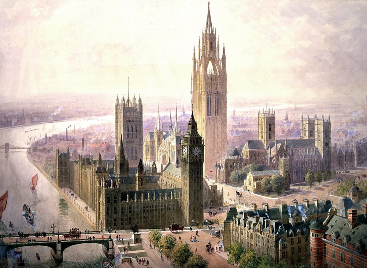
Lamb and Seddon’s Imperial Monumental Tower at Westminster
Pictured above is a 1904 proposal for an Imperial Monumental Hall and Tower in London. It was proposed by architects Edward Beckitt Lamb and John Pollard Seddon. The main feature of the proposal was a 167 meter (548 foot) Gothic tower, which dominates the entire site and its surroundings. It’s an ambitious proposal, and it uses verticality to elevate the monumentality of the site in three ways.
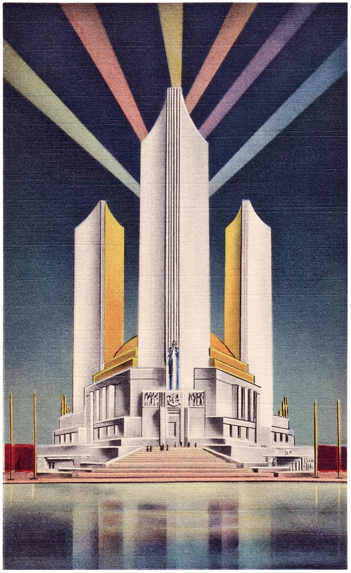
The Three Fluted Towers of the Chicago World’s Fair
Pictured here are three postcards from the 1933 Chicago World’s Fair. Each shows the Federal Building, which featured three fluted towers. These towers represented the three branches of the US government, and together they created an icon for the fairgrounds.
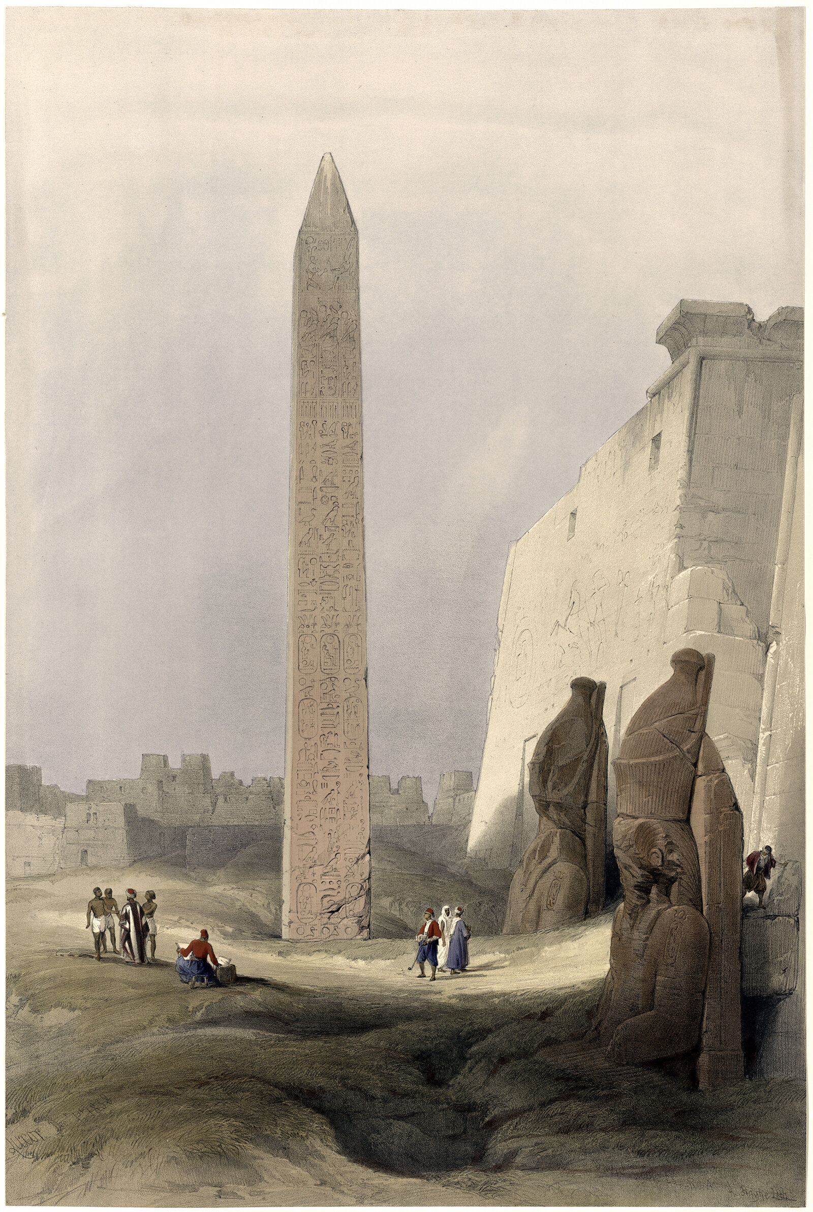
The Origin of the Obelisk
I was recently on a trip to Washington DC, and I went for a run on the National Mall. The centerpiece of the entire complex is the Washington Monument, which is a 169 m (555 ft) stone-faced obelisk. The monument is strikingly simple and quite effective at announcing its presence to the surrounding area. It got me thinking about the obelisk form, and how it’s meaning has changed over the centuries. What was once an integral part of a temple complex has become a singular expression of verticality.
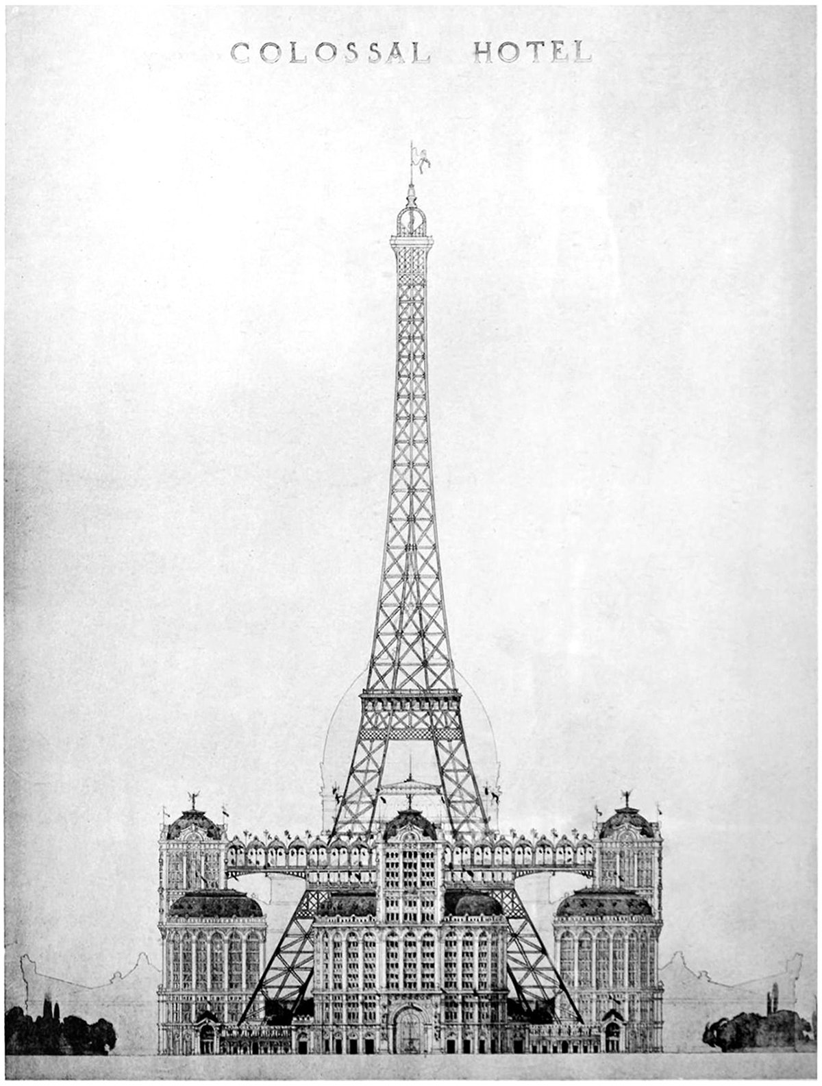
Alternate Realities : A Colossal Hotel at the Eiffel Tower
Pictured here is a proposal to put a colossal hotel at the base of the Eiffel Tower. It was proposed as part of the 1900 World’s Fair, called the Exposition Universelle, but it never got built. This elevation is the only drawing we have, which makes sense because most people who see the drawing would dismiss it immediately. The idea of filling up the void under the structure would destroy much of the Eiffel’s charm.
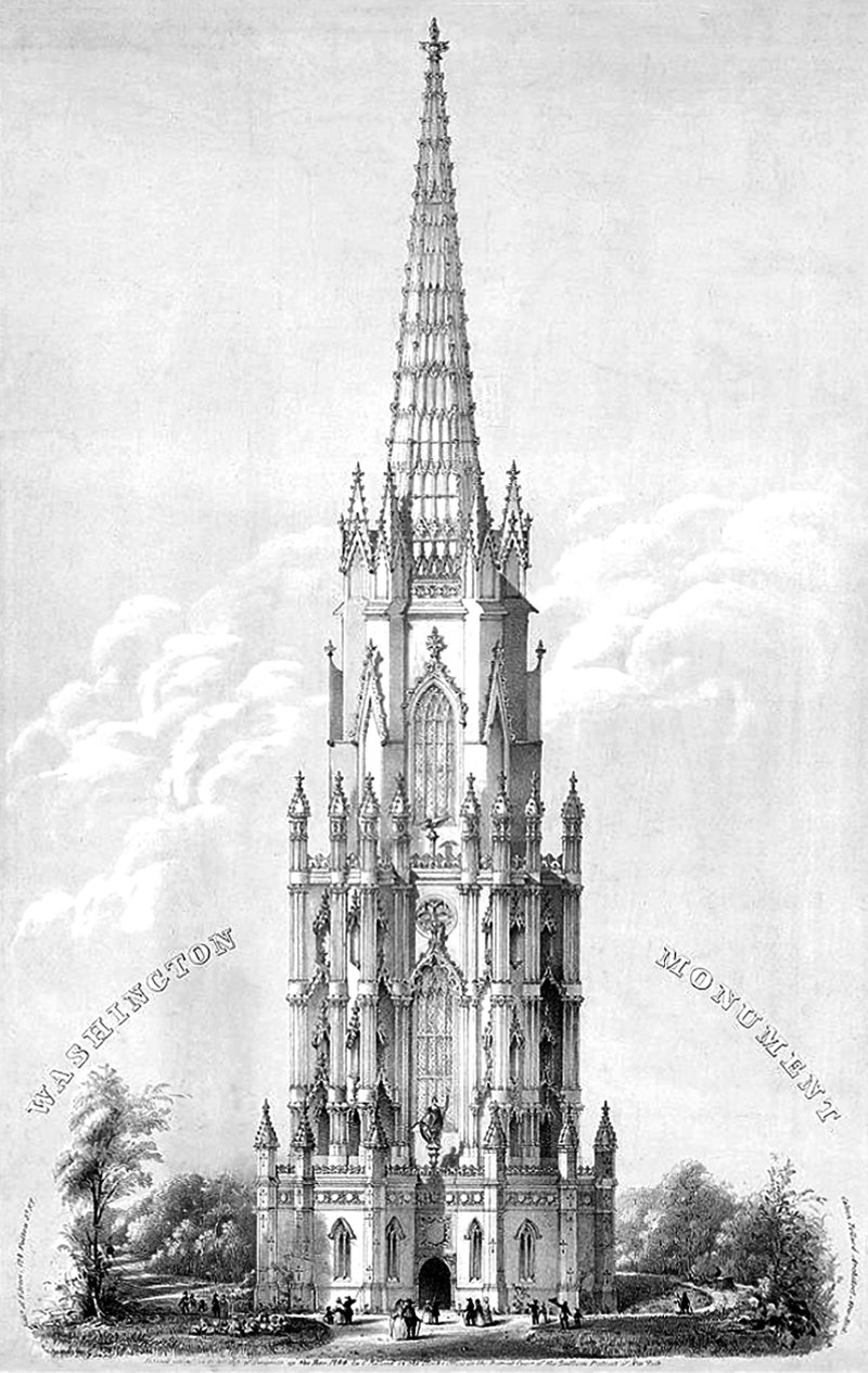
Calvin Pollard’s Proposal for the Washington Monument
Daniel Burnham once said, make no small plans. This is especially true in New York City, and the proposal pictured above fits right into both these molds. It’s a proposal for a monument to George Washington, and it would’ve dwarfed the height of the next tallest building in the city at the time (and also the tallest building in the world), Trinity Church.
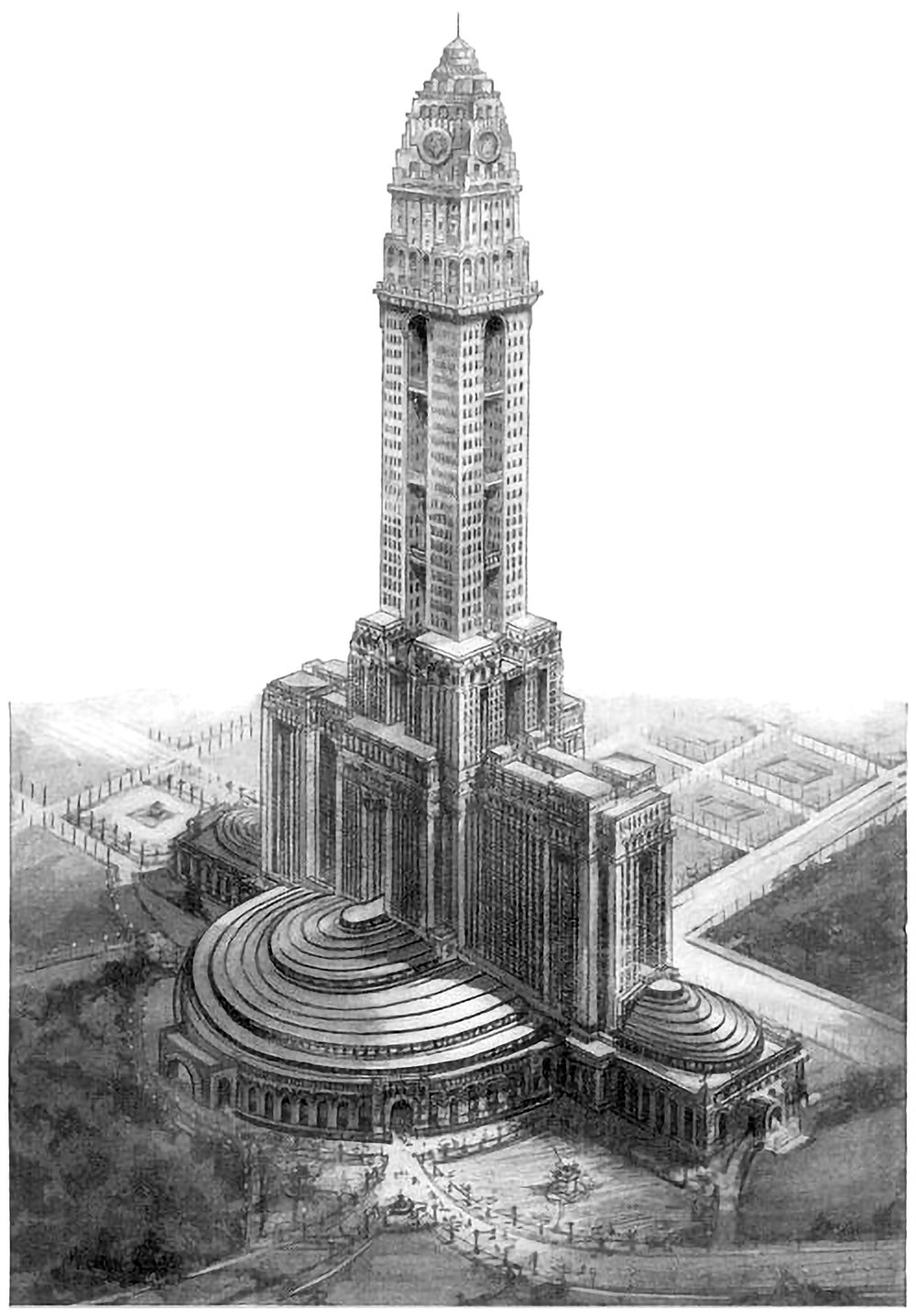
The Mole Littoria Project
Constructing the world’s tallest building is an act of politics just as much as an act of engineering. It’s a statement of accomplishment and power by all those involved. Paul Goldberger once wrote that you don’t build [the world’s tallest] skyscraper to house people, or to give tourists a view, or even, necessarily, to make a profit. You do it to make sure the world knows who you are. Pictured above is one example of this. It’s a 1924 proposal for the world’s tallest building, to be built in Rome. It was designed by Mario Palanti, who was an Italian architect who made his name in South America, and he proposed his design to Benito Mussolini, who enthusiastically approved the project.
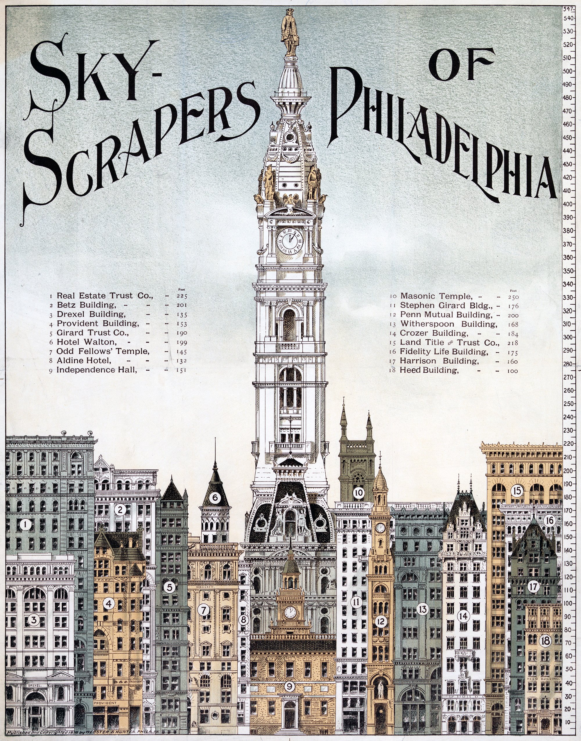
Skyscrapers of Philadelphia
The illustration above shows a lineup of tall buildings from 1898 in Philadelphia. All of them are of similar height, save for the City Hall Clock Tower. It stands alone, rising to a height of 548 feet, or 167 meters. It was the tallest building in the world when it was completed in 1894, and remained so until the completion of the Singer Building in New York in 1908. This status as the world’s tallest building is reinforced by the illustration, which shows it utterly dominating the other buildings in the city.
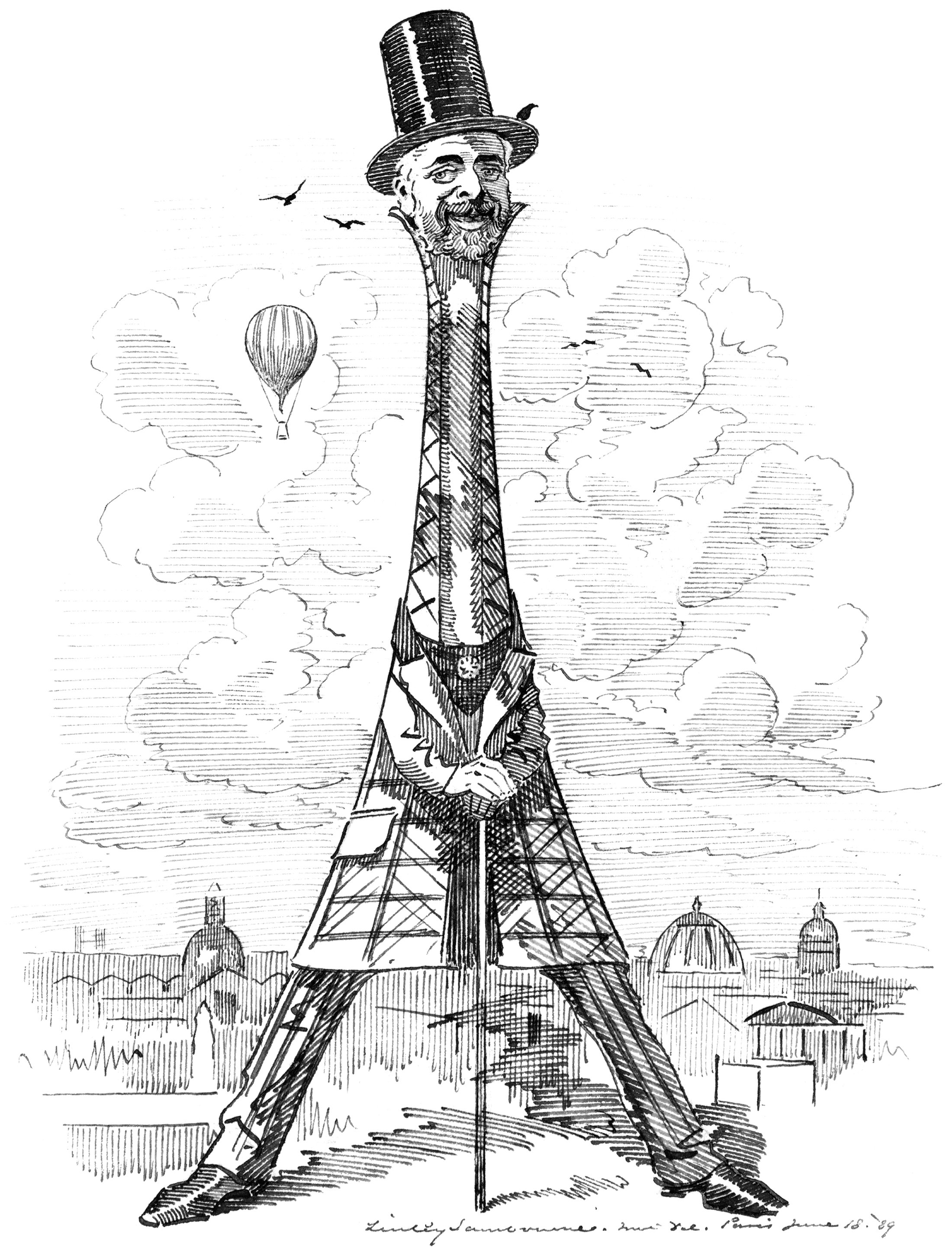
Eiffel as his Tower
Our buildings reflect our values and needs. This is especially true of our tall buildings, because they cost so much to build. When the Eiffel Tower was built in Paris, it reflected a worldwide drive for height in our buildings that was emerging at the time. It was a such a powerful statement of verticality that the man who designed it became something of a celebrity. He became linked with the tower in the eyes of the public, so much so that it was named after him like one of his children. This rarely happens with a building, but it demonstrates just how big an impact the Eiffel Tower had on the world.
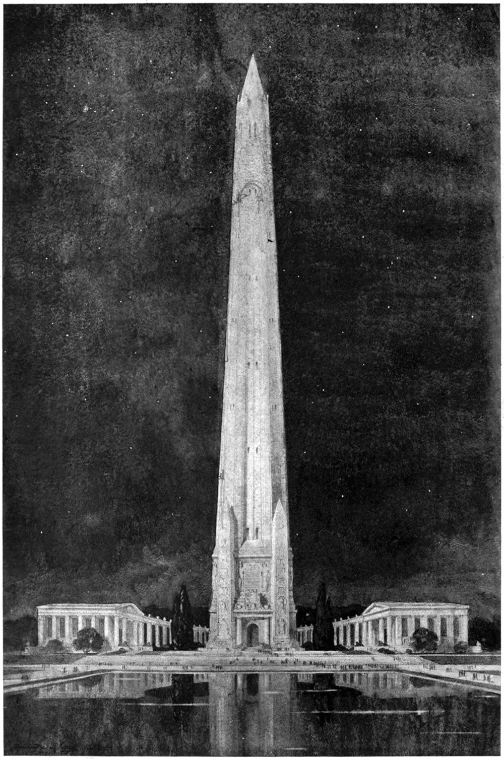
A Design for a National Memorial
Monuments and memorials are tricky beasts to design. Unlike a normal building, they’re imbued with meaning and symbolism that can be highly subjective. They’re not just buildings, but repositories for history and memory. This means they carry responsibilities to the person or event they are meant to symbolize. That’s what makes the above illustration so difficult to understand. It’s described only as Design for National Memorial. This is tough, because it doesn’t even make a claim to what it’s memorializing. One thing is clear, however; the designer was motivated by verticality.
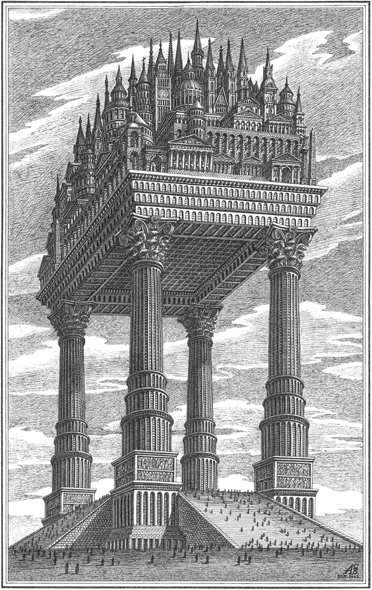
The Magic City
Pictured above is an illustration by Russian architectural theorist Arthur Skizhali-Weiss. It’s part of a series called The Magic City, which includes fictional realities dreamed up by the architect from 1999 to 2014. Apart from being an interesting composition of architectural forms, it embodies a few themes related to verticality.
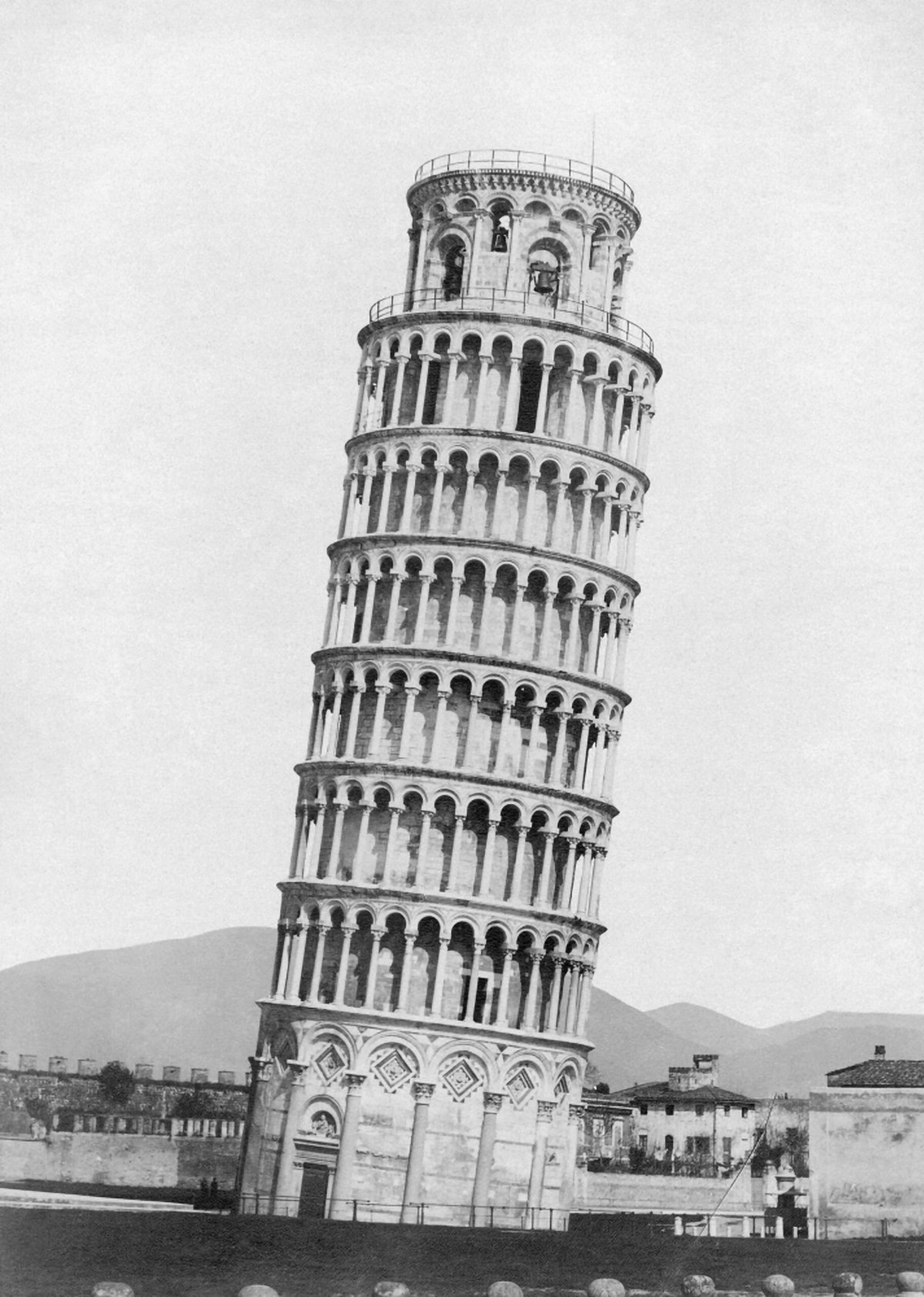
The Leaning Tower of Pisa and the Axis Mundi
Pictured here is the campanile at the Pisa Cathedral, known worldwide as the Leaning Tower of Pisa. The tower is world-famous for its iconic four-degree lean, and has become a major tourist attraction for the town of Pisa. This lean has allowed the campanile to become a symbol of the city. If you think of Pisa, you think of the Leaning Tower. This status and appeal comes from the campanile’s lack of vertical equilibrium, which forces visitors to confront the axis-mundi. It’s a unique tension that’s rooted in verticality.
Constant-Désiré Despradelle’s Beacon of Progress
He was possessed by the idea of a monument embodying the characteristics of American civilization, to be a memorial to the genius of the American people and a reminder of the glories of the Columbian Exposition in Jackson Park. These words describe the feeling of Constant-Désiré Despradelle after he visited the World’s Columbian Exposition of 1893 in Chicago. The exposition saw an entire complex of temporary buildings built in Jackson Park, only to be demolished after the fair. For Despradelle, Chicago needed a permanent monument to embody the spirit and grandeur of the fair. He set to work designing his vision, and the final result is pictured above.
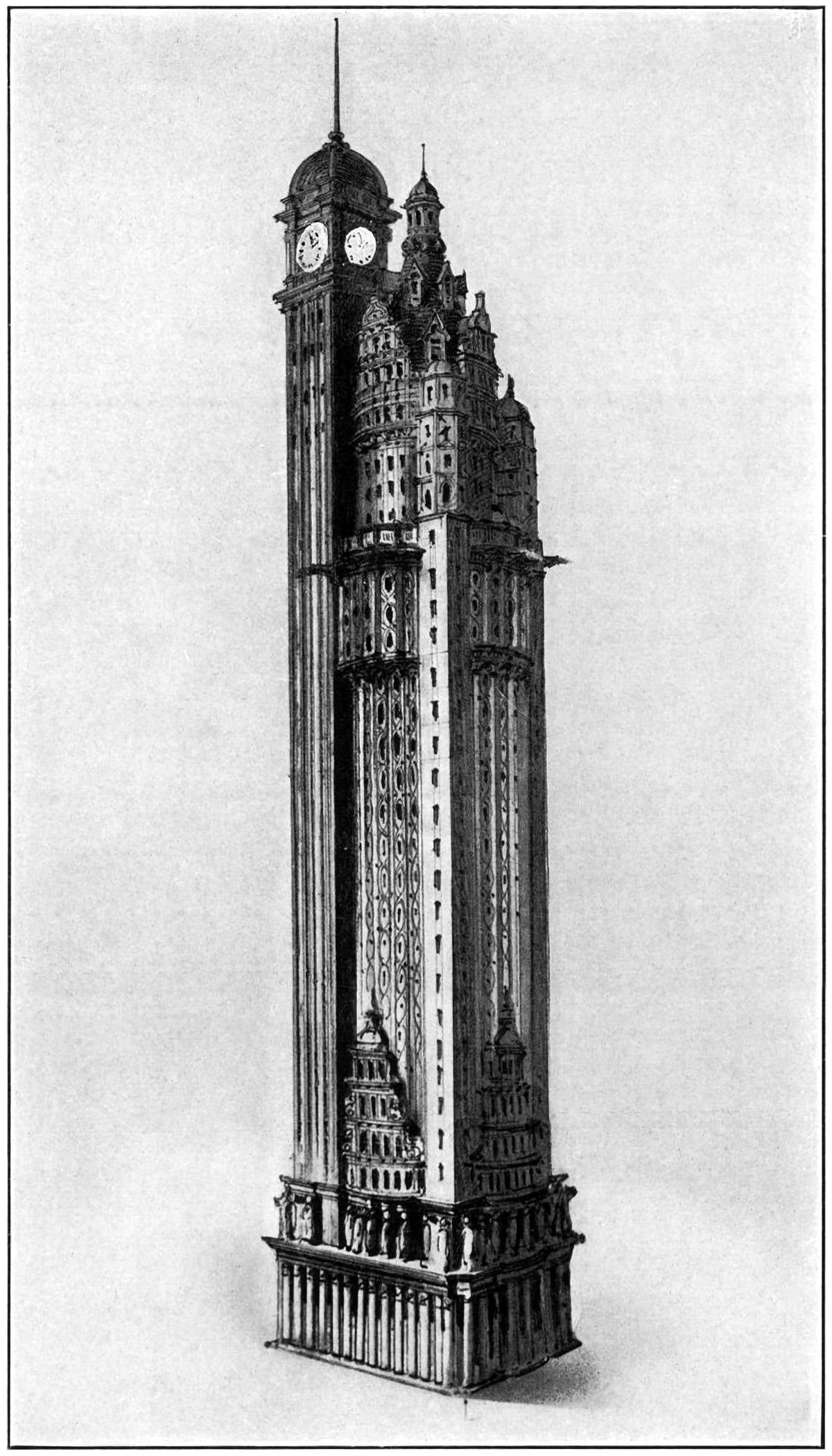
The New York American Journal Headquarters
Throughout my research into tall buildings and verticality, I’ve come across myriad examples of proposed and unbuilt structures. Some are alternate proposals by famous architects. Some are one-hit wonders that make their way into the mainstream history of skyscrapers. Some, like the one pictured above, are just intriguing and obscure images without much context. Details on this building are scarce, but from what I can find this is a proposal by Barney & Chapman Architects for the headquarters of the New York American Journal. It was located at Columbus Circle in New York City, on the site occupied by the Museum of Arts and Design today.
The Proctor Steel Tower
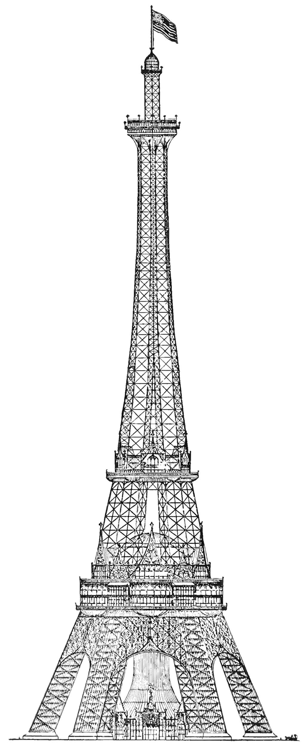
When the Eiffel Tower was completed for the 1889 World’s Fair in Paris, the world took notice. France had constructed the world’s tallest structure, and it immediately became the envy of the world. The next World’s Fair would take place in Chicago in 1893, and the organizers wanted to take the opportunity to out-do the Eiffel Tower with their own structure. The most successful proposal was the Proctor Tower, which is pictured above. It was 335 meters (1,100 feet) tall, which is roughly 12 meters (40 feet) taller than the Eiffel Tower.
Friedrich Gösling’s Proposal for the Reichstag
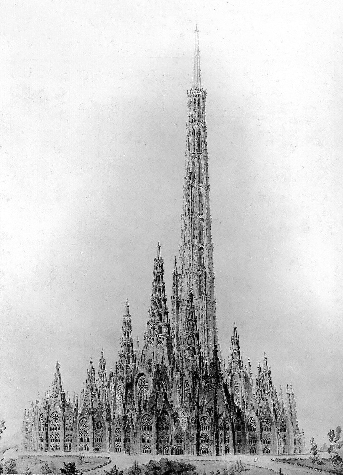
Pictured above is a competition entry for the original Reichstag building in Berlin. It was designed in 1871 by German architect Friedrich Gösling, and it’s a big departure from the Neoclassic design that ended up getting built. Gösling intended the design to embody the German way of life and the German idea of the state. He expressed these ideas with an organic plan and a Neogothic structure that seems to point upward with its myriad steeples and pinnacles. I suspect this upward focus was how Gösling’s idea of the German way of life in built form, because it’s so prevalent throughout his design. He was using verticality to project a sense of optimism about Germany and its future.
The Qtub Minar and the Verticality of Minarets
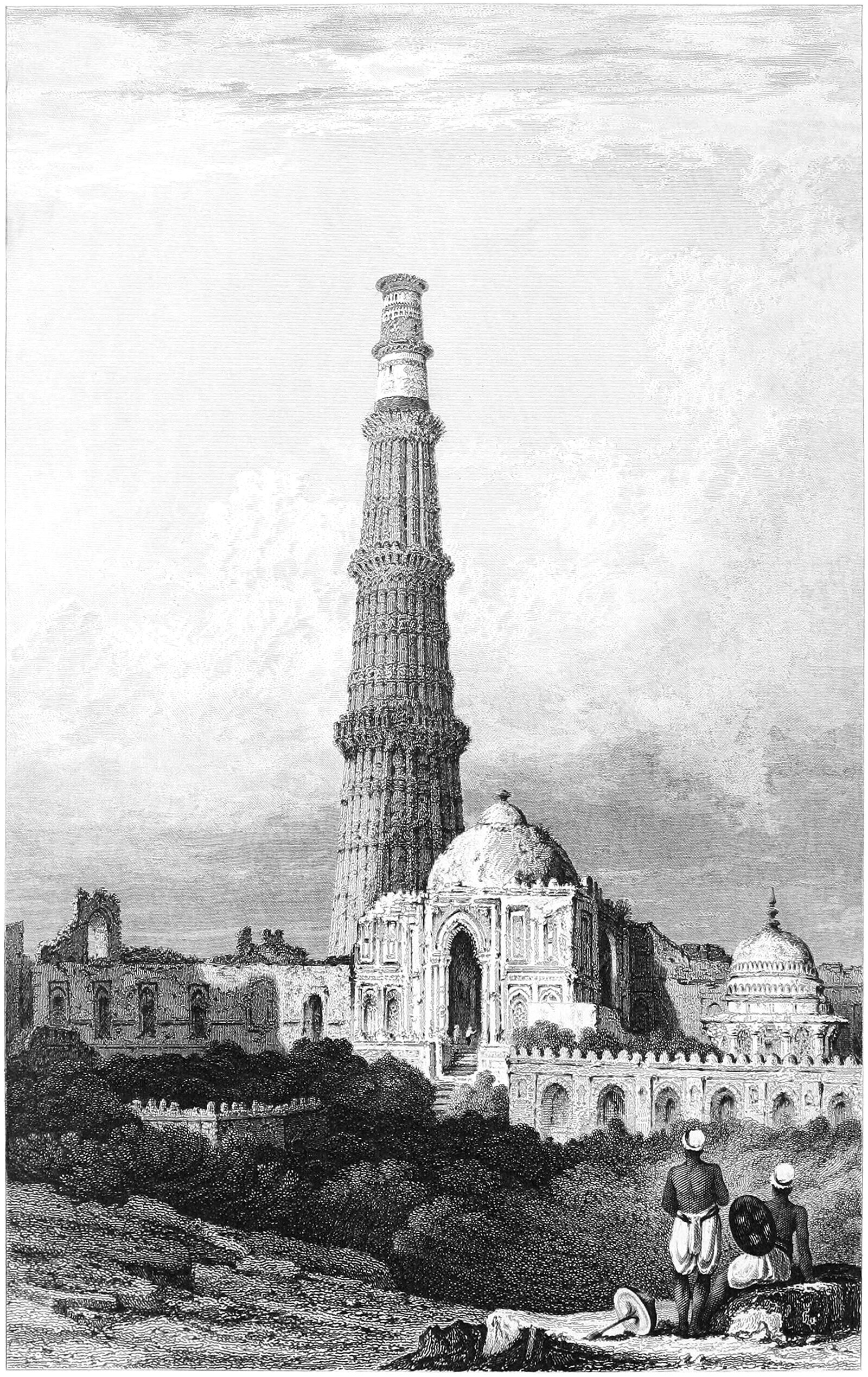
Pictured above is the Qtub Minar, which was built around 1200 just outside Delhi, India. It’s a fascinating example of a cross-culture artifact, and it departs from traditional minarets in three ways. First, it was built as the focal point of the Qutb complex and exists on its own, without an adjacent mosque. Second, it was built as a victory tower as well as a minaret. This means it was partly a monument to military victories, much like a triumphal column in Ancient Rome. Lastly, the minaret was designed by Muslim architects, but built by Hindu craftsman and laborers.
Rapunzel and the Isolation of Height
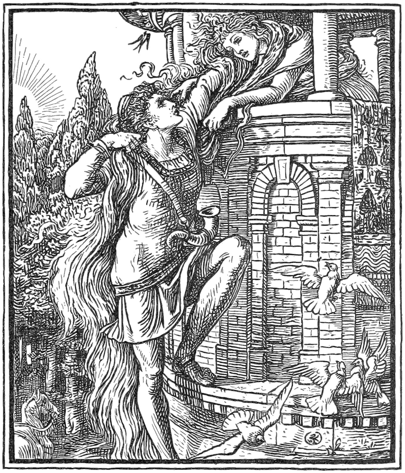
The story of Rapunzel and her long hair is a well-known folk tale with ancient origins. It’s the story of a damsel-in-distress and a prince who comes to rescue her. It’s well-worn territory in the world of folk tales, but the specifics of the story reveal a subtext that’s based on verticality.
The Chicago Columbus Tower
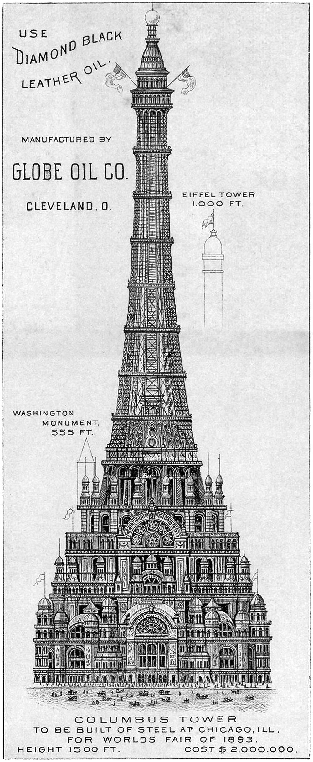
Pictured above is the proposed Chicago Columbus Tower, which was designed to be the centerpiece of the 1893 World’s Columbian Exposition in Chicago. It was 455 meters (1,500 feet) tall and would’ve cost two million dollars at the time (roughly 62 million dollars today). It’s an elaborate and ambitious proposal that was meant to out-Eiffel the Eiffel Tower, which was built for the previous World’s Fair in 1889. As if to hit this point home, the above illustration includes height references to the Eiffel Tower and the Washington Monument, which would’ve been dwarfed by this new structure.
The Columbian Triumphal Arch
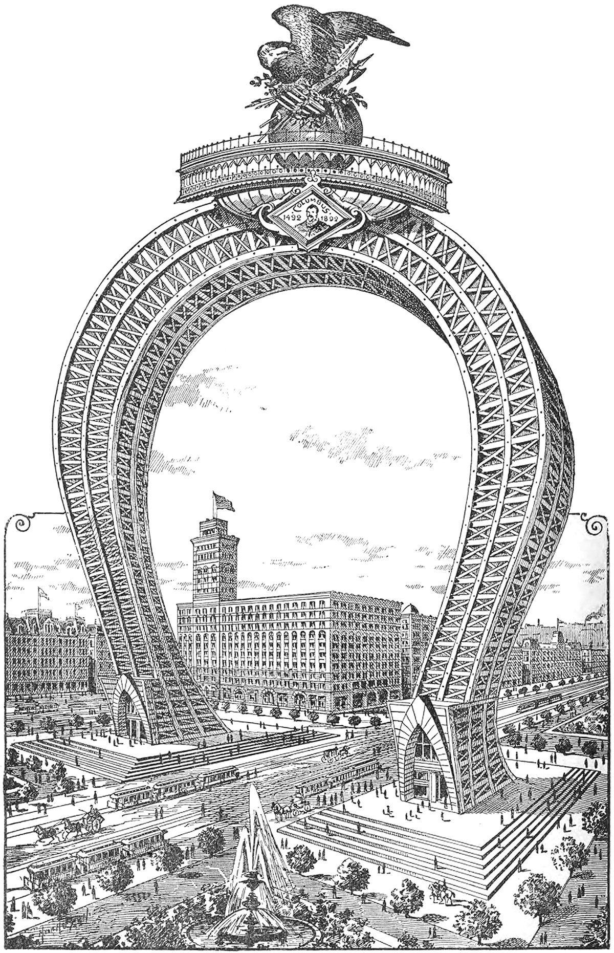
Here’s a doozy. It’s an 1891 proposal for a monumental arch that would’ve been the crown of the 1893 World’s Columbian Exposition in Chicago. It would’ve straddled South Michigan Avenue on the block adjacent to the Auditorium Building, which can be seen just behind the arch in the illustration. I can’t find any information on the designer, but whoever drew it up was no stranger to the Daniel Burnham quote make no small plans.
Best-Laid Plans : The Metropolitan Life North Building
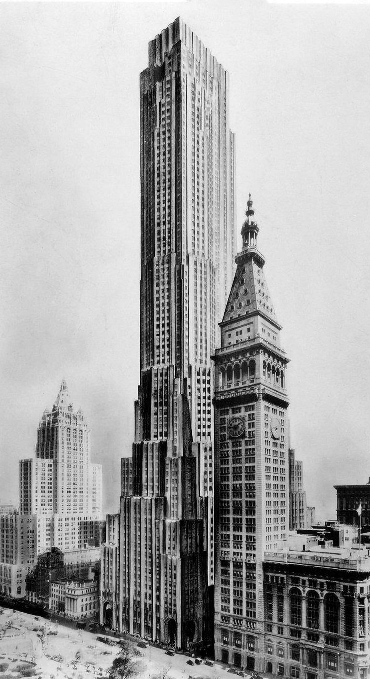
The best-laid plans of mice and men oft go astray. This quote pretty much sums up the story of the Metropolitan Life North Building. What began as a design for the world’s tallest building ended with a bulky mid-rise building that feels too grand for its modest height. Pictured above is an illustration of the original design, located on the east side of Madison Square Park in New York City. Topping out at 100 stories tall, it would’ve been the tallest building in New York by a long shot. Then the Great Depression happened.
