Alessandro Antonelli’s Basilica of San Gaudenzio
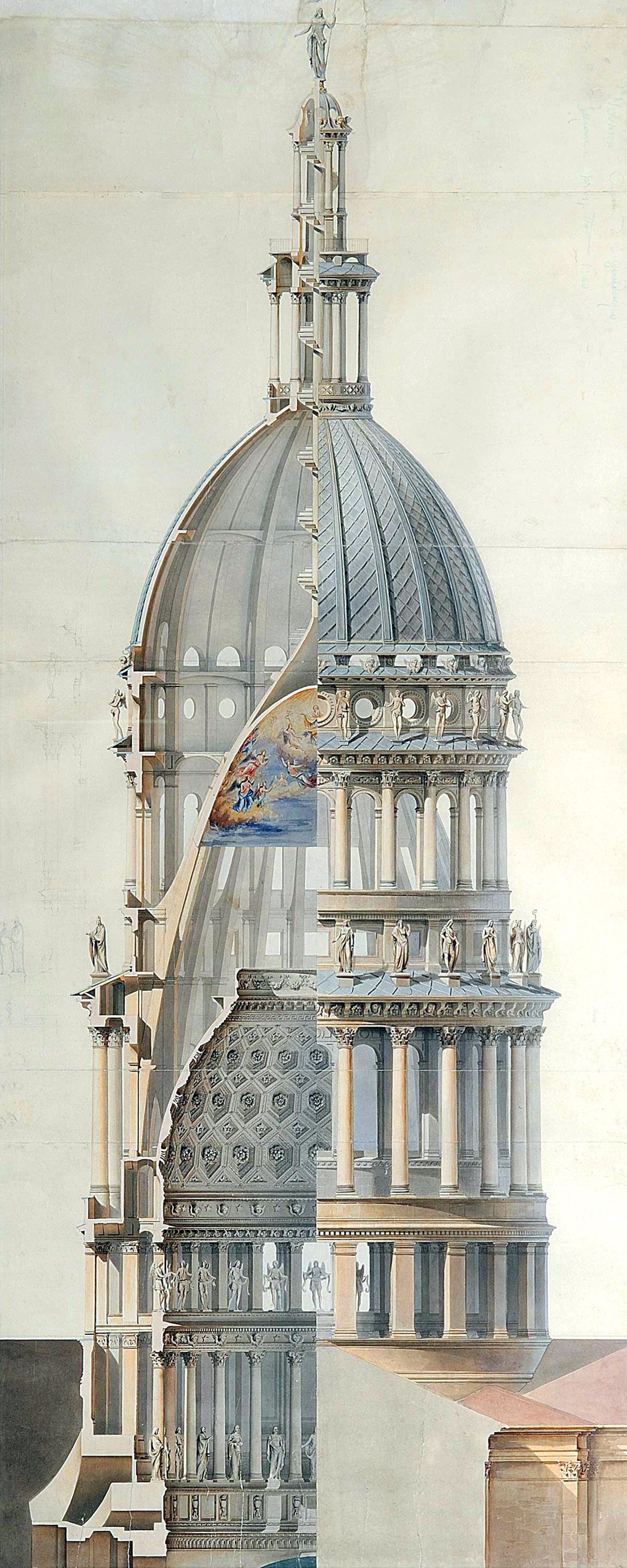
Illustration of the Basilica of San Gaudenzio from 1890, drawn by Cornaglia.
Pictured above is an elevation of the Basilica of San Gaudenzio in Novara, Italy. The building features an elaborate dome and cupola structure. This structure appears to be a typical Renaissance design on steroids, with quite a few stacked-forms below and above the dome itself. It seems over-built compared to the building it caps, and it’s overtly vertical design is a statement from the architect regarding the power of verticality.
When I first saw the drawing, I thought it was a work of satire. It feels like the architect just stacked as many levels on top of and below the dome itself without regard for proportions or context. It’s as if the architect was pushing the meaning of the monumental dome to it’s breaking point. I’ve previously written about monumental domes and how they represent a version of heaven on earth. The original evolution of the dome was borne out of a human need to reconstruct the heavens here on earth. San Gaudenzio’s design places the dome as high as possible, thus putting as much distance between itself and the earth as possible. This stretches the connection between heaven and earth.
This strategy distills the interior experience by maximizing the distance between the user and the dome. It has a more effective result on the exterior experience, however. The dome and the cupola rise high above the city, creating a tall and slender landmark that is visible for miles around. I suspect this was the main driver behind the design process. The architect wanted to build the tallest building possible while using the standard architectural forms of the day. The result is an awkward and very tall building that carries with it an idiosyncratic charm. I find it fascinating that a building such as this actually got built.
If we look closer at the design process, we find an architect wrestling with verticality and the human experience of it. Pictured below is a section of an earlier design for the building by its architect Alessandro Antonelli. This drawing gives us a few more clues as to his intentions. He was designing an elaborate series of interior dome structures, meant to layer on top of one another in order to create an optical illusion from below. This illusion represents the human world-view of verticality.
Cross-section of the dome and cupola for the Basilica of San Gaudenzio, drawn by Alessandro Antonelli. This was a proposal for the interior structure of the dome, which wasn’t built.
The lowest interior dome structure features deep coffers and a wide oculus. This was a reference to the human world, and it takes a strong influence from the Pantheon dome in Rome. The Pantheon’s oculus was open to the sky, however, which was meant to connect the actual heavens to the earth. Antonelli builds on this concept and inserts the Christian narrative by building a second dome above the first, meant to be viewed through the first dome. This parabolic dome would be painted with a heavenly scene, and when viewed through the lower dome it would appear as if Heaven was directly visible from inside the building. Antonelli essentially took concepts from the Pantheon and overlaid the Christian narrative on top of them. This pairing of domes and the required sight-lines from below could explain the need for such a tall and slender cupola structure. If it was lower, it would be difficult to properly fit in so much vertical layering.
Unfortunately, the parabolic dome was never built. The vertical proportions of the dome and cupola were, however. The result is the structure pictured above. An over-scaled vertical dome and cupola without the interior structures it was most likely meant to house. It’s an intriguing and oft-overlooked example of an architect wrestling with verticality while working within the architectural vocabulary of his time. He accomplished what he needed to from the exterior, but the interior was never finished to his original vision.
Check out other posts about architecture and verticality here.


