Welcome to On Verticality. This blog explores the innate human need to escape the surface of the earth, and our struggles to do so throughout history. If you’re new here, a good place to start is the Theory of Verticality section or the Introduction to Verticality. If you want to receive updates on what’s new with the blog, you can use the Subscribe page to sign up. Thanks for visiting!
Click to filter posts by the three main subjects for the blog : Architecture, Flight and Mountains.

Introduction to Verticality
Ever since humans descended from the trees and out onto the savannah, we’ve gazed upward in wonder at the sky and the stars. Until fairly recently in our history, this space above our heads was a mystery. Our ancestors would witness the diurnal movements of the Sun and the Moon, and the brilliance of a glowing sunrise or sunset. The clouds would drop water and thundering bolts of light and energy. At night, they would witness a spectacular tapestry of light-emitting dots, and connect them into elaborate shapes. The sky has been a continual source of wonder throughout our history, and we’ve spent countless hours thinking about the world we see above our heads.
The Need to Build on High
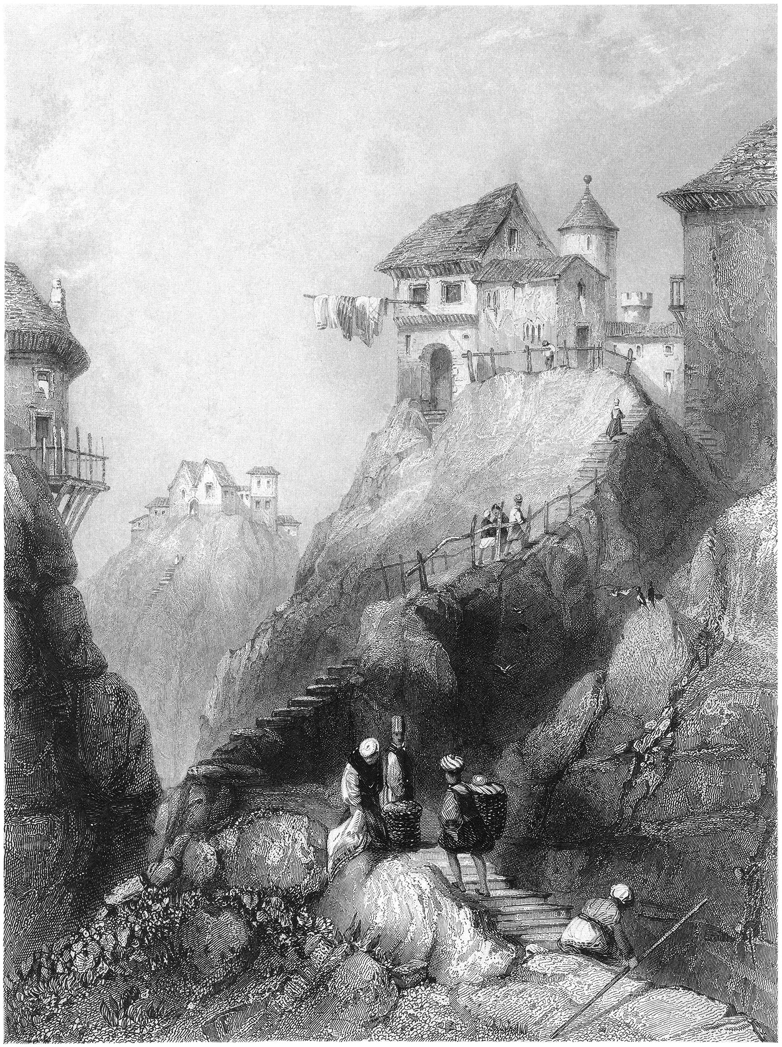
There’s a need among humans to occupy and build on the highest places around. These places act like magnets for anyone living around them. There are many reasons for this, but they all boil down to verticality. Occupying or building on a high place means you’ve done battle with gravity, and you’ve won.
Nat Lowell and the Tip of Manhattan
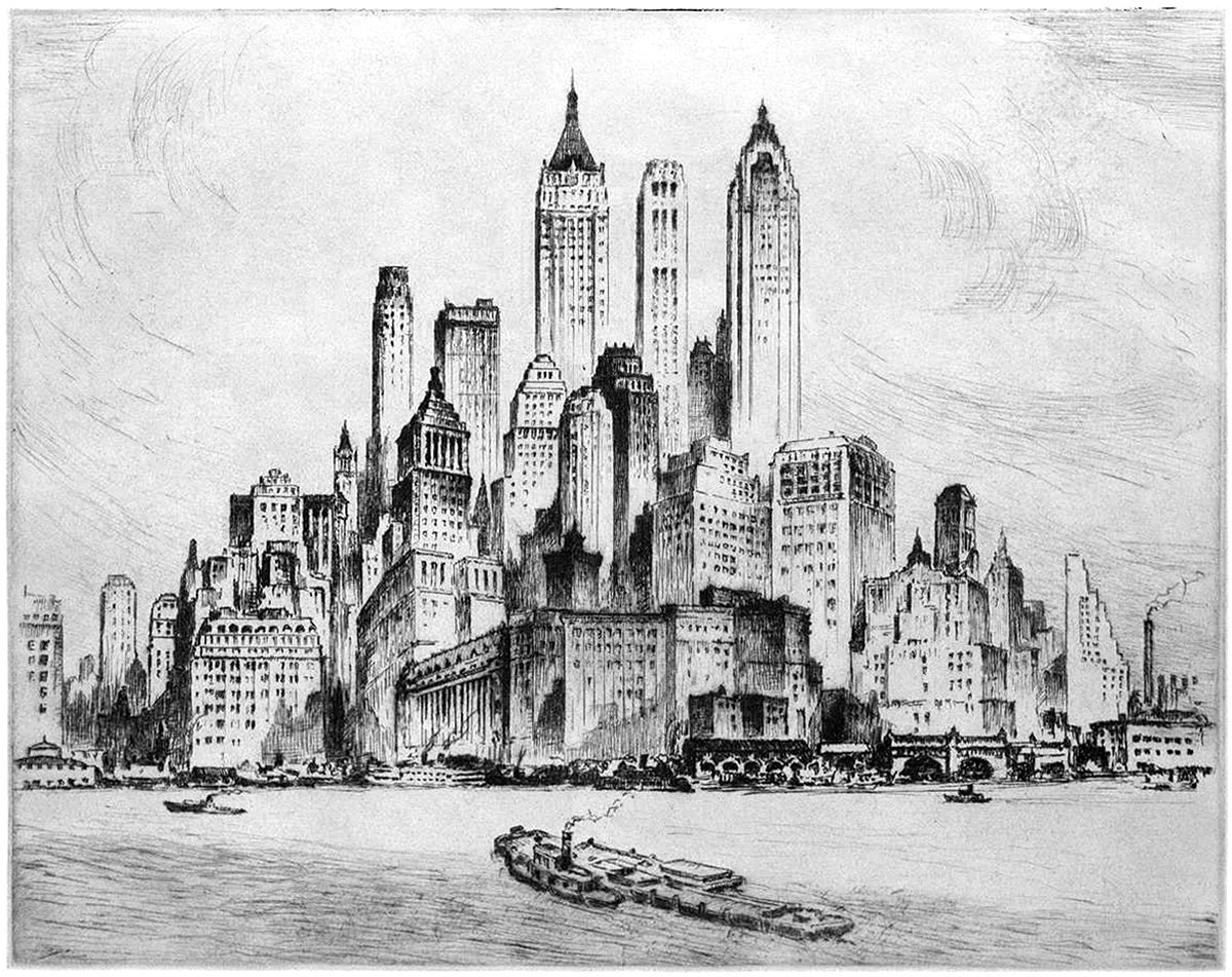
Pictured here is an etching by artist Nat Lowell, showing the southern tip of Manhattan, circa 1940. The perspective is from the harbor, and Lowell focuses on three towers, which are the tallest of the bunch. From left to right, they include 40 Wall Street, 20 Exchange Place, and 70 Pine Street. The composition isn’t literal, and Lowell has taken some liberties to arrange the buildings into a mountain of sorts, with the three aforementioned towers at the summit.
Lamb and Seddon’s Imperial Monumental Tower at Westminster
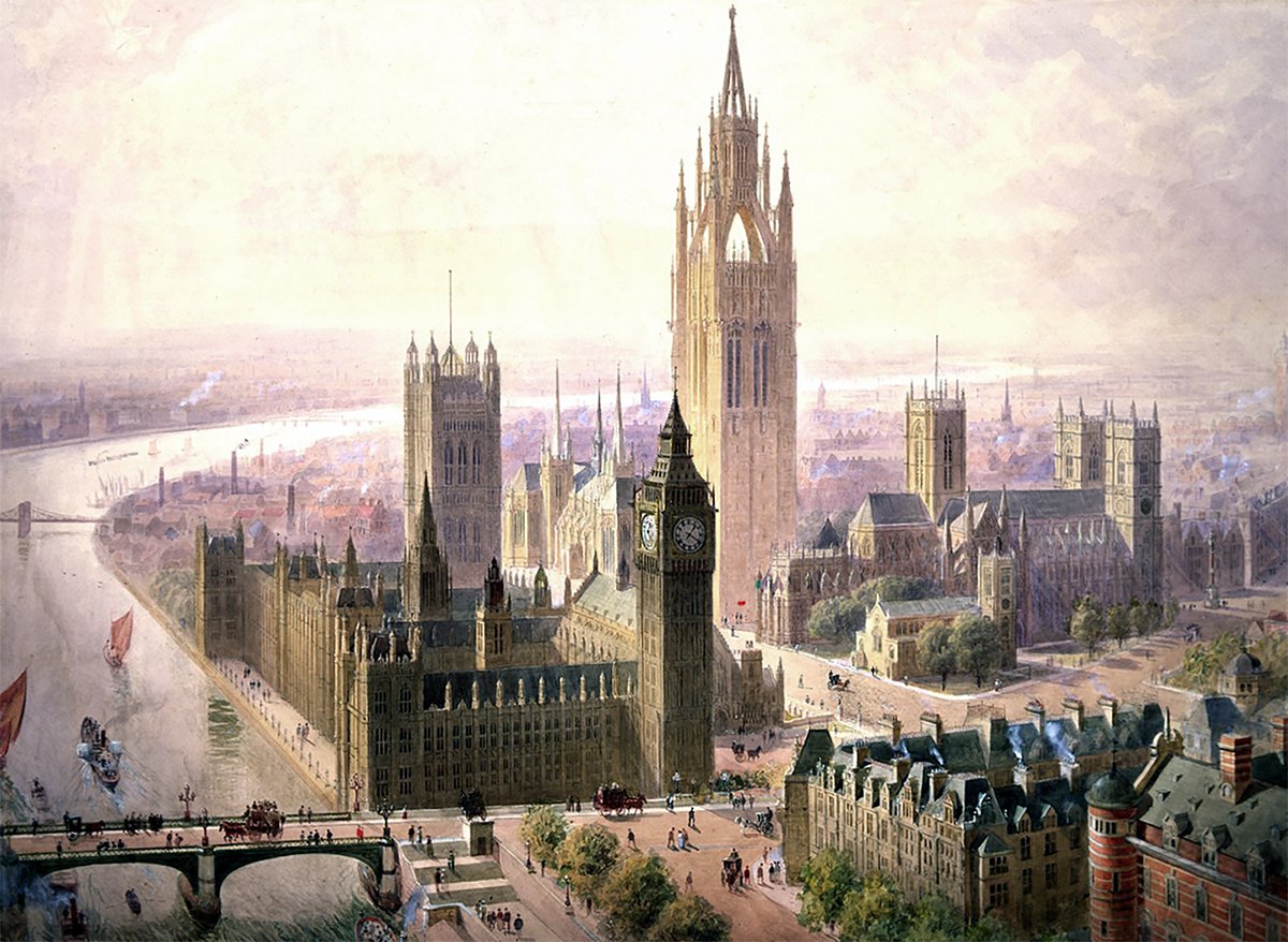
Pictured above is a 1904 proposal for an Imperial Monumental Hall and Tower in London. It was proposed by architects Edward Beckitt Lamb and John Pollard Seddon. The main feature of the proposal was a 167 meter (548 foot) Gothic tower, which dominates the entire site and its surroundings. It’s an ambitious proposal, and it uses verticality to elevate the monumentality of the site in three ways.
Alternate Realities : The Washington Monument
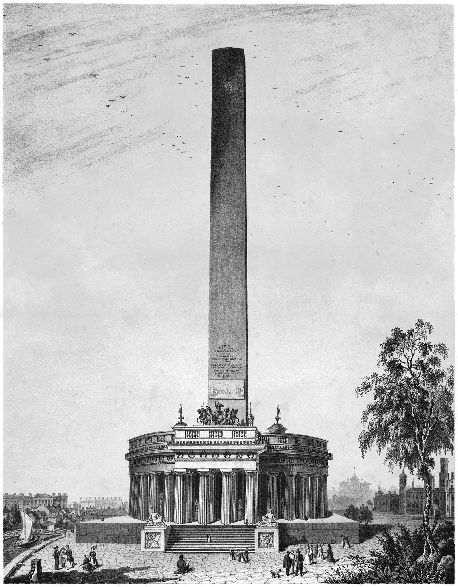
Pictured above is a proposal for the Washington Monument, designed by Robert Mills sometime around 1845. It was the winning entry of a design competition established in 1835 by the Washington National Monument Society. This design is the second of three structures that Robert Mills proposed or built for a monument to G.W., and each is based on verticality in some way.
The Origin of the Obelisk
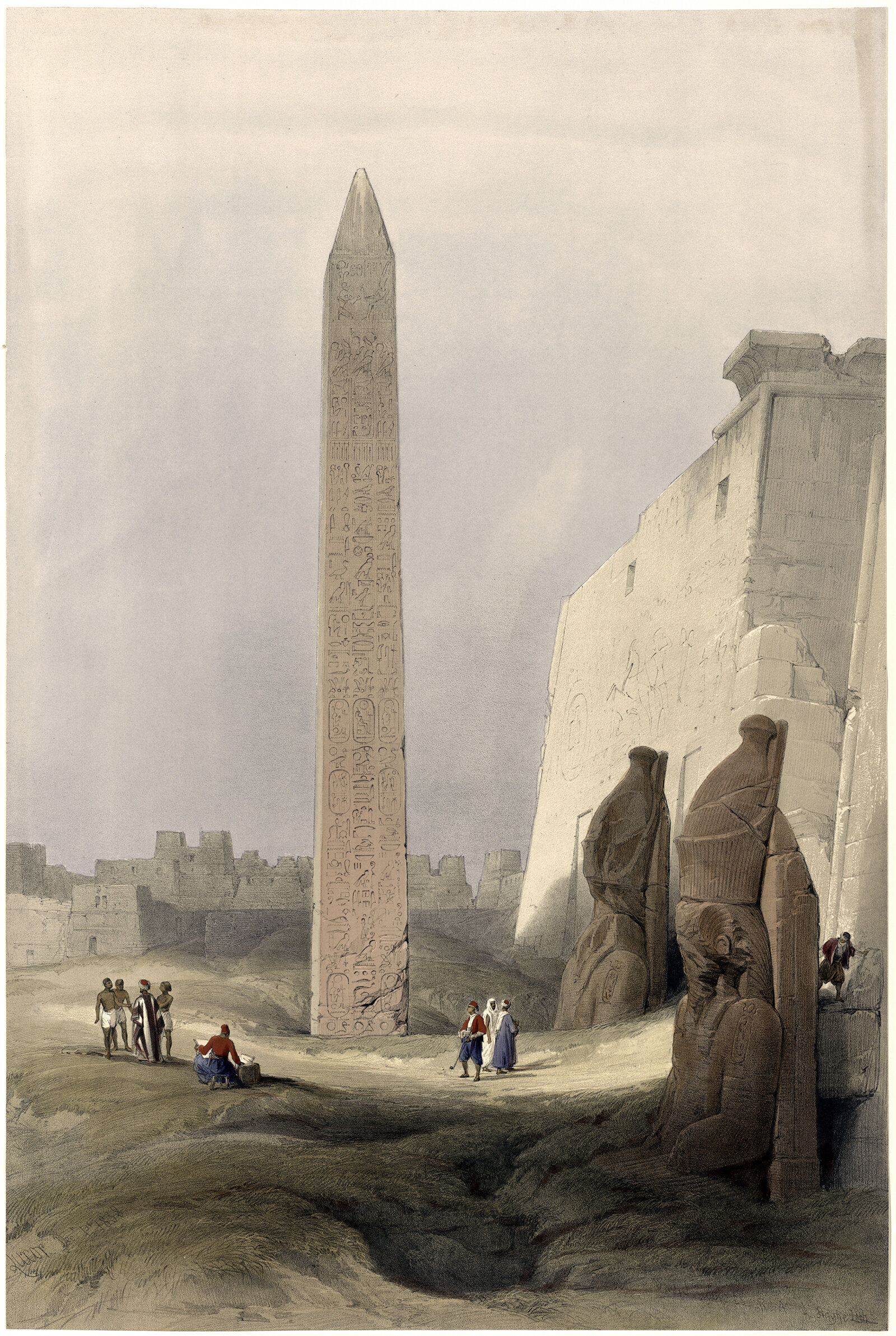
I was recently on a trip to Washington DC, and I went for a run on the National Mall. The centerpiece of the entire complex is the Washington Monument, which is a 169 m (555 ft) stone-faced obelisk. The monument is strikingly simple and quite effective at announcing its presence to the surrounding area. It got me thinking about the obelisk form, and how it’s meaning has changed over the centuries. What was once an integral part of a temple complex has become a singular expression of verticality.
Alternate Realities : A Colossal Hotel at the Eiffel Tower
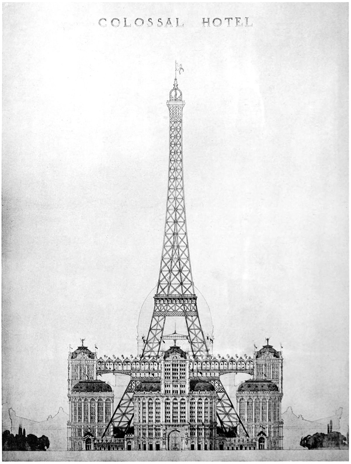
Pictured here is a proposal to put a colossal hotel at the base of the Eiffel Tower. It was proposed as part of the 1900 World’s Fair, called the Exposition Universelle, but it never got built. This elevation is the only drawing we have, which makes sense because most people who see the drawing would dismiss it immediately. The idea of filling up the void under the structure would destroy much of the Eiffel’s charm.
Calvin Pollard’s Proposal for the Washington Monument
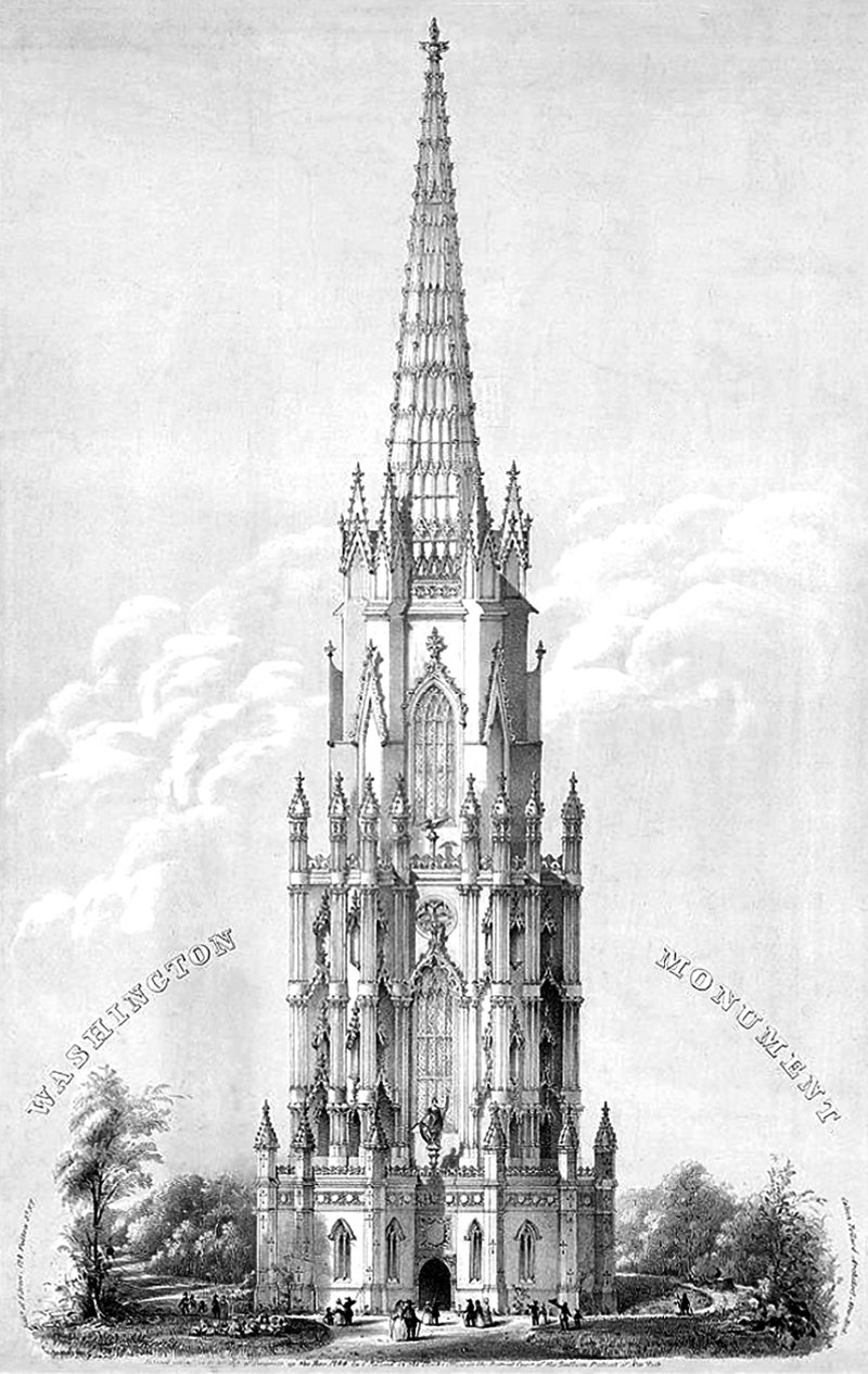
Daniel Burnham once said, make no small plans. This is especially true in New York City, and the proposal pictured above fits right into both these molds. It’s a proposal for a monument to George Washington, and it would’ve dwarfed the height of the next tallest building in the city at the time (and also the tallest building in the world), Trinity Church.
The Singer Building and the Power of Nostalgia
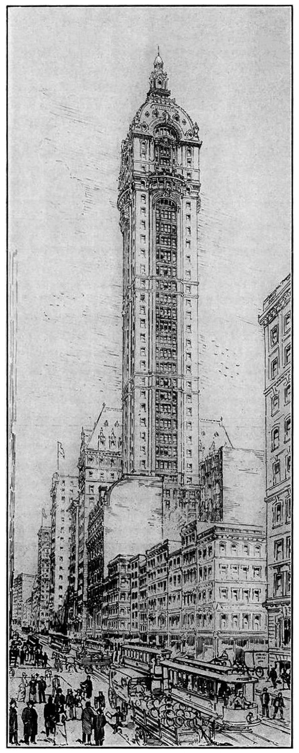
The Story of the Singer Building is a dark patch in the history of New York Architecture. It was the world’s tallest building when it was built, and just 50 years later it was the world’s tallest building to be demolished by it’s owner. This demolition coincided with a period of change in American cities, and it serves as a cautionary tale when compared to other, very similar buildings nearby.
The Mole Littoria Project
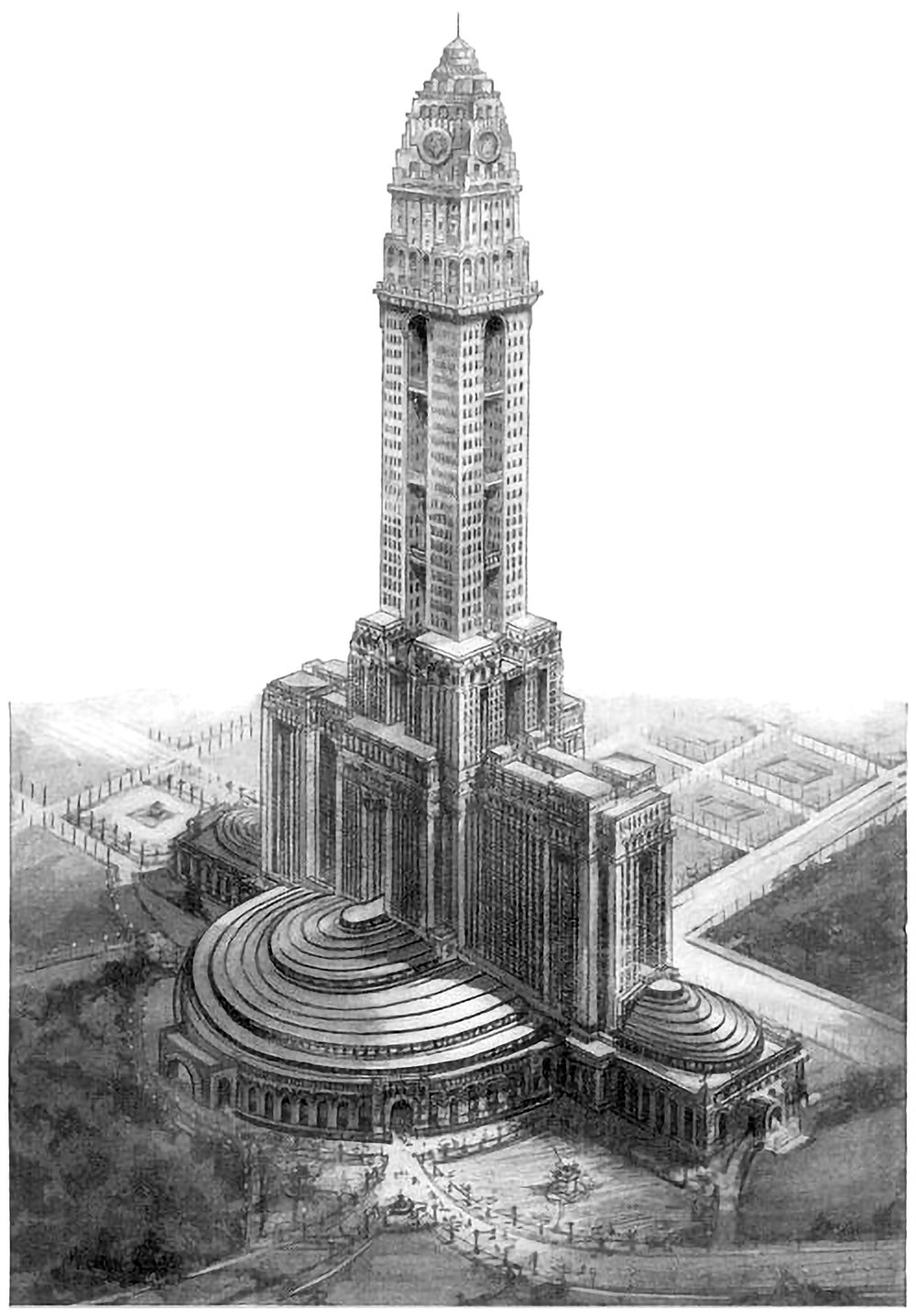
Constructing the world’s tallest building is an act of politics just as much as an act of engineering. It’s a statement of accomplishment and power by all those involved. Paul Goldberger once wrote that you don’t build [the world’s tallest] skyscraper to house people, or to give tourists a view, or even, necessarily, to make a profit. You do it to make sure the world knows who you are. Pictured above is one example of this. It’s a 1924 proposal for the world’s tallest building, to be built in Rome. It was designed by Mario Palanti, who was an Italian architect who made his name in South America, and he proposed his design to Benito Mussolini, who enthusiastically approved the project.
Skyscrapers of Philadelphia
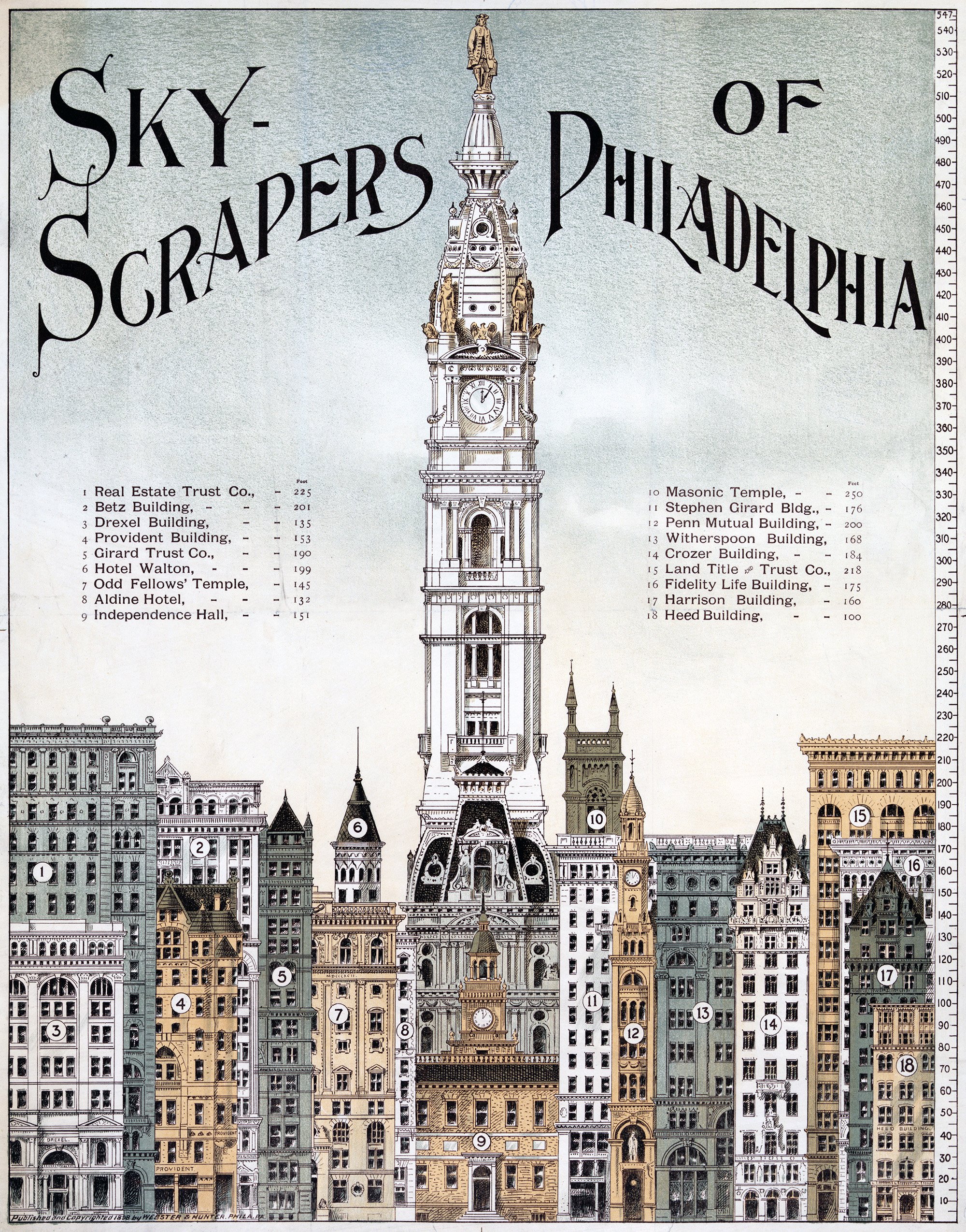
The illustration above shows a lineup of tall buildings from 1898 in Philadelphia. All of them are of similar height, save for the City Hall Clock Tower. It stands alone, rising to a height of 548 feet, or 167 meters. It was the tallest building in the world when it was completed in 1894, and remained so until the completion of the Singer Building in New York in 1908. This status as the world’s tallest building is reinforced by the illustration, which shows it utterly dominating the other buildings in the city.
Eiffel as his Tower
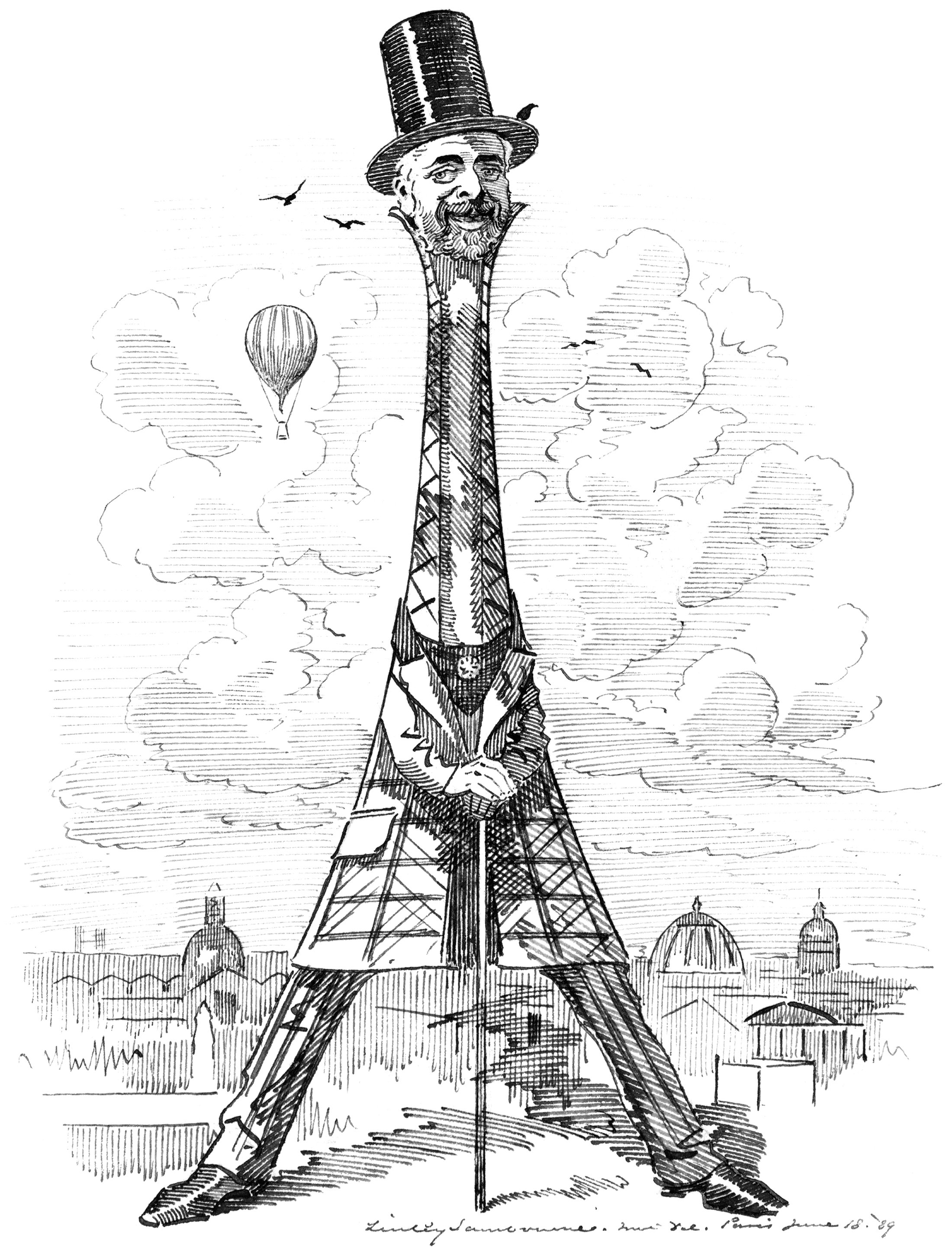
Our buildings reflect our values and needs. This is especially true of our tall buildings, because they cost so much to build. When the Eiffel Tower was built in Paris, it reflected a worldwide drive for height in our buildings that was emerging at the time. It was a such a powerful statement of verticality that the man who designed it became something of a celebrity. He became linked with the tower in the eyes of the public, so much so that it was named after him like one of his children. This rarely happens with a building, but it demonstrates just how big an impact the Eiffel Tower had on the world.
How You May Live and Travel in the City of 1950
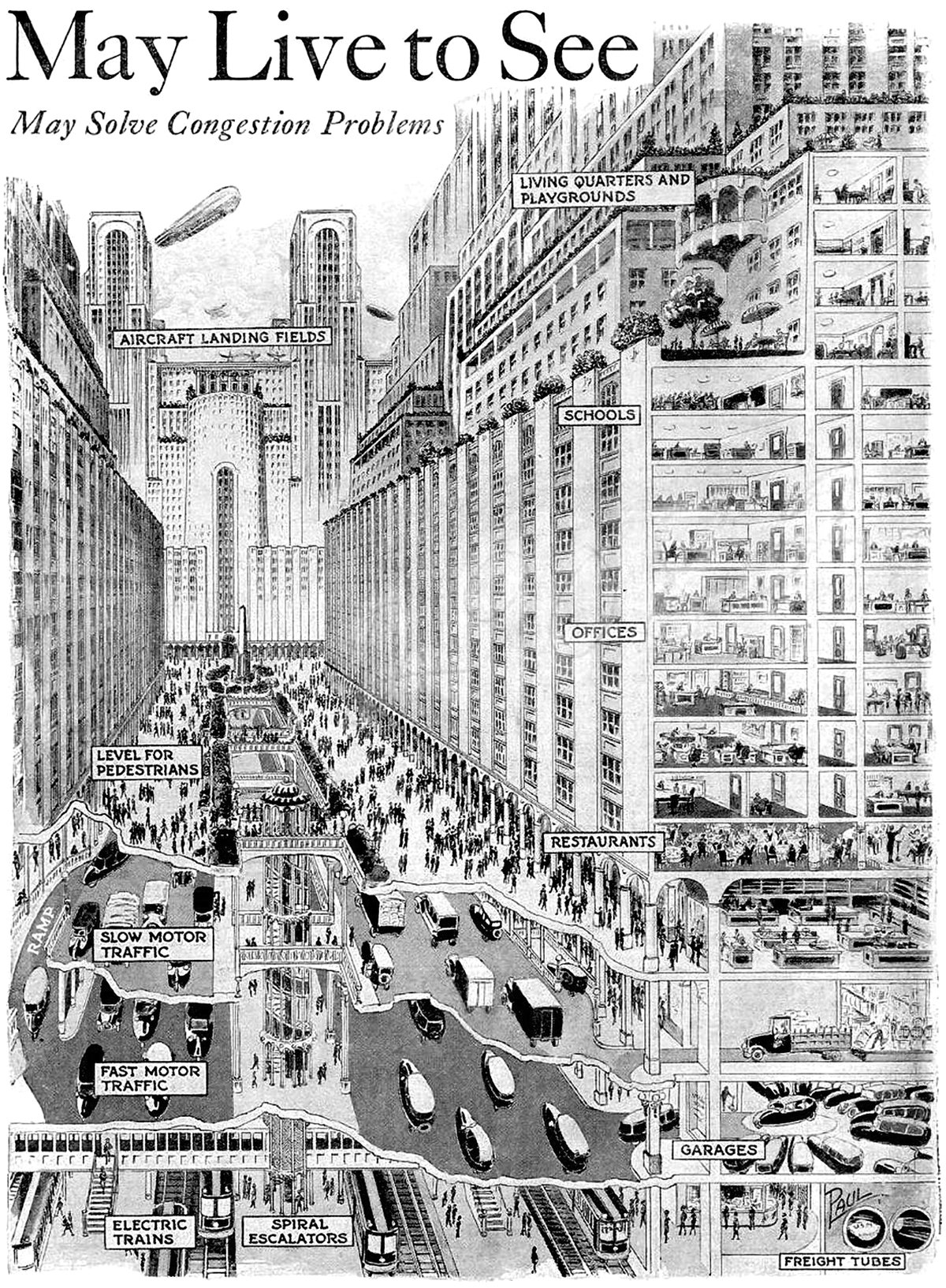
Pictured above is a vision for a future city from 1925, which predicted what cities would look like in 1950. It’s quite an ambitious proposal, since it required sweeping urban changes to occur in only 25 years. The changes feature a vertical separation of city functions that start below the ground and end on top of skyscrapers.
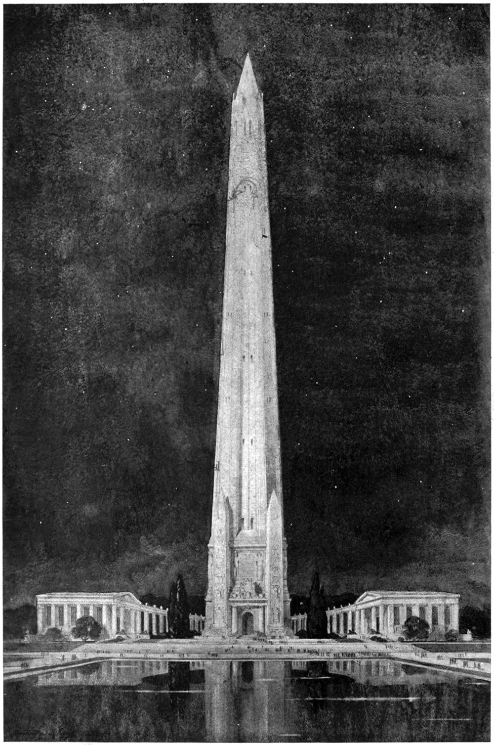
A Design for a National Memorial
Monuments and memorials are tricky beasts to design. Unlike a normal building, they’re imbued with meaning and symbolism that can be highly subjective. They’re not just buildings, but repositories for history and memory. This means they carry responsibilities to the person or event they are meant to symbolize. That’s what makes the above illustration so difficult to understand. It’s described only as Design for National Memorial. This is tough, because it doesn’t even make a claim to what it’s memorializing. One thing is clear, however; the designer was motivated by verticality.
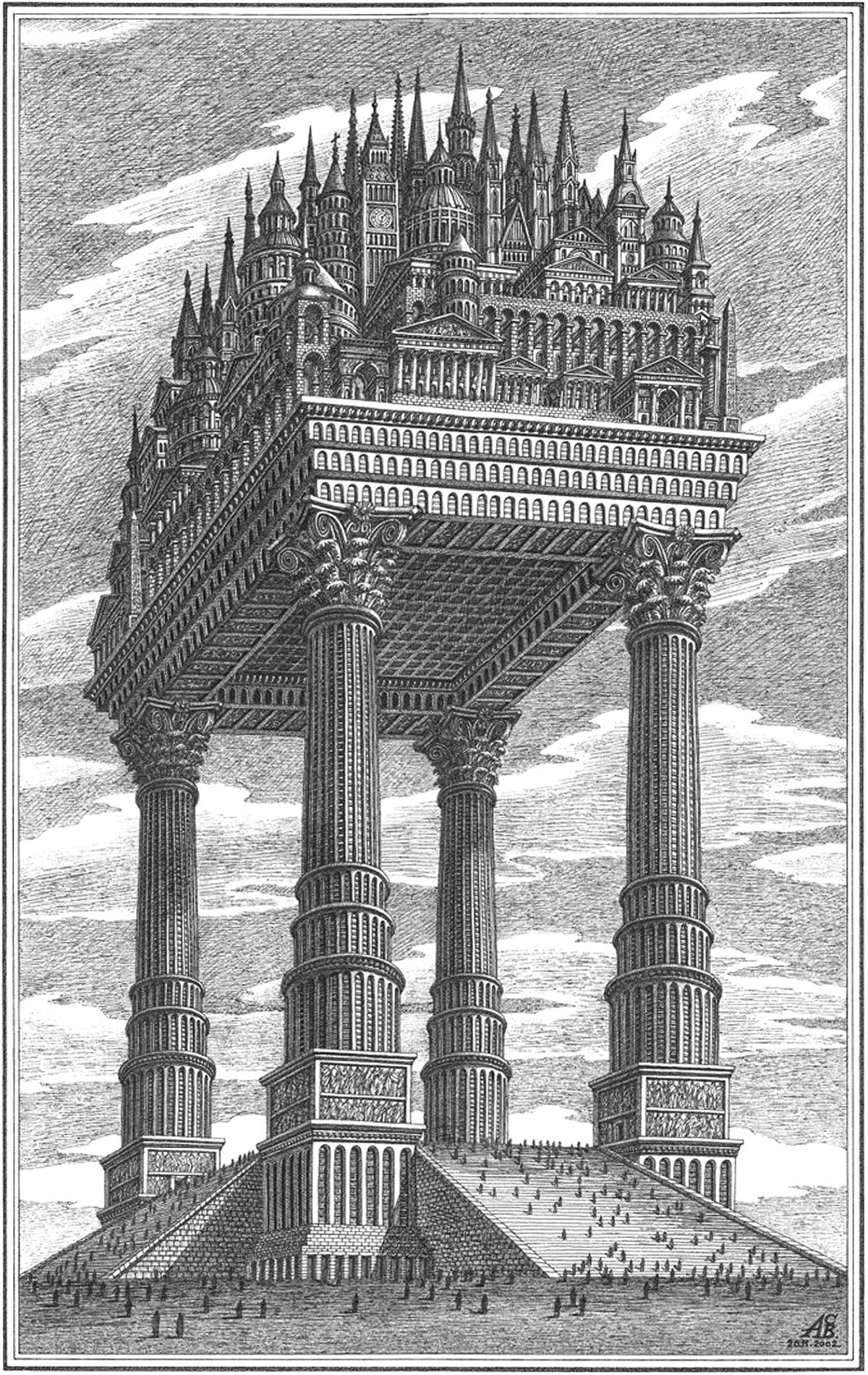
The Magic City
Pictured above is an illustration by Russian architectural theorist Arthur Skizhali-Weiss. It’s part of a series called The Magic City, which includes fictional realities dreamed up by the architect from 1999 to 2014. Apart from being an interesting composition of architectural forms, it embodies a few themes related to verticality.
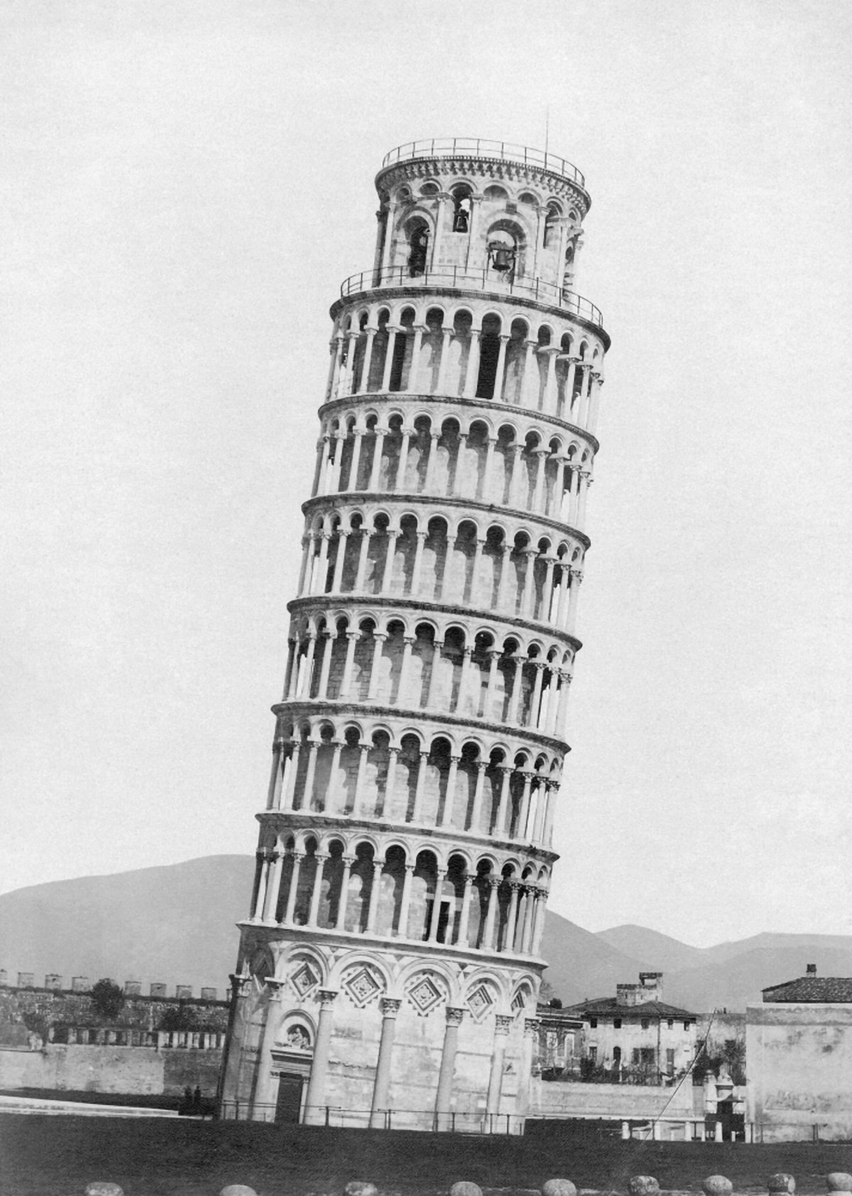
The Leaning Tower of Pisa and the Axis Mundi
Pictured here is the campanile at the Pisa Cathedral, known worldwide as the Leaning Tower of Pisa. The tower is world-famous for its iconic four-degree lean, and has become a major tourist attraction for the town of Pisa. This lean has allowed the campanile to become a symbol of the city. If you think of Pisa, you think of the Leaning Tower. This status and appeal comes from the campanile’s lack of vertical equilibrium, which forces visitors to confront the axis-mundi. It’s a unique tension that’s rooted in verticality.
Constant-Désiré Despradelle’s Beacon of Progress
He was possessed by the idea of a monument embodying the characteristics of American civilization, to be a memorial to the genius of the American people and a reminder of the glories of the Columbian Exposition in Jackson Park. These words describe the feeling of Constant-Désiré Despradelle after he visited the World’s Columbian Exposition of 1893 in Chicago. The exposition saw an entire complex of temporary buildings built in Jackson Park, only to be demolished after the fair. For Despradelle, Chicago needed a permanent monument to embody the spirit and grandeur of the fair. He set to work designing his vision, and the final result is pictured above.
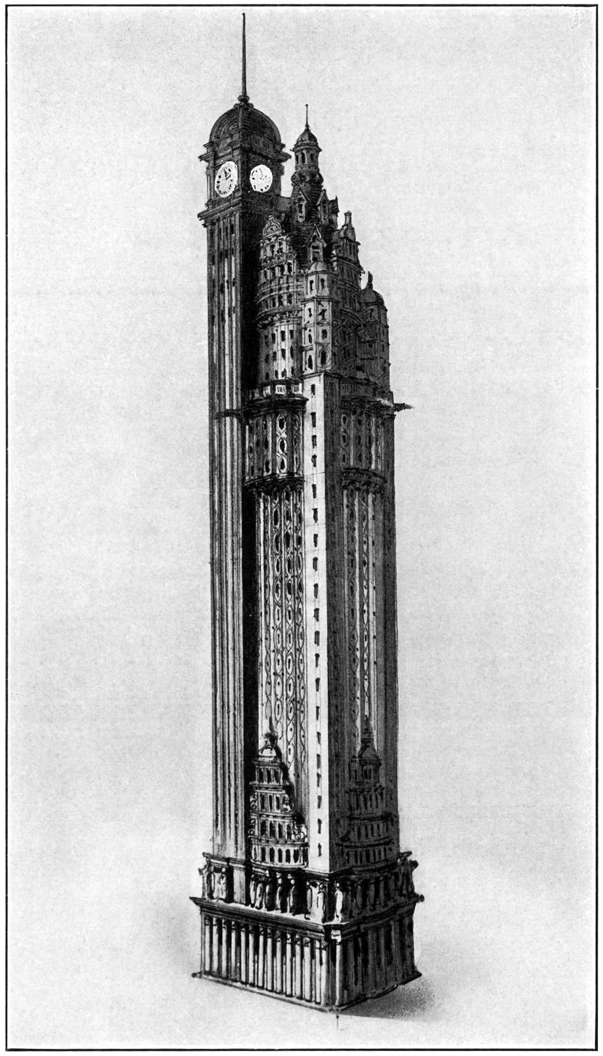
The New York American Journal Headquarters
Throughout my research into tall buildings and verticality, I’ve come across myriad examples of proposed and unbuilt structures. Some are alternate proposals by famous architects. Some are one-hit wonders that make their way into the mainstream history of skyscrapers. Some, like the one pictured above, are just intriguing and obscure images without much context. Details on this building are scarce, but from what I can find this is a proposal by Barney & Chapman Architects for the headquarters of the New York American Journal. It was located at Columbus Circle in New York City, on the site occupied by the Museum of Arts and Design today.
The Proctor Steel Tower
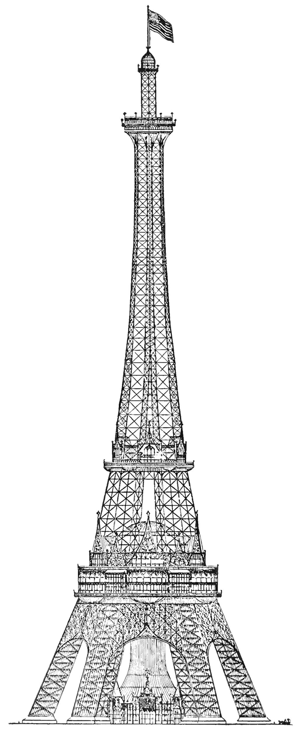
When the Eiffel Tower was completed for the 1889 World’s Fair in Paris, the world took notice. France had constructed the world’s tallest structure, and it immediately became the envy of the world. The next World’s Fair would take place in Chicago in 1893, and the organizers wanted to take the opportunity to out-do the Eiffel Tower with their own structure. The most successful proposal was the Proctor Tower, which is pictured above. It was 335 meters (1,100 feet) tall, which is roughly 12 meters (40 feet) taller than the Eiffel Tower.
Skyscrapers of To-morrow
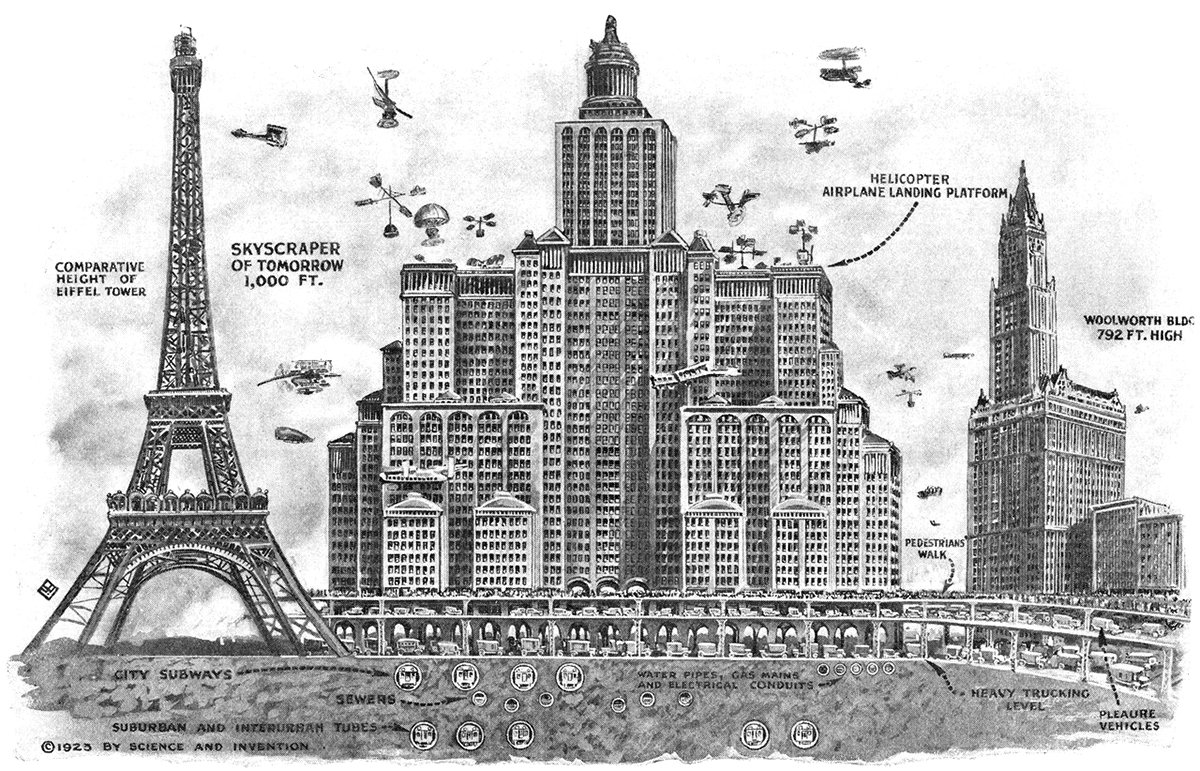
Pictured above is a 1923 illustration showing Harvey Wiley Corbett’s idea for a future skyscraper. Corbett believed buildings would continue to get taller and wider, resulting in massive, slab-like structures with aircraft landing platforms on their roofs and multiple underground levels of traffic. He compares his concept with two iconic buildings of the time, the Eiffel Tower and the Woolworth Building. These were both the tallest in the world when completed, which really hits home the sheer scale of Corbett’s structure.
