Welcome to On Verticality. This blog explores the innate human need to escape the surface of the earth, and our struggles to do so throughout history. If you’re new here, a good place to start is the Theory of Verticality section or the Introduction to Verticality. If you want to receive updates on what’s new with the blog, you can use the Subscribe page to sign up. Thanks for visiting!
Click to filter posts by the three main subjects for the blog : Architecture, Flight and Mountains.
Nat Lowell and the Tip of Manhattan
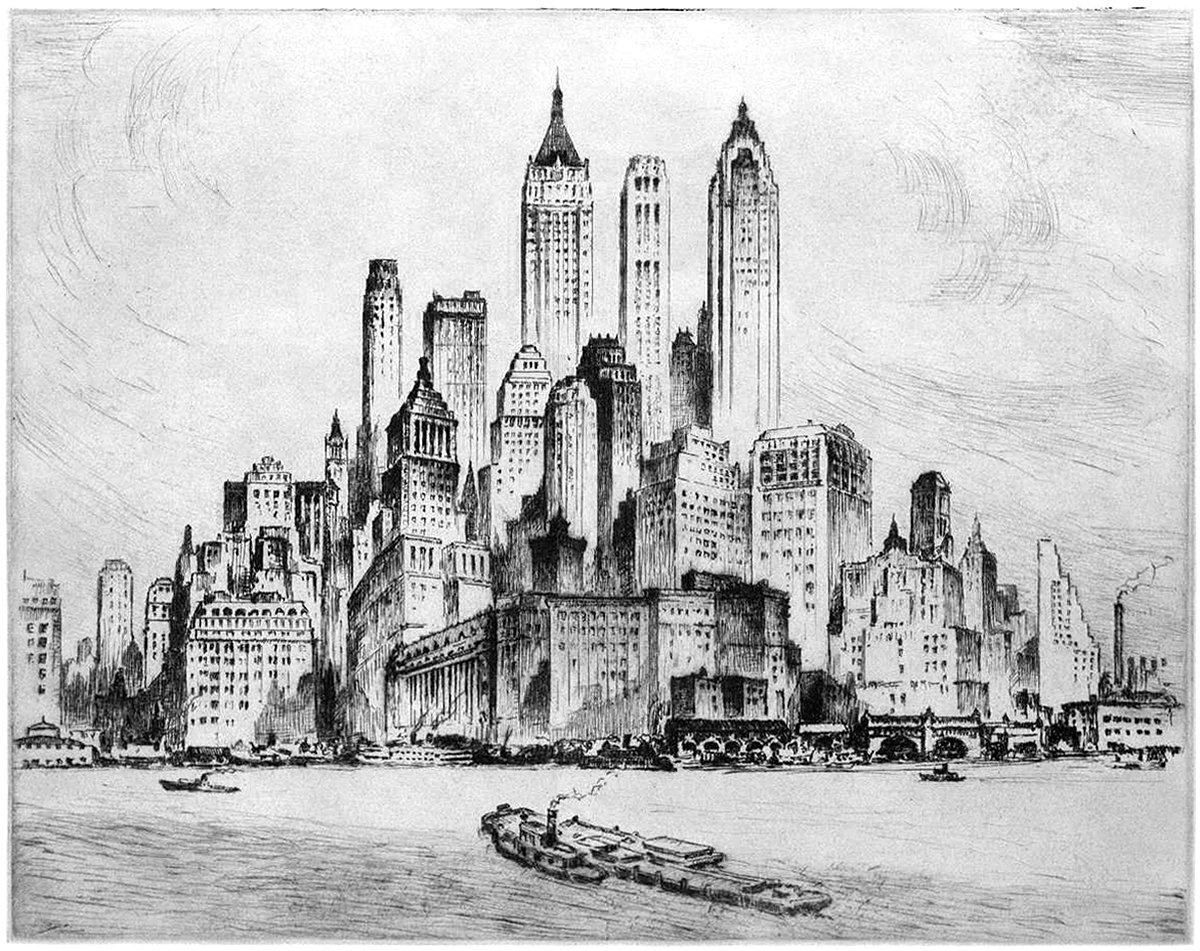
Pictured here is an etching by artist Nat Lowell, showing the southern tip of Manhattan, circa 1940. The perspective is from the harbor, and Lowell focuses on three towers, which are the tallest of the bunch. From left to right, they include 40 Wall Street, 20 Exchange Place, and 70 Pine Street. The composition isn’t literal, and Lowell has taken some liberties to arrange the buildings into a mountain of sorts, with the three aforementioned towers at the summit.
The Singer Building and the Power of Nostalgia
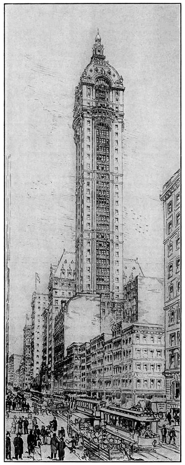
The Story of the Singer Building is a dark patch in the history of New York Architecture. It was the world’s tallest building when it was built, and just 50 years later it was the world’s tallest building to be demolished by it’s owner. This demolition coincided with a period of change in American cities, and it serves as a cautionary tale when compared to other, very similar buildings nearby.
The Mole Littoria Project
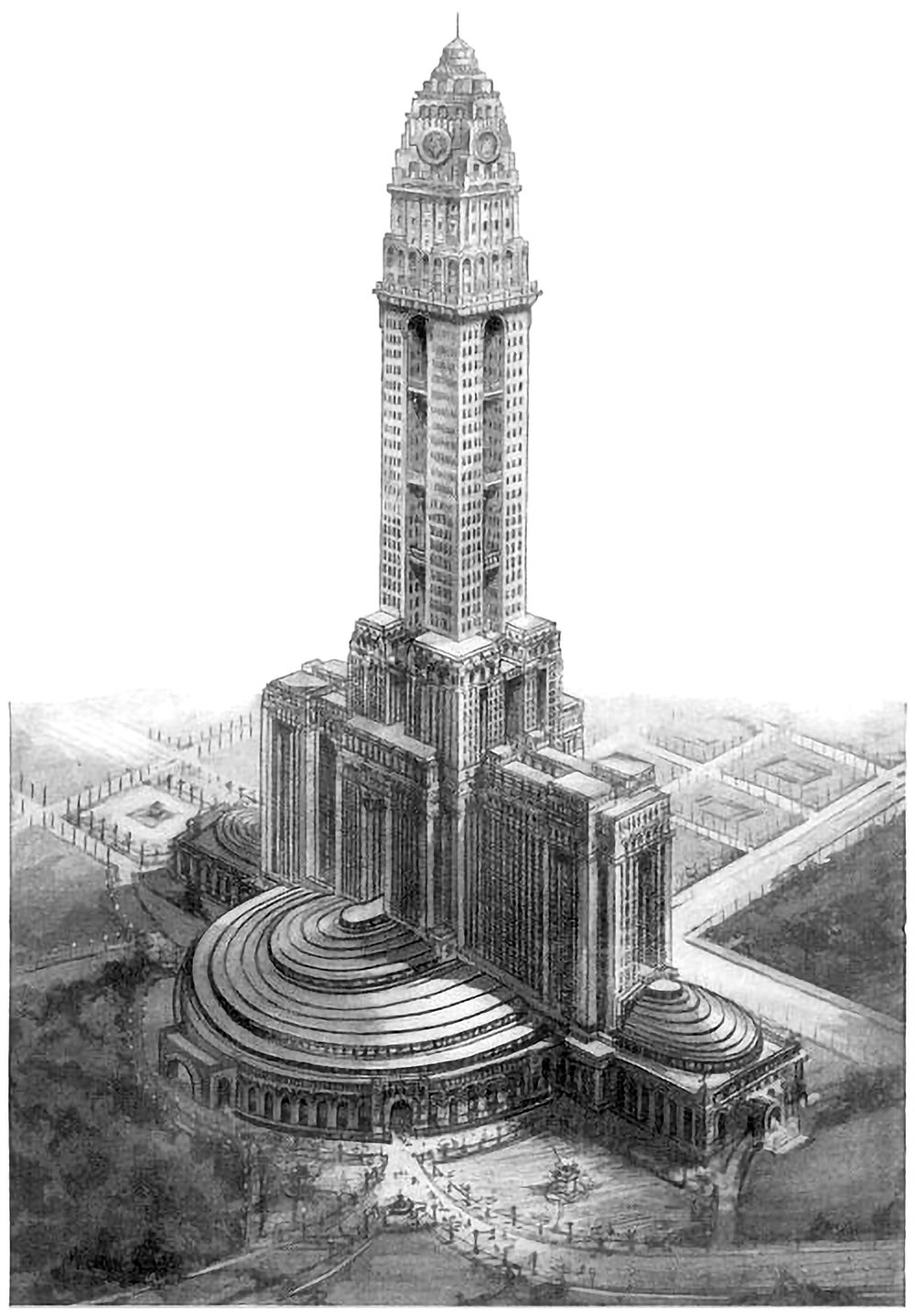
Constructing the world’s tallest building is an act of politics just as much as an act of engineering. It’s a statement of accomplishment and power by all those involved. Paul Goldberger once wrote that you don’t build [the world’s tallest] skyscraper to house people, or to give tourists a view, or even, necessarily, to make a profit. You do it to make sure the world knows who you are. Pictured above is one example of this. It’s a 1924 proposal for the world’s tallest building, to be built in Rome. It was designed by Mario Palanti, who was an Italian architect who made his name in South America, and he proposed his design to Benito Mussolini, who enthusiastically approved the project.
Skyscrapers of Philadelphia
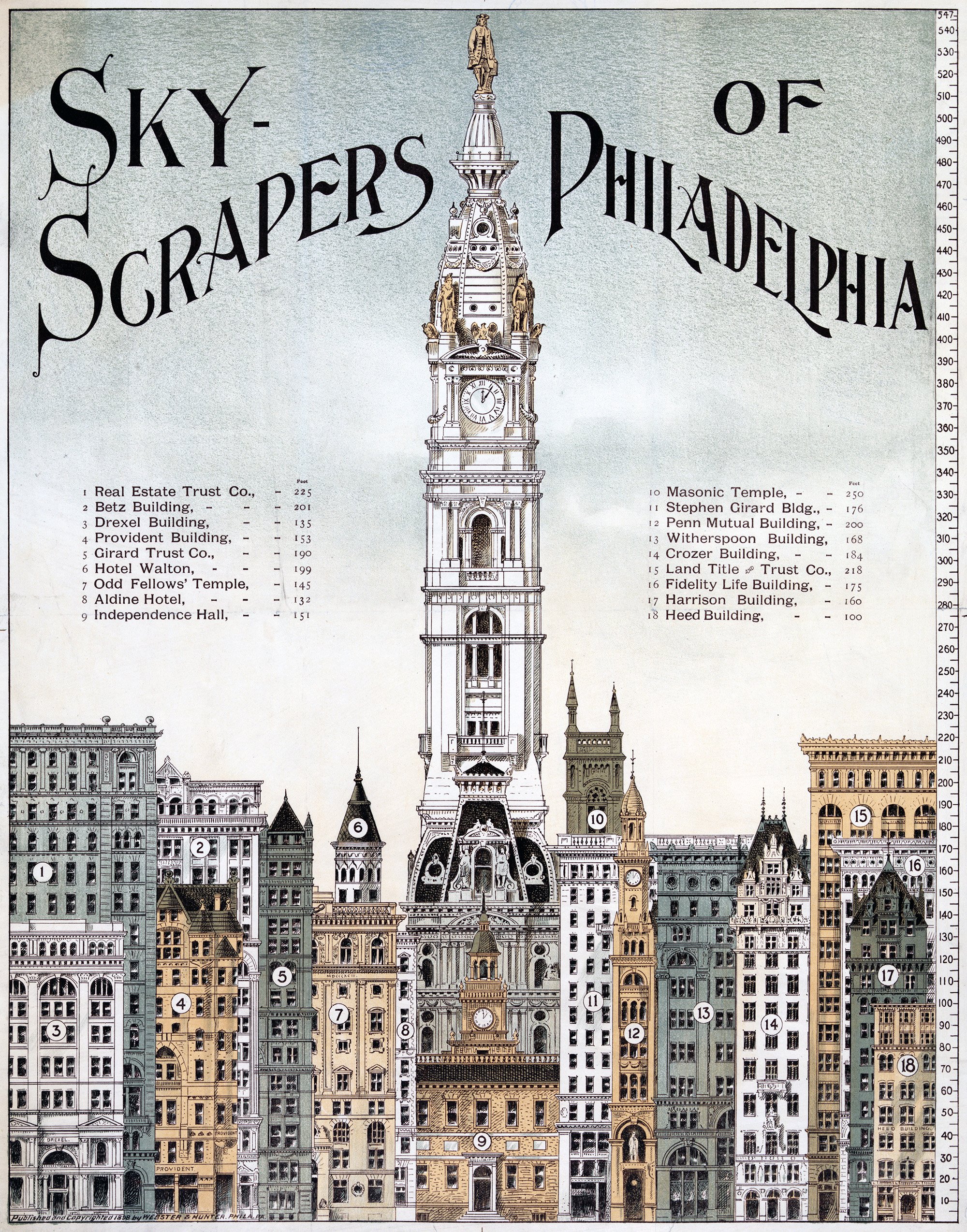
The illustration above shows a lineup of tall buildings from 1898 in Philadelphia. All of them are of similar height, save for the City Hall Clock Tower. It stands alone, rising to a height of 548 feet, or 167 meters. It was the tallest building in the world when it was completed in 1894, and remained so until the completion of the Singer Building in New York in 1908. This status as the world’s tallest building is reinforced by the illustration, which shows it utterly dominating the other buildings in the city.
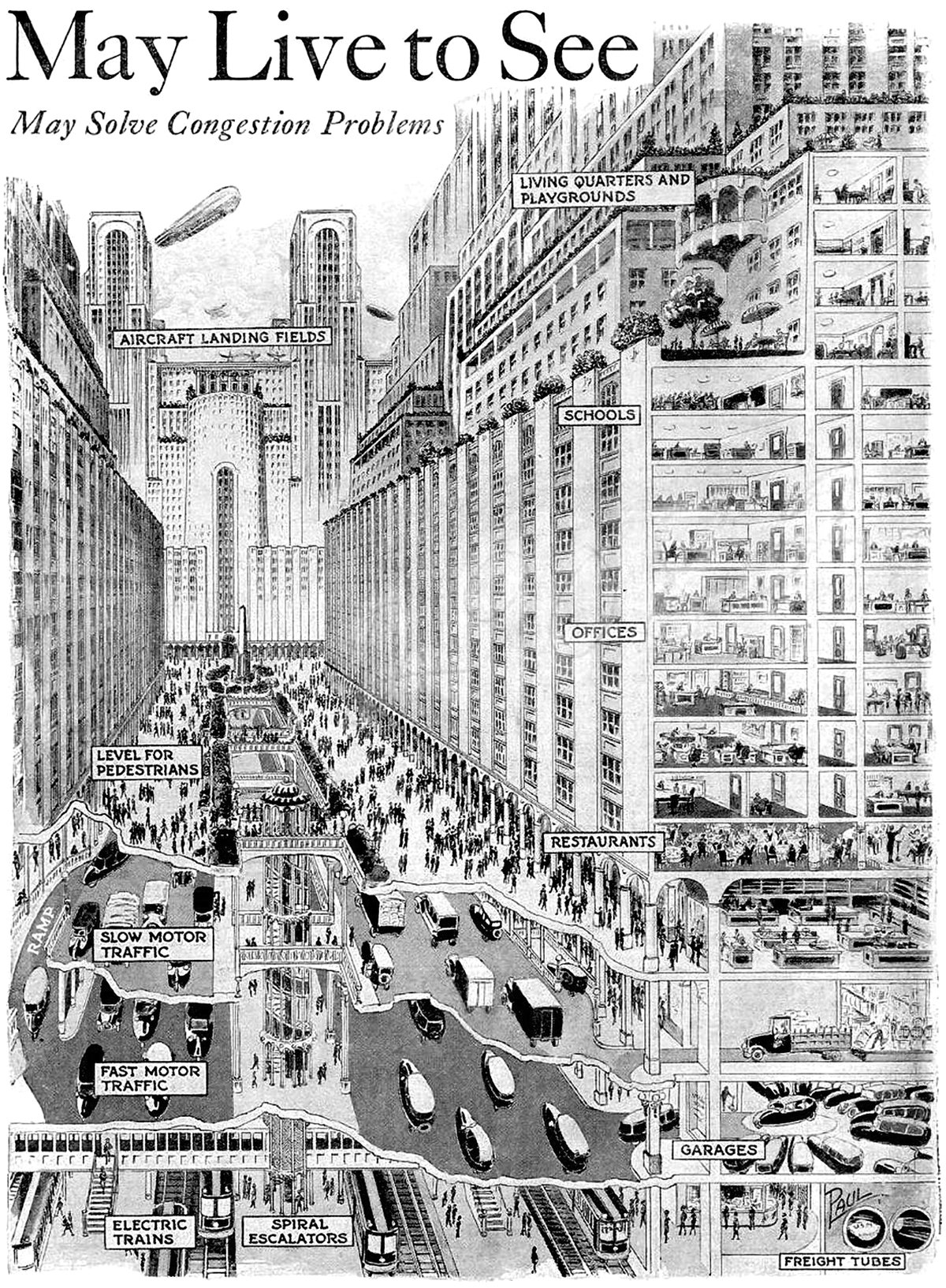
How You May Live and Travel in the City of 1950
Pictured above is a vision for a future city from 1925, which predicted what cities would look like in 1950. It’s quite an ambitious proposal, since it required sweeping urban changes to occur in only 25 years. The changes feature a vertical separation of city functions that start below the ground and end on top of skyscrapers.
Constant-Désiré Despradelle’s Beacon of Progress
He was possessed by the idea of a monument embodying the characteristics of American civilization, to be a memorial to the genius of the American people and a reminder of the glories of the Columbian Exposition in Jackson Park. These words describe the feeling of Constant-Désiré Despradelle after he visited the World’s Columbian Exposition of 1893 in Chicago. The exposition saw an entire complex of temporary buildings built in Jackson Park, only to be demolished after the fair. For Despradelle, Chicago needed a permanent monument to embody the spirit and grandeur of the fair. He set to work designing his vision, and the final result is pictured above.
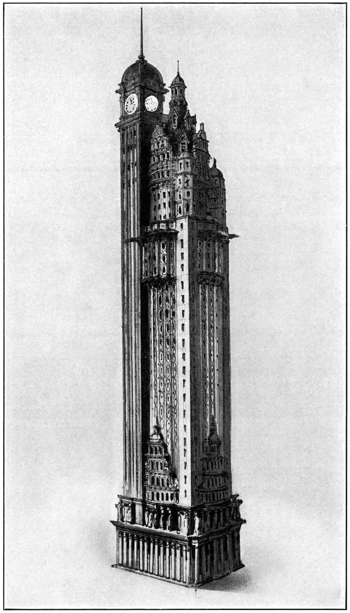
The New York American Journal Headquarters
Throughout my research into tall buildings and verticality, I’ve come across myriad examples of proposed and unbuilt structures. Some are alternate proposals by famous architects. Some are one-hit wonders that make their way into the mainstream history of skyscrapers. Some, like the one pictured above, are just intriguing and obscure images without much context. Details on this building are scarce, but from what I can find this is a proposal by Barney & Chapman Architects for the headquarters of the New York American Journal. It was located at Columbus Circle in New York City, on the site occupied by the Museum of Arts and Design today.
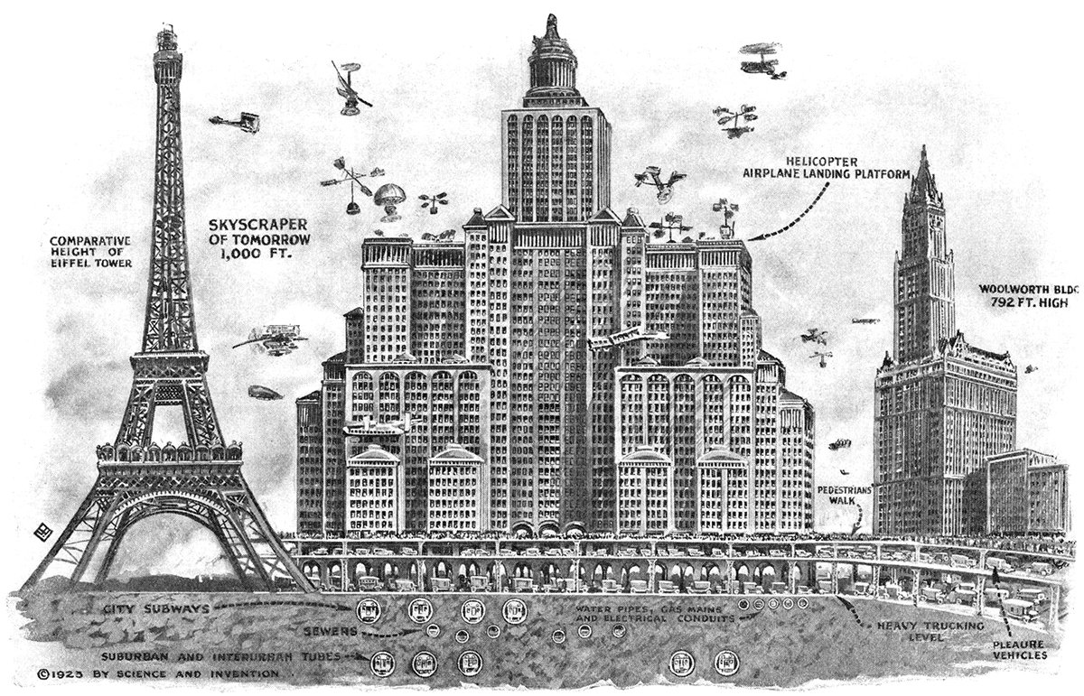
Skyscrapers of To-morrow
Pictured above is a 1923 illustration showing Harvey Wiley Corbett’s idea for a future skyscraper. Corbett believed buildings would continue to get taller and wider, resulting in massive, slab-like structures with aircraft landing platforms on their roofs and multiple underground levels of traffic. He compares his concept with two iconic buildings of the time, the Eiffel Tower and the Woolworth Building. These were both the tallest in the world when completed, which really hits home the sheer scale of Corbett’s structure.
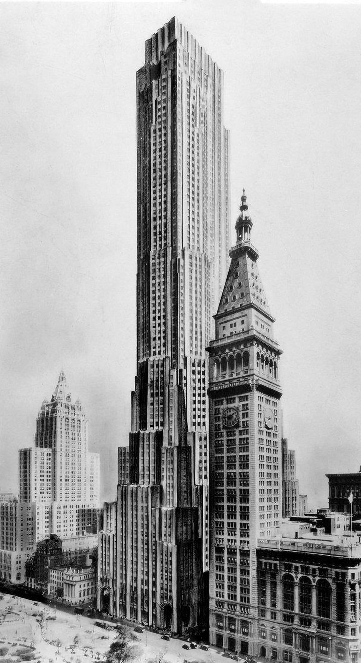
Best-Laid Plans : The Metropolitan Life North Building
The best-laid plans of mice and men oft go astray. This quote pretty much sums up the story of the Metropolitan Life North Building. What began as a design for the world’s tallest building ended with a bulky mid-rise building that feels too grand for its modest height. Pictured above is an illustration of the original design, located on the east side of Madison Square Park in New York City. Topping out at 100 stories tall, it would’ve been the tallest building in New York by a long shot. Then the Great Depression happened.
The Larkin Tower
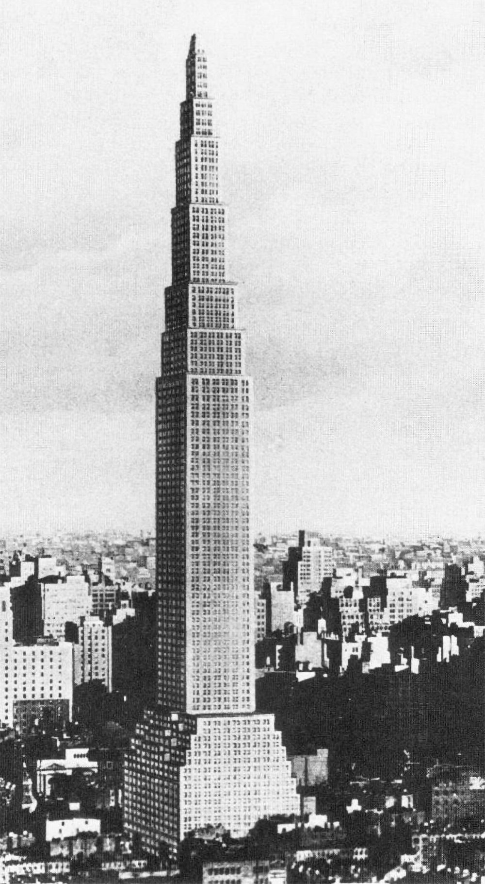
Nearly all proposals for the tallest building in the world include some type of defining element or design flourish that make them unique and memorable. The Chrysler Building has its metallic crown. The Empire State Building has it’s mooring mast and antenna. Not the Larkin Building. It was designed in 1926 for a site on 42nd Street on Manhattan, and it was 368 meters (1,207 feet) tall, making it the tallest structure in the world by a long shot. Aside from this, there’s not much else to say about it.
Piero Portaluppi’s SKNE Company Skyscraper
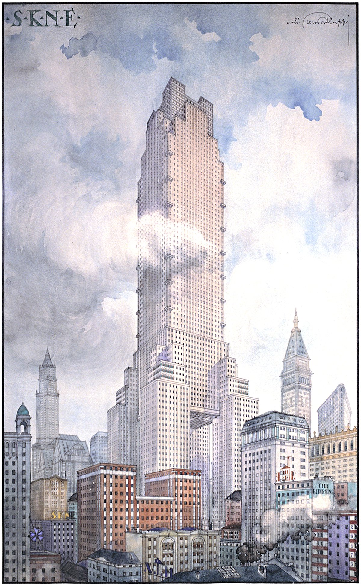
Pictured above is a conceptual design for a skyscraper by Piero Portaluppi from 1920. It was designed as the headquarters of the SKNE company for a site somewhere in New York. There’s two interesting angles here. The first is the tower itself, and the second is the method of representation shown.
The Tree and the Skyscraper
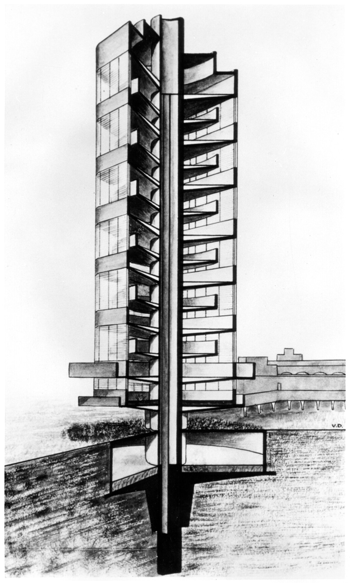
Pictured above is a cutaway drawing of Frank Lloyd Wright’s SC Johnson Research Tower in Racine, Wisconsin, built in 1936. This little tower is famous for its structure, which functions like a tree. There’s a central trunk, or core, with floors cantilevering off it like branches. This removes the need for any perimeter columns since all the structural loads transfer back to the central core. There’s also the large taproot foundation, as Wright called it. This functions like the roots of a tree, providing stability to the overall form. Wright was well aware of the tree metaphor, and he used it to sell the vision to his client. It wasn’t the first time he tried to make a tower structure function like a tree, but it’s quite possibly the purist example of the metaphor to ever get built.
The Woolworth Building and the Question of Ornament
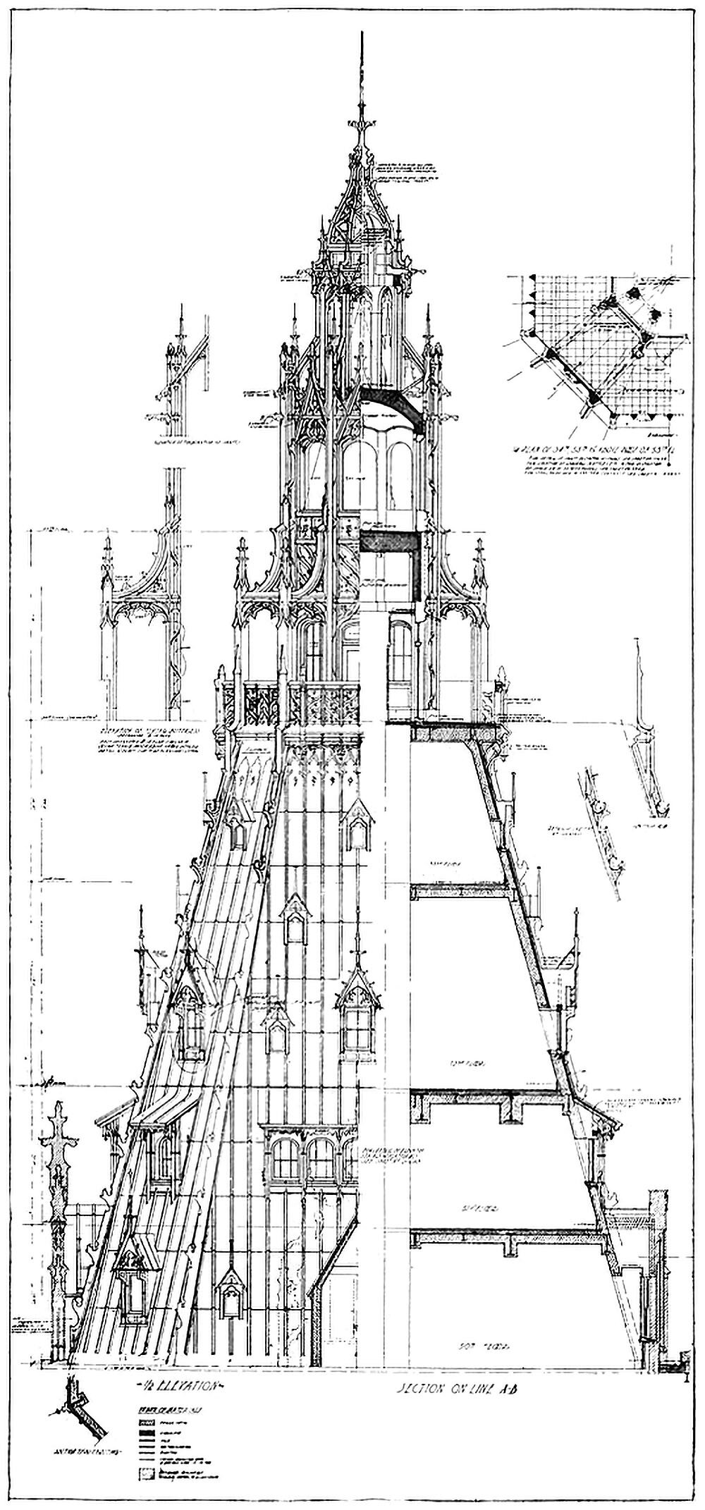
Pictured here is a combined elevation and section showing the crown of the Woolworth Building in New York City. Completed in 1912, the tower was the tallest building in the world at the time, and featured Neo-Gothic detailing throughout. As the drawing shows, this detailing is largely superficial, however. This is highlighted by the stark contrast between the left and right hand side of the drawing. This dichotomy between exterior and interior raises a couple questions related to verticality.
The Woolworth Building Tower Above the Clouds
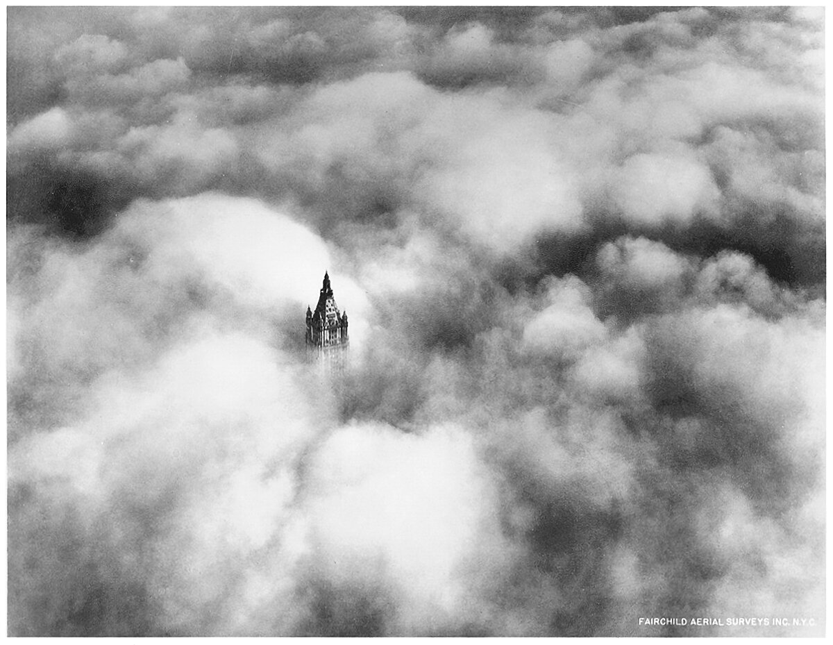
The Woolworth Building was the tallest building in the world when it was completed in 1913. It towered above Lower Manhattan and dominated the skyline of the city. The above photograph was taken in 1928, and it shows the crown of the tower poking up through the clouds, inhabiting an otherworldly realm of sunlight and clouds. This is an iconic image, because it shows that buildings as tall as this achieve verticality for their occupants. On a day like this, the upper reaches of the building are truly in the sky.
Bipedalism and The Skyscraper
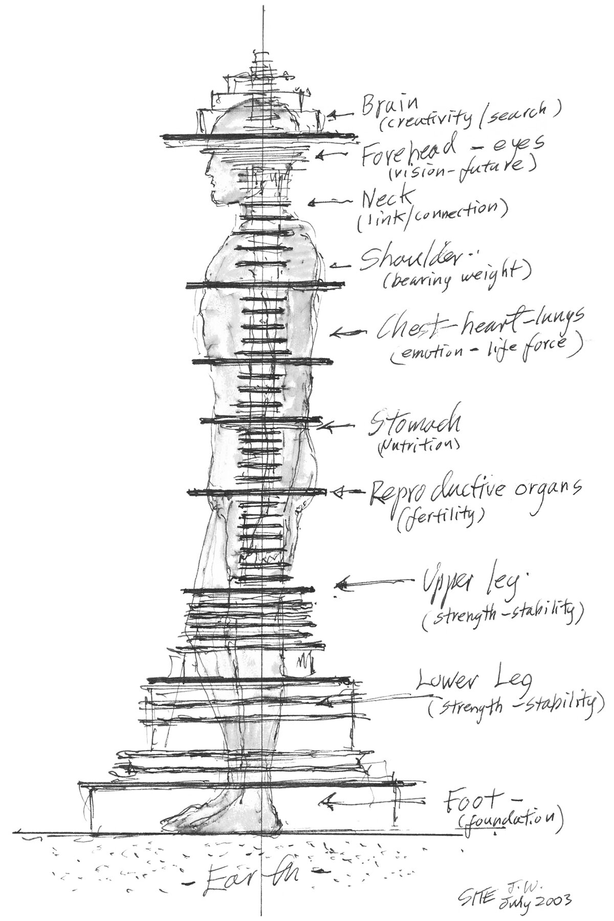
I came across this diagram the other day, and it immediately struck me. It was drawn in 2003 by James Wines of SITE for his Antilia Tower project, and it superimposes a human body on top of a tower section. I’ve previously written about the conceptual link between the bipedal human body and the tower, but this diagram takes it a step further and matches the functions of each part of the body to each part of the tower.
The Secret Apartment at the Top of the Eiffel Tower
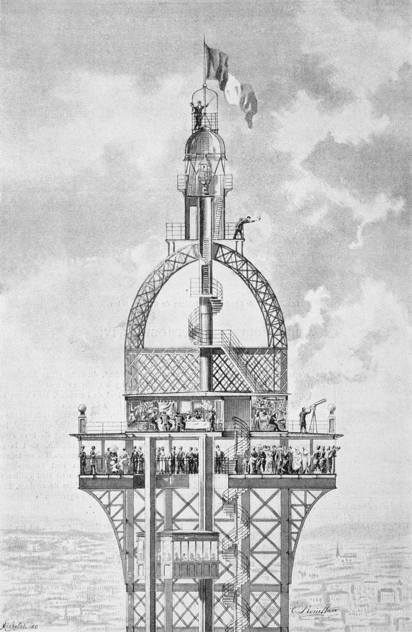
Pictured above is an illustration of the Eiffel Tower’s original crown design. You can see the main observation deck, which is packed with people, all enjoying the view atop the tallest building in the world. Unbeknownst to them, however, is the private apartment located on the floor just above them. It was designed by and for Gustave Eiffel as a private space for himself to entertain notable guests and perform scientific experiments. It’s generally referred to as the secret apartment, but it was fairly well-known to the public that Eiffel built the space for himself.

Athanasius Kircher’s Turris Babel
The concept of the Tower of Babel is a timeless one, and throughout history it’s attracted the attention and imagination of myriad individuals. One such individual was Athanasius Kircher, a German scholar and polymath who lived from 1602-1680. His 1679 work Turris Babel explores the concept of building a tower that would reach Heaven, and it was accompanied by a few etchings of such a building.
“Towers have always been erected by humankind - it seems to gratify humanity’s ambition somehow and they are beautiful and picturesque.”
-Frank Lloyd Wright, American architect, 1867-1959
The Original Flat-topped Sears Tower
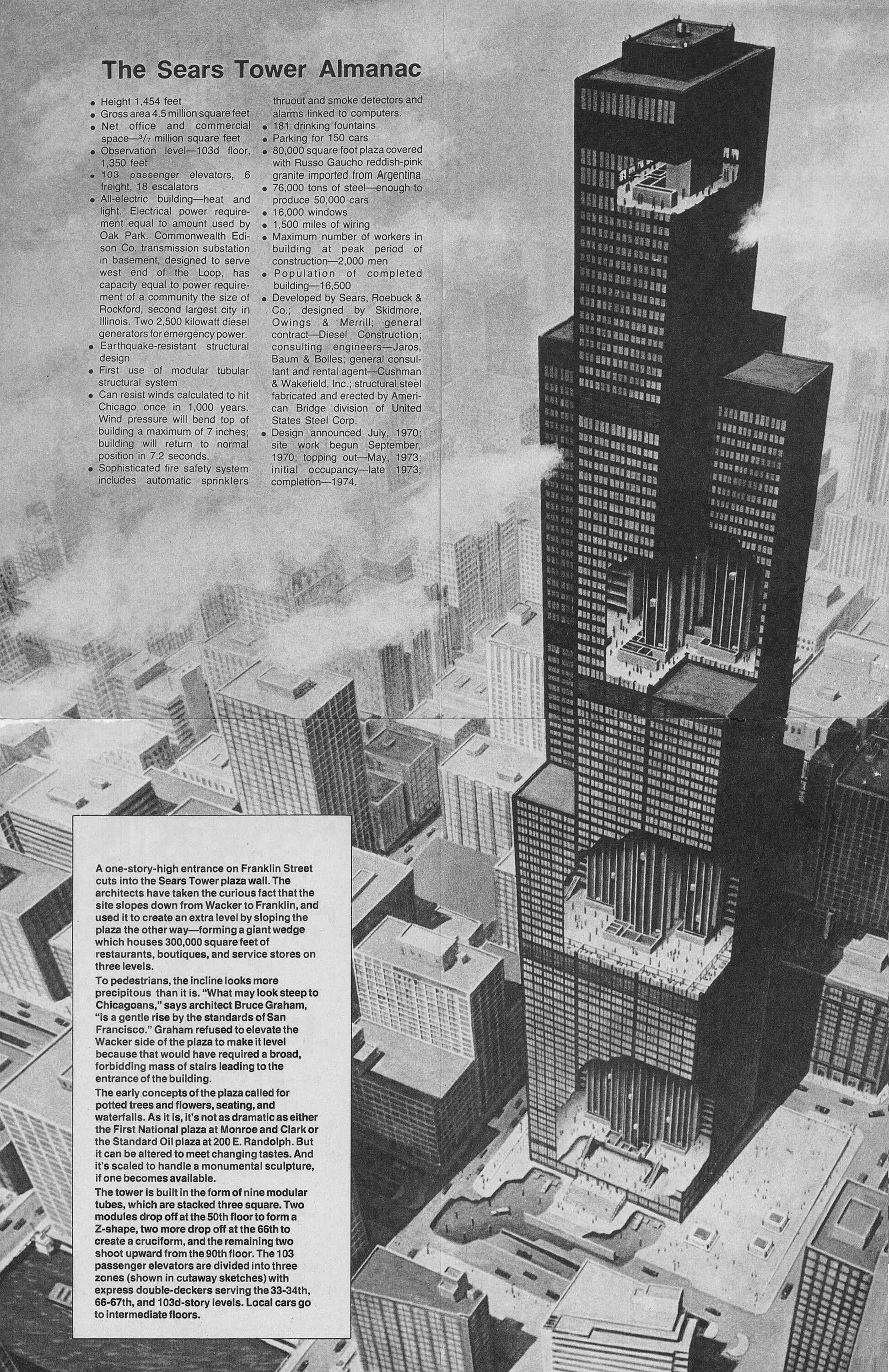
The above illustration shows the original design for the Sears Tower in Chicago, along with a bunch of factoids related to the scale of the building. Upon first glance, the first thing that stood out to me was the flat roof and lack of the building’s now-iconic antennae. As with most skyscrapers of this size, the building feels quite different without the white spires that are now so closely associated with the skyscraper. Similarly, imagine the Empire State Building without it’s spire, or the John Hancock Center without it’s antennae. It’s just not the same.
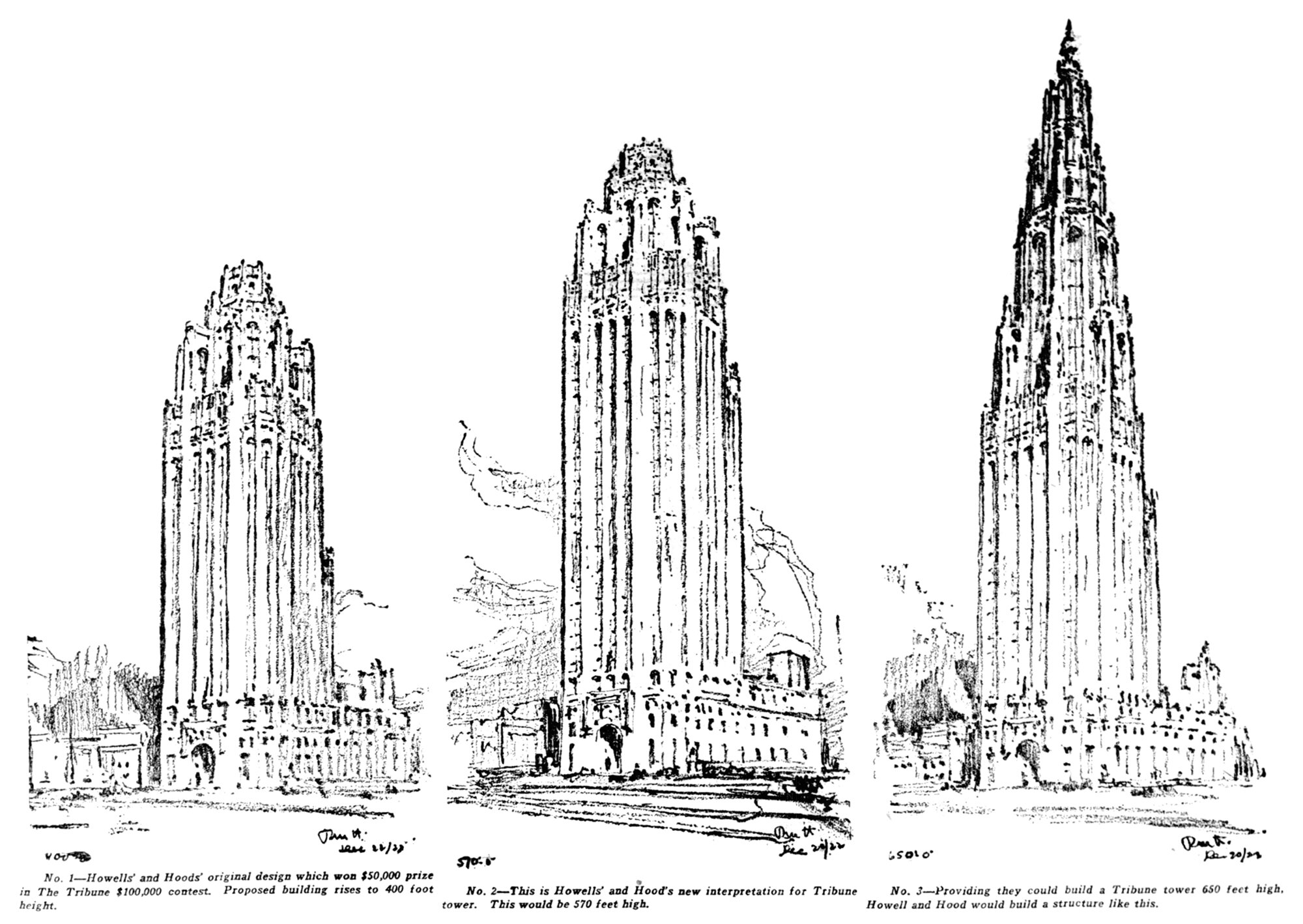
Alternate Realities : Chicago Tribune Tower
Pictured above are three design sketches for the Chicago Tribune Tower. They were drawn after the newspaper asked the architect to study taller options for the building, because they were considering whether or not to build the world’s tallest skyscraper. The increased height would require special approval from the city, so in the end they opted for beauty over height, and didn’t pursue the taller options.
