Welcome to On Verticality. This blog explores the innate human need to escape the surface of the earth, and our struggles to do so throughout history. If you’re new here, a good place to start is the Theory of Verticality section or the Introduction to Verticality. If you want to receive updates on what’s new with the blog, you can use the Subscribe page to sign up. Thanks for visiting!
Click to filter posts by the three main subjects for the blog : Architecture, Flight and Mountains.
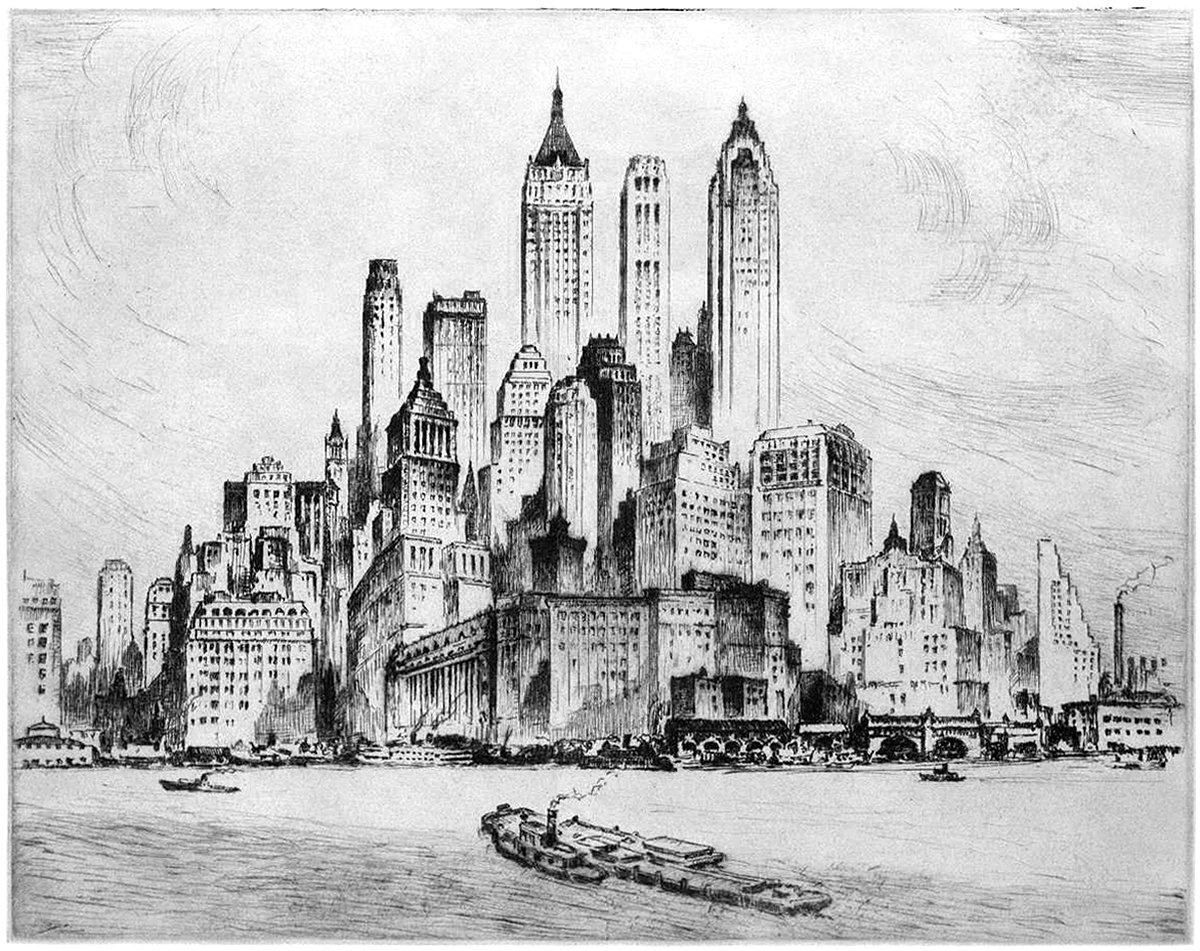
Nat Lowell and the Tip of Manhattan
Pictured here is an etching by artist Nat Lowell, showing the southern tip of Manhattan, circa 1940. The perspective is from the harbor, and Lowell focuses on three towers, which are the tallest of the bunch. From left to right, they include 40 Wall Street, 20 Exchange Place, and 70 Pine Street. The composition isn’t literal, and Lowell has taken some liberties to arrange the buildings into a mountain of sorts, with the three aforementioned towers at the summit.
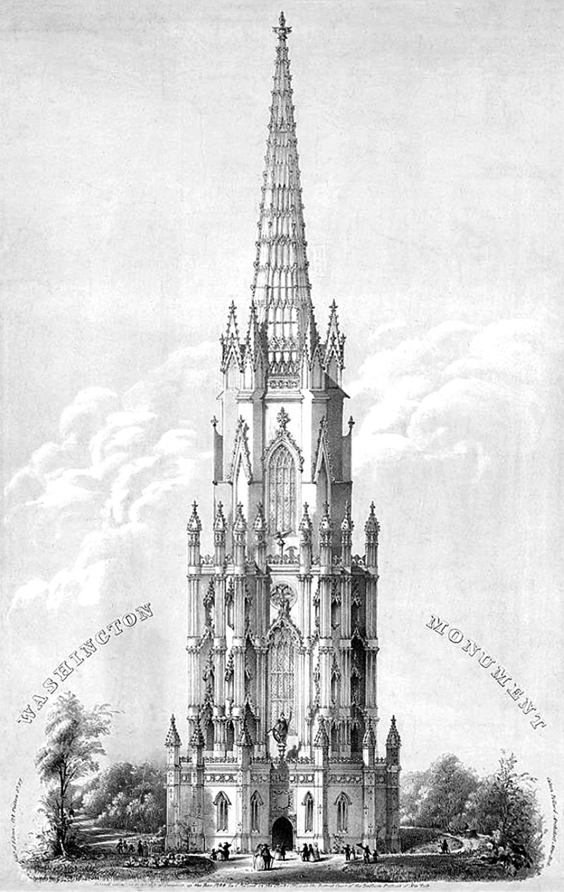
Calvin Pollard’s Proposal for the Washington Monument
Daniel Burnham once said, make no small plans. This is especially true in New York City, and the proposal pictured above fits right into both these molds. It’s a proposal for a monument to George Washington, and it would’ve dwarfed the height of the next tallest building in the city at the time (and also the tallest building in the world), Trinity Church.
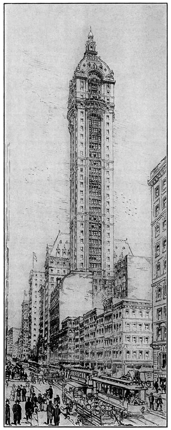
The Singer Building and the Power of Nostalgia
The Story of the Singer Building is a dark patch in the history of New York Architecture. It was the world’s tallest building when it was built, and just 50 years later it was the world’s tallest building to be demolished by it’s owner. This demolition coincided with a period of change in American cities, and it serves as a cautionary tale when compared to other, very similar buildings nearby.
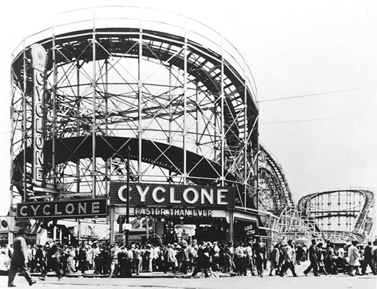
The Verticality of Roller Coasters
One of the most visceral sensations a human can experience is a sudden fall. This quick, downward acceleration of the human body can evoke feelings of terror if it’s unplanned or unwanted, or feelings of thrill and delight when it’s expected. For many of us, the sudden pull of gravity conjures up all these feelings at once. Roller coasters tap into this concept, and they meticulously curate it in order to maximize these feelings for their riders. A ride on a roller coaster pushes and pulls your body in myriad different directions, allowing a rider to experience gravity-like forces in many different directions. It’s an experience rooted in verticality, which is what gives them such appeal.
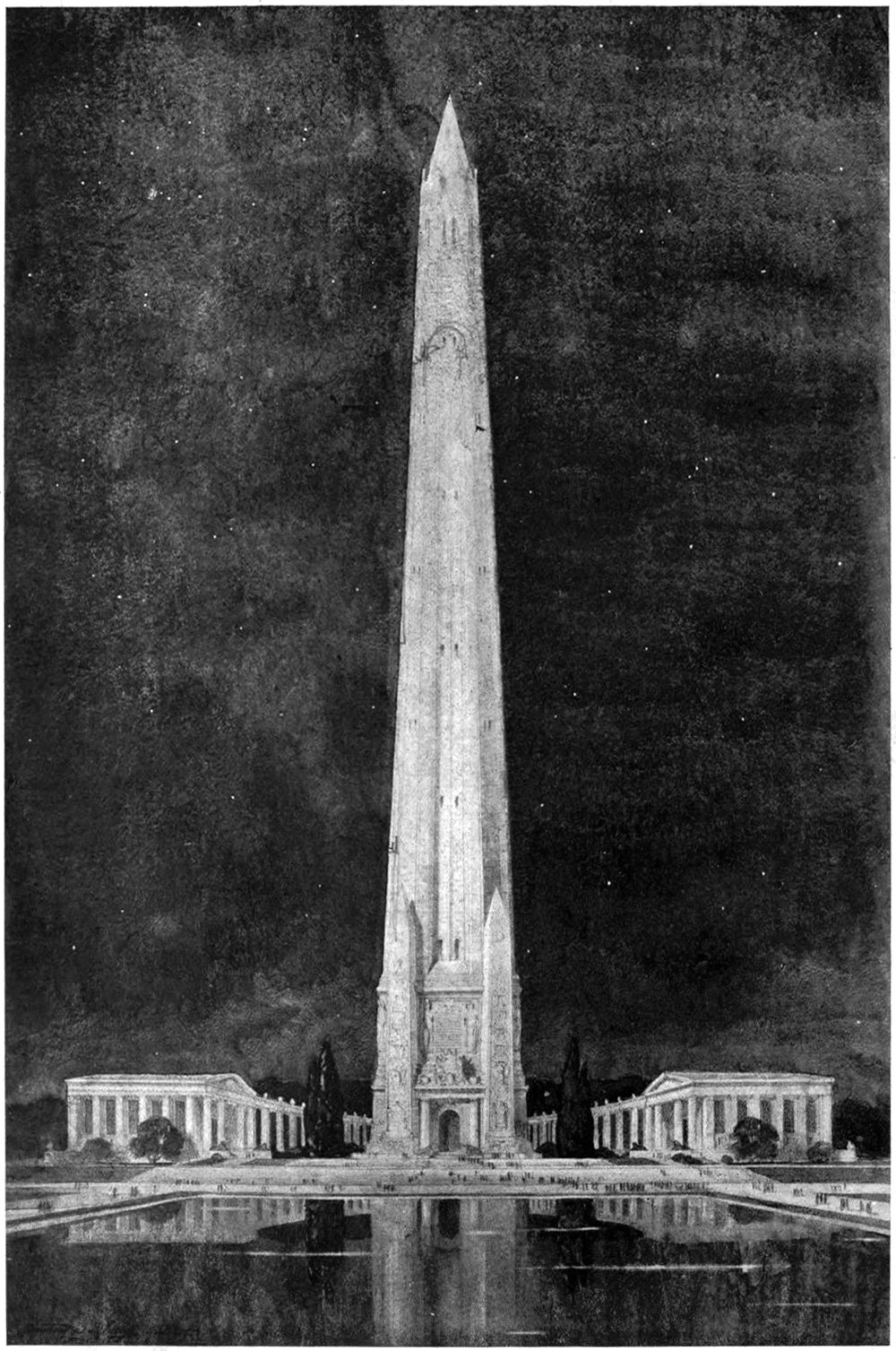
A Design for a National Memorial
Monuments and memorials are tricky beasts to design. Unlike a normal building, they’re imbued with meaning and symbolism that can be highly subjective. They’re not just buildings, but repositories for history and memory. This means they carry responsibilities to the person or event they are meant to symbolize. That’s what makes the above illustration so difficult to understand. It’s described only as Design for National Memorial. This is tough, because it doesn’t even make a claim to what it’s memorializing. One thing is clear, however; the designer was motivated by verticality.
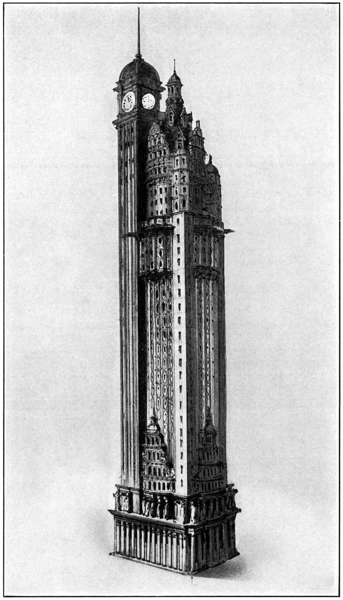
The New York American Journal Headquarters
Throughout my research into tall buildings and verticality, I’ve come across myriad examples of proposed and unbuilt structures. Some are alternate proposals by famous architects. Some are one-hit wonders that make their way into the mainstream history of skyscrapers. Some, like the one pictured above, are just intriguing and obscure images without much context. Details on this building are scarce, but from what I can find this is a proposal by Barney & Chapman Architects for the headquarters of the New York American Journal. It was located at Columbus Circle in New York City, on the site occupied by the Museum of Arts and Design today.
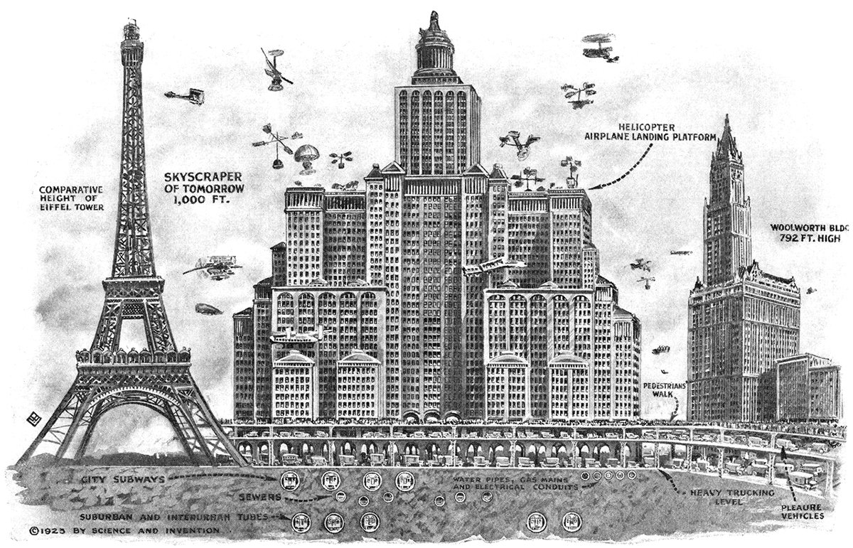
Skyscrapers of To-morrow
Pictured above is a 1923 illustration showing Harvey Wiley Corbett’s idea for a future skyscraper. Corbett believed buildings would continue to get taller and wider, resulting in massive, slab-like structures with aircraft landing platforms on their roofs and multiple underground levels of traffic. He compares his concept with two iconic buildings of the time, the Eiffel Tower and the Woolworth Building. These were both the tallest in the world when completed, which really hits home the sheer scale of Corbett’s structure.
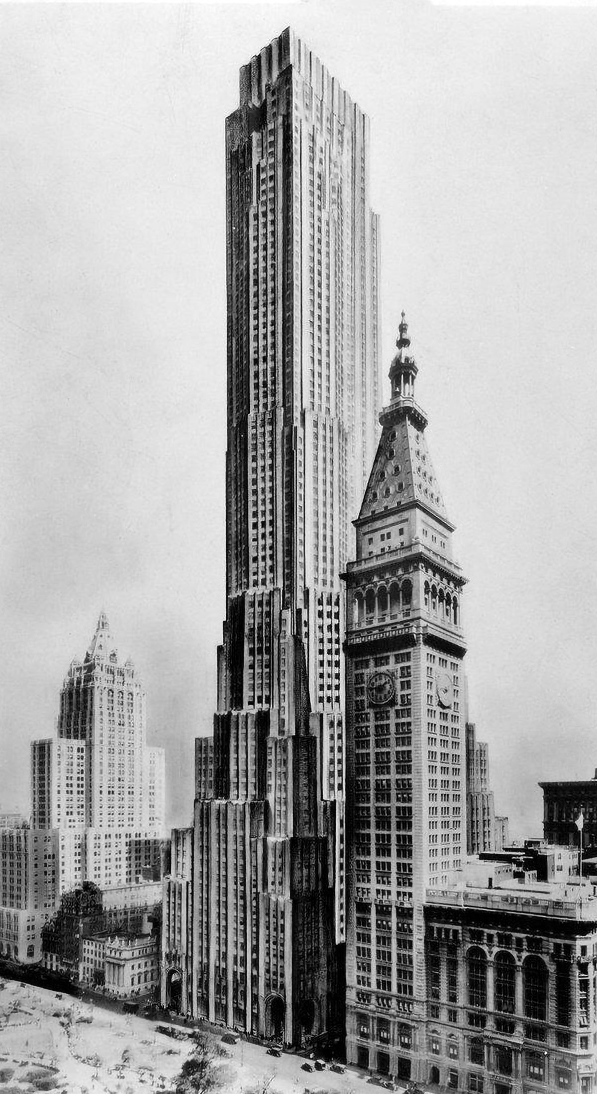
Best-Laid Plans : The Metropolitan Life North Building
The best-laid plans of mice and men oft go astray. This quote pretty much sums up the story of the Metropolitan Life North Building. What began as a design for the world’s tallest building ended with a bulky mid-rise building that feels too grand for its modest height. Pictured above is an illustration of the original design, located on the east side of Madison Square Park in New York City. Topping out at 100 stories tall, it would’ve been the tallest building in New York by a long shot. Then the Great Depression happened.
The Larkin Tower
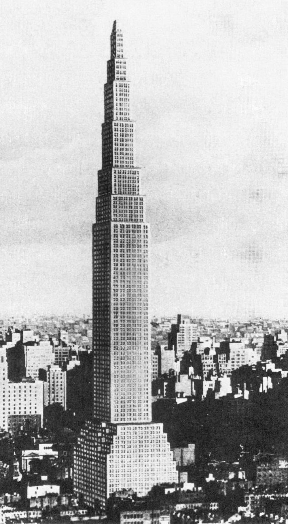
Nearly all proposals for the tallest building in the world include some type of defining element or design flourish that make them unique and memorable. The Chrysler Building has its metallic crown. The Empire State Building has it’s mooring mast and antenna. Not the Larkin Building. It was designed in 1926 for a site on 42nd Street on Manhattan, and it was 368 meters (1,207 feet) tall, making it the tallest structure in the world by a long shot. Aside from this, there’s not much else to say about it.
Piero Portaluppi’s SKNE Company Skyscraper
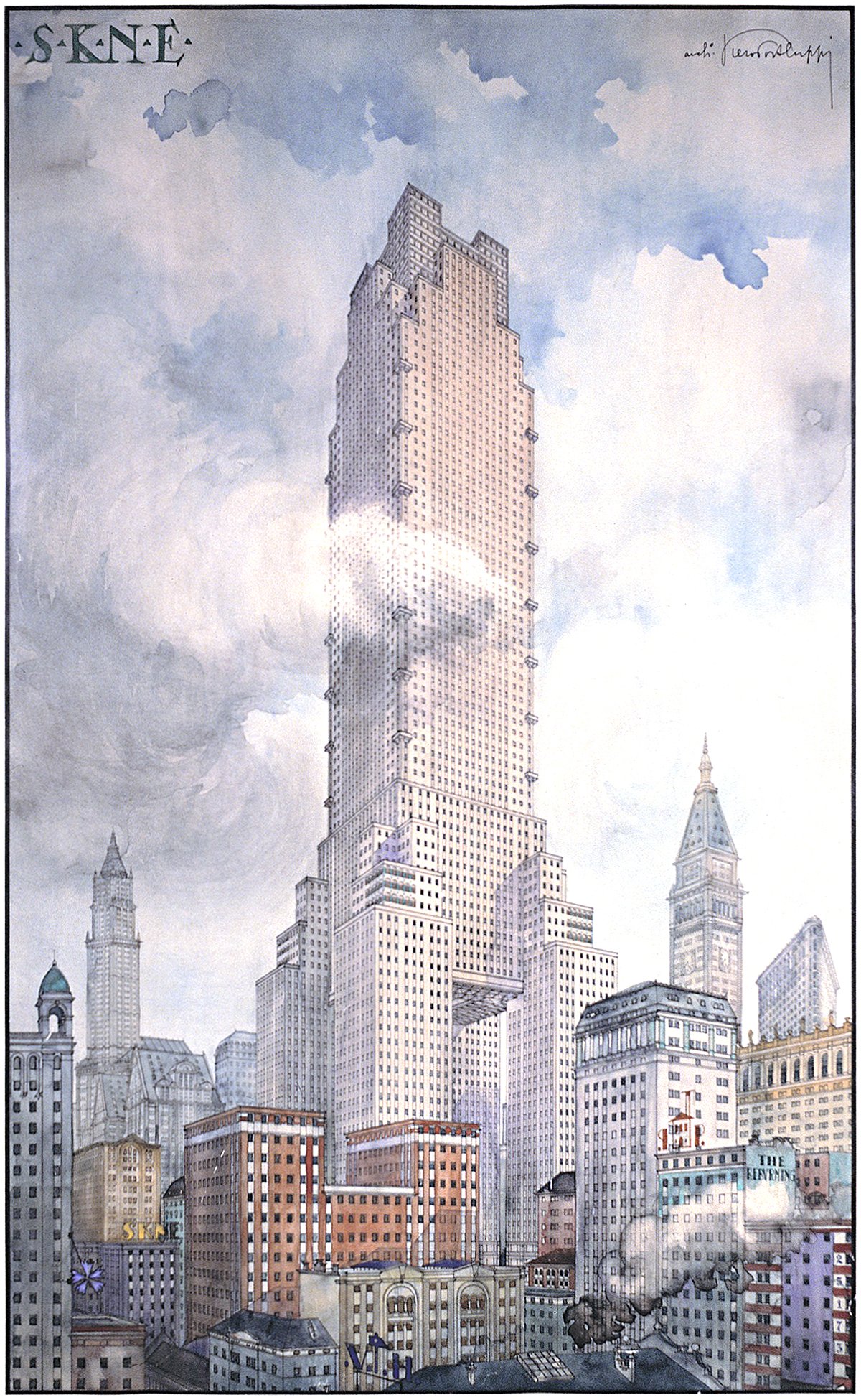
Pictured above is a conceptual design for a skyscraper by Piero Portaluppi from 1920. It was designed as the headquarters of the SKNE company for a site somewhere in New York. There’s two interesting angles here. The first is the tower itself, and the second is the method of representation shown.
A Proposal for an Observation Tower in Prospect Park
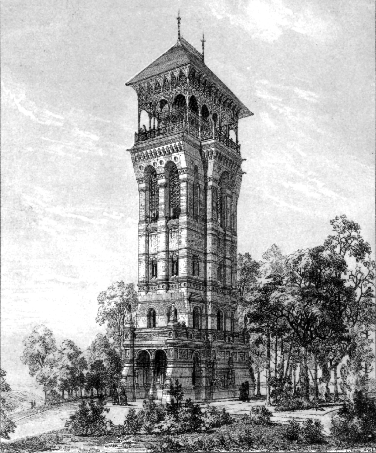
Prospect Park in Brooklyn is one of the great examples of landscape architecture in the United States. It was designed by the legendary landscape architects Frederick Law Olmstead and Calvert Vaux and was completed between 1867 and 1873. The original design included an observation tower at the highest point in the park, which is pictured above. Unfortunately, it never got built.
The Woolworth Building and the Question of Ornament
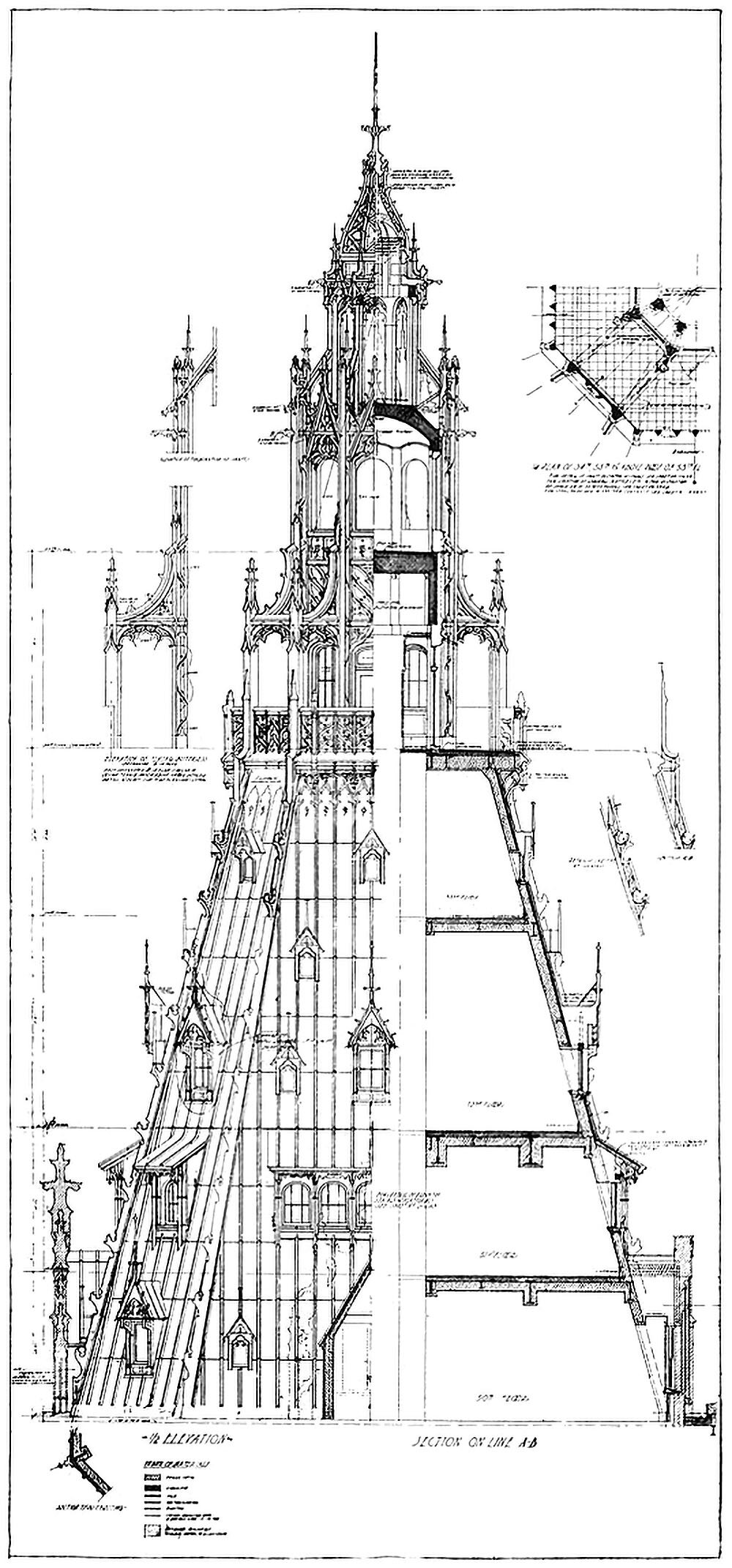
Pictured here is a combined elevation and section showing the crown of the Woolworth Building in New York City. Completed in 1912, the tower was the tallest building in the world at the time, and featured Neo-Gothic detailing throughout. As the drawing shows, this detailing is largely superficial, however. This is highlighted by the stark contrast between the left and right hand side of the drawing. This dichotomy between exterior and interior raises a couple questions related to verticality.
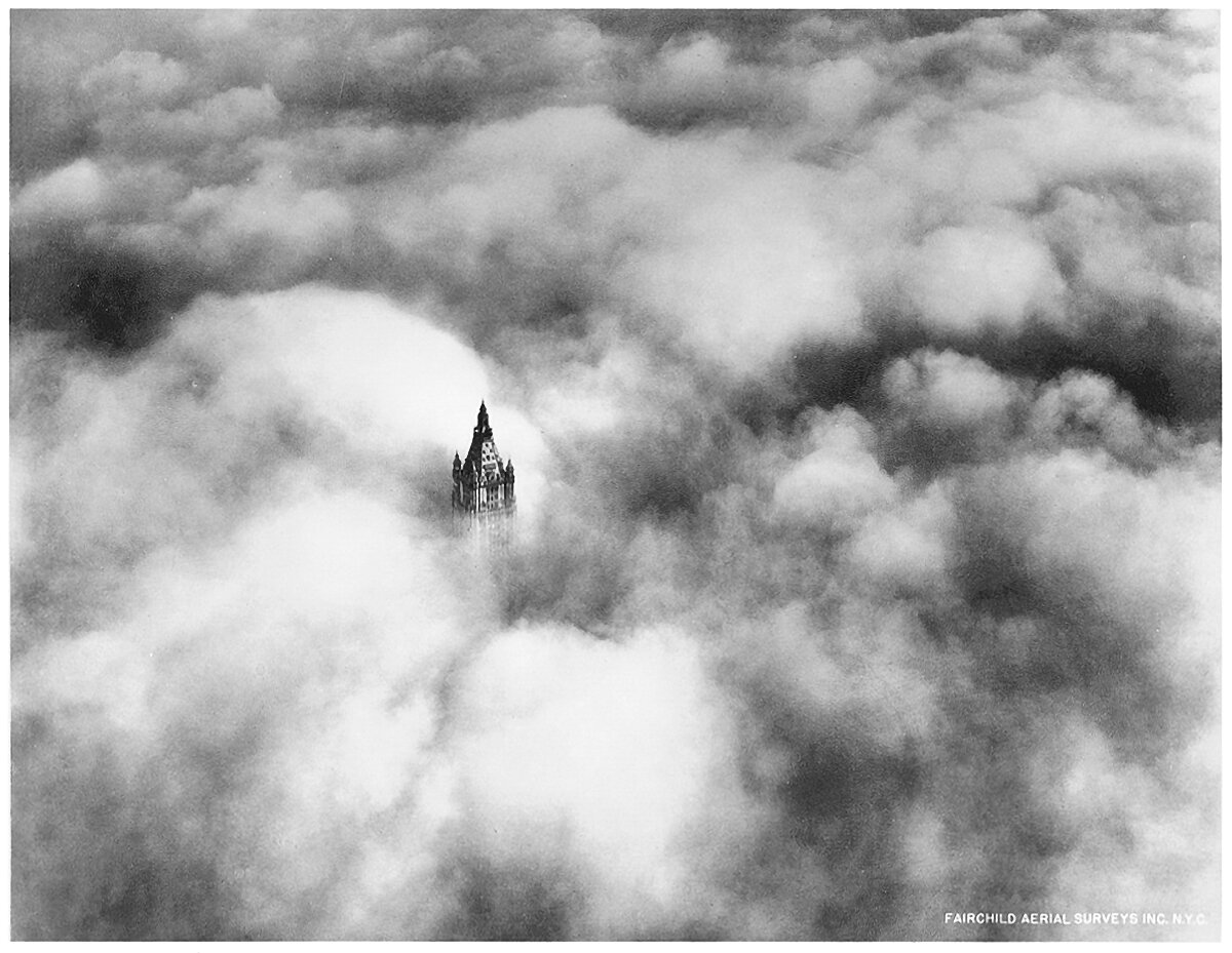
The Woolworth Building Tower Above the Clouds
The Woolworth Building was the tallest building in the world when it was completed in 1913. It towered above Lower Manhattan and dominated the skyline of the city. The above photograph was taken in 1928, and it shows the crown of the tower poking up through the clouds, inhabiting an otherworldly realm of sunlight and clouds. This is an iconic image, because it shows that buildings as tall as this achieve verticality for their occupants. On a day like this, the upper reaches of the building are truly in the sky.
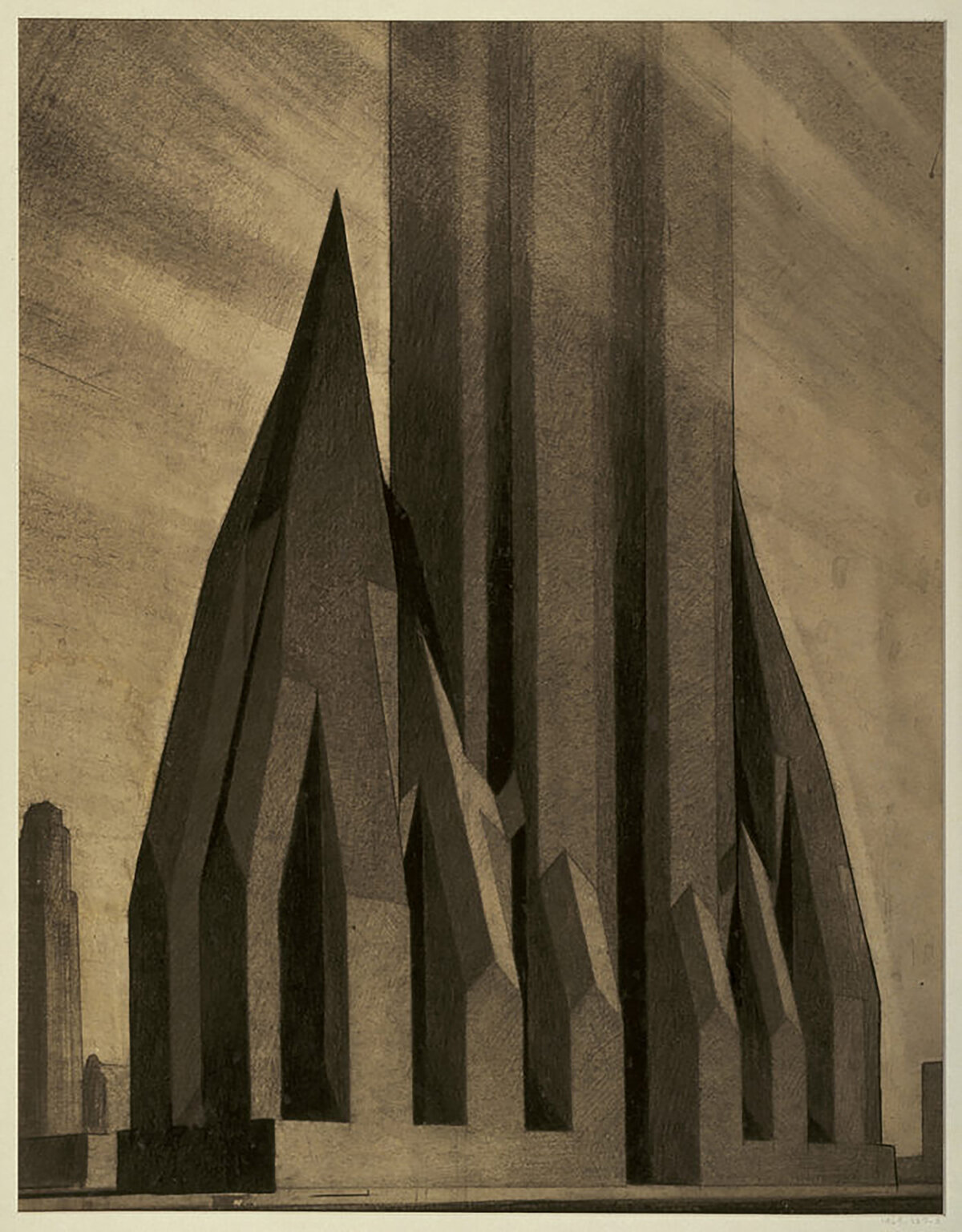
Zoning Envelopes and the New York Skyscraper
Back in architecture school, I had a professor once say that the most effective way to create change is to adjust the building code. That way every architect must conform their designs to meet the code’s requirements, which is much more impactful than any single building could ever be. It was sage advice, and throughout the history of skyscrapers, it rings true. Throughout the history of skyscrapers, arguably the most influential of these changes occurred in 1916 in New York City.
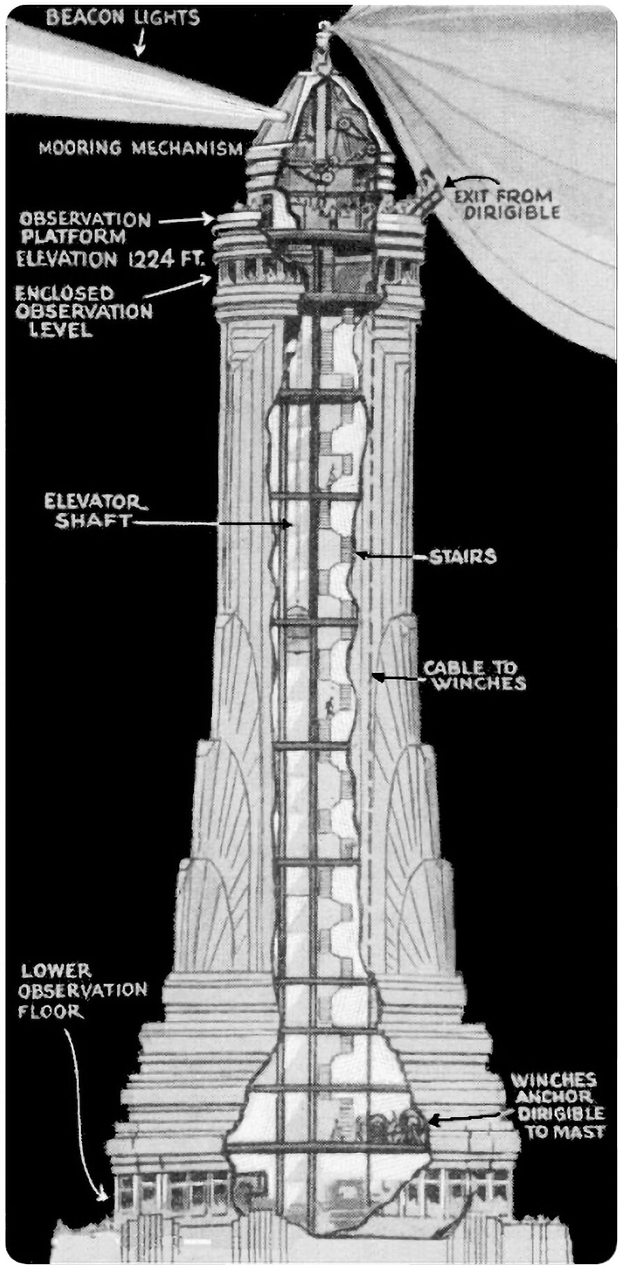
The Empire State Building’s Mooring Mast
Pictured above is an illustration from Popular Mechanics that shows the Empire State Building’s proposed mooring mast. This mast was designed to act as a dock for dirigibles, who could moor themselves to the top of the tower’s crown and load and unload passengers. It’s a wild idea, albeit completely impractical.
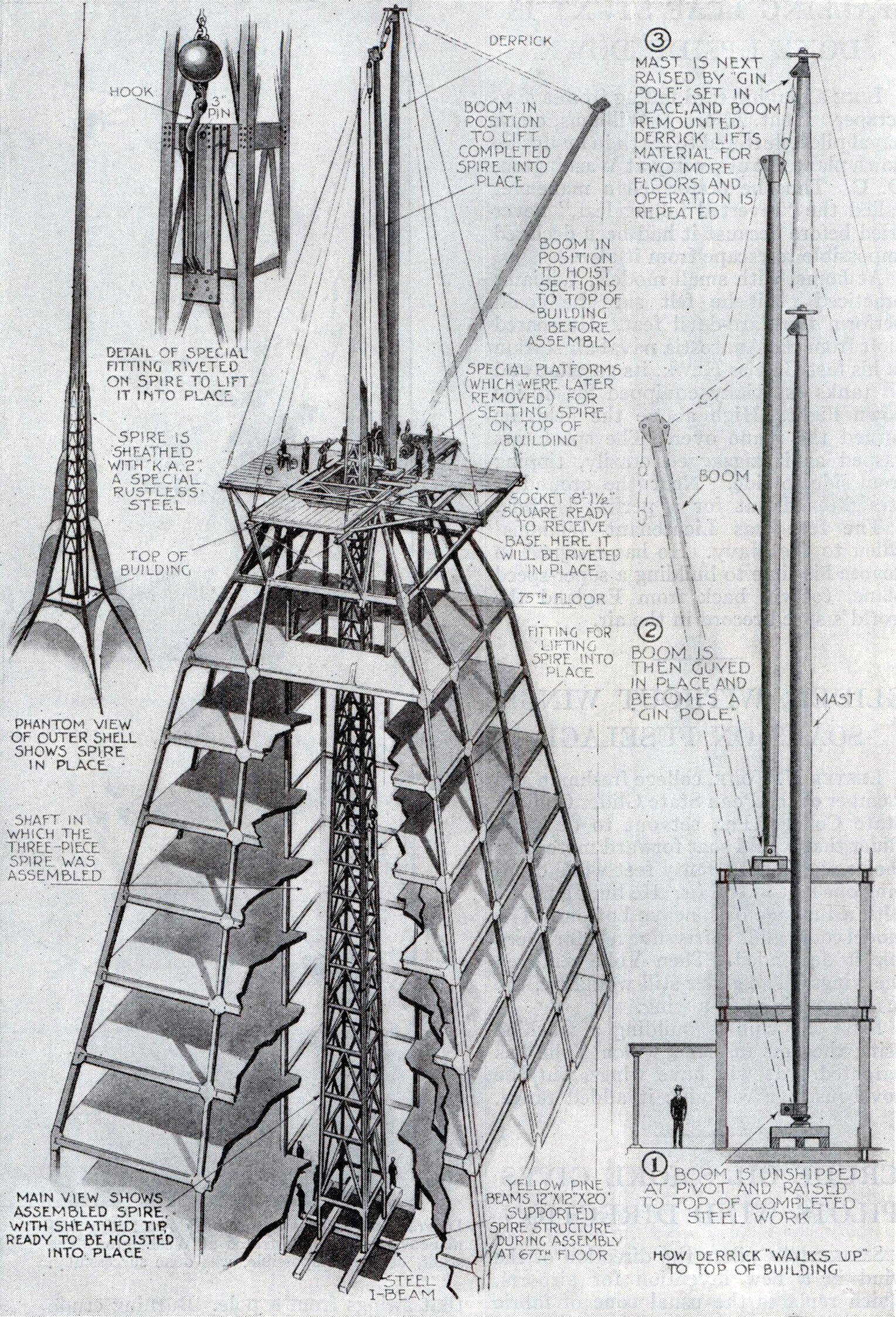
The Chrysler Building’s Hidden Spire
If you’re competing to build the tallest building in the world, and you want to conceal the final height until the last possible moment, how do you go about it? Well, you construct the spire inside the crown of the building, wait for your competitor to finish his tower, then lift your spire into place and take the title from him, of course.
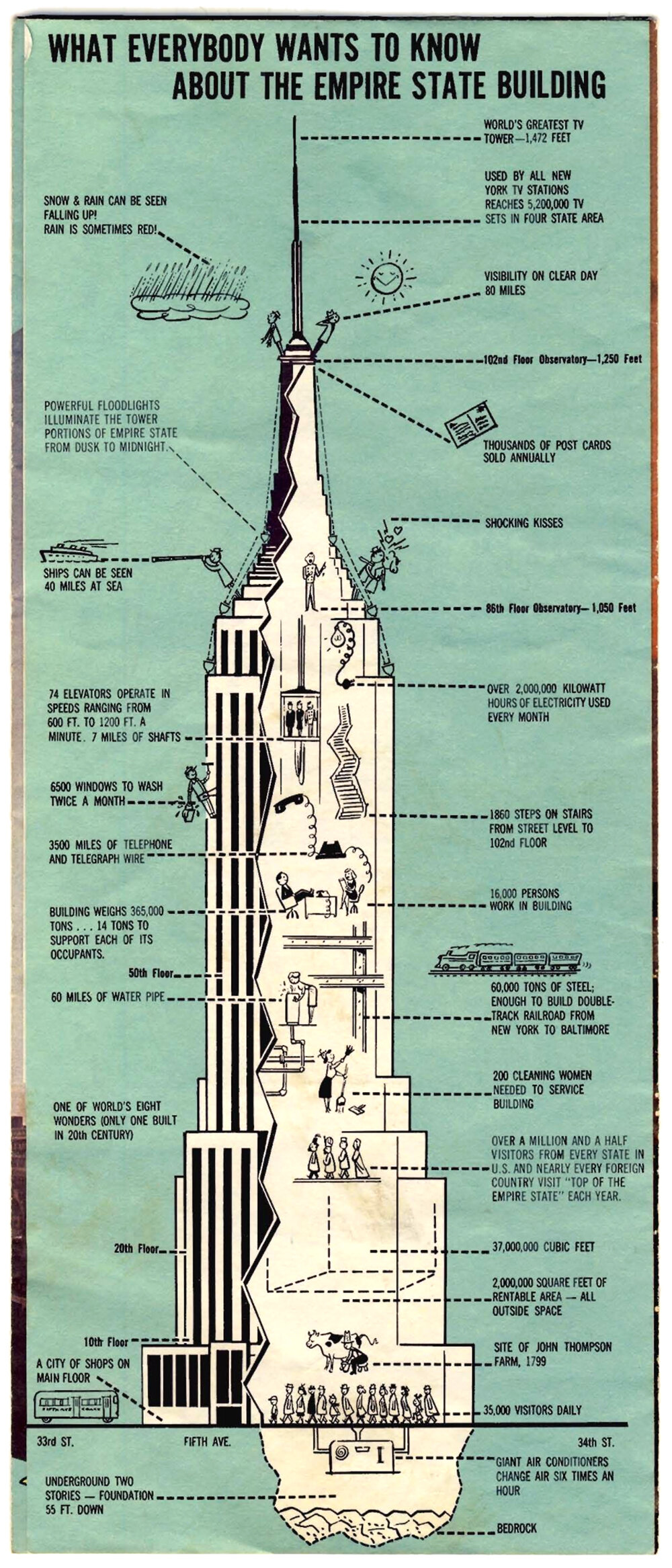
What Everybody Wants To Know About The Empire State Building
Only the most famous and iconic buildings of the world get their own marketing. The Empire State Building in New York City is one of these, and the brochure pictured above is a fantastic little bit of marketing for the tower. I don’t know when it was made or where it was sold, but given the television antenna at the summit, which was installed in 1965, it’s probably from the late 1960’s or 70’s.

Clarence H. Blackall’s Study for an Office Building
The above illustration originally appeared in an exhibition for the Boston Architectural Club in 1912. The subsequently published yearbook containing the drawing gives no context or background, just the cryptic title Study for Office Building and the architect’s name, Clarence H. Blackall.
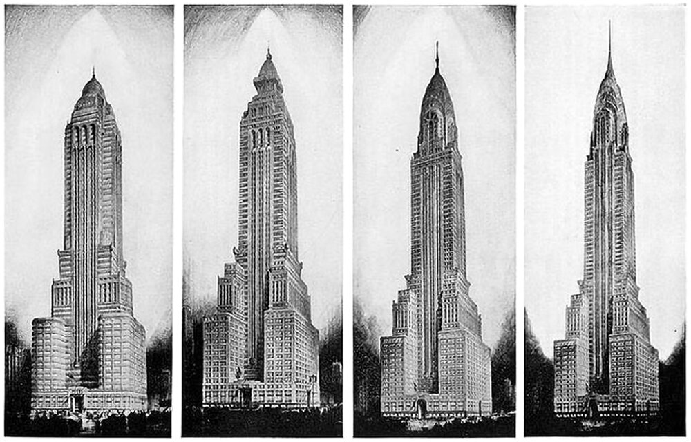
Alternate Realities : The Chrysler Building
The design process is never-ending. The only reason there’s an end is because something needs to get built, and it usually needs to happen quickly. It’s like a film, and the built result is like a snapshot from somewhere near the end of the film. .e image for example, showing. The above illustration is a good example. It four proposed designs for the Chrysler Building in New York.
“The skyscraper is Orwellian or Olympian, depending on how you look at it.”
-Ada Louise Huxtable, American architecture critic, 1921-2013.
