The Seattle Space Needle and Uninterrupted Verticality
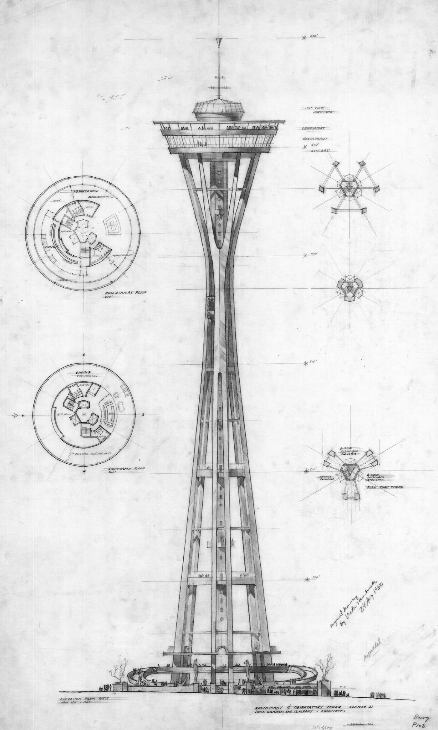
Section of an early design for the Seattle Space Needle. Drawn by the architect John Graham, the top house is less sculptural than the final version, but the iconic curves of the tower supports are much closer to the built design.
I recently visited the Space Needle while on a trip to Seattle, and the experience was a masterful example of uninterrupted verticality. Throughout the entire visit, I had visual access to my surroundings, and this made the experience much more meaningful than a typical observation tower or skydeck. This is because the lift experience is normally buried deep inside a building, so it doesn’t have views to the outside. This severs the experience of verticality and abstracts the act of ascension and descension. Not the case at the Space Needle, however, and it was fantastic.
Pictured above is an early design for the Space Needle. At the base, you can see an open, outdoor platform that visitors would use to access the lifts. This is quite similar to the original version that got built, and it did a great job opening up the tower base to its surroundings. Unfortunately, this has since been replaced by an interior entry sequence, complete with a massive gift shop. The new building does a good job preserving a visual connection to the tower and the outdoors, but I have to believe the original design was much more impactful because it was so minimal.
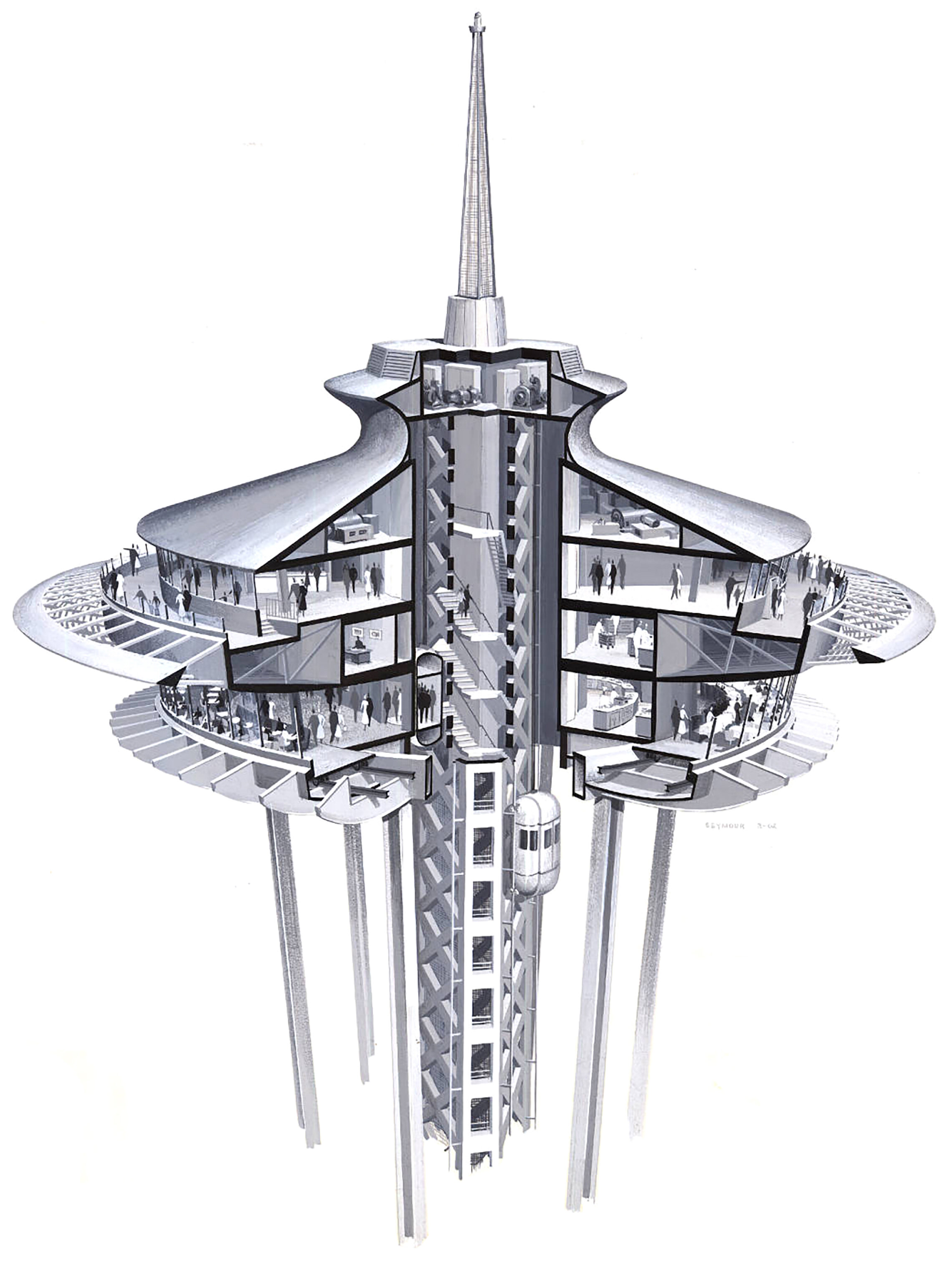
Next up was the ascent. The tower has two lifts, one for ascending and one for descending. They run up the central spine of the tower, and the cars are exposed to the outside. Windows in each car allow visitors to look outside as they move up or down the tower, which results in an unbroken view from ground to observation deck. I love lifts with windows, because I could see myself rising and I could survey my surroundings along the way. Because of this, I noticed myself connecting the experience on the ground with the experience in the sky. This can’t happen in a lift without windows. There’s no visual connection to your surroundings, and any sense of movement is abstracted because you can’t see yourself moving.
Cutaway drawing of the original design for the Seattle Space Needle. Original drawing from the office of the architect, John Graham, and the illustrator’s name was Seymour.
Once off the lift, I moved from an interior zone to an outdoor platform that was open to the sky. This outdoor experience really enhanced my sense of place. I could feel the temperature and appreciate a light breeze in the air, all while taking in the view of the city. Being outside let me be in the place, rather than looking at it through glass. After walking around the upper level a bit, I took the interior staircase down to the lower level, which slowly rotates around at one revolution per hour. This level features a glass floor and a cocktail lounge. The glass floor was unique because it moves, which increases the thrill level for those afraid of heights. It also creates a bit of disorientation when first entering the floor, since interior spaces like this don’t generally move. After spending some time walking around this level, I went back down on the other lift.
This experience was notable for its constant exposure to the outdoors. All along the way, the tower structure and its surroundings were visible, which created a great sense of place and allowed me to fully immerse myself in the experience of verticality. It also allowed me to better understand the city of Seattle and it’s suburbs, and I could further orient myself in the region based on views of Mount Baker and Mount Rainier in the distance. All in all, it was a fantastic skydeck experience that should be a model for buildings such as this.
Check out other posts about observation decks here.


