Welcome to On Verticality. This blog explores the innate human need to escape the surface of the earth, and our struggles to do so throughout history. If you’re new here, a good place to start is the Theory of Verticality section or the Introduction to Verticality. If you want to receive updates on what’s new with the blog, you can use the Subscribe page to sign up. Thanks for visiting!
Click to filter posts by the three main subjects for the blog : Architecture, Flight and Mountains.
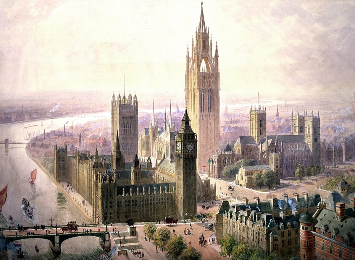
Lamb and Seddon’s Imperial Monumental Tower at Westminster
Pictured above is a 1904 proposal for an Imperial Monumental Hall and Tower in London. It was proposed by architects Edward Beckitt Lamb and John Pollard Seddon. The main feature of the proposal was a 167 meter (548 foot) Gothic tower, which dominates the entire site and its surroundings. It’s an ambitious proposal, and it uses verticality to elevate the monumentality of the site in three ways.
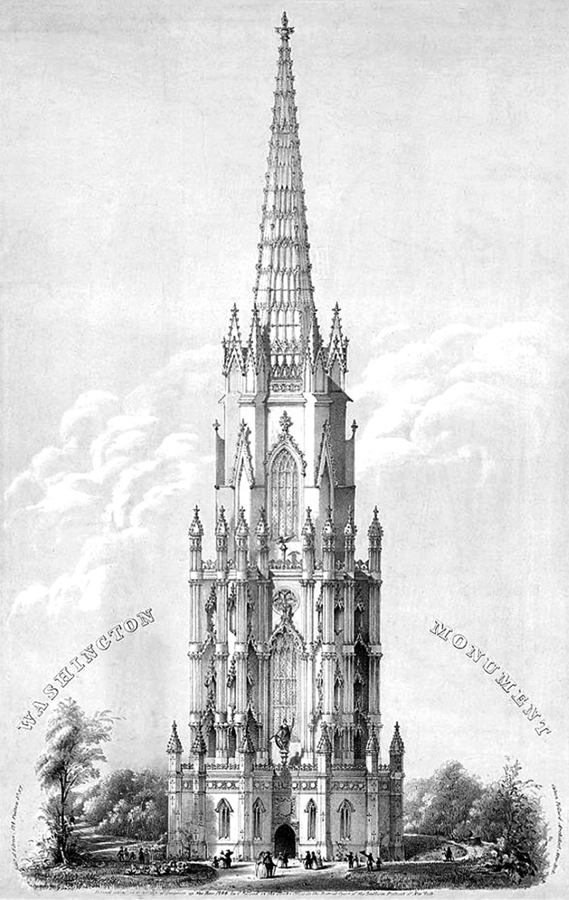
Calvin Pollard’s Proposal for the Washington Monument
Daniel Burnham once said, make no small plans. This is especially true in New York City, and the proposal pictured above fits right into both these molds. It’s a proposal for a monument to George Washington, and it would’ve dwarfed the height of the next tallest building in the city at the time (and also the tallest building in the world), Trinity Church.
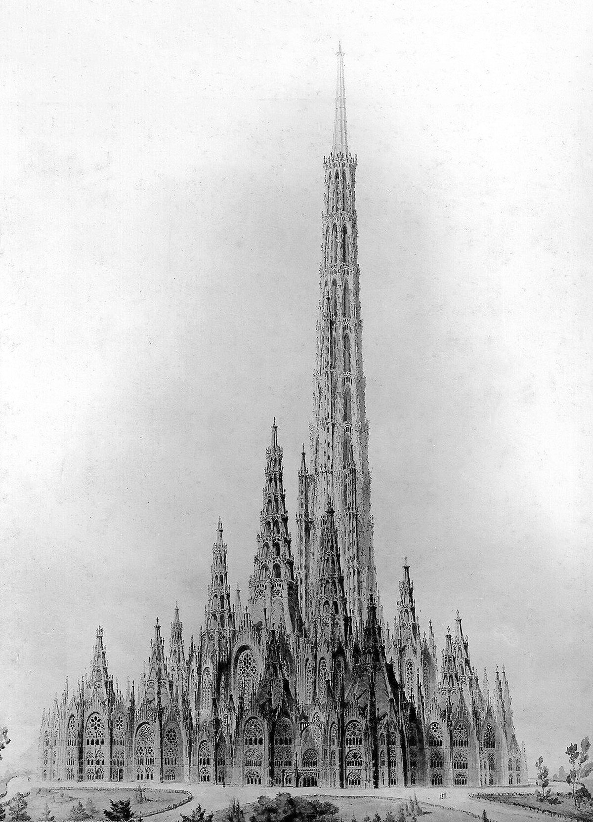
Friedrich Gösling’s Proposal for the Reichstag
Pictured above is a competition entry for the original Reichstag building in Berlin. It was designed in 1871 by German architect Friedrich Gösling, and it’s a big departure from the Neoclassic design that ended up getting built. Gösling intended the design to embody the German way of life and the German idea of the state. He expressed these ideas with an organic plan and a Neogothic structure that seems to point upward with its myriad steeples and pinnacles. I suspect this upward focus was how Gösling’s idea of the German way of life in built form, because it’s so prevalent throughout his design. He was using verticality to project a sense of optimism about Germany and its future.
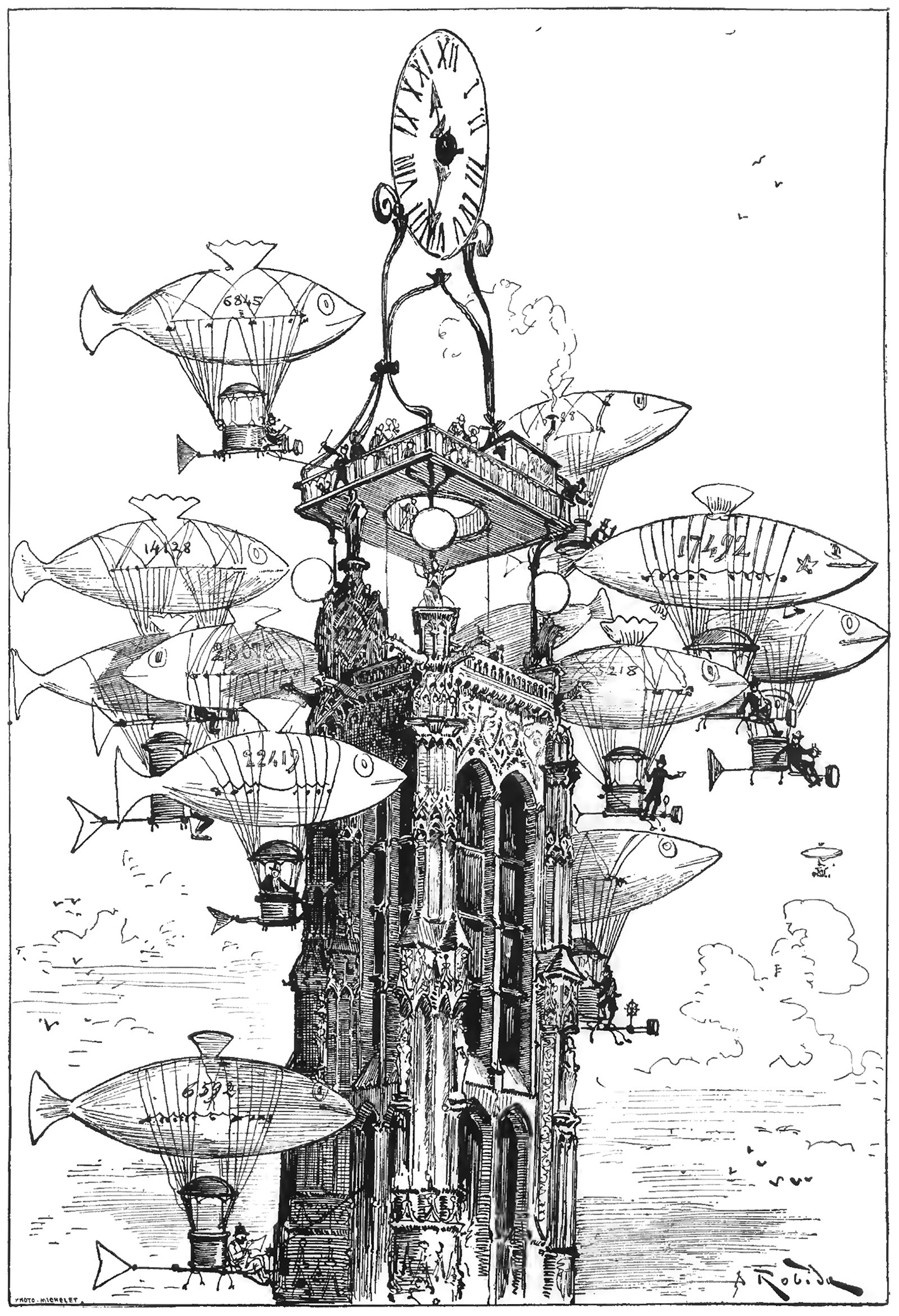
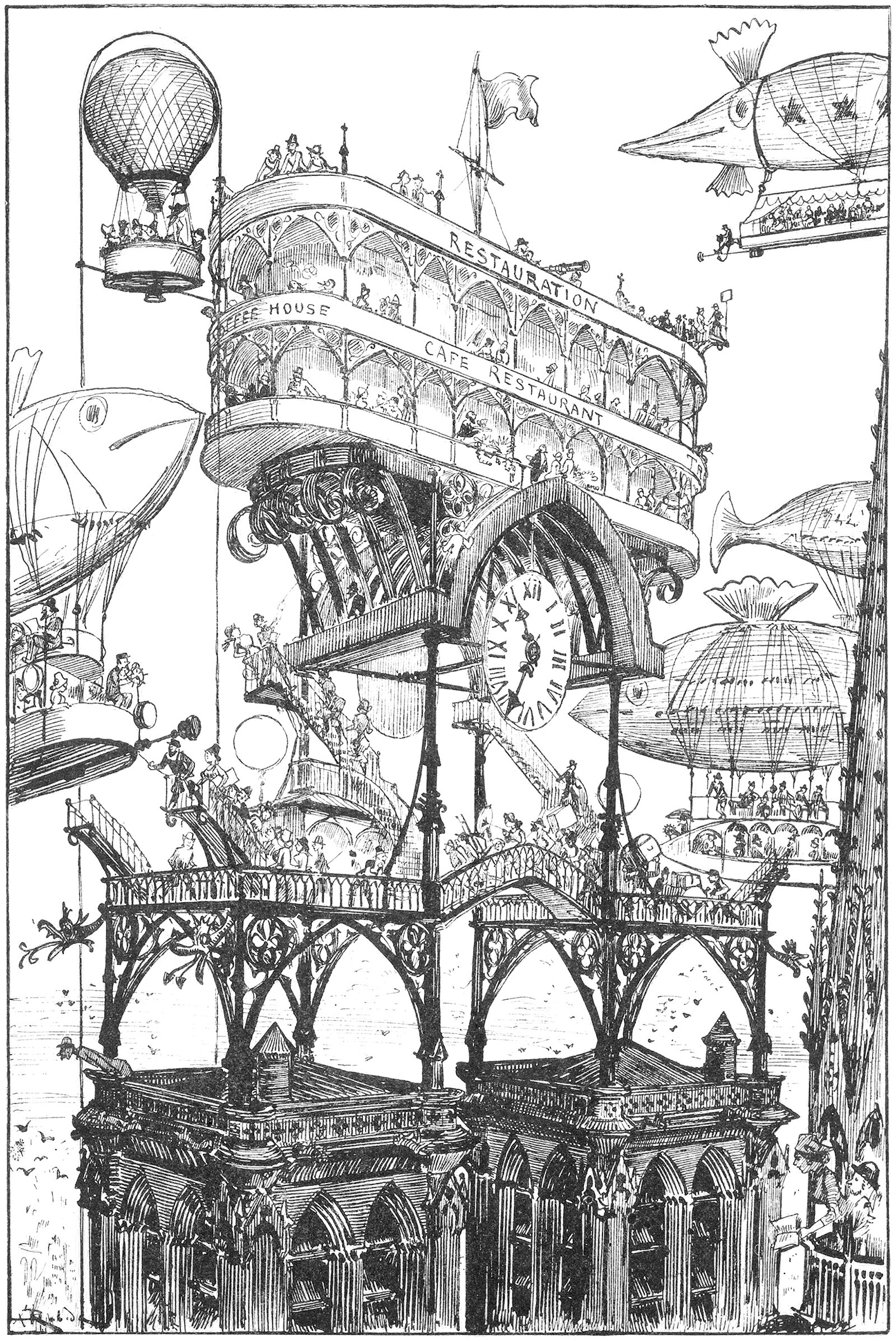
An Aerocab Station atop the Tour Saint-Jacques
The above illustration was drawn by Albert Robida for his 1883 novel Le Vingtième Siècle, or The Twentieth Century. This illustration was titled La Station d'Aerocabs de la Tour Saint-Jacques, or The Aerocab Station of the Tour Saint-Jacques, and it shows a raised platform and clock atop the iconic Parisian structure. Flocking around the tower is a group of dirigibles made to look like fish. What’s charming about the image is how the cluster of dirigibles resemble a school of fish, almost crowding out the tower itself from the image.
An Airport on top of Notre Dame
The above illustration was drawn by Albert Robida for his 1883 novel Le Vingtième Siècle, or The Twentieth Century. The novel describes a future vision for Paris in the 1950’s, focusing on technological advancements and how they would affect the daily lives of Parisians. Here he shows an elaborate transit station built on top of the bell towers of the Notre Dame Cathedral. It’s a wonderfully ambitious idea, and it represents modernity overtaking history.
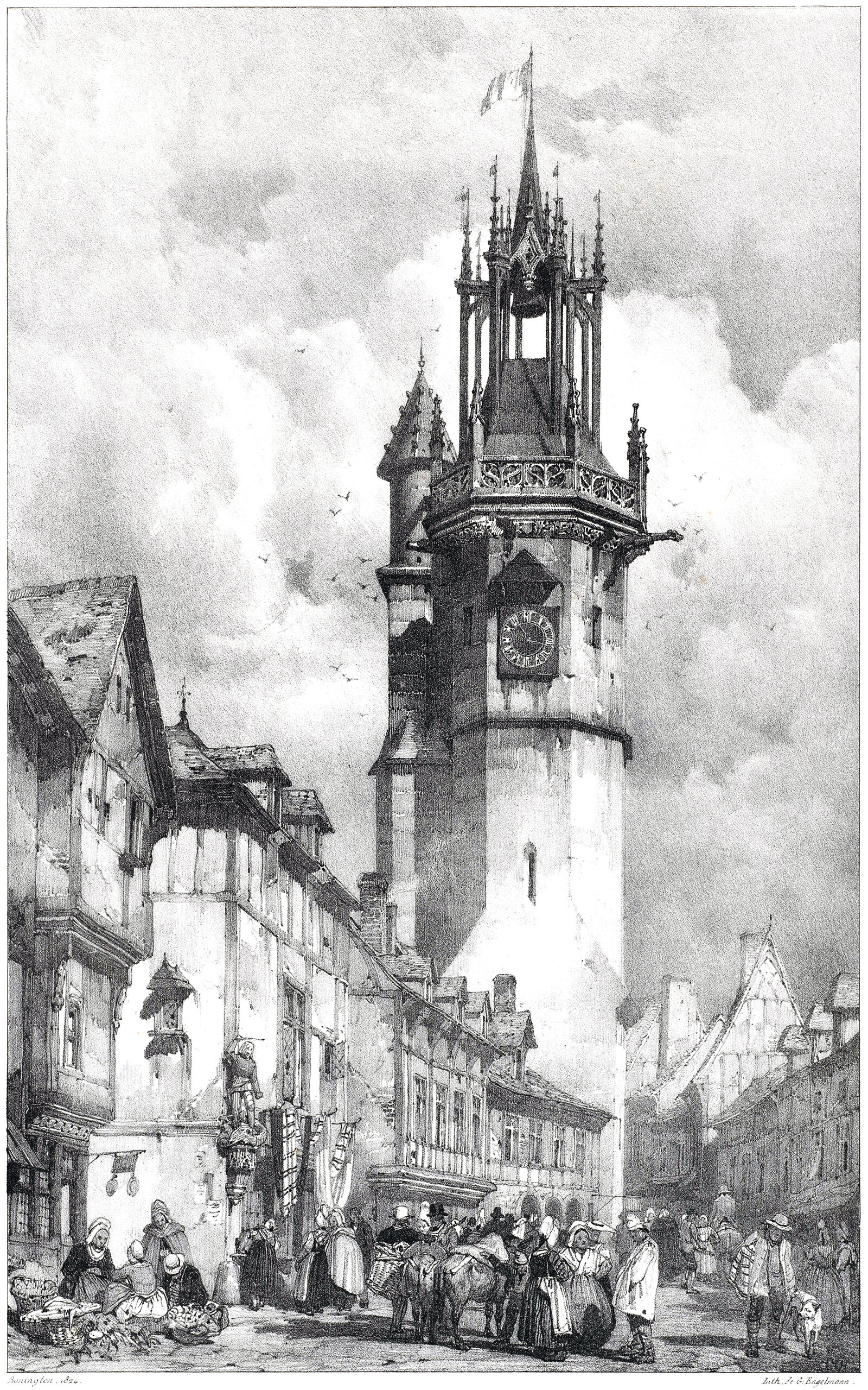
The Évreux Belfry
Pictured above is an illustration from 1825 showing a streetscape in Évreux, France. It was drawn by Richard P. Bonington, and it focuses on the town belfry, which was built from 1490-1497. Bonington does a great job of showing how a tower like this can dominate a streetscape, even if it isn’t that tall by today’s standards.
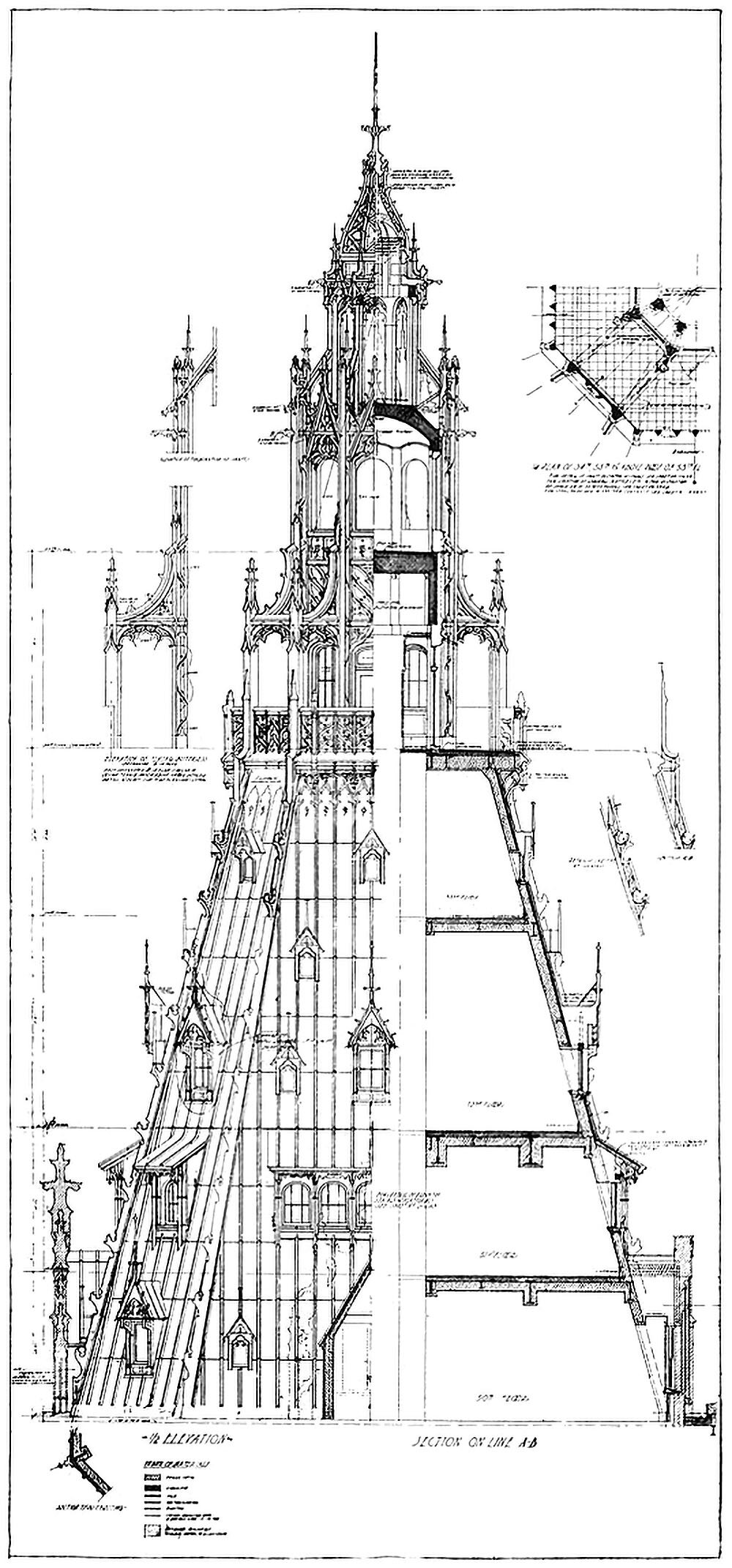
The Woolworth Building and the Question of Ornament
Pictured here is a combined elevation and section showing the crown of the Woolworth Building in New York City. Completed in 1912, the tower was the tallest building in the world at the time, and featured Neo-Gothic detailing throughout. As the drawing shows, this detailing is largely superficial, however. This is highlighted by the stark contrast between the left and right hand side of the drawing. This dichotomy between exterior and interior raises a couple questions related to verticality.
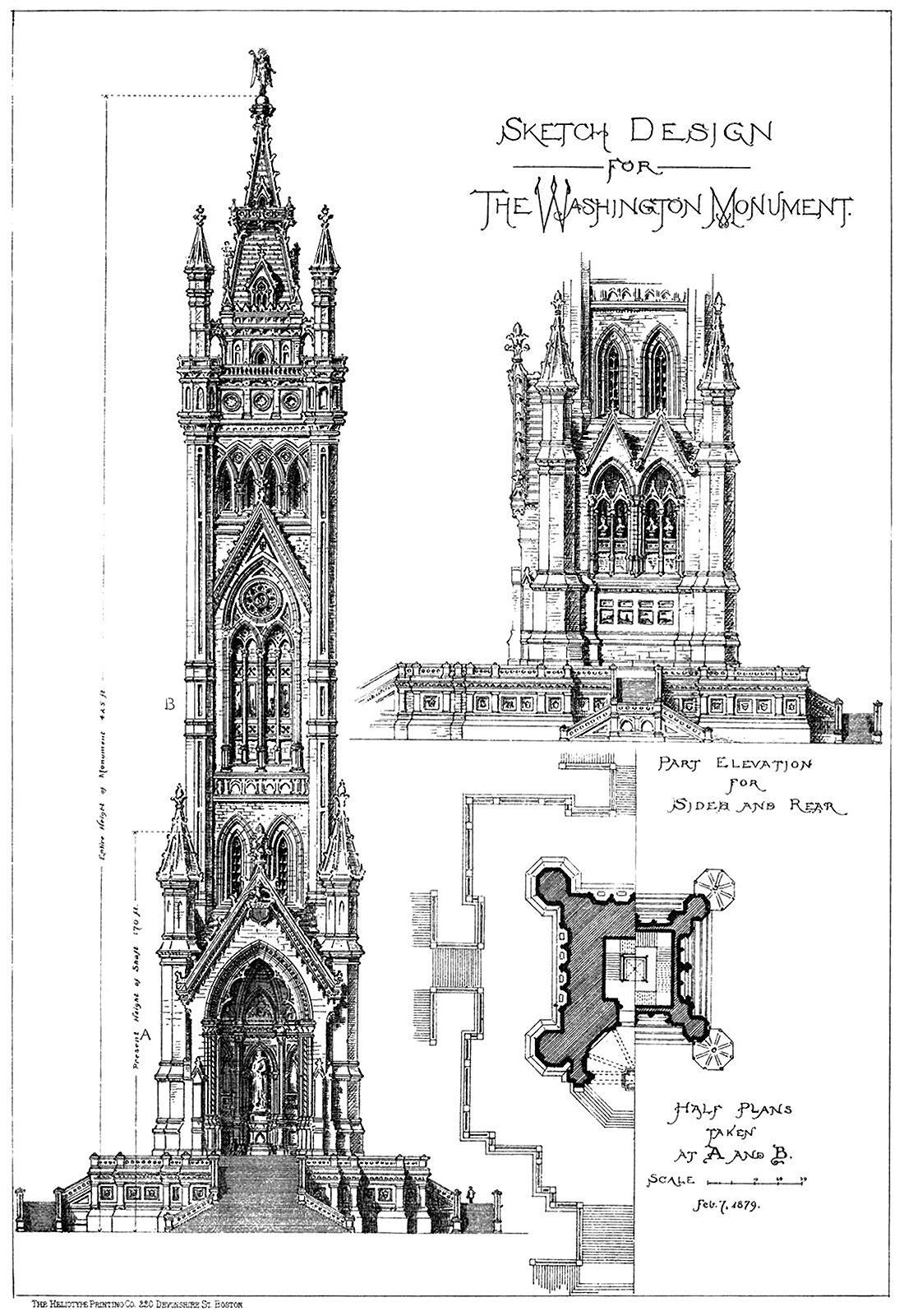
A Sketch Design for the Washington Monument
The above illustration originally appeared in American Architect and Building News, and was submitted to the publication by an architecture student. Curiously, the student is not named, and is just called ‘the author’. The student uses ‘the Gothic treatment’ for the design, which is wonderfully detailed, in stark contrast with the minimalist design that eventually got built.
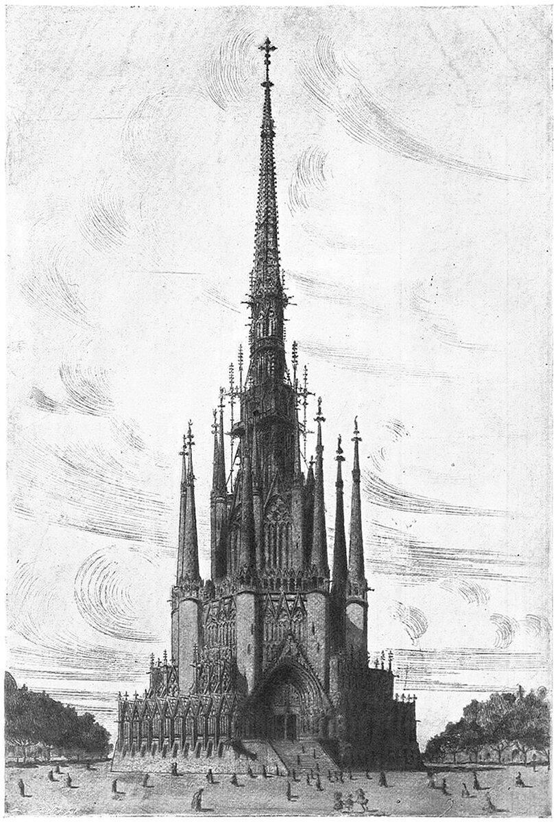
The Unbuilt Inmaculado Corazón de María
I came across the above image recently, and it really caught my eye. It’s a 1910 proposal for a school and church in Buenos Aires, called the Inmaculado Corazón de María (The Immaculate Heart of Mary), and it was designed by Catalan architects Josep Puig i Cadafalch and Josep Goday i Casals. Details are sparse, but the design seems to be a competition proposal that wasn’t chosen. It’s too bad, because it would’ve been an amazing building if it was completed.
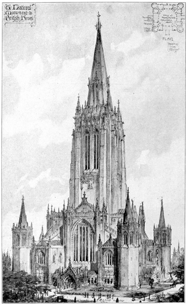
Edward B. Lamb's Monument to British Heroes
This is the National Monument to British Heroes, proposed by Edward B. Lamb in 1901. The structure was meant to house a hall of monuments and galleries, presumably to honor those who had died for the British crown throughout history. The proposal consists of a massive central belfry topped with a steeple and flanked by four turrets at its base.
Verticality, Part VIII: God versus Ego
The human world becomes as important as the world of God
The rise of Christianity in the Western world would have profound effects on the built environment and human culture. Two major threads would combine to influence Early Christian architecture and culture. The first is the architecture of the Ancient Romans, who were already wrestling with Verticality. The second is the Book of Genesis and its central theme of Heaven (the above) and Hell (the below). Combine these two, and you get an ongoing battle between God and Ego that would see some of the most impressive structures of all time get built.
