The Original Flat-topped Sears Tower
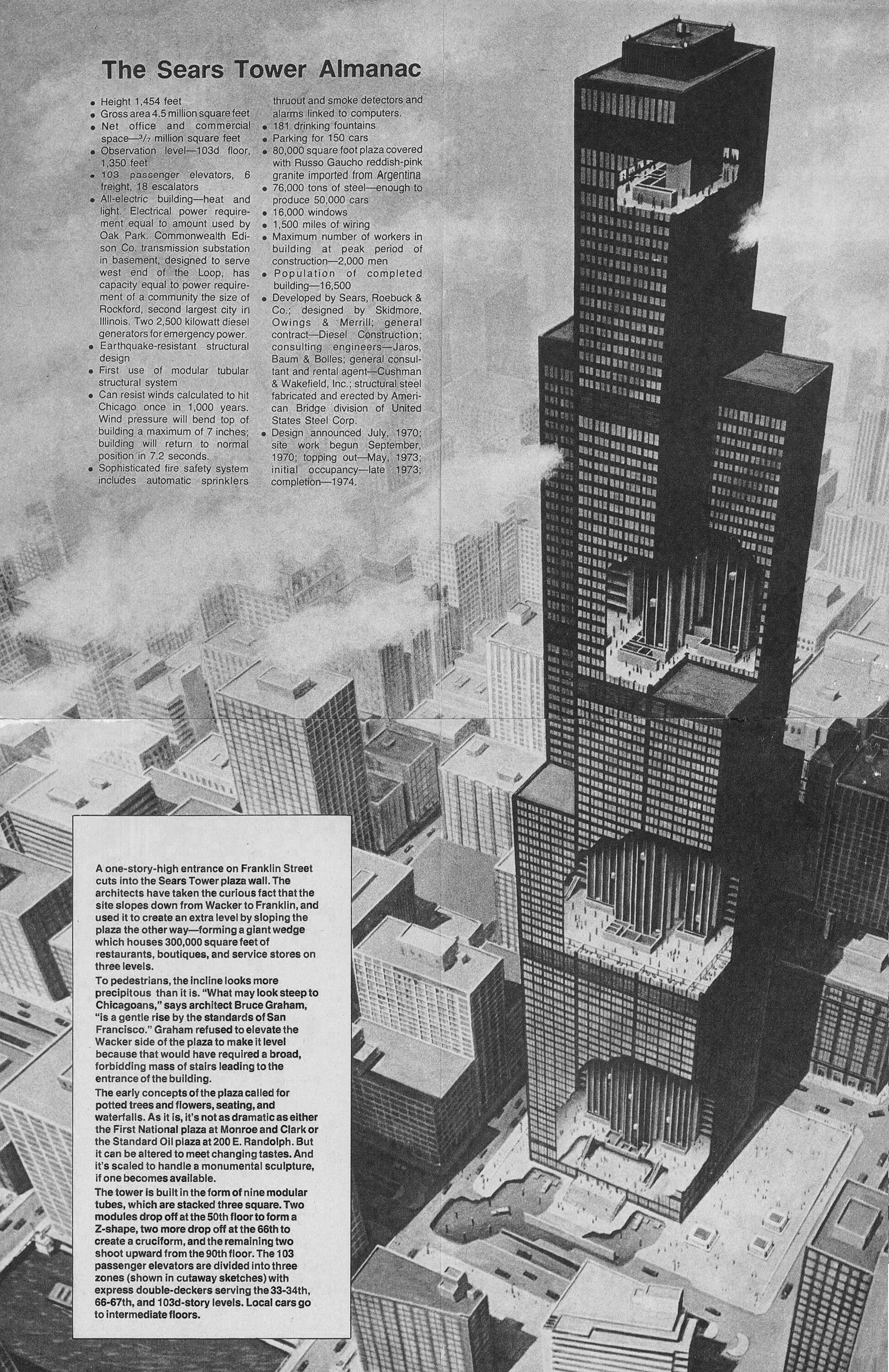
A page from The Sears Tower Almanac, showing a cutaway illustration of the skyscraper without it’s iconic antennae. The text explains some key facts related to the building’s structure and architecture, as well as the architect’s vision for the base of the building.
The above illustration shows the original design for the Sears Tower in Chicago, along with a bunch of factoids related to the scale of the building. Upon first glance, the first thing that stood out to me was the flat roof and lack of the building’s now-iconic antennae. Shown only as a black mass with setbacks, the building feels quite different without the white spires that are now so closely associated with it. Similarly, imagine the Empire State Building without it’s spire, or the John Hancock Center without it’s antennae. It’s just not the same.
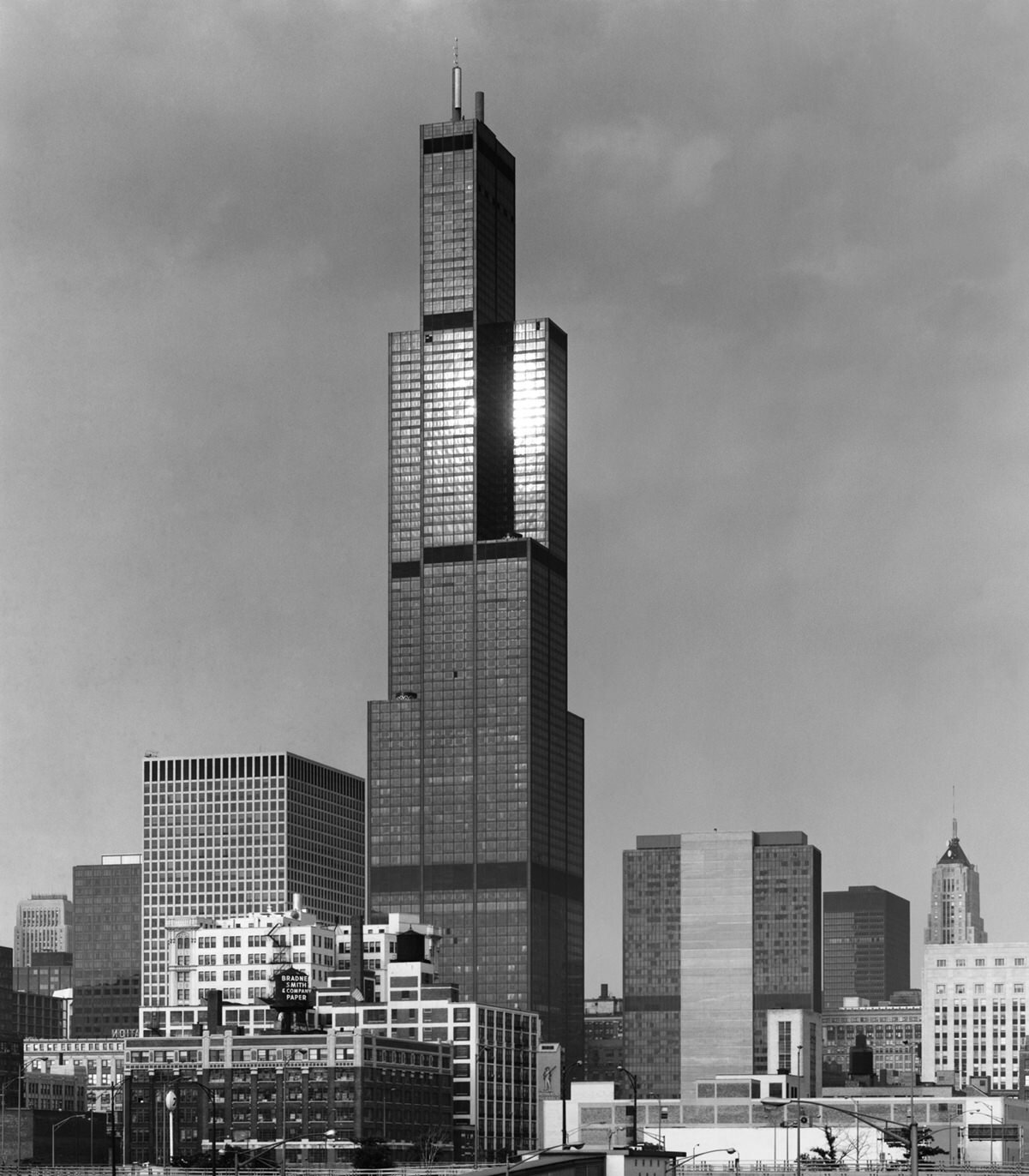
The Sears Tower topped out in 1973, and it originally had two stubby antennae atop it’s roof (pictured below), which were later extended to the height we see today. It’s interesting how these types of later additions, particularly when they make the tower taller, affect our perception of the entire form. At first glance, the above image almost looks like a different building without the white antennae, and the below image almost looks unfinished when compared to today’s version. It wasn’t unfinished, of course, and one wonders if a change would make such a difference if it didn’t affect the overall height of the building. Skyscrapers like this are built to be icons, and their crown design is the single most important factor in creating an iconic form. For Sears, had the setbacks or the façade been altered over time, I struggle to believe it would’ve had such an impact on the overall impression of the building.
Photo of the Sears Tower shortly after completion, showing the original, stubby version of the antennae. Photo ©️ Ezra Stoller. Image source.
Many of the world’s most famous skyscrapers have changed over time. Sometimes these changes occur during the design process, like the Empire State Building’s mooring mast. Sometimes they are rehabilitated with a different use, like the Art Deco towers of the Financial District in New York, which were originally office towers but have since been converted to luxury housing. Sometimes they get additions decades later as part of a modernization, like the antennae of the Sears Tower. In this last case, making a skyscraper taller increases it’s visibility on the world stage, and allows the building to adapt to change. It also created an iconography for the building that we now take for granted, so much so that the original design looks unfinished by comparison.
Check out other posts about Chicago here.


