Zoning Envelopes and the New York Skyscraper
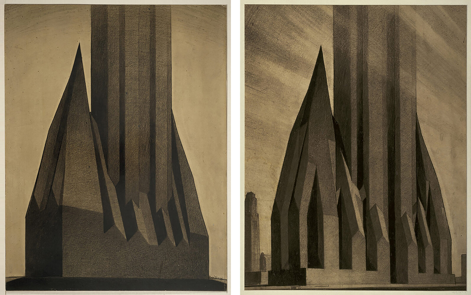
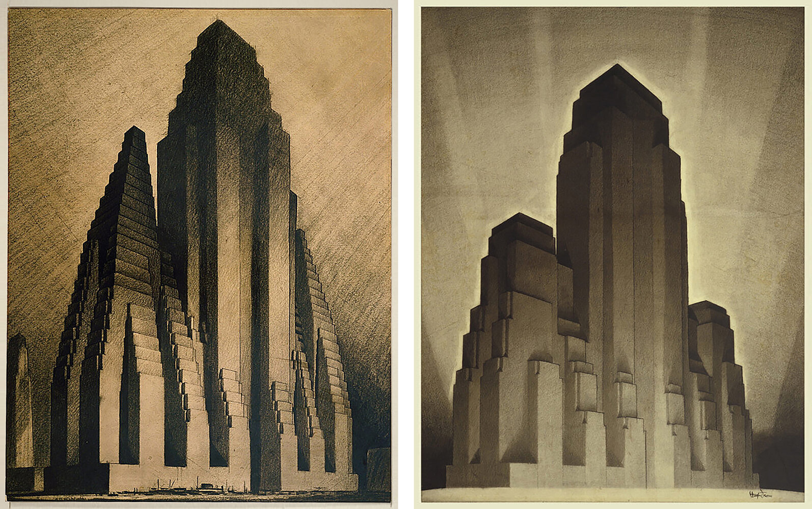
Set of renderings showing the impacts of the 1916 Zoning Resolution on New York Skyscrapers. Drawn by Hugh Ferriss in 1929, the diagrams begin with an abstraction of the setback lines established by the code, and progressively cutaway to reveal the setback-and-tower schemes so common in the city today.
While I was studying architecture, I had a professor say something that really stuck with me. He was discussing how architects can impact the built environment, and he said the most effective way to create change is to adjust the building code. That way every architect must conform their designs to meet the code’s requirements, which is much more impactful than any single building could ever be.
It was sage advice, and throughout the history of skyscrapers, it rings true. Arguably the most influential of these changes occurred in 1916 in New York City. As buildings were growing taller, land owners wanted to maximize profits so they increased the bulk of their structures as much as possible. The largest example of this was the Equitable Building, completed in 1915 and located in Manhattan’s Financial District. Pictured below, it was a massive building that caused a public backlash over the shadows it cast on neighboring streets and buildings.
Postcard showing the 1915 Equitable Building in Manhattan’s Financial District. The bulk of the building caused a public backlash due to the shadows it cast on neighboring buildings and streets.
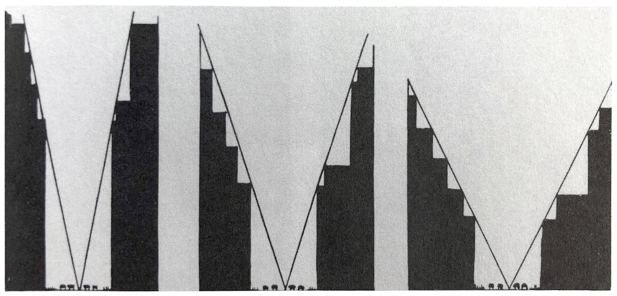
This backlash led to the 1916 Zoning Resolution, which established rules governing a building’s mass as it grows taller. Pictured below are three diagrams that illustrate the impact of these rules. The first diagram shows a series of street sections and the resulting setbacks required by the new code. As buildings grew taller, they would need to set back from the street along a diagonal line that sprang from the center of the street. This would allow more sunlight to reach street level, and it would limit the massive shadows cast by buildings like the Equitable.
Series of diagrams from the 1916 Zoning Resolution of New York, showing street sections and the resulting setback requirements of the new code.
The second diagram shows a comparison between the Equitable Building and a second massing that conforms to the new zoning. The solid lines represent the Equitable Building, and the dotted lines represent the setback rules established by the zoning laws. The taller a building was, the more it had to set back from its lot line. This resulted in buildings with large, bulky bases and slender towers. Buildings shaped like this became known as wedding-cake or setback-and-tower structures, due to the systems of setbacks involved as they rise from the street.
Diagram showing the impact of the 1916 Zoning Resolution in New York. The zoning laws changed to require buildings to set back from their lot lines as they grew taller, resulting in large, bulky bases and slender towers.
The third diagram shows a massing guide based on the zoning restrictions, applied to different building heights. It also includes heights of notable skyscrapers along the left side for comparison. This diagram is fantastic, because it takes a set of rules (the building code) and applies them to a design strategy (maximize the amount of floor area). The result is a set of solutions that looks quite similar to many buildings in New York that followed the same process.
Study of Economic Height for Office Buildings by J.L. Kingston, drawn in 1930. The diagram shows a set of massings, based on height, that conform to the 1916 Zoning Resolution for New York City.
Many of the most famous New York skyscrapers are examples of the setback-and-tower style. The two most famous examples are the Chrysler Building and the Empire State Building. Each was the tallest in the world when it was completed, and each featured a bulky base with a system of setbacks, leading to a slender tower element. Buildings like these popped up all over the city, and came to define what a New York skyscraper was.
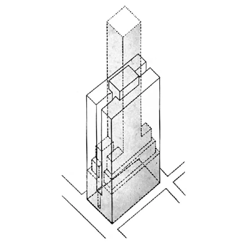
At first glance, the Empire State Building looks quite similar to the massing diagram above. This makes sense considering the two diagrams shown below. It’s clear both architects followed a similar logic to reach their designs, and the setback lines on the isometric diagram below hit the point home. The base of the Empire State Building isn’t as elaborate as the diagram above, but the tower element is a near match.
Diagrams of the Empire State Building that show its massing and how it conforms to the 1916 Zoning Resolution. These zoning laws would come to define the New York Skyscraper, and Empire State was one of the best examples of it.
It’s fascinating to consider how influential a few zoning laws can be on the city aesthetic. Because of the 1916 Zoning Resolution, New York has become the home of the setback-and-tower scheme, and examples can be found all over the city. My professor was right: whomever designed those zoning laws had a much greater impact on New York City than any single building could ever hope to have.
Check out other posts about New York City here.


