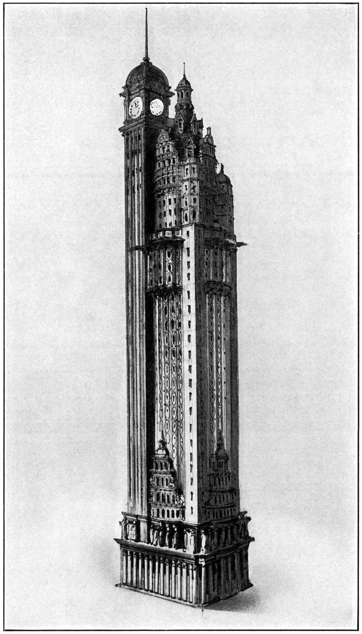
The New York American Journal Headquarters
Proposed headquarters for the New York American Journal, to be located at Columbus Circle in New York City.
Throughout my research into tall buildings and verticality, I’ve come across myriad examples of proposed and unbuilt structures. Some are alternate proposals by famous architects. Some are one-hit wonders that make their way into the mainstream history of skyscrapers. Some, like the one pictured above, are just intriguing and obscure images without much context. Details on this building are scarce, but from what I can find this is a proposal by Barney & Chapman Architects for the headquarters of the New York American Journal. It was located at Columbus Circle in New York City, on the site occupied by the Museum of Arts and Design today. It was originally published in a 1904 issue of The Architectural Record as part of a 90-page summary of Barney & Chapman’s works, but sadly there’s very little commentary other than a short paragraph outlining the facts above.[1] What we do have is four illustrations of the tower, all similar to the one shown above, and a floor plan, which is shown below.
By the looks of it, it’s a shame this guy never got built. It’s an eclectic jumble of different forms and styles, and as such, I view it as a microcosm of New York City. Just look at it; it’s got so much going on that it feels overcrowded, just like the city it was designed for. The architects deftly combine several different forms and styles into a single structure, which creates a sort of mini-skyline within the building itself. Rather than create a singular identity that plays into the larger narrative of the city, this building tries to be an entire city within itself.
The design begins with a classical base, including a Corinthian peristyle with a frieze of caryatids. Above this rises the tower shaft, which is situated behind a Renaissance-esque westwork on each façade. The tower shaft is then divided into two pieces. The main volume is a historicist structure with an elaborate crown, which looks similar to the westworks below. Huddled next to this is a clock tower that carries a Victorian vibe, reminiscent of train stations in Europe from that era. These three pieces combine to form the frankenstein that is the New York American Journal Headquarters.
Floor plan for the New York American Journal Headquarters proposal by Barney & Chapman Architects.
I’ve tried to make sense of this building, but without more information it’s tough to reach any conclusions. Is it a serious architectural proposal, or an act of whimsey or satire? Either are possible, which makes it that much more intriguing. A quick study of a typical floor plan, pictured above, shows a functioning, albeit awkward, interior experience. The entire plan revolves around a central elevator lobby with a pair of spiraling stairs that wrap around a massive cylindrical column. At the center of it all is a circular elevator. Wrapping around this core is a series of irregular offices that fill in the uneven spaces between the core and the façade. The main feature of these spaces are two bastion-shaped offices that jut out at the corners. These are quite odd, but somehow satisfying at the same time. One thing I can say for sure: whoever drew this up was having themselves a grand old time.
Check out other posts about unbuilt architecture here.
[1] : Schuyler, Montgomery. “The Works of Messrs. Barney and Chapman.” The Architectural Record XVL, no. 3 (September 1904), 203-296.


