Antoni Gaudí's New York Skyscraper
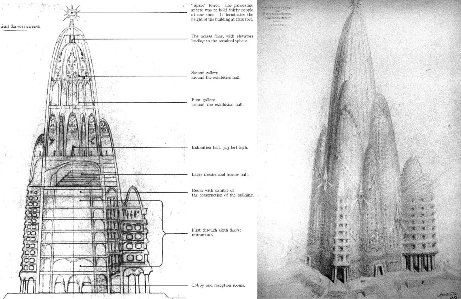
Section and drawing of Antoni Gaudí's Hotel Attraction, designed in 1908 for New York City. Gaudí raised the larger cultural spaces to the top half of the tower, which gives them more importance over the hotel. Drawings by Juan Matemala.
The Spanish architect Antoni Gaudí is known the world over for his iconic architecture, rich in organic, curvilinear forms. One lesser-known project of his is the Hotel Attraction. It was designed in 1908 for an unspecified site in Lower Manhattan, New York City. The project would have housed a hotel, restaurants, theatre hall, exhibition hall, galleries, and a panoramic lookout at the top, called the 'Space Tower'. If built, it would have been 360 meters, or 1,181 feet tall.
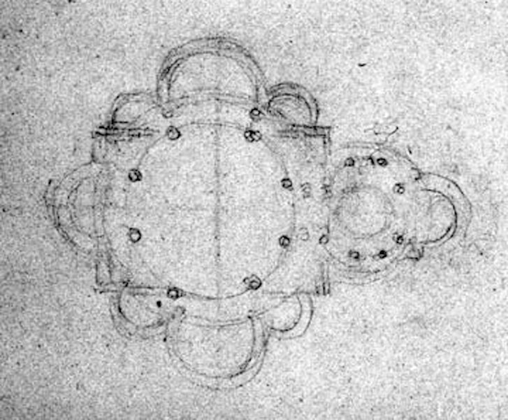
Many elements of verticality are present here. At first glance, one can easily see the mountain metaphor in the design, with a tapered form and smaller floor plates as one ascends, enhancing the value of the highest spaces. At the peak, Gaudí placed a panoramic sphere with 360 degree views of the surrounding city. This decision gives the highest place in the building an experience similar to being at the top of a mountain: it's the smallest, has the best views, and takes the biggest effort to reach. Also, like the human body, the tower has an axis-mundi with its plan, pictured below, centered directly below the spherical lookout on top. Another interesting aspect is that Gaudí raised up the larger cultural spaces to the top half of the tower, as shown in the section above. This makes a statement that culture is more important than the revenue-generating hotel below, which makes sense considering he was a socialist.
Plan of the building. This sketch was allegedly by Gaudí himself.
It's always interesting when a world-famous architect takes a stab at designing a skyscraper. Many styles and proclivities that work well in shorter buildings don't necessarily work when dealing with a vertical form, so the problem must be approached differently. One way to approach it is to tap into our innate need for verticality. It seems as if Gaudí knew this well, since he lifted up the cultural spaces and put a viewing platform at the top of his 'mountain'.
Further Reading:
Antoni Gaudi's Fantastical, Futuristic 1908 Hotel Attraction (Curbed)
The New York City That Never Was: The Gaudi Hotel (Untapped Cities)
Check out other unbuilt designs here.


