The Towering Centerpiece of an International World Centre
Illustration by Ernest Hébrard, showing the centerpiece of his proposal for an International World Centre. Hébrard decided on a monumental tower as the centerpiece to his plan, which speaks to the need for verticality in a landmark.
Pictured above is a monumental tower designed by Hendrik C. Anderson and Ernest M. Hébrard as part of a 1912 design for an international world centre. It was a visionary project without a real location, meant to be a utopian vision for the city of the future. Either way, this tower, which most likely would’ve been the tallest in the world at the time, speak volumes about the designers and their intent.
The overall design is shown below, which is a typical example of the Grand Manner style of planning. This style includes vast, straight boulevards that cut through a city with large intersections that usually include a civic building or monument. The best real-world examples of this style are Paris and Washington DC. You can see a major axis along the center of the plan, anchored on one side by a large civic building, and anchored on the other by the tower shown above.
The Tower of Progress, as it’s called in the design drawings, is surrounded by civic headquarters for different disciplines. These include medicine, justice, science, religion, and banking, among others. Each of these headquarters is a low building that is part of the city, while the designers chose to represent progress with a tower in the middle of a large plaza. This decision is quite telling. Through its name, Anderson and Hébrard were saying that verticality is a metaphor for progress, and both of these would be the centerpiece of their city.
Aerial view of the proposal for an International World Centre by Ernest Hébrard, with the monumental tower shown at the right side of the main axis.
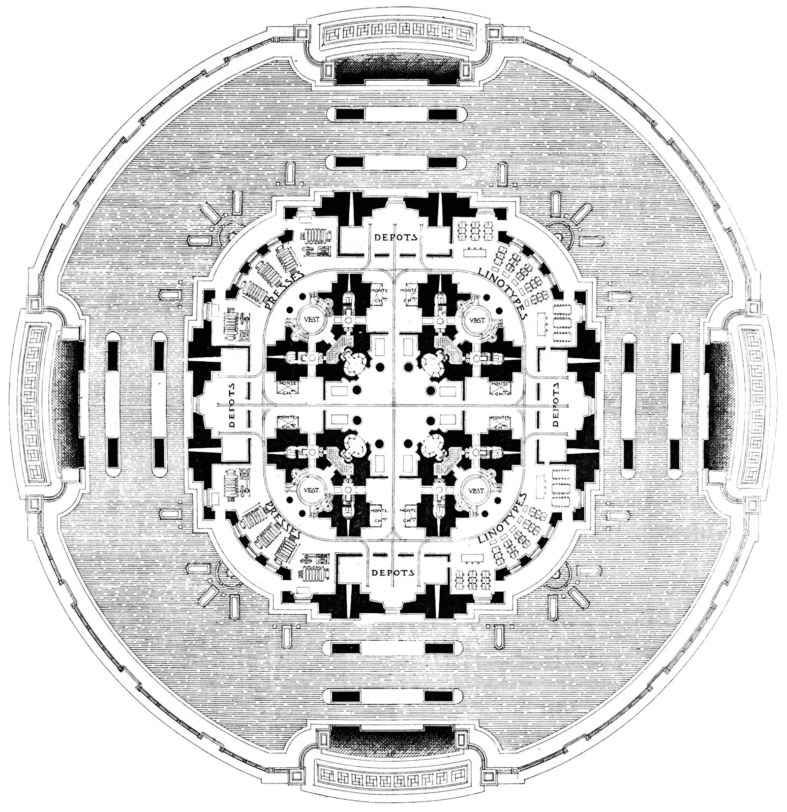
The design of the tower is quite elaborate, with a massive base and a large arched void that cuts through the base. This void suggests the tower was to have public access, and it was a way of welcoming the public in to enter its footprint. The literature accompanying the drawings describes the tower thus:
The Science Group has for its crowning motif a gigantic Tower of Progress. This tower, planned on lines of practical utility, is capable of providing offices for those international societies recognised as beneficial to humanity and to the progress of the world, as well as for the World Press and a great station of wireless telegraphy. The Tower rises in the midst of a circular space set aside for Industrial and Scientific Congress buildings. This group includes buildings which will be dedicated respectively to Medicine, Surgery and Hygiene, Law and Criminology, Electricity and Inventions, Agriculture and Transportation … These buildings form what is known as Congress Square, and the Tower of Progress, rising in their midst, is the heart of both the International Centre and the City.[1]
Floor plan of the central tower of the International World Centre proposal by Ernest Hébrard.
So there you have it. Anderson and Hébrard designed their city to be focused on a monumental tower that represented human progress. The tower was to house offices for organizations focused on human progress, and it would be topped by a massive radio beacon. These men were hoping to capture human progress in the built form, and they did so using verticality. It wasn’t enough to build a city of the future; that city must also include the tallest building in the world at its heart.
[1]: Andersen, Olivia Cushing, Hendrik Christian Andersen. Creation of a World Centre of Communication. Rome: Hendrik Christian Andersen, 1918. 55.
Check out other posts about architecture and verticality here.


