The Larkin Tower
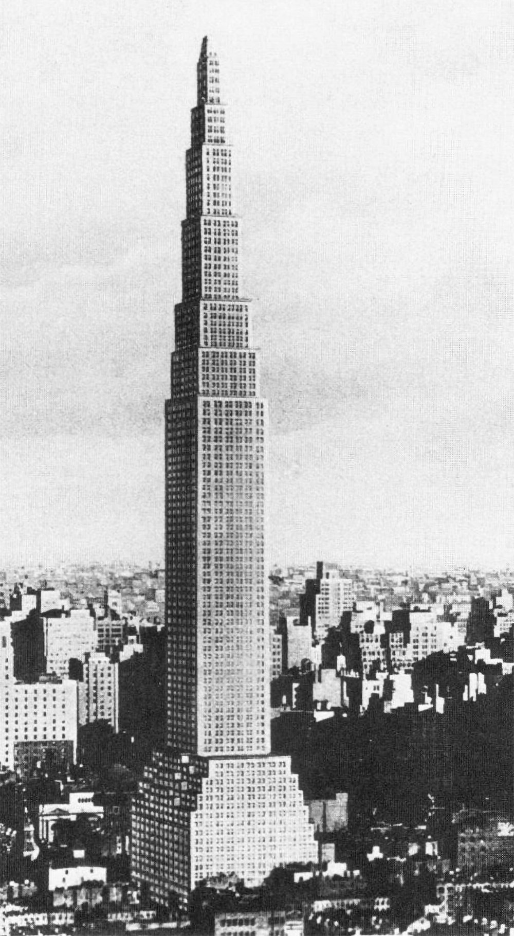
John and Edward Larkin’s proposed tower design from 1926. It remained unbuilt and was dismissed by architecture critics as unrealistic.
Nearly all proposals for the tallest building in the world include some type of defining element or design flourish that make them unique and memorable. The Chrysler Building has its metallic crown and spire. The Empire State Building has its mooring mast and antenna. Not the Larkin Building. It was designed in 1926 for a site on 42nd Street on Manhattan, and it was 368 meters (1,207 feet) tall, making it the tallest structure in the world by a long shot. Aside from this, there’s not much else to say about it.
Consider the design. It begins with a bulky base and a series of shallow setbacks. Above this is a tower element with a series of telescoping setbacks that culminate in a diminutive pyramid at the summit. That’s it. It’s so simple that it looks incomplete, as if the architect followed a stacking formula and forgot to deviate from it to make it unique. Compare this to the Woolworth Building or the Singer Tower. These buildings were each the tallest in the world, but they were also unique architectural marvels with their own personality and character.
Building the tallest structure in the world is a statement. It satisfies the ego of the builders and it signifies their power and strength. The Larkin Tower takes this idea and strips all the panache away, as if it only cares about height and nothing else. It’s only interested in the tallest label and not how it looks or functions. It exists as a pure exercise in verticality.
The proposal was met with skepticism, but not because of its aesthetics.[1] The structural system and the vertical transportation posed the biggest challenge. A building this big requires lots of elevators in order to function, and each of these elevators eats into the building’s rentable space. To put it simply, the more elevators you need, the less rentable space you’re left with. Less rentable area equals less profit, which can quickly doom a project of this scale. Combine this with the slender profile of the Larkin Tower, and it’s quite tough to create a financially feasible project. This is one of the trade-offs of verticality. The taller a building is, the more complex its systems must be in order to function. These systems cost more money, which must be offset by more rentable area or higher rents, and so on and so on.
Other skyscrapers were able to make this equation work by creating a brand around the building. This was usually done by designing an iconic tower and giving it the label of tallest. This imbues a building with status, which will increase demand for its interior spaces. Larkin had the tallest label, but its design didn’t add to its status. It never made it past the initial renderings, and I suspect the aforementioned reasons were a major factor in its downfall.
Check out other posts about unbuilt architecture here.
[1] : Goldberger, Paul. The Skyscraper. New York: Alfred A. Knopf, 1986. 77.

